SlideMagic Blog

Frequent updates about all things presentations since 2008. Subscribe to never miss a post.

RSS
·Layout

How to create a logo page in a presentation

Yes, I have been in this situation as well:

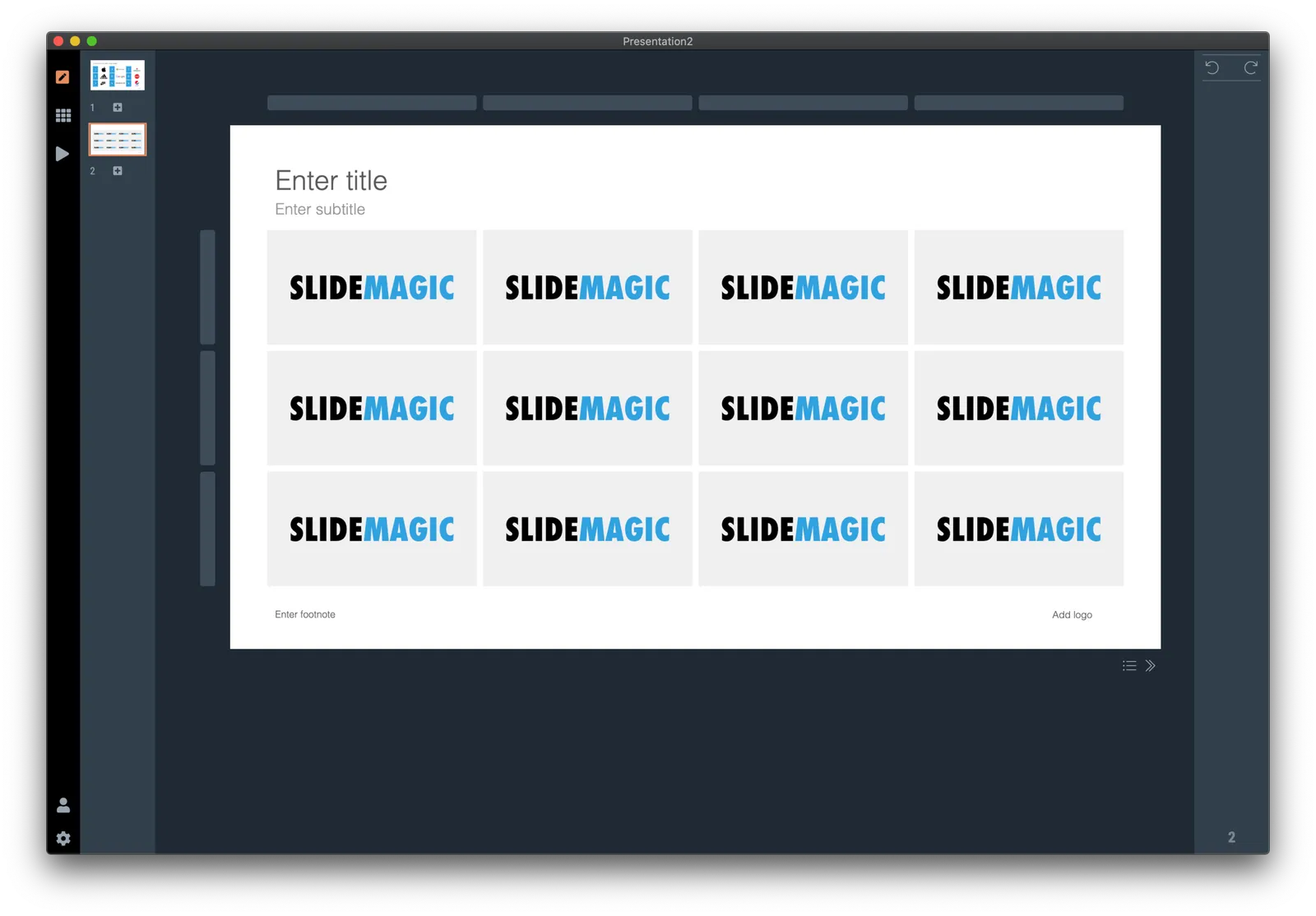
Below is a short video that shows how SlideMagic makes creating logo pages in a presentation really easy. In the first example, I start from scratch with a completely blank page. Notice how logos get plopped in, and how everything lines up instantly in the grid, and how easy it is to add columns, text boxes without having to re-arrange and re-align the entire page. (I have added this slide as a free slide on the template store, you can find it here, stripped of the logos I used because I could not verify copyrights)

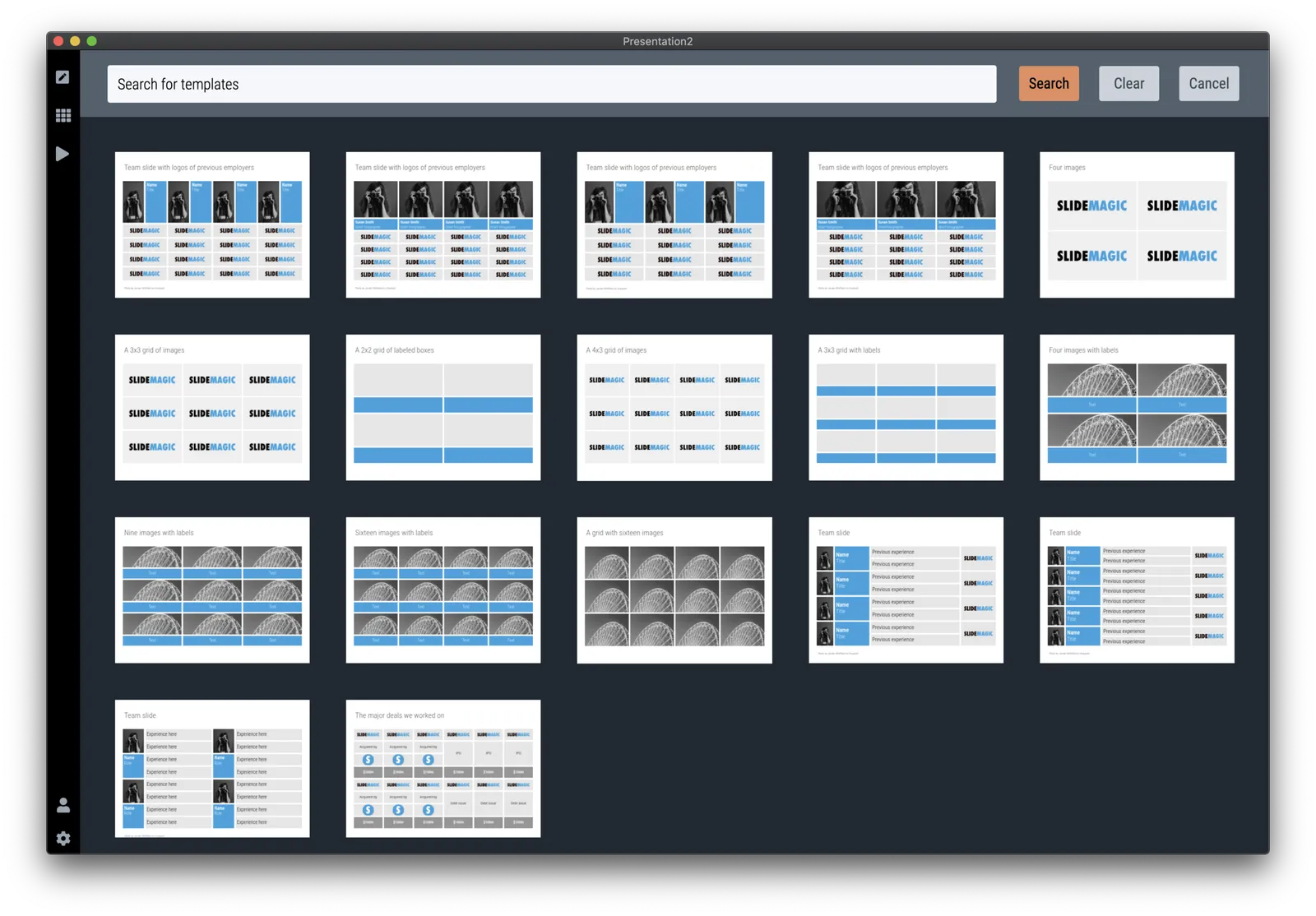
The alternative is to start with one of the built-in templates of SlideMagic, search for “logo” in the app and see what slides come up:

Now you can customise the page and swap the logos for the ones you need.

The exact same search available in the online template bank as well (try searching for logo), but users who are downloading the PowerPoint version directly from the web site miss out on the magic of SlideMagic when it comes to manipulating image grids.

My suggested strategy: tweak things in SlideMagic, and export at the very last moment to PowerPoint if you have to share things with your colleagues. You will save a lot of time making those nasty logo grids.

·Software

Better PDF conversion

I just released V2.2.3 of SlideMagic, with a big feature update: a new approach to exporting PDF. Until now, I created PDF files by having the program recreate a .magic slide in .pdf, element by element, picture by picture, letter by letter. This got me to 99% accuracy, the 1% being cases where small mistakes would be introduced. For example, a word dropping to the next line because of tiny deviations in font size.

Unlike PowerPoint exports, PDF files are set in stone, you want to send that presentation to an investor, there is no way to fix a quick glitch.

So I changed the approach, the new PDF exporter takes a screen shot of the exact page you created and puts it in a high resolution PDF file. What you see is what you get, 100% of the time, by design. In the process, I could actually delete hundreds and hundreds of lines of code.

The app should upgrade itself in the background for existing users, or you can force the upgrade by downloading a new version from the site.

Other V2.2.3 improvements are mainly under the hood. For the geeks: the app has been upgraded from Electron 6 to 8, with a very recent version of Chrome, and both app and server now share the exact same code to render slides, images, and PowerPoint files, which will save me lot of time as I make improvements. I basically paid my duties for fixing “quick and dirty” copy-paste coding of a few months ago.

Continue reading →
·Colors

Why are all your images black and white?

Yes, almost all the images on my blog and in the SlideMagic template bank are in black and white. Why?

SlideMagic uses (and encourages you to use) a sober colour scheme: basically different levels of grey with one accent colour that should match the dominant colour in your logo. This is a pragmatic choice. SlideMagic is all about business presentations, not art. More colours require additional design skills to get it right. Too many colours can make a slide busy, can create inconsistencies between slides, make the brand identity of your slide weaker. Yes, a pro designer can get it right, and maybe the amateur as well, but - and that is a very important but - it just adds to the time it takes to create your deck. And SlideMagic is all about speed. One accent colour and greys always looks good.

Full colour images introduce colours to your slide that might not always match your colour scheme. Colour schemes of images can also vary wildly between images, creating inconsistent slides. You often see that professional-grade designs (ads, brochures, web sites) use images that have been selected based on their colour profile. The amateur slide designer does not have time for this. That’s why keeping things black and white solves this issue: images blend in, and images look consistent.

Should all images always be black and white? Absolutely not. Personally, I would go for anonymous images to be black and white, but depictions of real things in full colour; your product, your app screen, your prototype.

Continue reading →
·Video

Virtual backgrounds in video conferencing

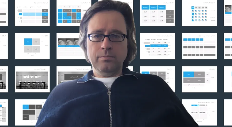
Camera technology is finally good enough to solve the video conference background problem: no more bed rooms, bad lighting, plumbers, kids and/or other unpredictable events behind your back. In the settings tab of zoom, go to virtual backgrounds and set it to the mood you want.

 Almost perfect, my hair and sweater pattern did get adjusted as well…

Almost perfect, my hair and sweater pattern did get adjusted as well…

Most of your slides should be tables in disguise

After more than 25 years of designing presentations, here is an important insight: most of your slides are tables. Not only the spreadsheet-type straight table with columns full of numbers, but a more generic 2 dimensional layout of any idea.

Writing text on paper, in a word processor or telling a story verbally, is one dimensional. You make a point one after the other. A good slide adds a second dimension to organise your thoughts.

  • Time to show a sequence of data
  • Steps in a process or a supply chain
  • Pros and cons
  • Sales, costs, capital

Dependent on this second dimension, different slide types come out: 2x2 matrices, categorised lists, column charts.

 The algorithm picks up some real tables as well…

The algorithm picks up some real tables as well…

Many of the classical management consulting frameworks were the result of someone trying to fit an idea across 2 axes. When it worked, you got a nice layout to discuss an issue, and often, you spotted missing scenarios that you did not consider before (“hey, what happens in the low-low box?”)

This also shows why bullet points are poor slides: they are 1-dimensional, you are missing that powerful second dimension to organise your idea.

Now you see why in SlideMagic the table is central to everything. It encourages you to think in 2 dimensions for every slide you try to design. Organising and lining up boxes is difficult in most presentation software. And when you got it to work finally, someone asks you to add another row and take out column 2. Piece of cake in SlideMagic.

Continue reading →

One slide, multiple views

SlideMagic can change the way a slide looks at the touch of a button:

  • Aspect ratio, going back and forth between 16:9 and 4:3
  • Background colour: between dark and light
  • Explanation panel: with or without a side box with space for text for when you are not there to explain the slide in person

In traditional presentation software, this can be cumbersome to do. The software is not to blame, it is by design. If you give the user full flexibility about how to place images, size shapes, and colours she can use, you cannot avoid stretching of image aspect ratios, mixing up slide layouts, and confusing colours when you apply changing to a slide layout. Yes, all can be fixed, but it always takes a bit of mopping up to get right.

SlideMagic has a very rigid colour and slide layout regime, and it pays off, you can go back and forth between different slide layouts instantly. Here are six versions of the same slide, all generated with a single click without corrections:

 4:3, dark slide background (see how the app interface itself turns light to provide enough contrast)

4:3, dark slide background (see how the app interface itself turns light to provide enough contrast)

 Dark background, with the slide-out panel

Dark background, with the slide-out panel

 16:9, dark background

16:9, dark background

 Wide screen, with a light background, the app turns dark again

Wide screen, with a light background, the app turns dark again

Continue reading →

Video: making slides in the app

I am still mainly focused on improving the app, but soon I focus on marketing as soon as I see that a group users really gets hooked on using the product (and that group can be very small). One good way to show what the app can do is short screen capture videos I think. I quickly put two together, without editing, just my playing around.

The first one creates a data table with integrated bar chart (notice how it lines up) from scratch:

The second slide uses the built in slide template bank (the app has access to the same slides as you can search online). Notice how you pull in the template, quickly add in columns, delete rows, and pull in another image. (I am using the beta Unsplash integration here). They key problem with pre-designed PowerPoint templates is having a design layman adjusting a template that was created by a pro. SlideMagic solves that.

Do VCs like short pitch decks or detailed ones?

I am monitoring my server logs to catch broken links now that I am taking years of Shopify links down (it is like playing tennis against a ball throwing machine). One of the URLs that produced a 404 error was this one:

Do-interested-VCs-like-short-pitch-decks-that-stimulate-discussion-or-detailed-pitch-decks-that-demonstrate-thought-thoroughness

Someone must have typed this question in somewhere. Let’s try to answer it:

I think the different types of documents are needed in different stages of the VC due diligence.

Initially a VC is trying to get her head around what it is that you are actually doing. Presenting a massive fact pack with market statistics will show that you are diligent, but will not help her answer the question of the moment. It will also show that you do not really have great sales skills and tact.

On the other hand, showing up with 2 pages TED Talk-style (2 page filling images) in order to have a fresh exchange of ideas freed from bullet points, will not get you past that initial hurdle either.

In some sectors, leaving detail out can actually hurt. For example for a biotech pitch, it can all hinge on the results of your clinical trial, down to nitty gritty statistics. Leaving that out invalidates the pitch.

There is no one-fits-all answer here. Think how much time you have, think at what stage of the process you are in, think how well an investor understands the industry and see what is the right information needed for this moment.

If you are sending a deck via email (“send and pray”), add a bit more information, maybe separated in a clear upfront pitch and an appendix in the back. Again use judgement: details work plans of the team are probably not interesting, additional pages with bio info of the team could actually help (easy to skim, team is very important), confidential IP/technical information or financial data you might not want to email to an investor at all initially.

Continue reading →
·SlideMagic

Closing the old template store, subscribers can move to the new one

The new platform now includes the entire collection of the slides of my old Shopify templates store (and much more of course). Yes, it might be costing me SEO rankings, but I am going to close it down: multiple platforms are confusing for users, and hard to manage. Also the old store was difficult to use for subscribers who had to go through some check out process every time they want to download a slide.

For each paying subscriber with an active subscription, I have created an account on the new platform with a Pro subscription that expires at the same time your subscription on the old store did. I don’t store your passwords, so you have to go to slidemagic.com (this site), go to the log in page, and hit “forgot password”. After entering the email address you used for the old store, you should receive a link where you can create a new password (invisible to me).

I will keep the slide download option running on the platform, because that is what people are used to when it comes to buying presentation-related things online, but selling templates is not the main point of SlideMagic. The pro subscription also unlocks the full feature set of the downloadable presentation app. Try using it:

  • Super easy to customise templates
  • A lot, lot more templates available
  • PowerPoint export so your colleagues do not have to notice (of course you can tell them about the secret of SlideMagic).

If you are stuck email [email protected], and I am here to help.

Continue reading →
·Concepts

Presenting sensitivities

I added a few more slides to the database today, one of them was this one: a template to present a sensitivity analysis.

Why this particular layout?

  • It is nicely spaced out, a calm composition for so much data
  • Numbers are disconnected from the spreadsheet: rounded up, entered by hand
  • Colours, bold, are used to direct the eye to what is important, and what is secondary

Some thoughts about how and when to present this type of analysis:

  • Presenting sensitivities and not the same as analysing them. The latter is the homework that you should have been doing before the presentation. Figure to what factors your model is sensitive, decided whether that is how it should be, then gather more information where needed to increase your confidence in variables that can make a big difference. What is left to discuss are sensitivities after you did everything to minimise and/or understand them.
  • The ranges of the variables you show should be realistic. This is not an exercise in mathematics, but an attempt to really understand what drives the future.
  • Pick dimensions that are not correlated, if the risks on the x and y axes are the same, you are not adding much insight.
  • Try flipping the analysis upside down, instead of showing deviations from the base case, show “what you would have to believe” in order to get to a certain number.
  • Be careful when sharing this type of data if you are in some negotiation about valuation. If the other side understand your model, they can basically salami slice the valuation using your own excel. You need to understand the sensitivities, but sharing them directly might not be smart.
Continue reading →