SlideMagic Blog

Frequent updates about all things presentations since 2008. Subscribe to never miss a post.

RSS

Further search improvements

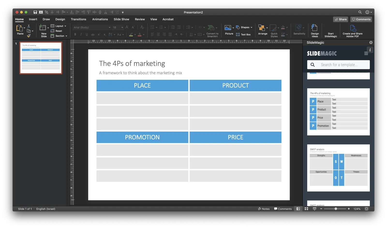
We got the house settled into some routine now which means I can focus my attention on SlideMagic again. Following up on a blog post of 2 days ago, I made more improvements to the slide search algorithm that produces related slides:

  • It identifies variants of the same design (more or fewer columns or rows for example
  • A similar message or concept that they are trying to convey
  • Slides that are different but have the same visual structure as the one you initially picked

I removed the category labels in the search results (that were useful for me, but not really for a user). Instead, I am going for a single list of slides sorted by relevance without revealing what is behind that relevance. And that algorithm will get better and more accurate over time.

Size-based suggestions

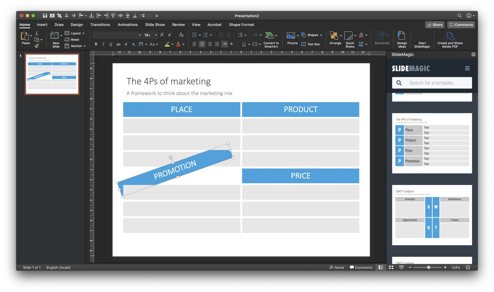
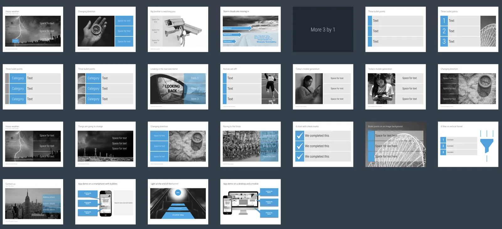
A key step in my slide design process is figuring out what sort of grid I need: 3 x 1, 1 x 5, 4 x 4? Almost every slide in a business presentation is some sort of table in disguise. Today I started adding a “more x by y” search suggestions on the web-based template browser of SlideMagic. I will add more automation to slide classification in the near future. One obvious extension is the same slide but then with 1 more column, etc.

·Data visualization

How to design management dashboards

The number of app installs of SlideMagic 2.0 is still small, but the graph has a similar shape as the exponential graphs we all have gotten used to over the past weeks.

Modern analytics tools allow you to track literally everything under the sun in your app and/or web site. Instant information overload supported by colourful graphs that look good, but don’t say much. This overload of data is similar to the ones I would encounter as a consultant at McKinsey. And now, 15+ years later, I find myself following a similar approach to making sense of it for my own app.

Most case examples about analytics are built for established apps and web sites with huge customer flows you can micro analyse whether the check out button should br green or red. SlideMagic is not there yet.

  • I find myself going through a certain cycle. It starts with a basic question, “how many people did actually install the app”, which results in a daily manual routine to find the latest number, which then gets translated into a proper query in an analytics app. I check whether my analytics tool is consistent with the numbers I can dig out of my own server. Slowly, slowly, I get a sense of how the app behaves with a consistent set of data that I can recognise.
  • Slowly, slowly, I start adding more questions to the picture, and make sure that I keep a picture of how they relate.
  • Each factor has a specific visualisation: some are lines, some are bars, some uniques, some totals, some cumulative, you need to play around with it.
Continue reading →
·Delivery

Getting to the point

Everyone is working remotely The meeting is on an improvised video call. Less time to prepare the slide deck. People watching slides on small screens. There is less room for “escape behaviour”, request another sensitivity analysis, rephrase slide 25 to get back to it later.

The current situation might be a turning point in corporate communication. PowerPoint still holds the fact packs and the result of our analysis, built up over months, updated with the latest information. Then, there is the (virtual) meeting tomorrow where you have 5 minutes to make a point. “OK, what it all boils down to is this…”

And that’s where SlideMagic comes in: fast and simple.

Photo by Tommy Lisbin on Unsplash

Home school your kids coding

Schools are shuttered here in Israel, I took the opportunity to create a morning routine where I teach my kids to code. They like it so far. Coding is actually hard to learn in a 30-person class room setting, and our Waldorf-style school does not even offer it as an option. This school break might actually turn out to be very productive.

I chose Javascript: you can use it both in the browser and on servers, and code experiments in a browser give instant visual feedback of your efforts. I am using this course (the beginner one from the same instructor I used to dust off my 1992 degree). No affiliate link links or kick backs for me here, prices for Udemy courses vary wildly depending on different times you check them out (some sort of A/B testing I think).

Photo by Feliphe Schiarolli on Unsplash

Stock photos and the virus

We are getting used to the photos of hospital entrances, images of empty trains, empty shelves. But they are still a lot better than the photo model wearing a mask with impeccable make-up, no sign of sweat, ready to cure the next patient.

·Investor presentation

Instant reaction to a draft pitch deck

The other day I was eye balling a pitch deck and here I am jotting down my reactions as I go page by page:

  • Logo and colour on the front page looks nice, a grammatical error and an over used buzz word in the slogan
  • Vision statement instead of describing what the app is all about. Vision statement contains overused buzzwords, and lists actually multiple possible consumer hooks, each could be a business in its own right, some are features, some are business models
  • App screen shot looks nice, but highlighted features do not match the vision of the previous page
  • Lots of market data, but in this industry, no one will ever doubt that the market is small, the question is how to take on the existing giants and way of doing things
  • Product description (matches the screen shot, not the vision). Trying to relate this product to products I know (both traditional ones, and other innovators I am aware of). Maybe this product is new and does not merit a direct comparison, but still I am trying to understand what it actually does before getting into the positioning. Existing product comparison are good for the purpose of educating.
  • Very dense internal consulting chart that shows how the team came up with the value proposition
  • Competitive analysis is a detailed spreadsheet, competitor columns need re-ordering, feature rows need re-ordering and grouping
  • A key strategic partner pops up at the end of the slide deck as a very important part of the brand
Continue reading →
·Culture

15+ years of working from home...

I have been working from my home office since 2002, and for me, the experience has been great. Well, it fits my personality (introvert who does not crave water cooler chats), and the sort of work I like to do (create, design things).

The coming weeks will give an opportunity to find out what sort of work can be done from home, and to what type of people it will appeal. There will always be people that need constant supervision and checking to stay “focused”. There will always be managers who just love to have all subordinates around ready to be called in at any time it suits her agenda. There will always be cultures that thrive on corridor chats to coordinate things.

For other situations, this might be an opportunity.

Photo by Breno Assis on Unsplash

"Only three per customer!"

This slogan creates a sense of scarcity and it works. People who would otherwise buy 1, or even one, take 3, just to be sure. Google used it to get users to sign up for Google Wave RIP.

The same is happening now with people stocking up with supplies. They see a half empty shelf, better make sure not to be left out, and the shelf empties out completely soon after.

When thinking about how to use scarcity in your presentations, consider the long-term implications to your brand as well. User might feel duped when they find out that you opened the flood gates 3 weeks after that special offer.

In the case of SlideMagic, the early restricted signups were required since things were still buggy. Today I removed the required to sign up for an account before downloading the app as a sign of confidence in the platform.

Photo by Miguel Pinto on Unsplash

·SlideMagic

Better defaults

In version 2.2.5 I cleared up the default settings in SlideMagic. The way things used to work were aimed at a professional presentation designer: the presentation settings including logo and colour were saved as default as soon as you save the presentation. I have changed that: defaults get saved in the background as soon as you make active changes to the settings yourself, loading and saving a presentation with different settings than yours does not impact your defaults.

I made a big effort to avoid the whole book keeping of colour templates and profiles. I think SlideMagic does the right thing in the background now, and given the few settings options there are, it is easy to adjust something if needed.

You can download the latest version here.