SlideMagic Blog

Frequent updates about all things presentations since 2008. Subscribe to never miss a post.

RSS
·Templates

Different levels in presentation templates

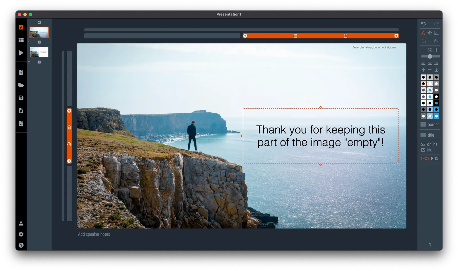
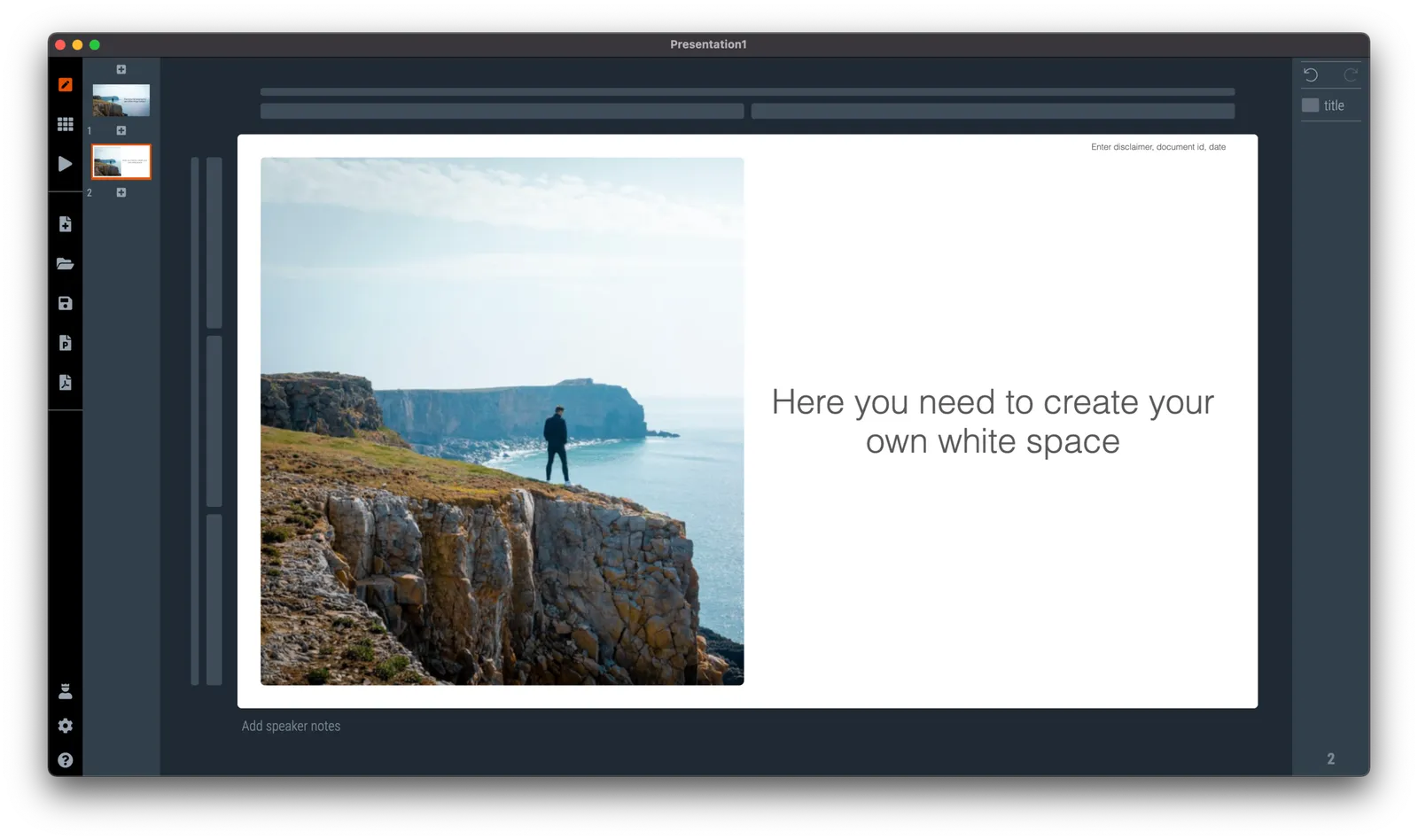
A “presentation template” is usually a PowerPoint file that new employees receive on their first they of work. There is more to a presentation template I think.

  1. Your corporate visual communication style/culture

    • Consulting firms: lots of complicated diagrams and frameworks, meant for solving a problem rather than presenting
    • Investment banks: dense text and tables with graphs, meant for reading rather than presenting
    • Consumer goods company: product packaging shots and bullets
    • University: list of bullets
    • Etc. etc.
  2. The actual software file that holds the basis layouts, logo, and colours (this is the one you get on the first day of your employment)

  3. Running versions of important presentation documents that get constantly updated and tweaked

    • Sales presentations, each for a different lead or a different customer segment
    • Quarterly results presentations with - well - different quarterly results
    • Strategic planning presentations, each one for a different product group
    • Etc. etc.

Most of the day-to-day presentation work in companies is in step 3, the tweaking of existing documents to update it for the latest sales meeting or board meeting. These presentations are in fact the “templates”, not the empty file.

In most presentation design software the tweaking of an existing slide is tricky and over time a slide degrades after many iterations where users insert the wrong fonts, colours, and trip up a decent slide layout that worked for 5 boxes, but not for 6. (“Template rot”).

The above is true for both existing corporate presentations and shiny new templates purchased online. The latter look amazing fresh off the press, but it shows when a non-designer tried to fit it to her needs.

Continue reading →
·Data visualization

Trying to understand vaccine effectiveness

Here in Israel we are ahead of most other countries in terms of vaccination and the prevalence of the delta variant. After almost zero cases, the count is starting to creep up again. There is a lot of confusing data going around and it is surprising to me that the scientific community does not have a generic approach to evaluate the effectiveness of vaccines.

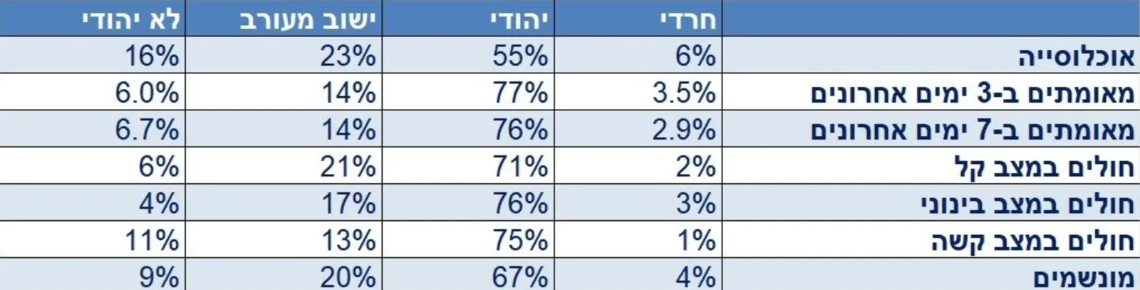
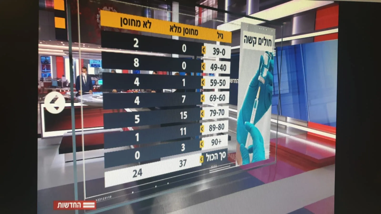
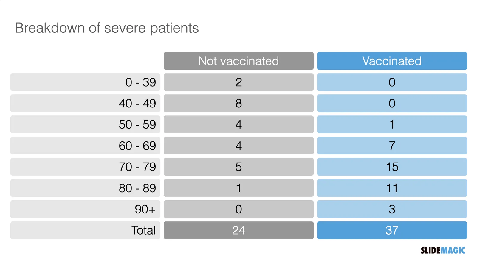
Last night the following table appeared on the TV news. Severe cases by age category and vaccination status. But these absolute numbers cannot be taken at face value.

  Source: https://twitter.com/arad_nir/status/1416832997597265933/photo/1

Source: https://twitter.com/arad_nir/status/1416832997597265933/photo/1

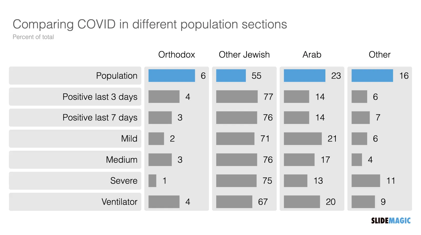
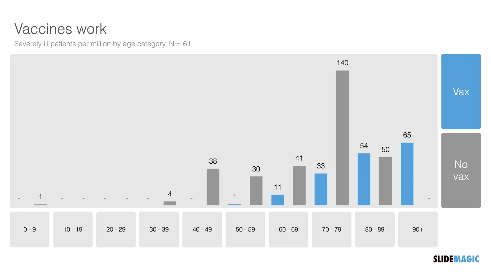
“Open source” statisticians went to work and made some adjustments. The population categories are not equally big (there are more young people than old people), and the vaccination rate is not the same (older people vaccinate more). So the correct approach is to look at severe cases / million, split by vaccinated and unvaccinated. I put the results in the graph below and added the chart to the SlideMagic library.

I put the results in the graph below and added the chart to the SlideMagic library. Search for “vaccine’ in the SlideMagic app and the designs will pop up, either for use in a COVID-related presentation, or maybe something completely different that requires a similar layout.

·Creativity

Lost in translation

Many presentations are good because there are many steps involved between the “source” and the “receiver”

  1. You have the story in your head as a complex set of ideas that are entangled and interdependent
  2. You start writing it down in short hand, which require you to “flatten” the multi dimensional story into a sequence.
  3. The sequence of bullet points now becomes a visualisation of your story. Instead of listening to a complex verbal argument, your eyes glance through the points and you can change the order at lightning speed. Cut, paste, slice, dice, until it looks good to you (without taking into account how it sounds).
  4. Many people stop here and jump to stage 6
  5. Now, chunks of this “visual” bullet point story get translated into visuals, another transformation: sentences, words, paragraphs get turned into visual compositions and graphs.
  6. The presentation to the audience is no longer your story, it is you translating the visuals back into sequential verbal text.
  7. The audience listens to the sound track of your slides and tries to reassemble the story that was in your head when you started the whole process.

Photo by Eirik Skarstein on Unsplash

·SlideMagic

Your presentation "secret weapon"

We are doing some SlideMagic user interviews and the term “secret weapon” came up. One user, somewhere in a big office tower, is a lone user of SlideMagic and uses the build-in PowerPoint conversion to share slides with colleagues. People start to notice the difference in the slide the person produces.

Here are some situations where you can use SlideMagic as a secret weapon, a starting point for setting up the beginning of your presentation. Most of these slides are very time consuming to set up in PowerPoint or Keynote:

  • A perfectly lined up, massive grid of logos (you finished the 10 x 4 grid, and now you need to move to 7 x 6 because you got 2 more logos)
  • Data tables with bar charts that need to line up (oops, 12 rows instead of 10)
  • 2x2, 3x3 matrices, other consulting style matrices
  • A diagram with boxes that are connected with arrows
  • A team chart where all the headshots need to have more or less the same size, with the “eye line” at the same height

Nobody needs to know / find out that you use SlideMagic, but we would not mind if you spread the secret…

Photo by Joshua J. Cotten on Unsplash

·Colors

Think of image colour

Image libraries (including the ones that are available in within SlideMagic) have become so huge that you can afford to be very picky when it comes to image searches. Next time, don’t just use a keyword, but also pay attention to colour. And not just your accent colour of your brand book, but also complementary colours. We will add this colour filtering to the feature pipeline of SlideMagic.

I am in the process of a total overhaul of the SlideMagic web site and using this principle myself, focusing on images that fit with SlideMagic blue, or its opposite, orange.

(Still great to see how SlideMagic’s automatic image cropping gets it right in most of the cases)

·Story

A bit less logic, a bit more story

Most project or research result reports go like this:

  • Objective: what were you trying to do?
  • Approach: how did you do it?
  • Results: what is the data you got?
  • Conclusion: what did you find?

This is almost a chronological recording of your work. Logical, organized, exhaustive. Your peer scientist, boss, teacher, will approve, you did the work thoroughly and got to some interesting findings.

It is not the most exciting structure though. Most novels or movies do not follow a chronological timeline. To make things more interesting, you need to take your audience through a story, which might mean breaking the logical flow a bit.

  • Conclusion: what did you find?
  • Objective: why was this so special, why was it never found before?
  • Results: what is the (tiny) subset of all your data that proves your point?
  • Approach: why was this so tricky to achieve, what hurdles did you overcome to get there?

The key to story writing in business is to pick off the questions your audience is likely to have next. The biggest one first (often surprisingly: “what are we talking about?”), which leads to the next big one (“Isn’t Google doing this already?”), which leads to the next one, (“That does not sound like a big deal to me?”), etc. etc… The sequence of questions are different for each situation, depending on your topic and your audience.

The results upfront approach works well in business: leaving your audience guessing will just distract them. When it comes to movies, you might want to leave the plot reveal to the very end…

Continue reading →
·Story

Making it personal

Audience or customer segments can be very abstract. Mid thirty women in socio economic class C… C-level executives with operational responsibility.

To make things more personal, you can replace the abstract definition by someone you know that fits the segment. A friend, a colleague. What if I had to present to her?

Photo by Mario Purisic on Unsplash

Changes to the commenting system

After more than a decade, I switched of the commenting system on the blog. In a world with Twitter, commenting volume was relatively low on the blog and often abused by spammers posting below posts from years ago. The Disqus commenting engine I used started off great, but has turned into a huge burden of tracking code over time after the company was sold by its initial owners. The SlideMagic blog now loads a lot faster and offers more privacy.

Photo by Margarida CSilva on Unsplash

·Templates

Explained: vaccine 90% effective, vaccinated still expected to be 50% of infected

There is a lot of confusion here in vaccinated Tel Aviv, now that around 50% of people infected with COVID appear to be full vaccinated. Newspapers are heavily quoting the “64% i.s.o 90% for the Delta variant” which does not seem to be based on the correct calculation of vaccine effectiveness.

I used an explanation by Dvir Aran to make a slide that explains how it is expected that 50% of infected people are fully vaccinated, even with a 90% vaccine effectiveness.

The logic is as follows:

  • Take 100 people who are seriously exposed to the virus

  • Assume a 90% vaccination rate (the case for the at-risk population in Israel at the moment):

    • A small group is exposed: 10 people
    • A big group is protected 90 people
  • Assume a 90% vaccine effectiveness:

    • 10 out of 10 unvaccinated people will get infected
    • 8 out of the 90 vaccinated people will get infected
  • Of the total of 18 infected people, 8 will be fully vaccinated, so around 50/50

Of those 18, the majority of cases with symptoms and serious complications will be unvaccinated of course.

I have added this slide to the SlideMagic library, search for “COVID” and it will pop up, or download it here. Pro subscribers can convert this chart to PowerPoint, if you have to. (Students, you can claim a free membership!).

·SlideMagic

SlideMagic student program

We are working on new pricing plans, one of which is a free plan for students. Ahead of any formal announcements and websites, blog readers can already take advantage of this options. Email support at slidemagic dot com from your school/university email address (after you created a regular free account), and we will switch you on the new program for one academic year.

Photo by Good Free Photos on Unsplash