SlideMagic Blog

Frequent updates about all things presentations since 2008. Subscribe to never miss a post.

RSS
·Delivery

Presentation Zen on YouTube

Garr Reynolds was the first presentation blogger in the world back in the mid 2000s. His book “Presentation Zen” is still the standard introduction into the world of presentation design. His blog has gone quiet over the past years, but recently Garr has been active on YouTube covering among other things how to improve your Zoom presentations. Garr might no longer be in your RSS reader, but it is worth adding him to your YouTube subscriptions.

·Concepts

Scaling of data charts in SlideMagic

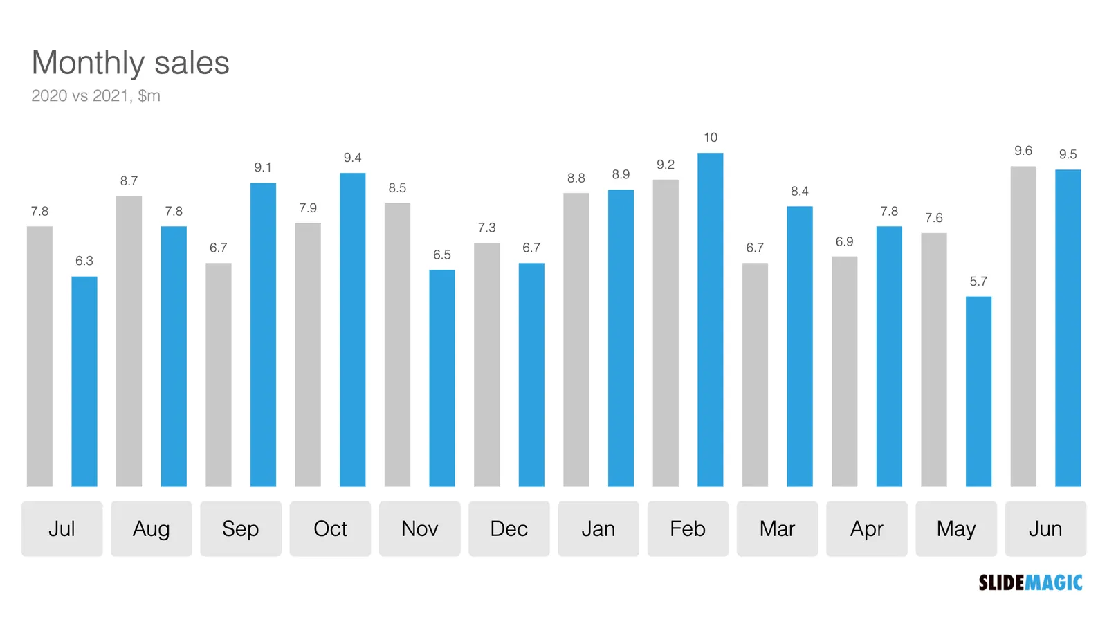
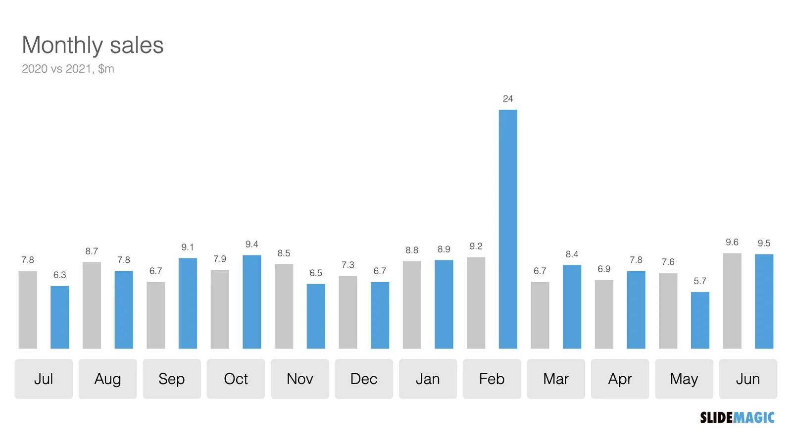
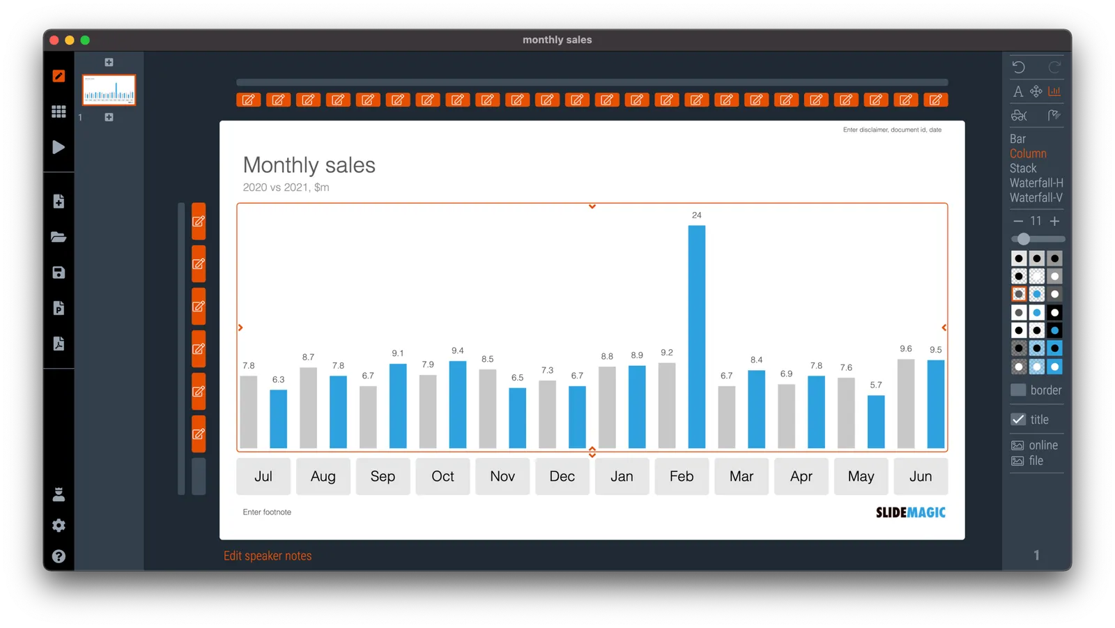
In SlideMagic, you do not have to worry about picking the right scale for your data chart. The entire chart adjusts itself to the numbers you type in. See the example below:

To make sure that a consistent scale is used for your entire chart, you need to place all your data points in one shape, instead of using multiple shapes for example for each month.

P.S. I have added this monthly sales comparison chart to the SlideMagic slide library so you can easily use it in your own presentations as well. Search in the app for ‘sales’ and it will pop up.

·Typography

How to punctuate bullet points

Dr Clare Lynch is “chief business writing expert” at Doris and Bertie Ltd and a University of Cambridge writing instructor, she has an excellent YouTube channel that deserves more viewers.

In a recent video, she explains the official rules for punctuating bullet points, full stops or not, capitals, etc.

She gives 3 options and a warning:
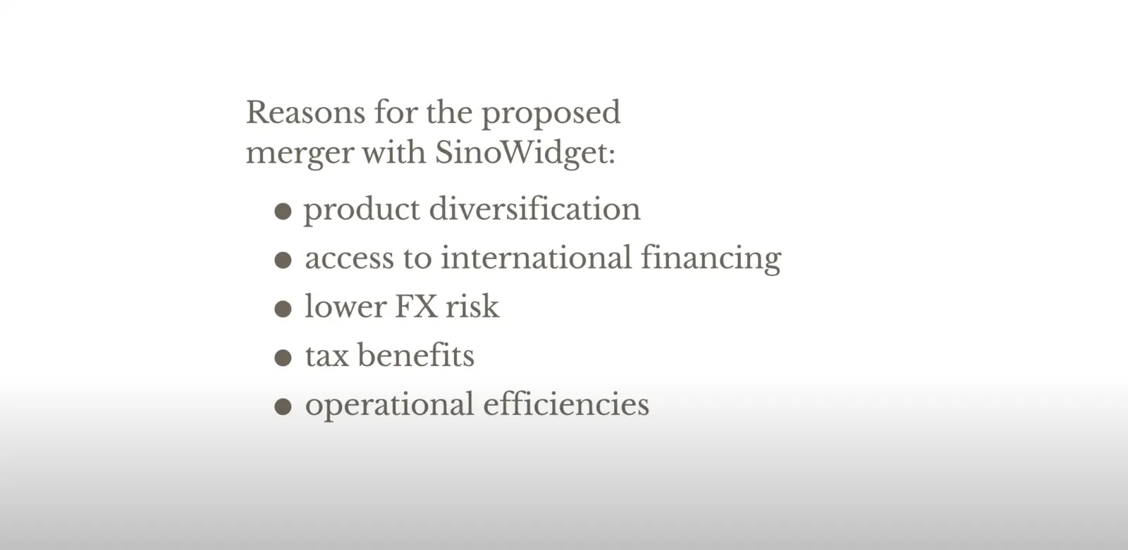
 Colon: no capitals, no full stops
Colon: no capitals, no full stops

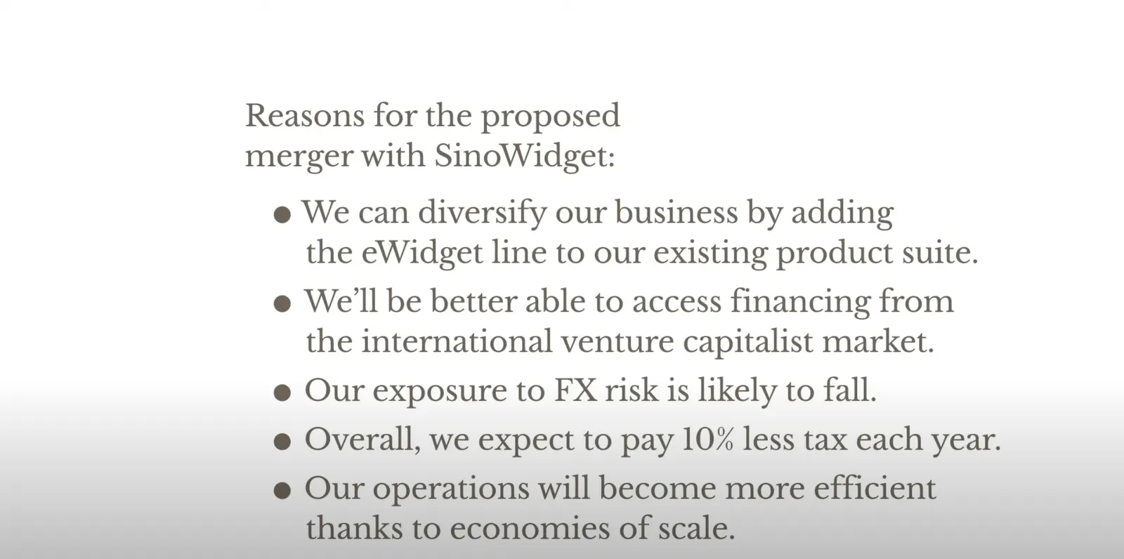
 The long hand version with capitals, and full stops
The long hand version with capitals, and full stops

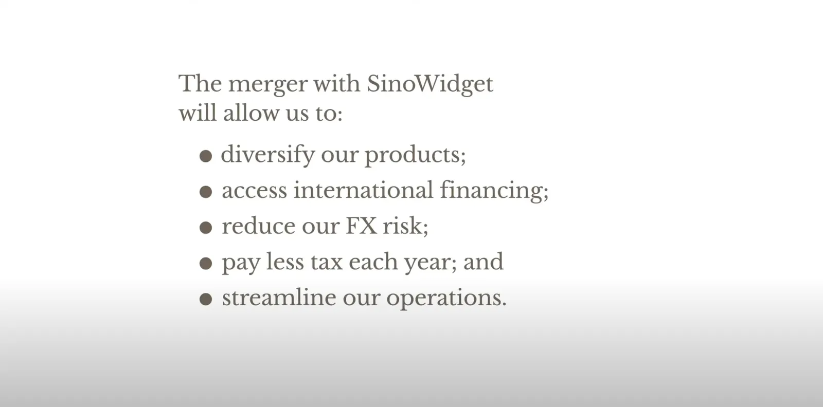
 For writing: semi colons

For writing: semi colons

 Don’t mix sentence styles

Don’t mix sentence styles

Back at McKinsey in the 1990s, we were taught to write paragraphs in bullet point form but starting with what we called a “clunk”, with a heavy paragraph sign as the bullet point anchor (a pilcrow), and leave the full stop out after the last sentence (but use them for other sentences in the bullet point paragraph).

In presentations? First rule avoid bullet points if you can. If you to include some sort of list to make your point on a slide:

  • I try to keep the text super short (even shorter than Clare in the above examples)
  • Try using some repetition: Higher sales, higher market share, lower costs (“business poetry”)
  • And pay close attention to the length of the text I am writing, I want all text boxes to be roughly the same in terms of length. Yes, I admit that I sometimes “stuff” a super short bullet point with a non-essential word to make it look prettier…

·Creativity

Songs written in less than 20 minutes...

A clickbait link popped up on my phone with songs that were written in less than 20 minutes (I am linking to another post with the same subject).

Yes, these songs might have been written in 20 minutes, but I am sure that those 20 minutes are the result of years of practice, trying, and noodling by these musicians. All that effort that was built over a long time just fell in the right place.

I think this is true for every creative process, including presentation design and storytelling. In Hemmingway style: ‘gradually, then suddenly”, Seth Godin talks about it in “The Dip”, a tank filling up drop by drop until it finally bursts with great force.

·SlideMagic

Server move

I will be getting back to writing blog posts as we are slowly moving towards autumn.

Over the past weeks, I have been preparing a switch of cloud infrastructure provider for SlideMagic to Amazon AWS. The second (stealth) project I am working on requires a very high level of security that could not be delivered by the existing platform. It is amazing what infrastructures you can put together in 2021 at the click of a button.

I have just switched the SlideMagic backend over to the new servers (sweaty palms…) and everything seems to be working OK. I know that there many pioneer users among the readers of this blog, if you spot anything unusual happening, please reach out to me at jan at slidemagic dot com.

·Concepts

Shuffling

Another slide makeover. I will post the ‘after’ before the ‘before’, since the email delivery service sometimes does not render all the images I put in my blog posts…

And here is the original, created by The Information

What did I change?

  • I shuffled rows and columns to get the biggest possible continuous space of similar blocks, this is visually more pleasing, and groups/ranks players in a better way. (Hmm, should have swapped Instagram and TikTok now that I look at it).
  • I changed the colors, the traffic light analogy does not really work here. The “yes” and “testing” should be very similar in color, while the “no” should be a clear gap.
  • I added a more punchy headline
  • I calmed the whole chart down by simplifying the legend and taking out the logos.

I have added the slide to our template bank. Users of SlideMagic (try it, there is a free version), can access the slide by searching for “social” in the template bank.

·Data visualization

Leaving the math to your audience

It is raining COVID statistics in Israel as we are the first country in the world to deal with a post-vaccination outbreak. Below is one table that was released by the Ministry of Health (I found it here).

I have translated it in a quick SlideMagic chart (it always puts a big smile on my face to see how quickly this can be done).

But this data is horrendous to understand. Percent of what? What is 100%? The audience is left to do the math themselves. Compare the categories to the breakdown of the population, look at differences between 3 and 7 days ago, look at the ratio between mild to severe, etc. etc.

Using bars instead of numbers (another smile) makes things a bit clearer.

But in this case, it would have been clearer to release the data in absolute numbers and let people construct their own charts.

I have added the charts above to the SlideMagic library, search for COVID in the app and the slides will show up (see the search here).

Summer break.

As usual, I am dropping the frequency of blog post for a few weeks in summer, I hope you all have a relaxing holiday.

·Images

"Empty" images

When looking for images for your presentation (SlideMagic has a great built-in image search engine), consider searching for images that are relatively “empty”, i.e., images with a lot of white space. This allows you to set them as the background for your entire slide. See the example below.

Pick your keywords to find these type of layouts: empty, background, wallpaper, sky, cliff, horizon, etc. etc.

Photo by Zoltan Fekeshazy on Unsplash

·Data visualization

Cheating with statistics

The chart below (source) is a good example of “axis”. The drop in life expectancy looks huge, but upon closer inspection, we see the the vertical axis starts only at 72.

There is another problem with the chart: “the sharpest since World War II” is not supported by the data.

One way to bring out the significance of the message, and support the WWII point is to show the annual change (not the absolute number) in life expectancy since 1940.