SlideMagic Blog

Frequent updates about all things presentations since 2008. Subscribe to never miss a post.

RSS
·Data visualization

Information hierarchy

I just returned from a short trip to Paris to show my son around some of the famous sites and restaurants. In 2021, that means a lot of health checks and tests. I was probably the only one in the airline terminal that looked at all the forms with the eye of a typographer.

I am not talking about elegance here, pure functionality. The people at check in desks are looking for “positive” or “negative”, the date the test was given, and whether the passport numbers match. On the test result form, the thing that is printed biggest is the name of the testing laboratory…

All this can be fixed easily with an adjustment of font sizes.

What you really want to say

Very often, after you created that data chart that you thought drives the point home, you change the headline with an even more powerful statement. In those cases, consider changing the entire data chart…

The above can also be show this way:

·Story

Demo versus manual

Giving a demo of your application or web site to an investor or potential partner is different from teaching a new user how to use it by herself.

For the user:

  • Where do all the buttons sit
  • How to log in
  • How to update settings
  • Where to find your account details
  • How to create a project from scratch
  • Etc.

For the investor / partner:

  • What does the app do?
  • Show me a walk through of a “story” or use case
  • Have a project ready to show
  • Look, there is actually a piece of software that is working…
  • Etc.

In presentations, you are most likely to deal with scenario 2. Do all the prep work (logging in etc.), and design a very clear script of what you want to show, cutting out any tangents and other delays. Keep it short and focused. Rehearse your walk through, and as a backup, have a series of consecutive screenshots ready just in case Murphy’s law kicks in.

·Data visualization

Rounding numbers in data charts

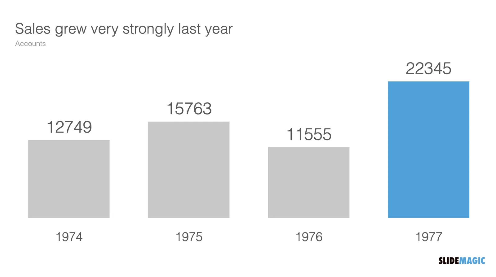
How to round numbers in a data chart? It depends. The chart below does not look very appealing

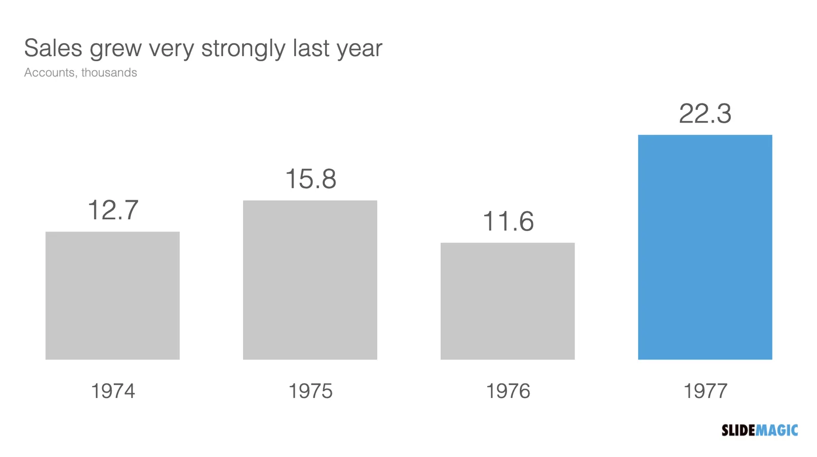
The numbers are hard to read. This chart can serve 2 purposes. Either show the trend in sales, or show the exact sales figures. To show a trend in sales, simply show the accounts in thousands, and round up to one decimal point:

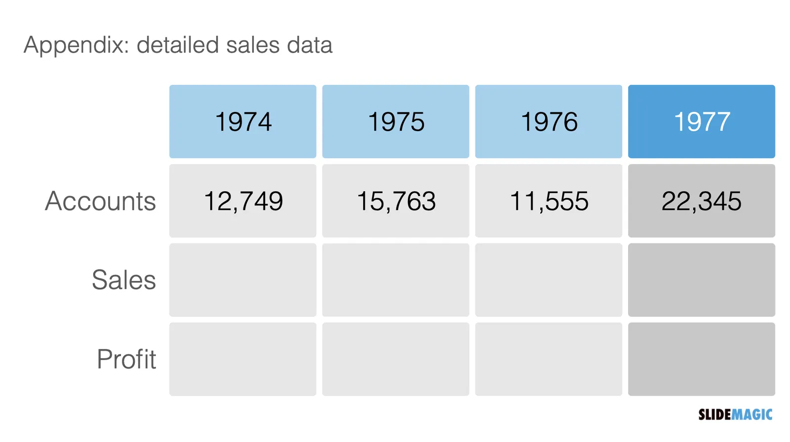
If you need to provide the actual precise sales data (for accounting or tax purposes), put it in an appendix slide that does not even pretend to show a trend:

·Story

Overstoryfying

Some article titles are click bait, others seem genuinely interesting and I am curious to find out the answer to the question posed. The disappointment is big when the journalist embarks on a very long story where characters are introduced and developed, background stories presented until the punch line comes somewhere halfway the 10 minute article.

A good product or company pitch does not have to be long.

·Story

Streaming a presentation

Music streaming services such as Spotify change the way musicians make music. With an unlimited amount of songs to listen to, users can now skip through tracks quickly. The result: musicians put the ‘hook’ or chorus of the song really early in the track to convince new listeners to stick around just a few seconds longer. During a live performance of the same song, the build up could be different.

The same applies to your slide decks that you send for someone to read without you being there to explain. The investor or customer is ‘streaming your slides’. Think about how to put that ‘hook’ in your story to keep the viewer interested.

Hooks don’t have to be blunt. A massive drum solo as your song opening might get people to hit the skip button. “We will have $3bn sales in 18 months” sounds impressive but might not be credible. An unusual chord change, or a counterintuitive perspective on the market could do the trick.

·Layout

Visual math

Following my post from last week about pi, here is a link to a page full of beautiful visualisations of mathematical concepts. Often, a written formula is not the right way to explain math and proportions….

Plugged in

This blog post by Fred Wilson resonated with me.

Surrounding yourself with smart people is not enough to make (investment) decisions. Now that I am knee deep into coding applications myself, I finally start to understand technologies that I have been pitching in dozens of slide decks over the past decades.

I think it goes a bit further than Fred’s blog post. Really smart people (not saying I am) with MBAs (I have one), that work at prestigious companies such as McKinsey (I worked there) are extremely good at telling you why something will not work, and 99% of the time their arguments make perfect sense. It is very hard for these people though to commit to believing in something that will work. Advisors are not entrepreneurs.

·Delivery

Winging it

“Winging” a presentation, making it up on the spot, is extremely hard, and I would say, impossible. All people that seem to get up on stage and deliver a perfect pitch without any effort have in fact been rehearsing this over and over and over. (The previous instances where they pulled off the same trick). You need to practice really hard to be spontaneous.

When you look at a piece of paper with the scribbles of your thoughts, it seems like you have it all in your head. Everything is there. But standing in front of an audience is different. Your eyes are moving quickly across the piece of paper, going back and forth if relationships are not clear. With speaking, there is no rewind option. You need to build that “visual” in people’s minds step by step.

Many things can go wrong here:

  • You forgot the exact sequence of your points and you realize it too late, now you are stuck without a way to go back
  • You get distracted and are not sure where to pick things up, as you try to get your thoughts together, you repeat a few things you already said
  • You delivered that powerful punch line too early and now your speech ends with a mumbling “well, that’s it, thank you”

Don’t wing your pitch.

·Design

The right proportions in design

Certain layouts and compositions look right, others seem wrong. We can see it, but we can’t point our finger to exactly why.

This formula for the constant pi got my attention:

It is the so called Wallis product, a beautifully simple representation of a number that seems very random, the first 50 digits of pi are 3.14159265358979323846264338327950288419716939937510……

Pi governs the shapes of rounded shapes, , waves and much more. The elegance of a circle is simple. But it is governed by a complex set of harmonics and ratios that all relate to each other. Beautiful designs have them, beautiful music has them. In most cases, we only appreciate the end result without grasping the underlying logic.