SlideMagic Blog

Frequent updates about all things presentations since 2008. Subscribe to never miss a post.

RSS
·Creativity

Writing the whole thing again in 30 minutes

Writing a good presentation is a process that takes time. There is the time to complete the analysis and make the graphs and tables, but also time to ponder the story and the flow.

If you somehow end up rewriting your whole deck in 30 minutes the day before the presentation, and leaving out many of the data charts that took you days to make, then it does not mean that you made mistakes, got it wrong, or wasted your time. You actually had to go through the whole loop in order to pull off that 30 minute rewrite.

WeCrashed

I have been watching a few episodes of “WeCrashed”, the Apple TV+ series based on what happened to WeWork. Lots of investor pitching here, as Adam is raising money to keep his business going.

People often use this high profile entrepreneur case studies as inspiration for writing investor decks. But these were very specific types of deals. A specific entrepreneur, a specific funding and expansion strategy, a specific stage the company was in, and and very specific type of investor bet: putting in huge sums of money and hope to get your return out before the bubble pops.

Your might be a different type of entrepreneur, with a different growth strategy, in a different phase, and pitching to a different profile of investor

P.S. I wrote a few posts about WeWork on this blog before.

·Software

AI in presentation design

AI is making an entry in office applications. See this article with a funding announcement for a company. The idea is to analyse human computer input (text, clicks) and try to automate routine tasks (think booking a flight, making a quarterly financial report).

What about presentation design?

Artificial Intelligence is a very generic buzz word, and we need to be highly specific when talking about its application in any area. What the technology does is analyse vast amounts of inputs and outputs and then reverse engineer their relations without “understanding” anything of the underlying thought process that a human would go through.

I can see one type of presentation design that could be subject to automation, the 1-on-1 slide makeover. There are many designers, design agencies out there that take your slides, do not edit their content at all, but simply make them look prettier:

  • Align and distribute layouts
  • Fix inconsistent fonts and colors
  • Change font sizes
  • Etc. etc.

Feeding thousands of before and afters will ultimately lead to a computer system that could do this automatically.

They key to slide design is though to have the courage to start editing in the content. Rephrase text. Break up slides into multiple layouts. Remove table columns. Round up numbers. Change the type of graph. Etc. etc. And that is at slide level, in most cases deeper surgery is required: a reflow of the whole story line.


·Data visualization

Bar chart formatting

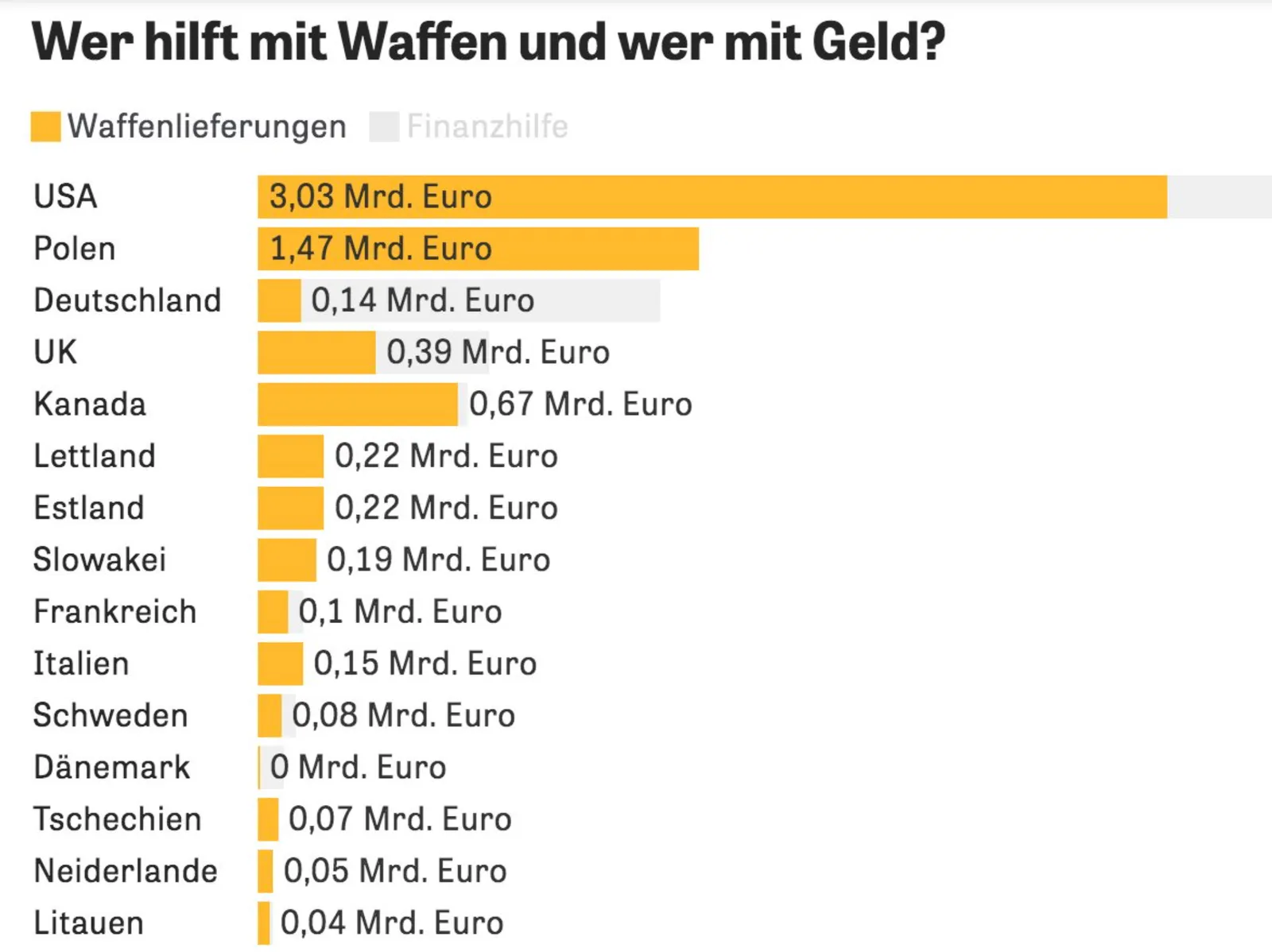
This chart can be improved in many ways (source), you can see it without understanding German…

  • No need to repeat “Mrd. Euro” (billions of Euros) at every data point, just put the unit at the top
  • The data labels of the second data series is missing, as is the total
  • The color of the 2nd data series is too light (probably to make the text readable)
  • I would right-align the row labels
·SlideMagic

Free student plan for SlideMagic

SlideMagic will be offered for free to students. I am working to set up a partnership with a student validation service to create a streamlined automated signup process. In the meantime readers of the blog can already apply for a free SlideMagic membership:

  • Create a regular free SlideMagic account with your school/university email address
  • Verify that email
  • Visit this link to apply for a free subscription

This process is still partly manual, so response will not be instant. Student memberships will run until Aug 31, after which you need to apply for a new one.

·Layout

McKinsey chart make-over

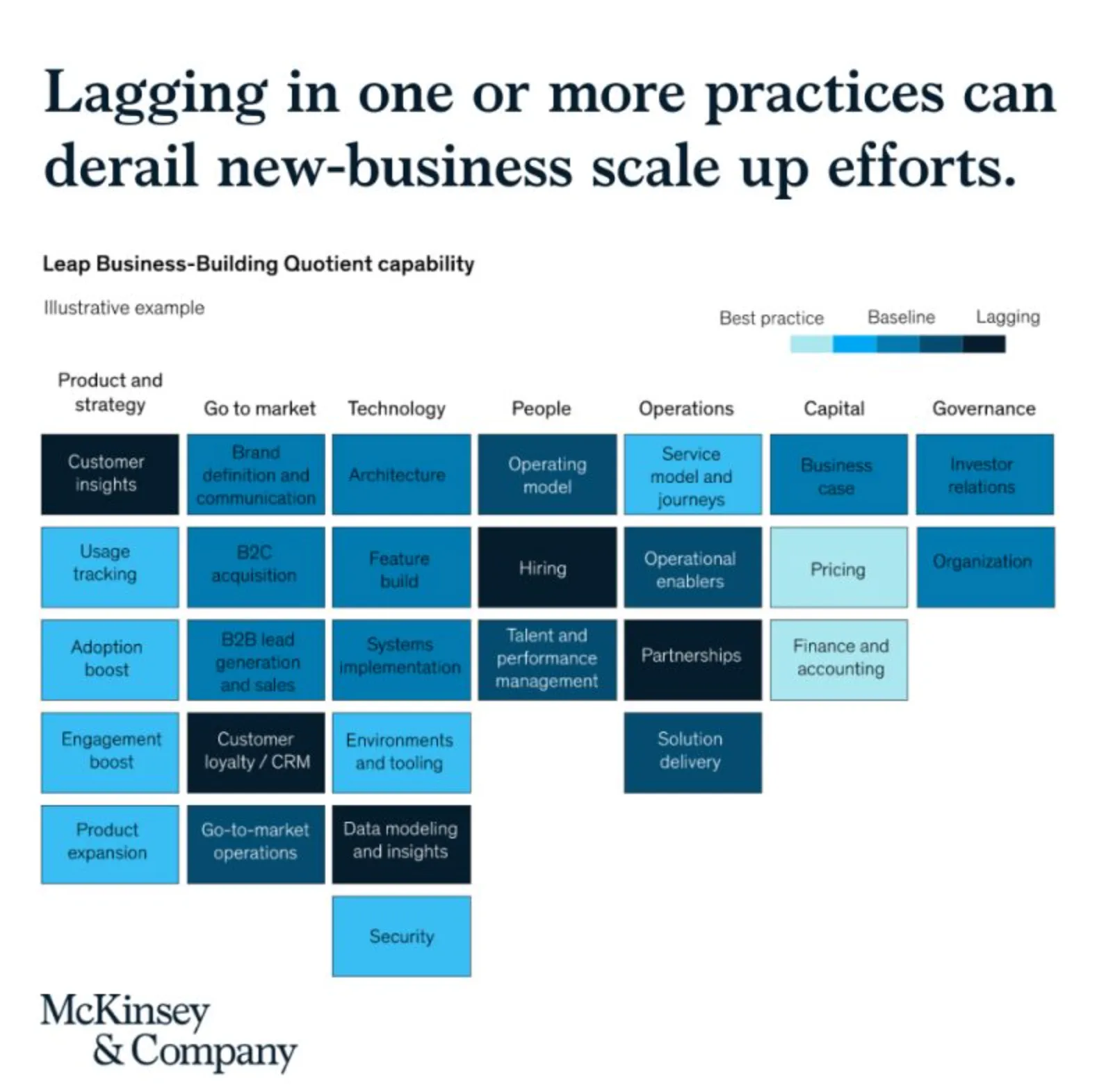
See the following McKinsey framework (background here):

The slide does not look bad, but there are a few things that I would change:

  • Flipping the columns and rows of the table, there are more columns than rows, I tend to put the axis with the most data in rows
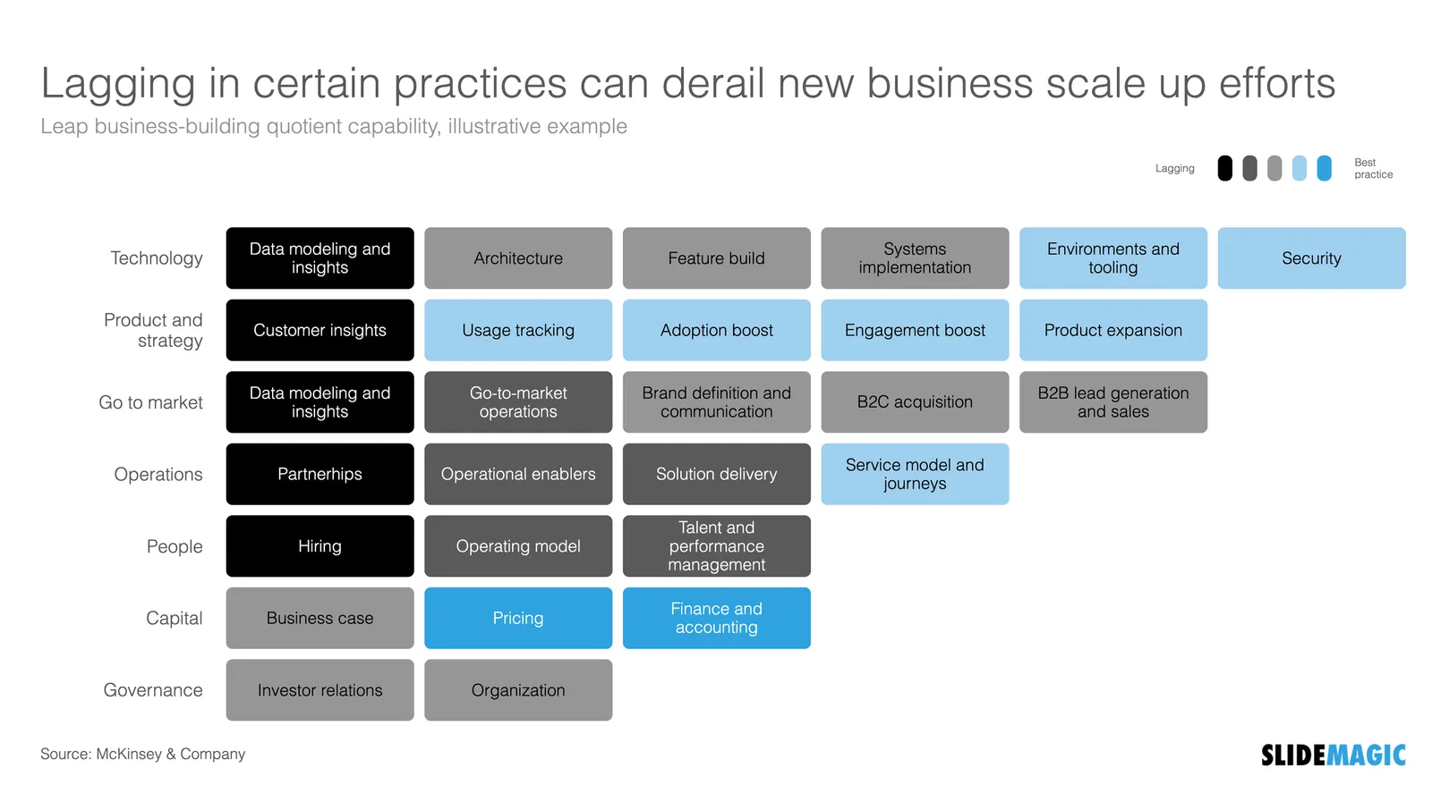
  • Sorting the categories by number of boxes, to get a more visually pleasing line (McKinsey probably sorted the columns by importance)
  • Sorting the boxes within a category by color (and not by importance)
  • Fixing the color coding, the dark colour is actually the worst score.

Below is a quick makeover in SlideMagic, you can find this chart in the SlideMagic slide library for you to use.

·Images

Landscape photos

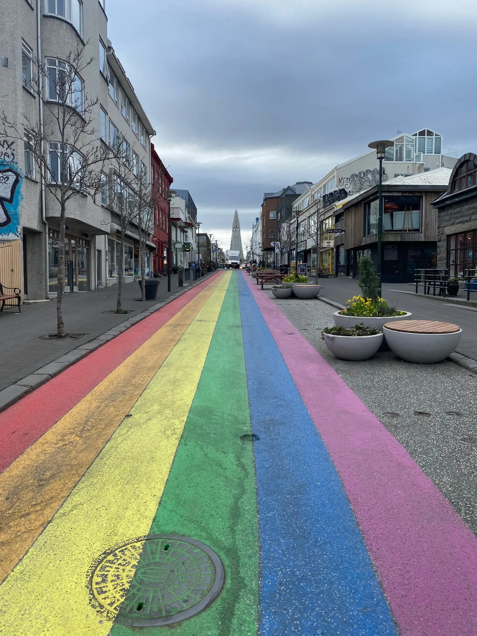
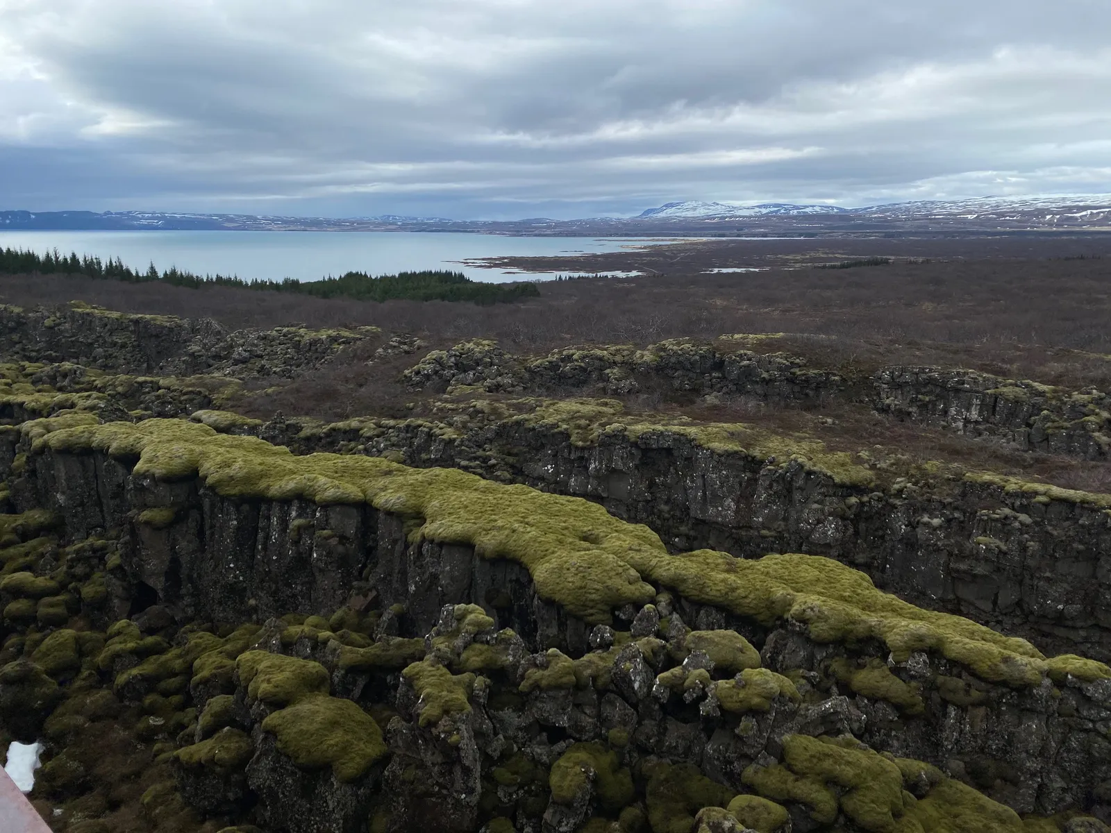
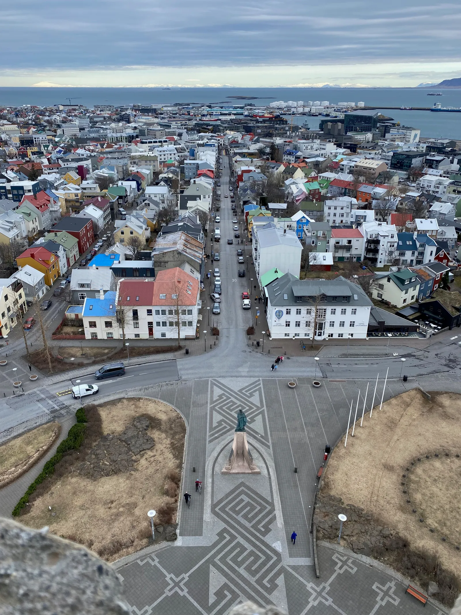
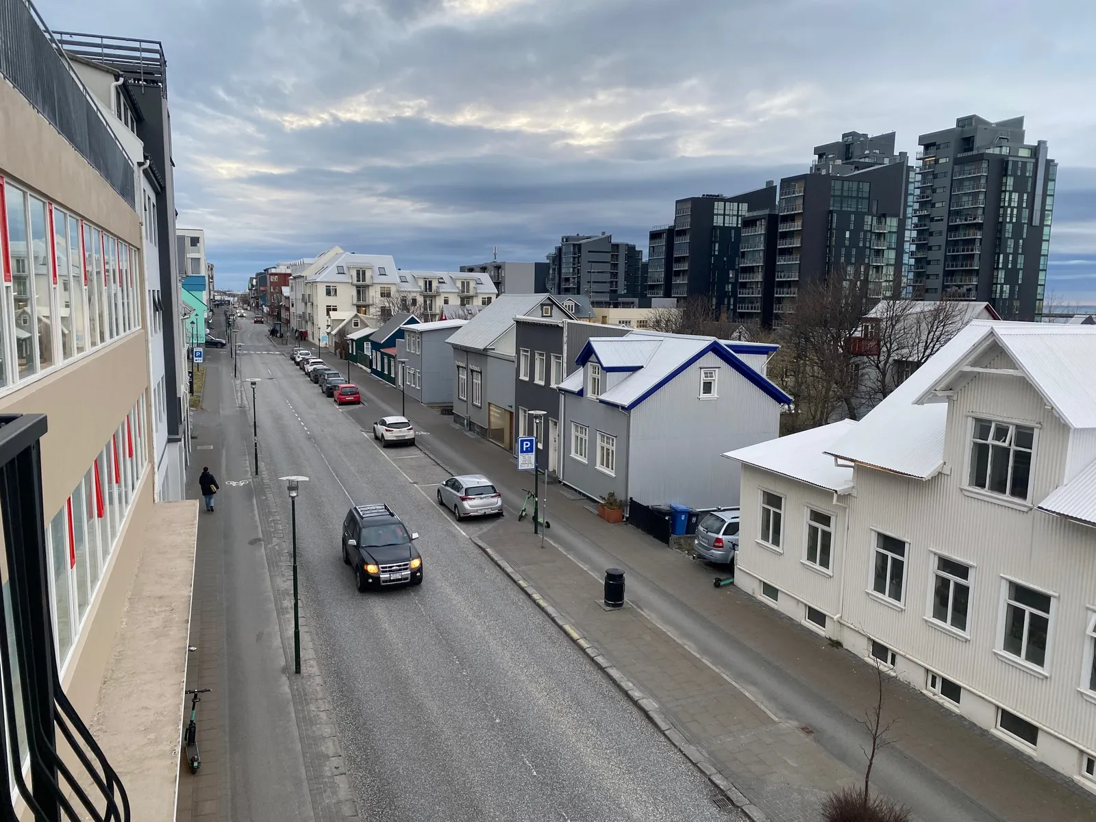
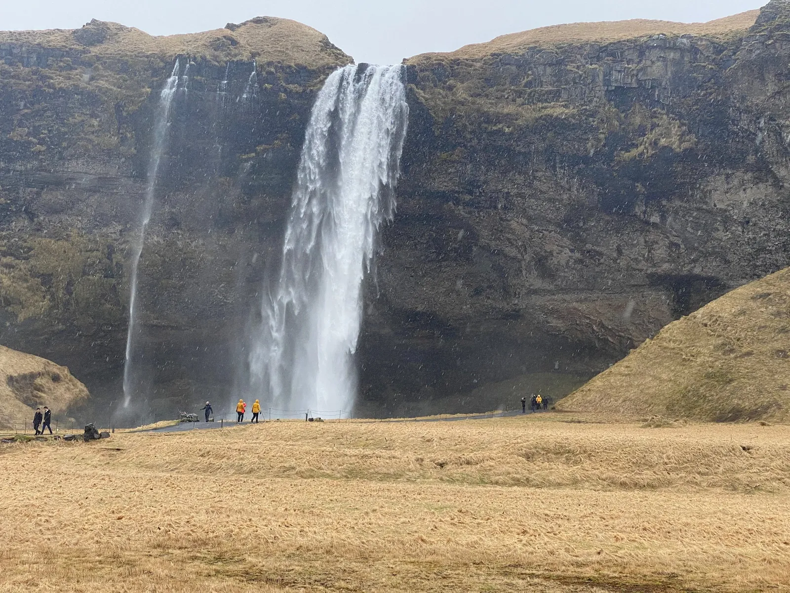
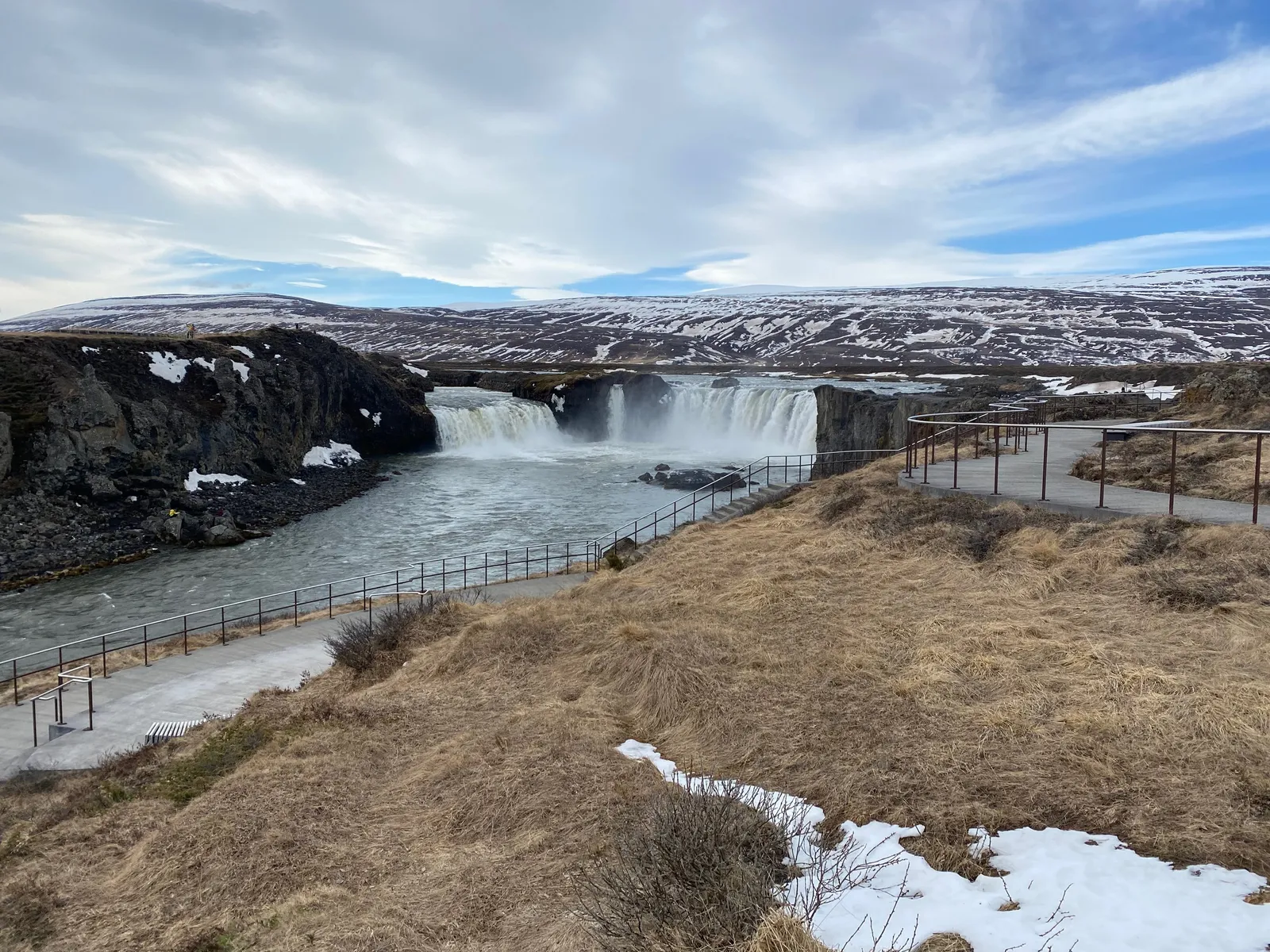
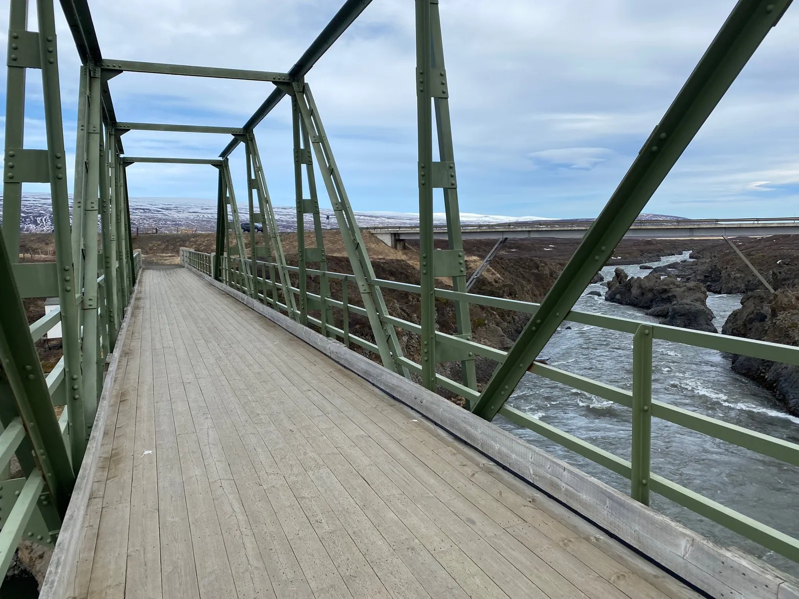
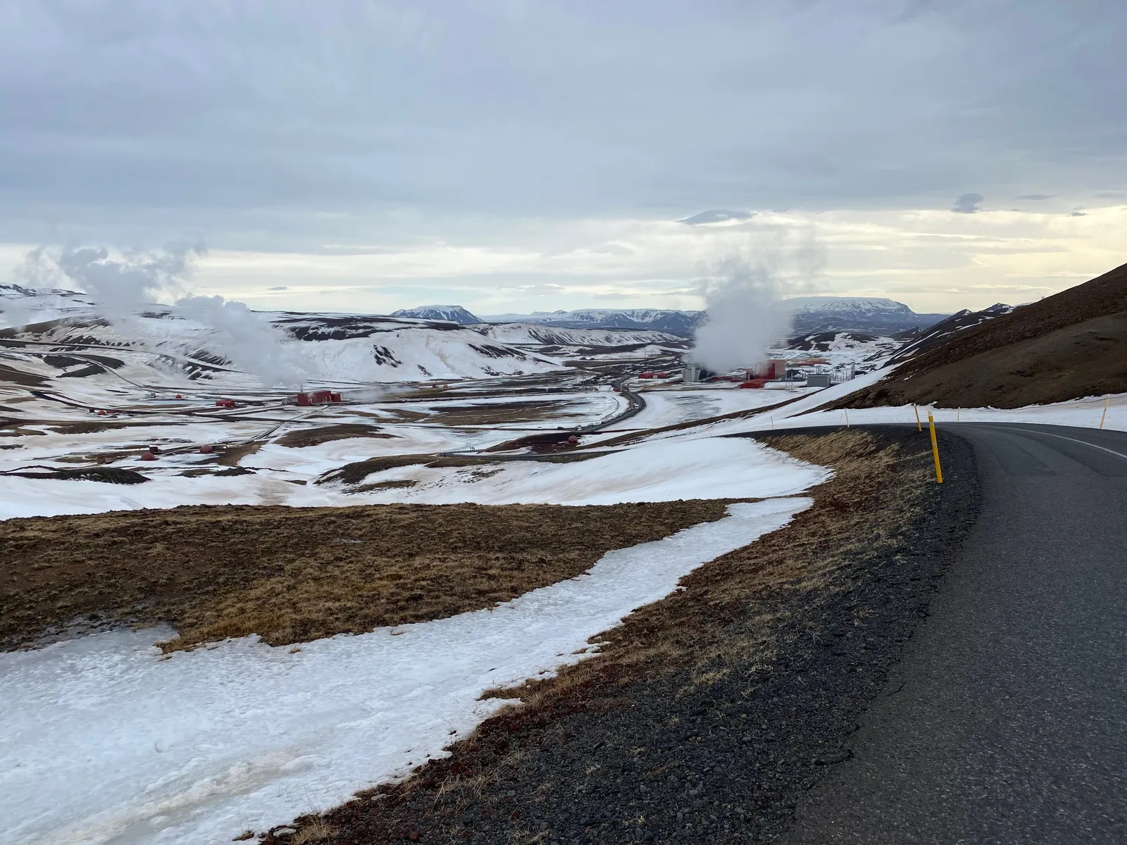
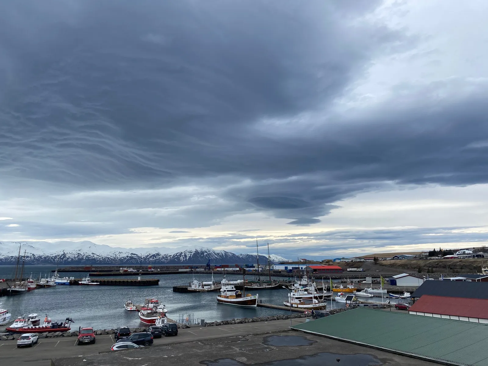
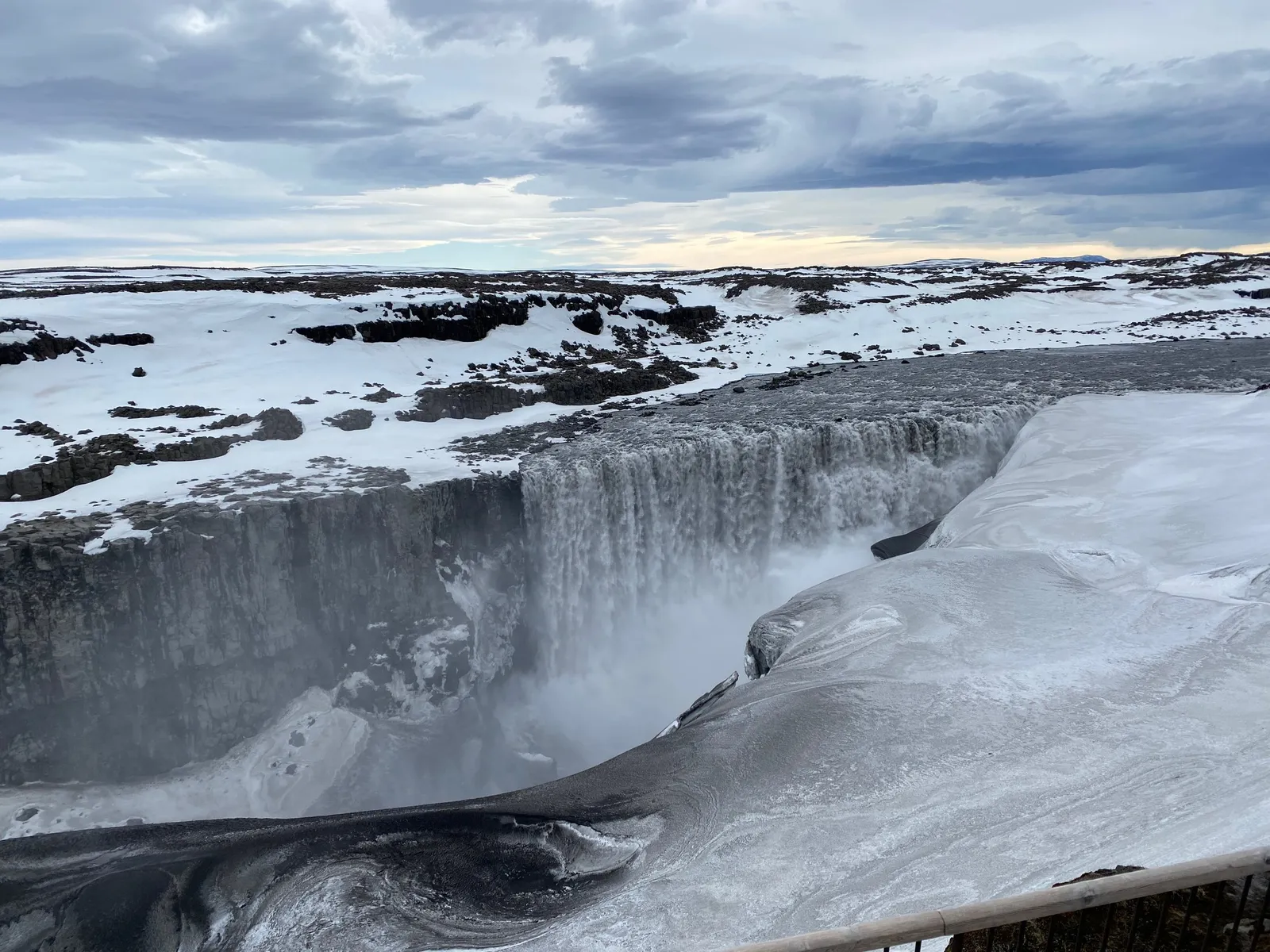
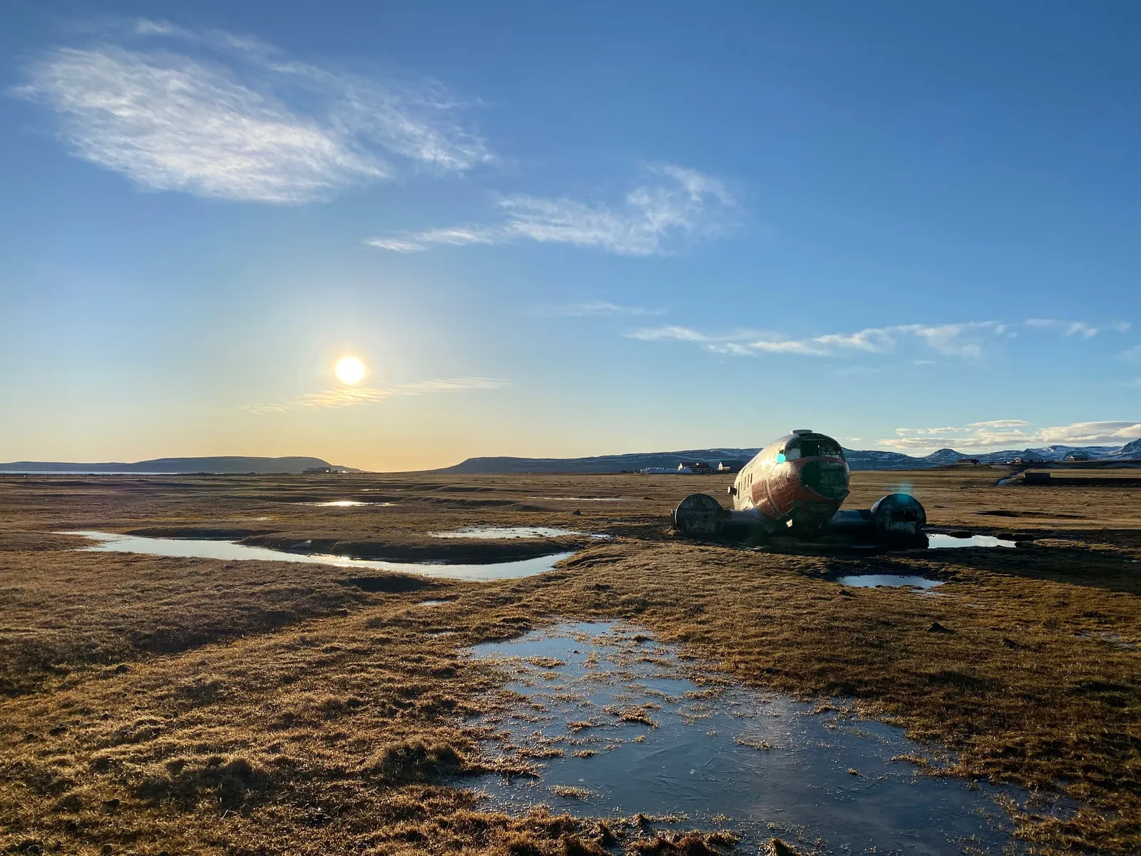
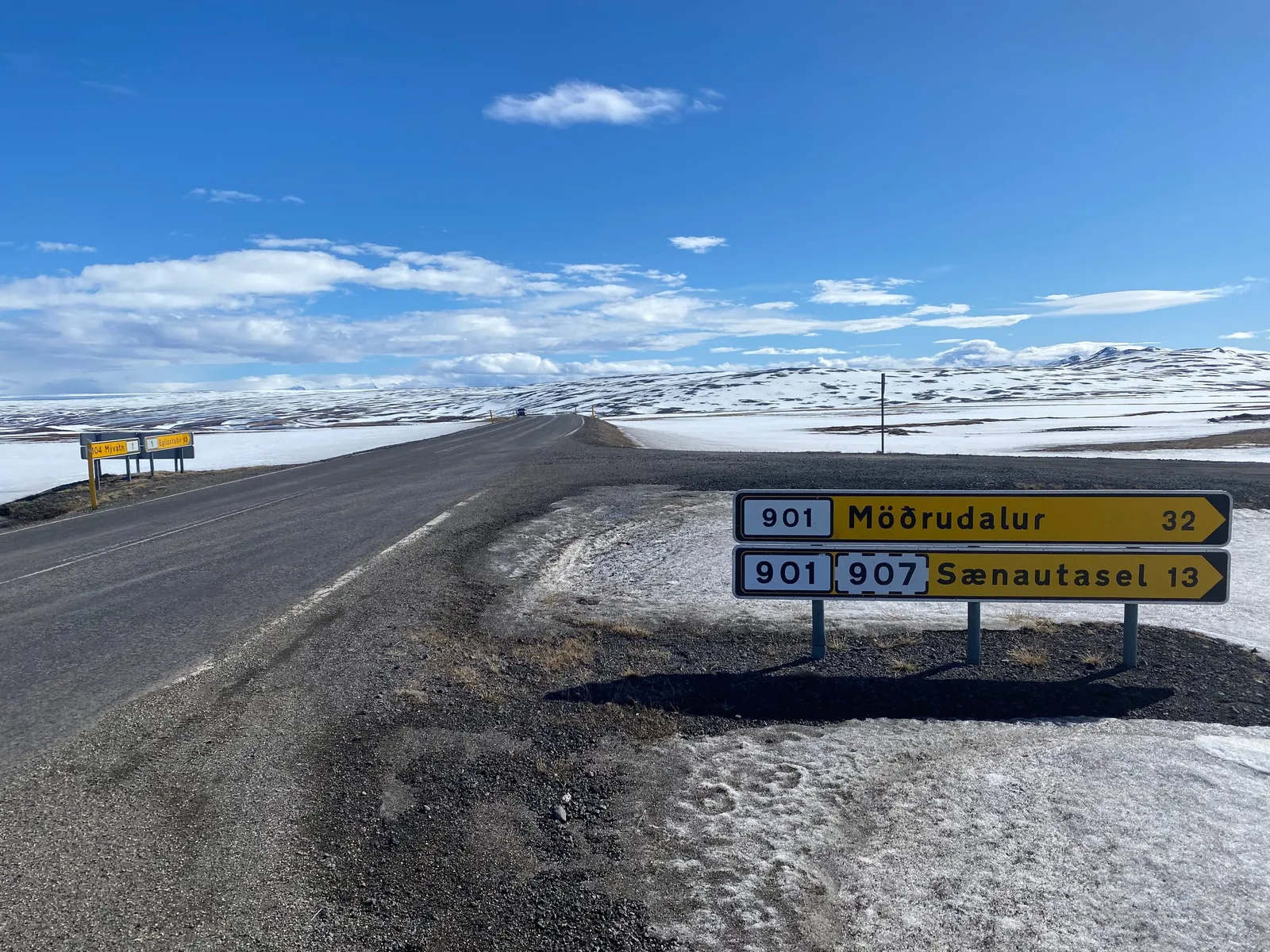
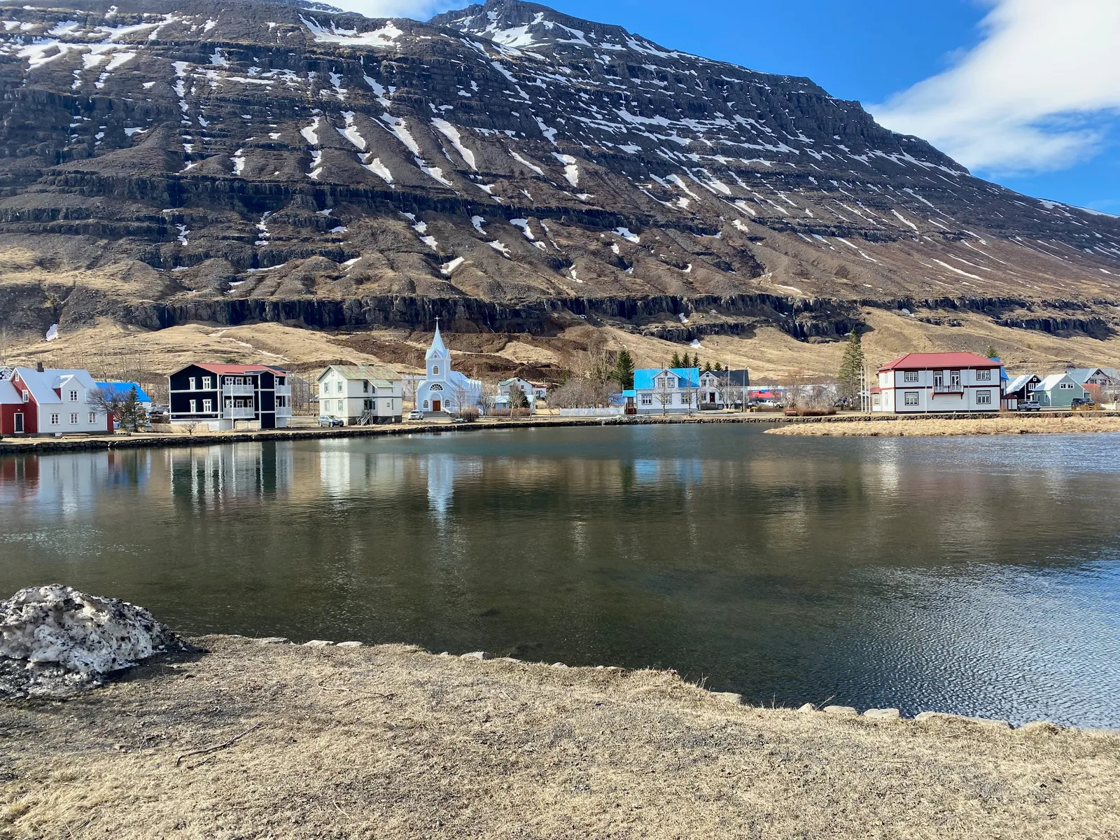
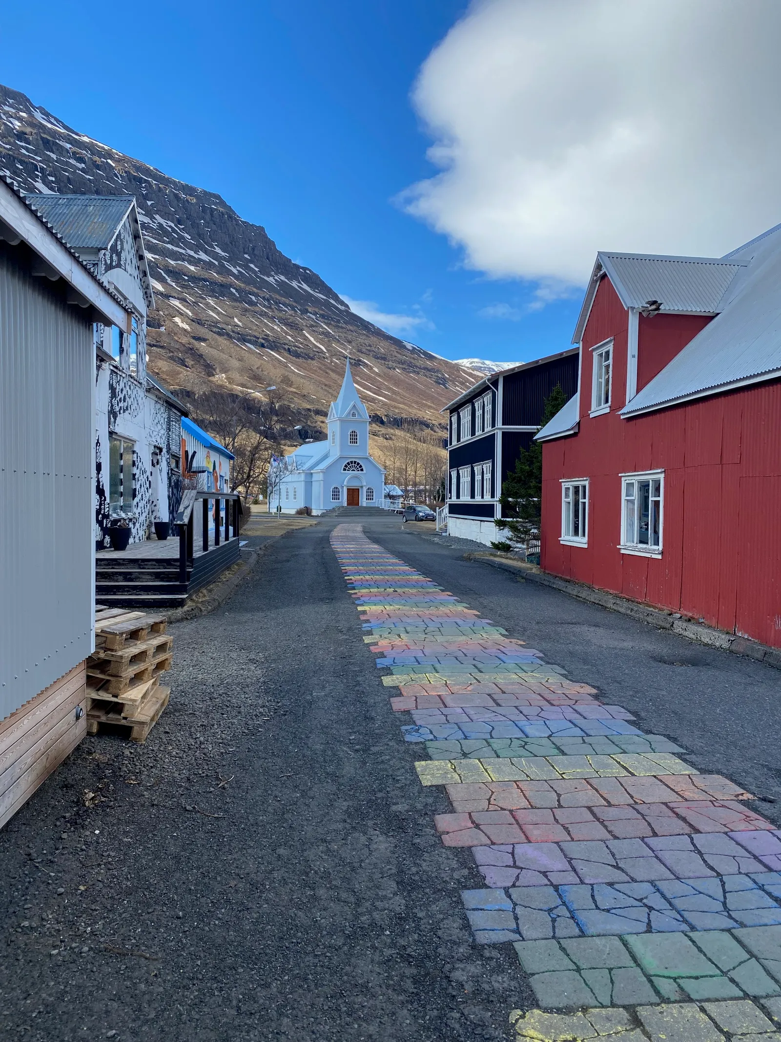
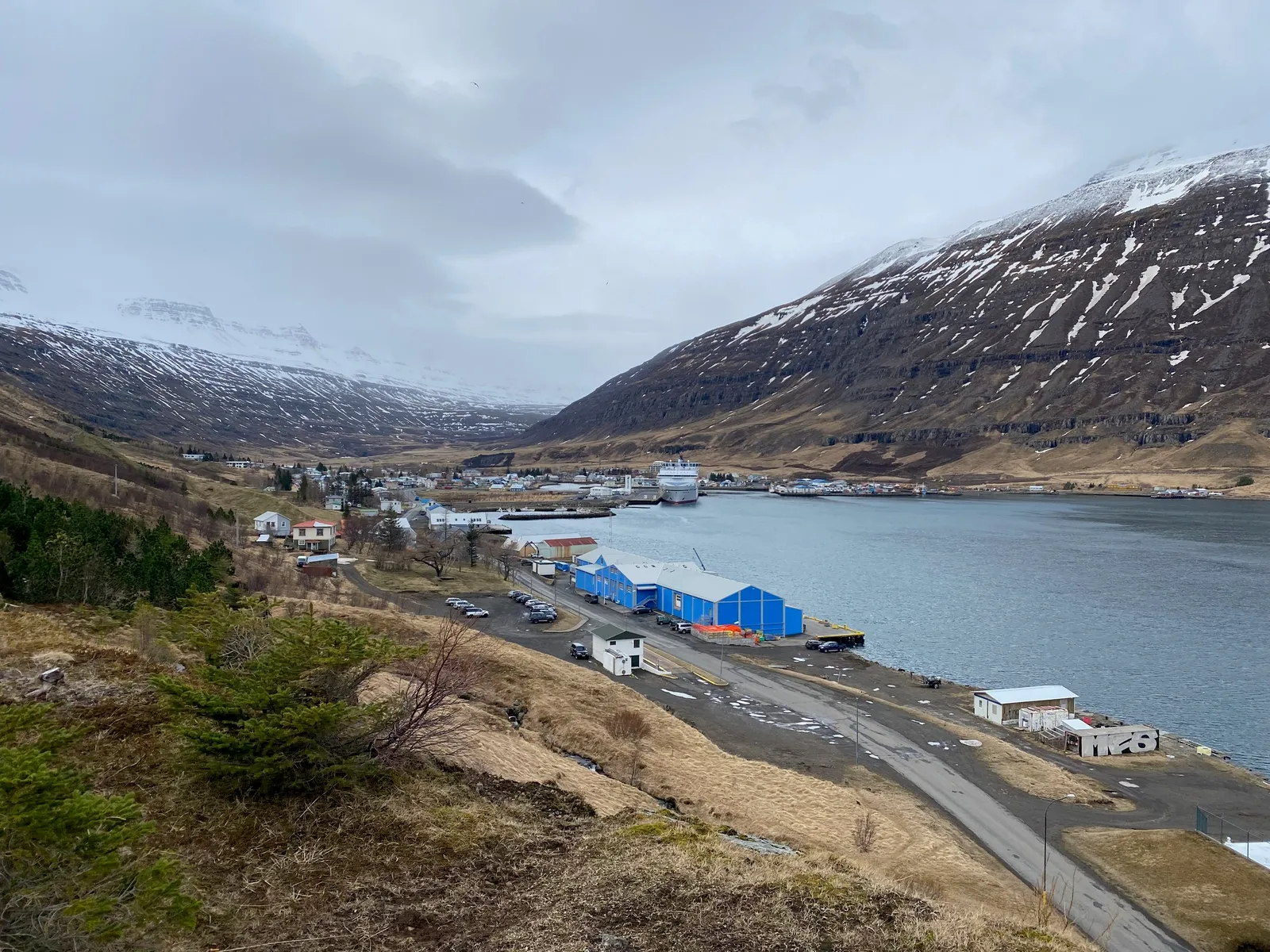
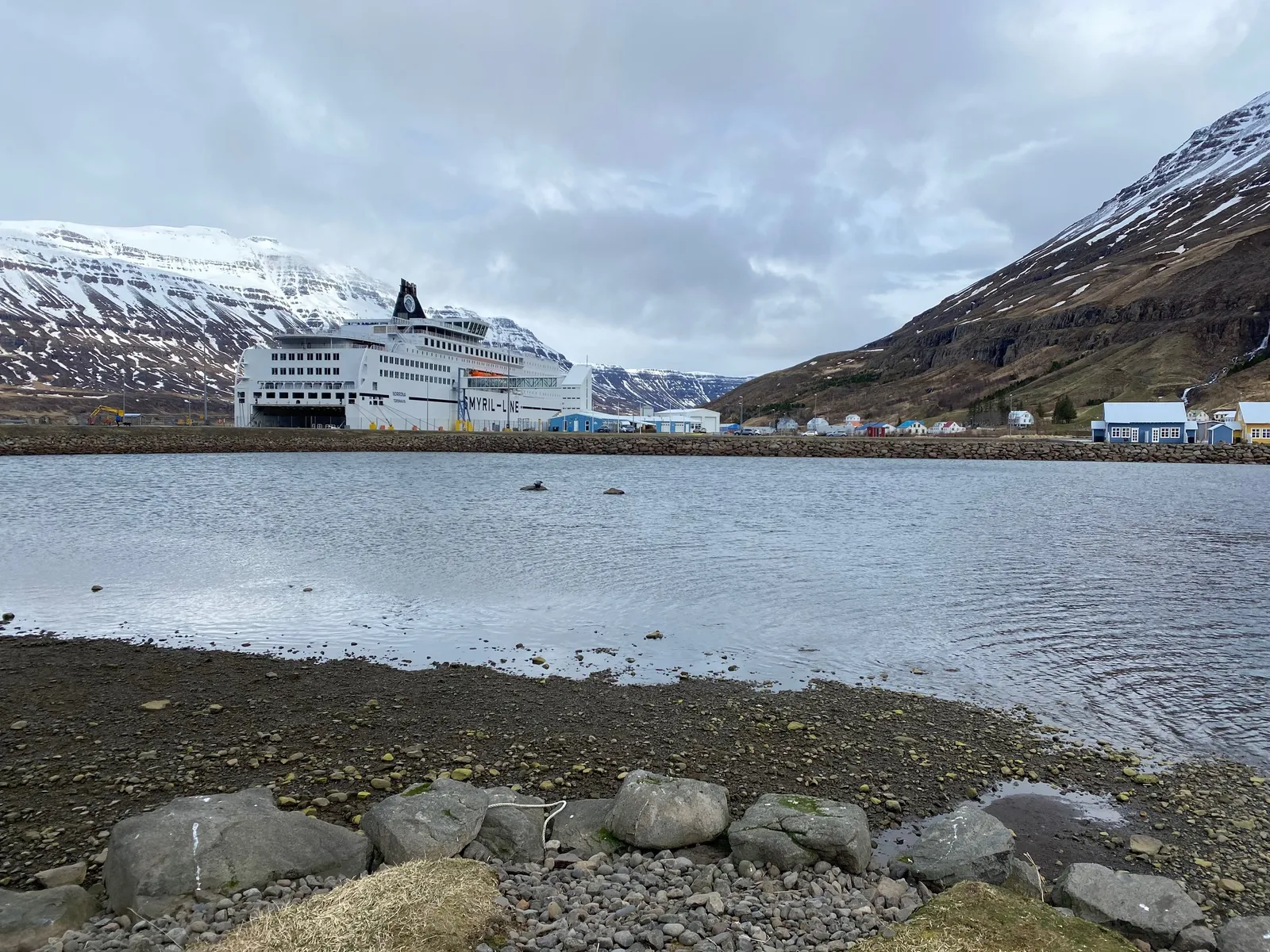
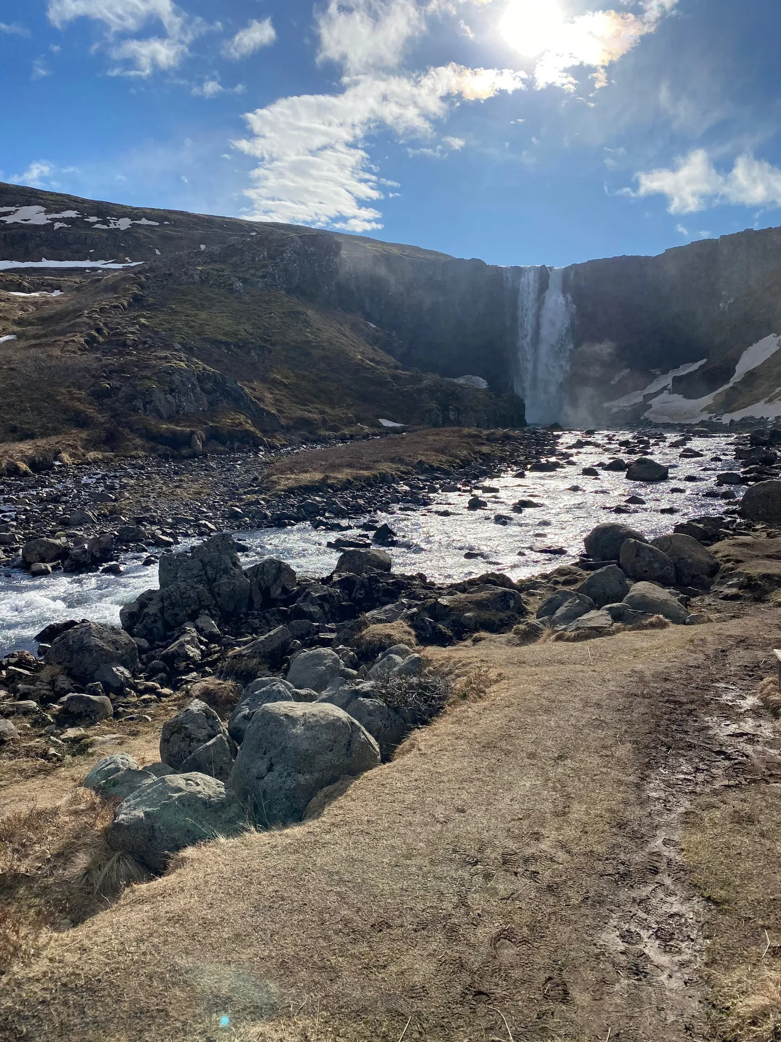
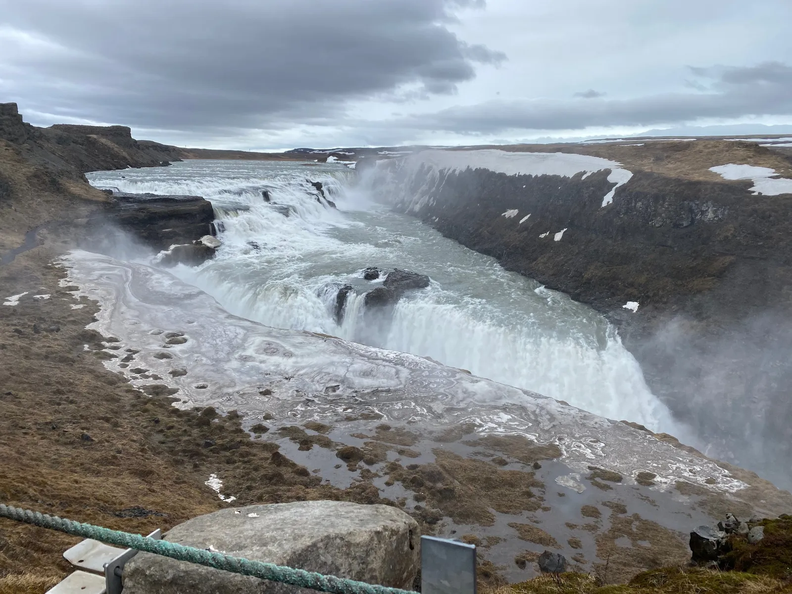
I just returned from a wonderful spring holiday in Iceland (this explains the silence on the blog here). Below is a quick subset of the images I took with my phone (the ones without family members).

These are the raw shots, without cropping or any colour/light adjustment. What is my approach to making these landscape shots:

  • I actually do not overthink my photographs: just snap to catch the moment
  • I hardly ever use the zoom function on my phone. If needed, I can always crop images later to get a zoom effect. Live zooming reduces the image quality and makes the image more sensitive to an unsteady hand / shaking.
  • I tend to look for lines (roads, rock formations, etc.) to force some sort of eye movement in the images
  • Where possible, I try to catch a small element in the foreground to create a sense of depth. (Often a family member taking the same photo, pictures of family taking pictures is one of my favorite themes)
  • Painters already discovered this, often the sky is one of the most interesting visual elements. Try dropping the horizon in one of your shots.
  • Most photos are taken at eye height. Create unexpected perspectives by lowering or lifting your camera
  • Pay attention to the sides of your image. Adding a tiny bit of a wall or other structure in your shot can make the image feel “closed” or “trapped”, leaving it out gives a much more open feel.
Continue reading →
·Culture

The cultural differences...

Communication cultures differ widely across countries. I experienced it myself in multiple situations:

  • Working as a Dutch national in McKinsey’s London office, people found me somewhat ‘blunt’
  • Living as a foreigner in Israel, I would sometimes be surprised that the first thing some says to you is “how old are you?”
  • Participating in a large Zoom call with many American participants who pretext a point of criticism or disagreement with a 1-2 minute apology before getting to the point

It is important to be aware of these differences:

  • As someone who is presenting
  • But also as someone who is in the audience and needs to put the presenter in perspective

Some of these differences might actually not be down to culture or character. Not all languages have words for specific nuances, so things literally get lost in translation: Language 1 has 5 options on a scale, language 2 only 2. If you are the native speaker in the 2-option language it is hard to pick (or even know) which of the 5 options to pick.

Read body language and ask for clarification when in doubt, or use some self deprecation to preempt possible issues.

·Layout

COVID isolation policy

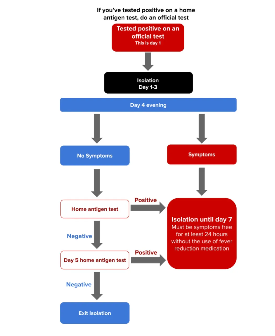
A quick re-make of a graphic with the Israeli COVID isolation policy, here is the original

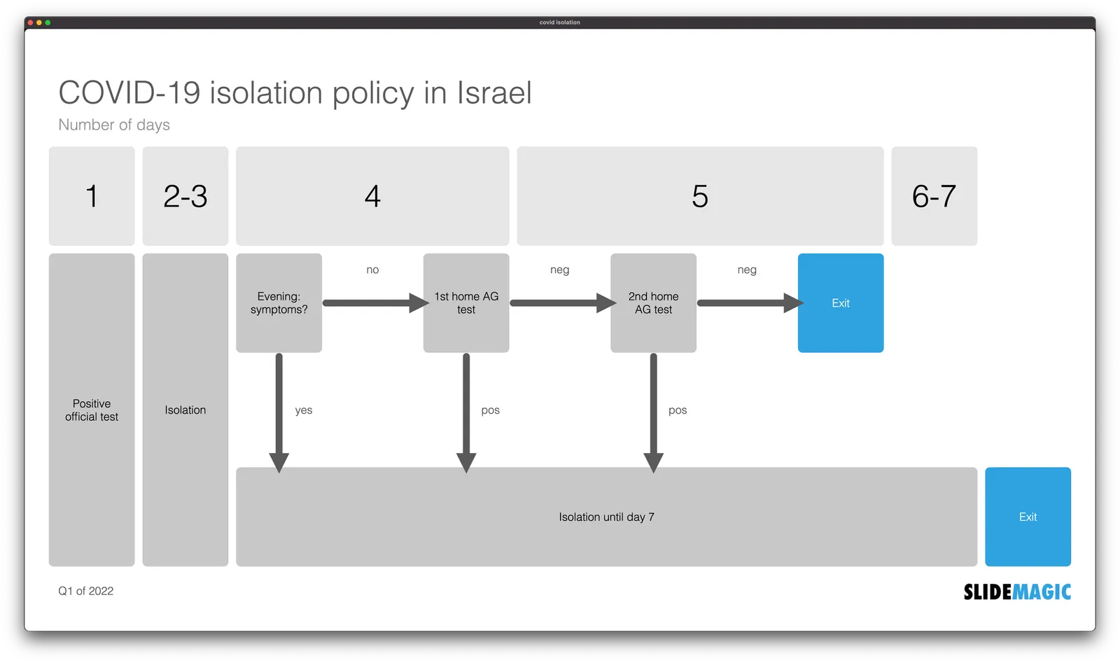
Below is my version in SlideMagic. I tilted the diagram, to put more emphasis on the timeline. Search for ‘COVID’ in the SlideMagic template bank and the slide will show up for you to use, either exactly as is, or as the basis for another timeline chart.

·Story

Zelensky's roadshow

Ukrainian president Zelensky is ‘touring the world’ via video calls to parliaments to drum up support for his country in the conflict with Russia. Each speech is tailored specifically to a country. Here are some of the patterns:

  • Establish a connection, giving a compliment about the country: “I have been there”, “What a beautiful city”
  • Make you feel what it would be if all the agresion happens to you: “What would you do if the port city of Genua would be destroyed?”
  • Link the struggle of the Ukrainian people to a historic struggle of you (“You stood up after Pearl Harbour, we are in a similar situation now”)
  • Making you part of the event: “This is not about Ukraine, but a struggle of the entire world against evil”, i.e., you are not just an audience
  • Rubbing it in that he is doing something, and taking the hits (for you, see previous point), while you ‘sit back and relax’
  • Appealing to personal moral standards, this is not about business, country or world politics, this is about innocent people dying
  • Addressing individuals directly, i.e., the Prime Minister of the Netherlands was singled out by name in today’s address to the Dutch Parliament.
  • Asking for very specific things that a country can do
  • Rather than begging for help, he projects strength and determination and is inviting people to join the winning side

All of this is delivered in a short speech, with short sentences that are to the point.