

Most presentation design software today is the result of someone in the 1980s thinking: “hey, this mouse is cool, you can use it to draw things!”. We can move, drag, stretch, place things freely across our drawing canvas.
Presentation software SlideMagic aims to close this tangent and go back 20 years earlier to the 1960s when graphics designers in Switzerland developed a clean and crisp style of communication and design that does in many cases the exact opposite of the freedom the mouse offers: tight grids, limited font choices, limited colours. simple shapes.
Eyeball the posters on this Pinterest board by Misswyss and see what you can learn form them for your own designs. Which one do you like? Which one does a better job at communicating than others? Why is it that some of these very simple designs look very pretty?
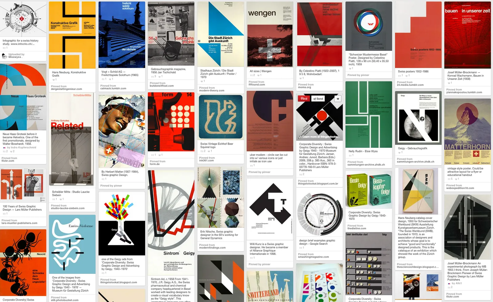
Examples of posters designed in the Swiss style
Some of the features they have in common:
- Limited number of colours
- Sans serif font (only one)
- A strict grid alignment throughout the page
- Relatively small headlines
- De-emphasising (making things grey) rather than emphasising (making things bold) text
- Flat shapes, no gradients, drop shadows, textures
- Big silhouettes, simple shapes
Why not steal some of these ideas in your slide designs?
Art: Albert Anker, The walk to school, 1872, 90 x 150 cm Subscribe to this blog, follow me on Twitter
