SlideMagic Blog

Frequent updates about all things presentations since 2008. Subscribe to never miss a post.

RSS
·Software

Photoshop alternatives?

Adobe is moving to a subscription pricing model for its major software products (Photoshop, InDesign, Illustrator, etc.). I signed up for a $20 or so monthly introduction offer but then forgot that I got upgraded to around $55 charge after one year. This is probably good value if you use many Adobe products, and use them frequently.

As a presentation designer, I fall in between the typical user segments. Here is how I use Adobe products:

  • Acrobat:
    • Stitching together multiple PDFs into one
    • Reducing file sizes of image-heavy PDF files
  • Photoshop:
    • Removing backgrounds from images
    • Compressing, re-sizing large image files
    • Putting text on blank 3D objects
  • Illustrator: opening, selecting groups, re-coloring of stock vector files before saving them as PNGs.

Is there a combination of alternative software packages that could do these basic functions?

Some responses to an earlier tweet:

Art: Typesetter at the Enschede printing factory (was located behind the St. Bavochurch) in 1884, painting by the American artist Charles Frederic Ulrich.

·Software

New SlideMagic video tutorials

I am in the process of creating a library of video tutorials for SlideMagic. Here are the first three, you can expand them to full screen size for more detail.

From the 3x3 grid to a basic slide composition

How to clone a template

How to import individual slides from another presentation/template

Art: William Merritt Chase, A Friendly Call, 1895.

·Layout

Adding structure to text

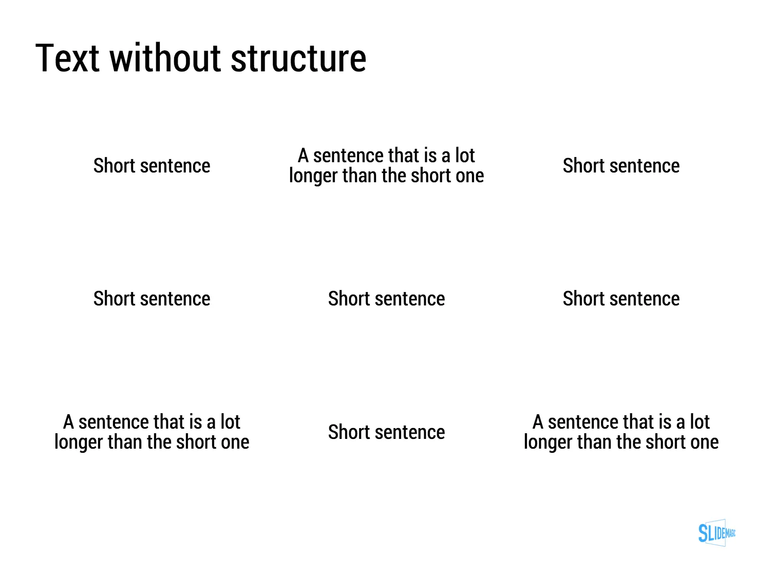
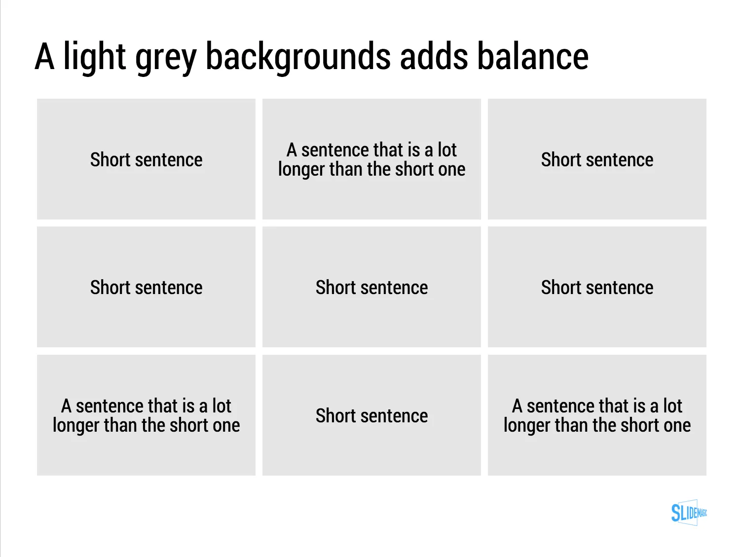
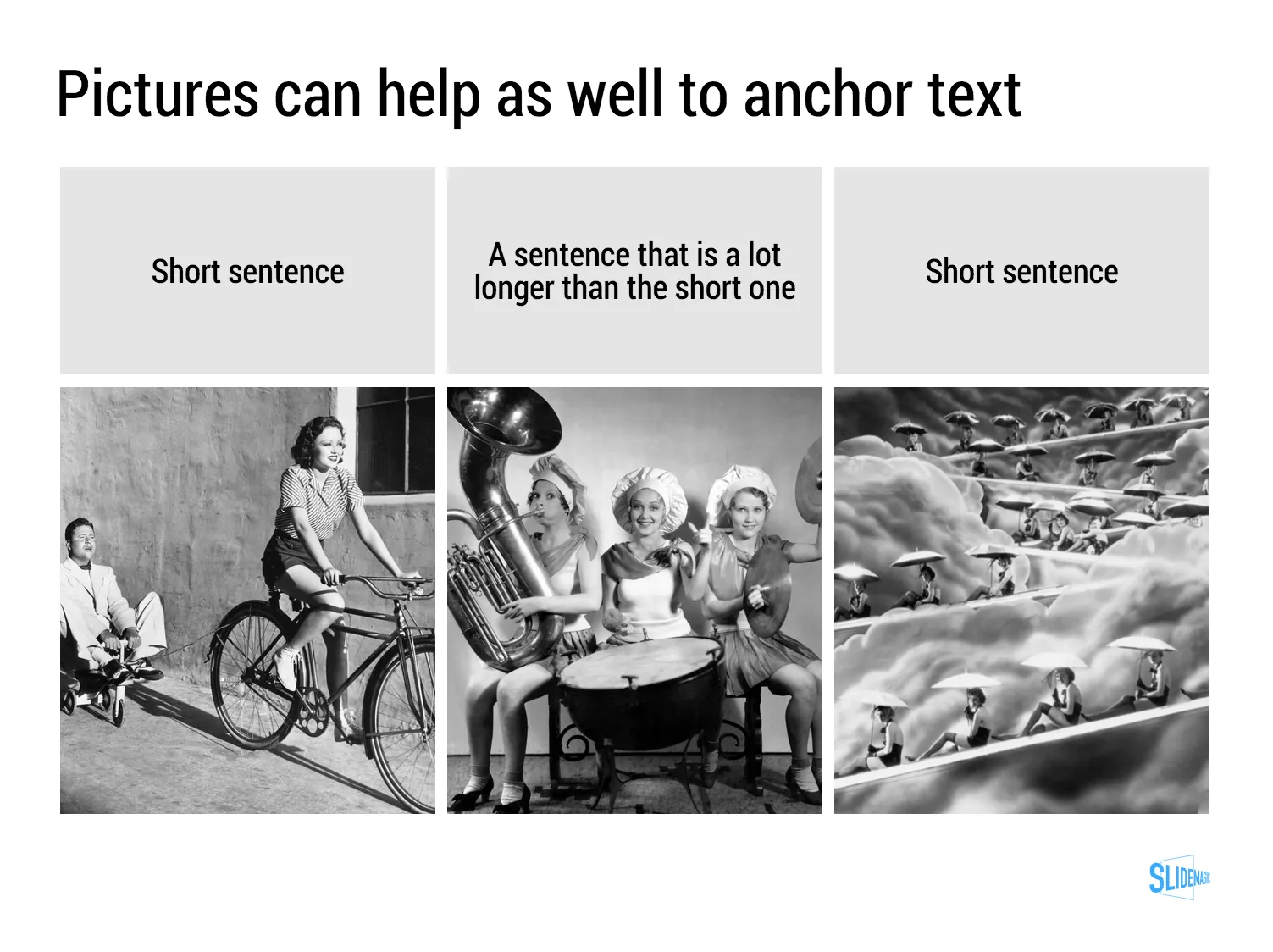
Sentences or titles never have the same length, so putting them on a page without some form of framing makes the whole slide look unbalanced. My solution: a light grey background  creates a box that gives structure to the text. You can also use images to reinforce the slide’s grid layout. Many people use an outline, a frame around text for the same purpose. I think a light box fill looks a lot better.

The light grey box is one of the key structuring elements in my presentation design app SlideMagic. Traditional presentation design software is not very well set up to changing grids of text boxes and images. Try doing it in PowerPoint, then try to do the same thing in SlideMagic.

Art: Piet Mondriaan, Broadway Boogie Woogie, 1942

"You don't look like a fashion company"

Related to last week’s post about looking like the company you want to look like. A client in the fashion/apparel business recently got feedback on their pitch deck: “it does not look like the pitch deck of a fashion business.”

Fair point. Especially if you are in the business of fashion, jewellery, sport cars, wine, etc. businesses for which consumer branding is important, you might want to spice up your presentation a bit.

Where do you find the slide real estate to do it? You cannot put a big image of that 1961 bottle on every slide. I try to use separator pages for that. Break your presentation in sections (problem, solution, about, financials) and use the page that announces a new section as the scaffolding for a page-filling image that reflects what your company does. Make sure the images throughout the presentation are similar in style.

Here is a separator slide that I could have used in my own SlideMagic pitch deck (it was of course created with SlideMagic…)

Art: portrait by Giovanni Boldini (1845–1931) showing Elizabeth Wharton Drexel in 1905.

Look like the company you want to look like

Presentation slide design has two components:

  1. The visual concept of the slide
  2. The look and feel of the slide

Number 1 can be hard, hard enough that professional presentation designers like me can make a living out of helping out clients to do just that.

Number 2, the look and feel, is a lot easier to solve, and yet people get it wrong so many times:

  • Times Roman (or even Comic Sans) fonts
  • Standard Microsoft Office 2010/2011 colours (later versions of PowerPoint actually look OK)
  • Low resolution, cheesy images yanked from Google image search full of copy right issues
  • Three levels of bullet points (dots, dashes, stars) in different font sizes
  • Clip art

Here is a simple observation: you come across they way you look. So, if you want to come across as a successful startup:

LOOK LIKE ONE

Slides that are poorly designed, contain too much text, and use the wrong visual concepts, still can look calm and professional when the basics of layouts, fonts, colours are sorted. Most slides in Apple presentations consist of a large picture of a piece of hardware with 2-3 short sentences/words. It all looks great.

It is hard to copy a design style of someone else. You often start out great, but bit by bit your own style creeps back in. You look at your effort, you look at your example, and somehow the example looks good and yours does not. You need to stick to your example. Fonts, positioning of headlines, text, images, everything. It is a similar effect when you see a small child trying to draw a 3D house. It does not come out right because does not have the courage to simply follow what you see: lines disappearing in a vanishing point, sometimes at extreme angles. It does not match with the child’s perception of reality where everything is supposed to be straight.


Continue reading →

The impatient clicker

The revolution in presentation design over the past 5 years has mostly been about creating better on-stage experiences. Big pictures, one-message-per-slide, consistent colours, proper layout.

The definition of “presentation” is widening though. PowerPoint is replacing the word processor in corporate communication and is used to create documents that are meant for reading rather than presenting.

In my bespoke design work, I see more and more decks that are used as attachment to a cold email: VC pitches, sales presentations. The audience setting for these type of presentations is a little bit different from the classical standup presentation. Your audience is not captive and can decide to close the file, skip ahead, at any moment. A cold email deck is very similar to a web page competing with hundreds of other links to click to take you somewhere else.

Some design pointers to these types of presentations. SlideMagic beta testers will notice that I have put a lot of these requirements into my presentation design tool.

  • Look and feel. When you are on-stage, you can masquerade the unprofessional look and feel of your slides somewhat with your overall stage presence. No such thing in cold emails. If the slides look like amateurishly designed PowerPoint slides, the company that’s behind them will be perceived as such.
  • Must click. Like the beat in a piece of music, an impatient VC or potential customer has the urge “to keep on clicking”. If the slides it boring, or hard to understand, she will not re-read the slide a second time, instead: “Oh, maybe the next one is clearer” [CLICK]. You do not control the beat, design your slides in such a way that the message comes across before the next click comes along.
  • The basics. You are not there to explain, you cannot keep the audience locked in the room and force them to go through your dramatic analogy as an opening. Tell them bluntly what you are about, right upfront.
  • Keep them hooked. For standup presentations, you do not always have to throw those impressive stats early on. Here, you have to do all you can to keep people hooked. You can do this in 2 ways: mention the impressive facts (2 million paying users in 2 months) and - maybe even more important - anticipate the obvious questions: slide 3: “This looks like a Google me-too? Wrong!”.
  • Branding. On stage there is no need to remind people whom they are listening to on every page. In cold emails, a bit of reminding is actually good. A tiny logo at the bottom right of each page is hopefully enough to get people to remember your name by the end of the deck.
  • Explanation. You are not there, so super abstract slides will not be understand. Consider using 2 lines for the slide title. Or add a subtitle box under your slide with the full length narrative in point 8 fonts (SlideMagic ships with explanation boxes to the right of each slide).
  • Details later. The first part of your presentation is all about getting people to understand what you do, and why things are so great. You do not need the full detail of your team, technology, etc. for this. But, if you succeeded, the reader might want to dig a bit deeper. Consider adding the more dry information in an appendix of your deck, in a denser presentation style. Bios of team members are a good example where dense text with rich backgrounds can add value.
Continue reading →
·Investor presentation

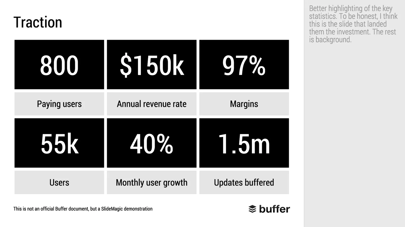
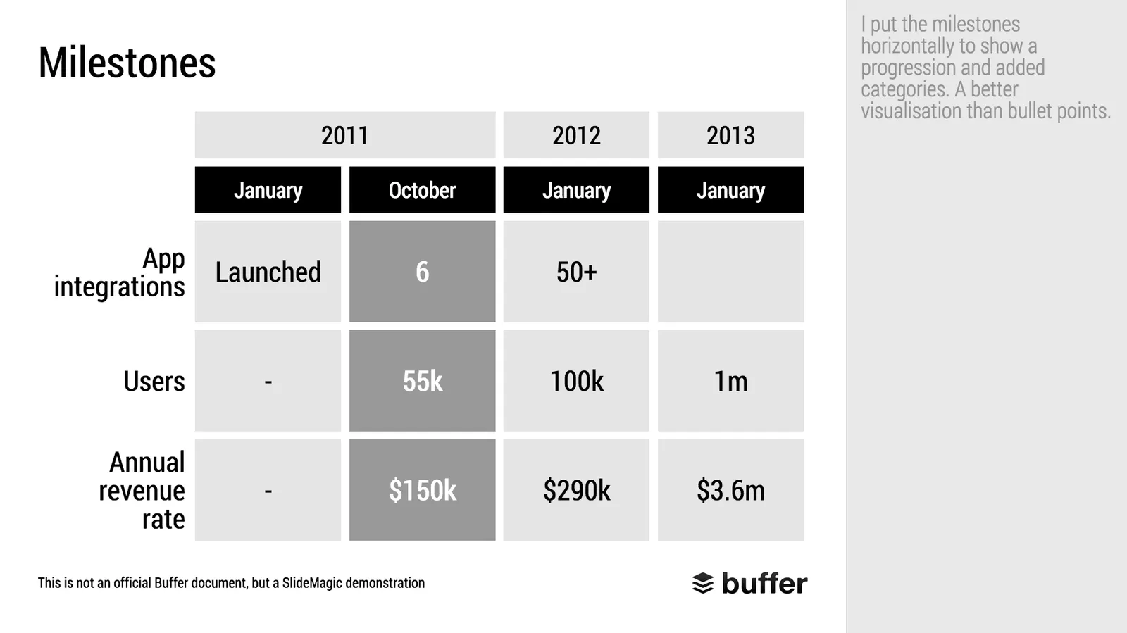
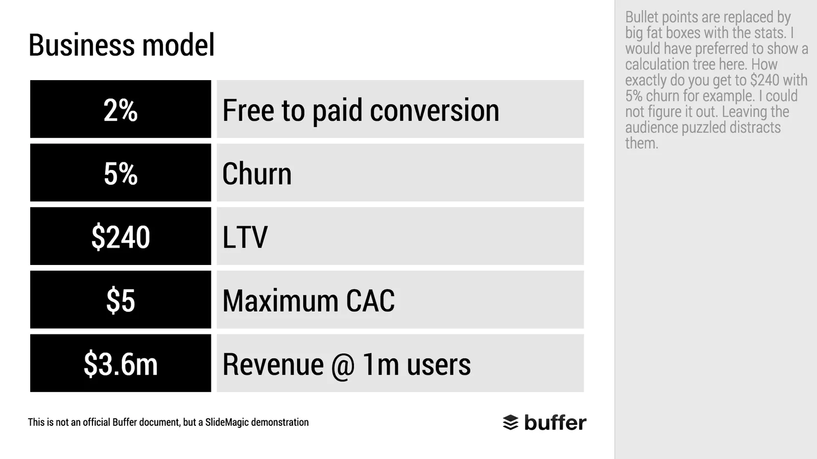
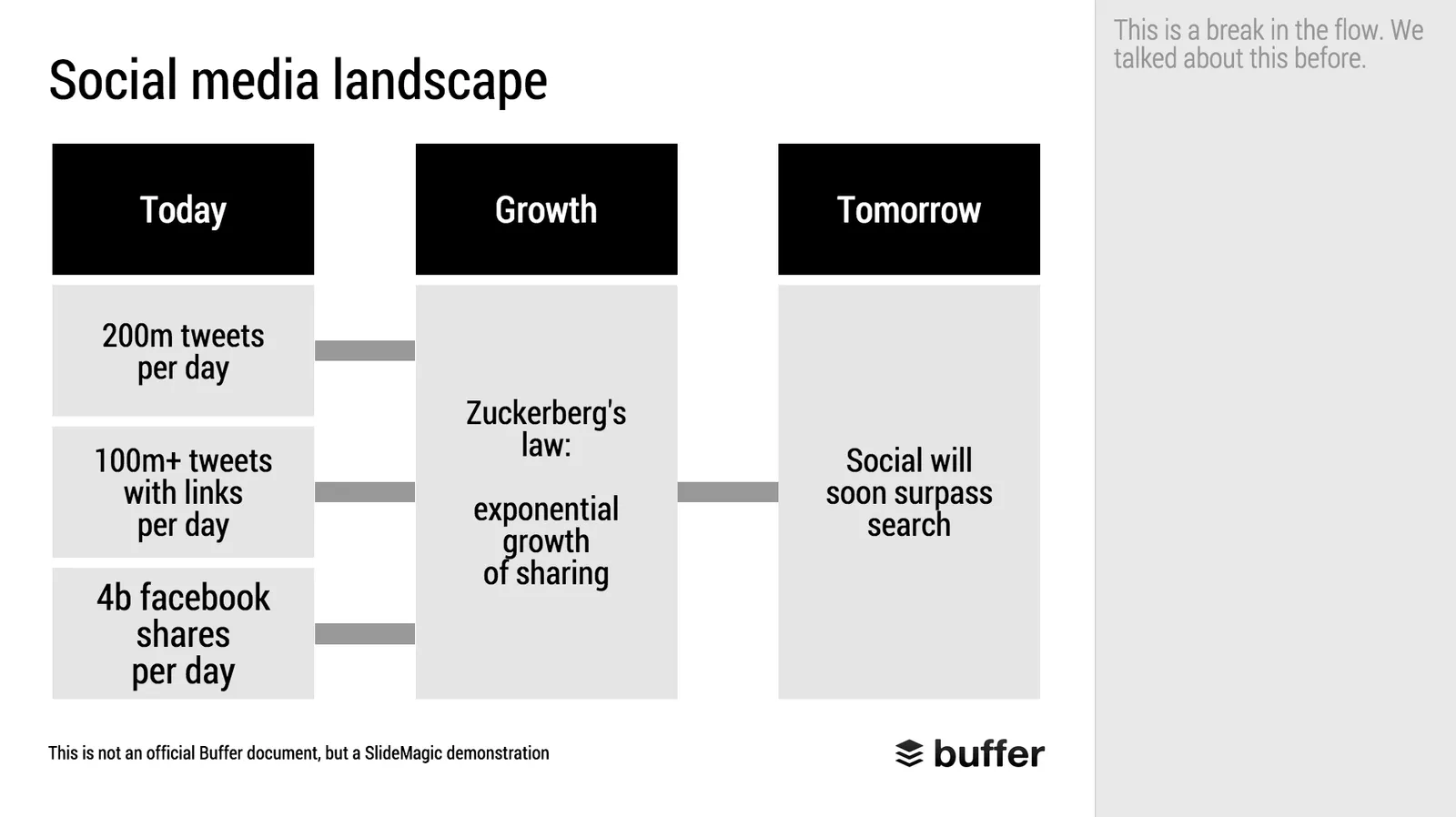
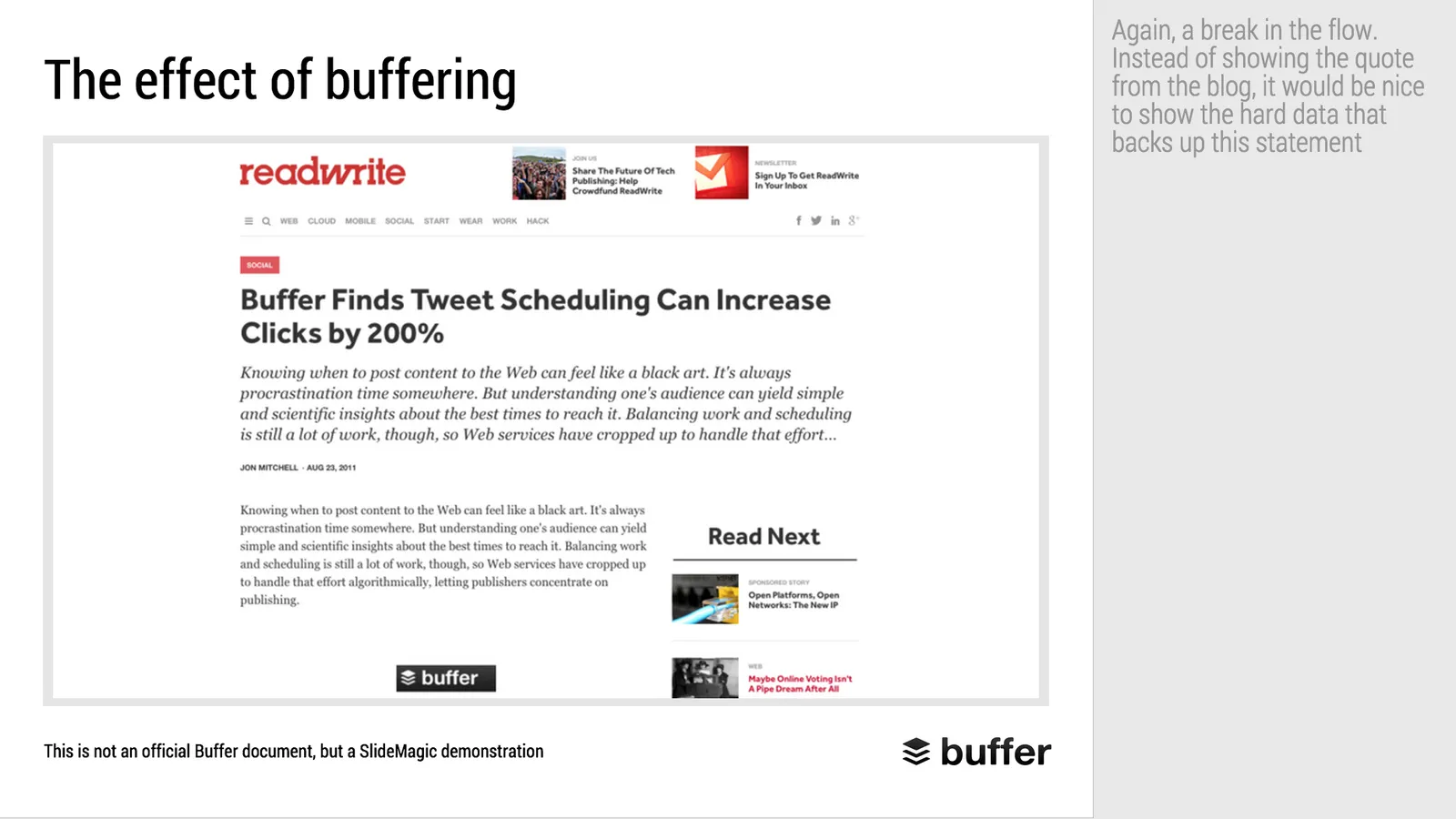
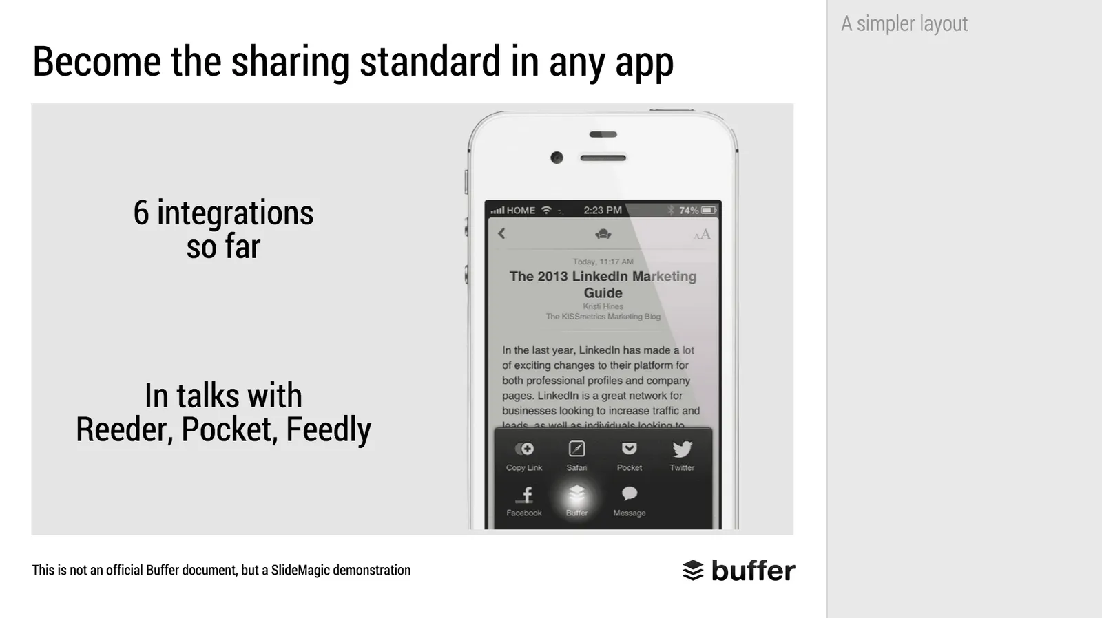
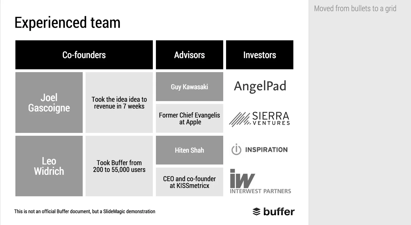
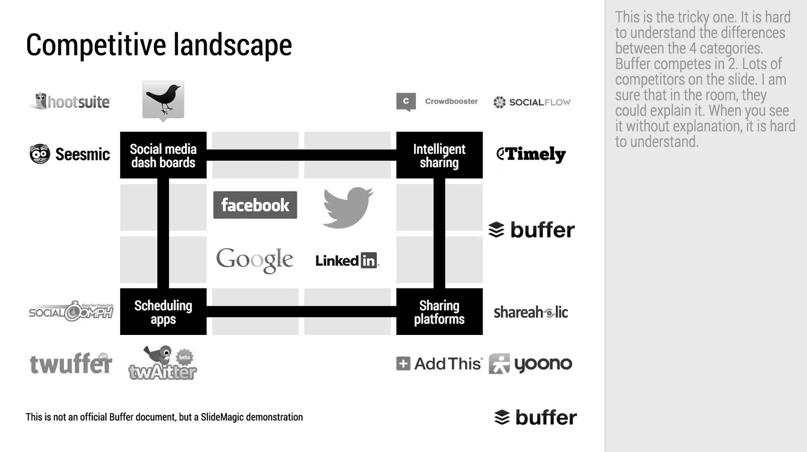
Makeover of the Buffer pitch deck that landed them $500k

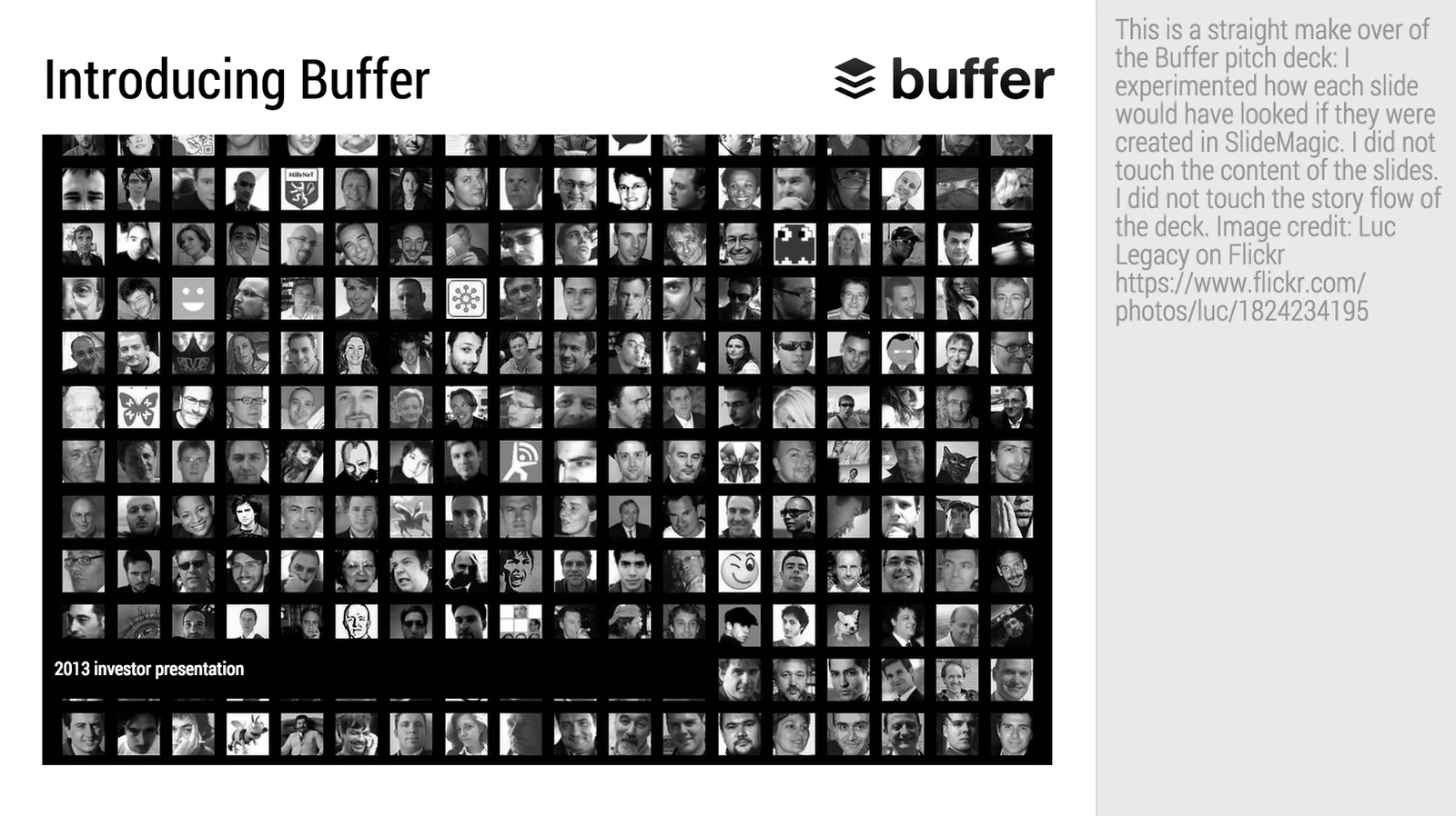
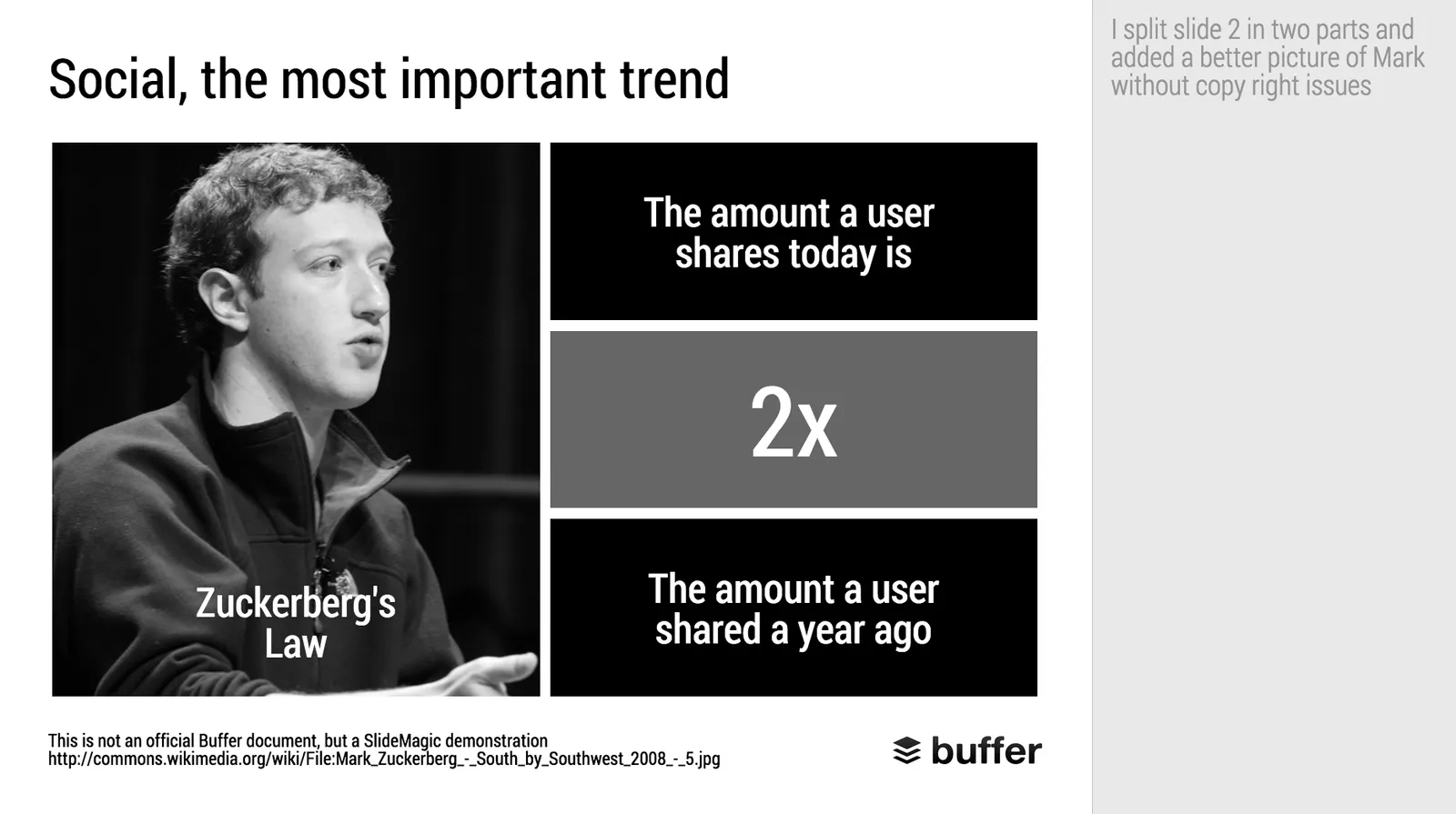
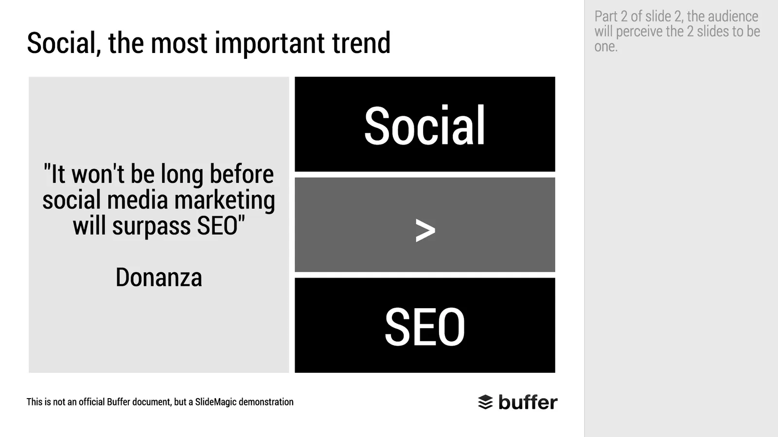
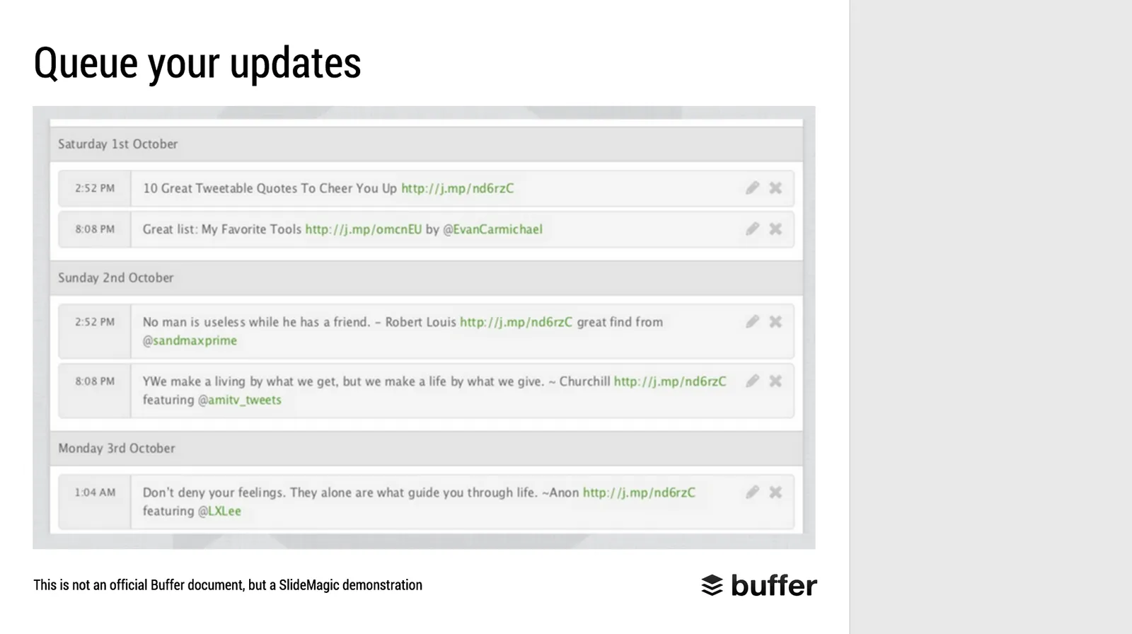
When Googling for examples of VC pitch decks, the on that Buffer used to raise $500k in 2013 ranks high. I decided to give it the SlideMagic treatment: how would the deck have looked when the slides would have been created in SlideMagic.

  • I changed the slide design to fit SlideMagic
  • I did not change the slide content
  • I did not change the story flow

I have a few comments on the slides that I have put in the SlideMagic explanation boxes.

Here is the original:

Here is the same deck in SlideMagic. You can clone this presentation to your own SlideMagic account by clicking this linkand use some of the slide concepts in your own presentations. I have also added this presentation as a template in SlideMagic’s template library.

Art: Johann Zoffany paints a group of Englishmen in Rome for the Grand Tour, united only by their wealth and love of art; unlike most conversation pieces, this was not a commissioned work

·Story

Reading, watching, listening, writing, presenting, telling

They are all different activities, they all require different slides:

  • Presenting and watching: The creator stands on stage with some visual support, the audience watches the performance. You have 3 types of slides:
    1. Slides that set the mood (a big picture/word/sentence)
    2. Slides that show a fact/trend
    3. Slides that show how things are related
  • Writing and reading. The creator writes text (facts and ideas held together by a story line), and the reader reads them, without assistance. Slides: text pages or bullet points.
  • Telling and listening. No slides, the creator imagines, translates to audio, the audience listens and reconstructs.

You see where it goes wrong. People use slides meant for reading to an audience that is watching.

The more I think about it, any slide that just lists stuff in a sequential order without any other relationship, should just be eliminated out of a presentation that is meant for watching and replaced by multiple “mood slide”, “fact/trend”, or “relationship” slides.

Fact and relationship slides could actually get complicated and busy in some cases. Bullet point slides of unrelated items can be incredibly clean and minimalist. The first are OK, the latter not.

I need to develop this quick thought a bit further in future blog posts.

Art: In England, artist Francis Barraud (1856-1924) painted his brother’s dog Nipper listening to the horn of an early phonograph during the winter of 1898. Victor Talking Machine Company began using the symbol in 1900, and Nipper joined the RCA family in 1929.

·Data visualization

Good and bad use of data charts

I came across these charts created by The National Geography in a special article about Food by the Numbers. The print article is an extraction from a video. (I made a poor quality image with my phone).

Like in most infographics, the rules of creating data charts are broken. It works well in the 2 graphics on the left, not so good in the map.

  • The line charts abstracts away everything you do not need. Years are omitted, the scale is really rough. It focuses on the things that need communicating. The exact point estimate for “today” (2011), but still the number is nicely rounded (not 1,800,232,433). The growth trajectory is clear (without cheating with broken axes). Real data and projection are clearly separated.
  • The connection to the pie chart is good. The pie chart itself is super minimalist with a huge data label to communicate and visualise the one number we need to know (could have bee “4%”). [Contradicting myself here, usually I do not like pie charts].
  • The map works less well. The differences in size between the bubbles is hard to see. A simple stacked column might have been better here. Also, the really interesting statistic is to show the 4% broken down by region, not the absolute size. Maybe South America uses relatively more bio pesticides than North America?

Art: Pieter Breughel the Elder, the Harvesters, 1565

Common presentation design mistakes

Here are some common mistakes I see in briefings for presentation design projects. They range from typographical details to big picture issues:

  • The presentation never explains what it is you actually do
  • The slides say something different than the verbal explanation
  • Too many benefits, as a result: no positioning
  • Doubt between positioning options shines through in the slides
  • Presenter gets lost in side stories
  • Amateurish images (“funny” ones)
  • Images with copy right issues
  • Font, colour, alignment, image resolution, aspect ratio chaos
  • Inconsistent graphical style
  • Inconsistent analogies
  • Cliche analogies
  • Good data, but the wrong data charts
  • Jargon and buzzwords
  • Quotes from airport best seller authors
  • Bullet point place holders rather than a story
  • Too many words that explain too little
  • Too few words that say something generic
  • Five slides combined in one
  • The presentation spends too much time on the obvious
  • The presentation avoids the elephant in the room
  • Slides from a strategic Board meeting that talk about some strategic choice and expose weaknesses are ported straight into the pitch deck
  • Comments and notes with sensitive information are left in presentations for everyone to read
  • Sensitive data that is taken out of the chart can still be accessed when opening the graph
  • 99% solution, 1% problem
  • About us, us, us, us
  • Too long a summary, too short a body, too long a wrap up
  • Errors marked by the spell checker are still ignored
  • Custom fonts that get rendered as Arial
  • Slide title appears 3x: in the title, in a bubble, in a line across the bottom
  • Second line of a bullet point paragraph is misaligned
  • First line of a regular non-bullet point paragraph pops out as if it were a bullet point
  • Inconsistent slide templates throughout the presentation (resulting from a Frankenstein, slam the deck together, effort)
  • Some charts are still in Microsoft Graph / Microsoft Office 2003 format
  • Data charts are copied straight from Excel, without bothering to round up/down
Continue reading →