

I came across these charts created by The National Geography in a special article about Food by the Numbers. The print article is an extraction from a video. (I made a poor quality image with my phone).
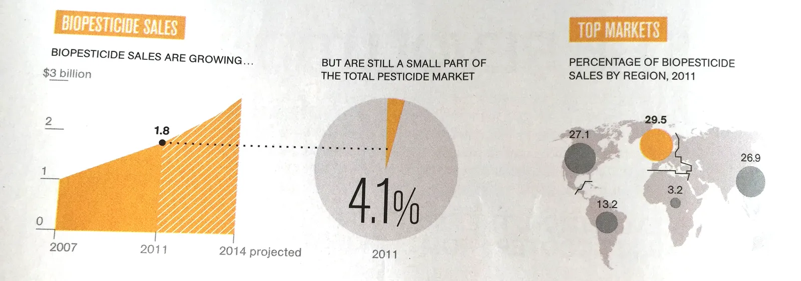
Like in most infographics, the rules of creating data charts are broken. It works well in the 2 graphics on the left, not so good in the map.
- The line charts abstracts away everything you do not need. Years are omitted, the scale is really rough. It focuses on the things that need communicating. The exact point estimate for “today” (2011), but still the number is nicely rounded (not 1,800,232,433). The growth trajectory is clear (without cheating with broken axes). Real data and projection are clearly separated.
- The connection to the pie chart is good. The pie chart itself is super minimalist with a huge data label to communicate and visualise the one number we need to know (could have bee “4%”). [Contradicting myself here, usually I do not like pie charts].
- The map works less well. The differences in size between the bubbles is hard to see. A simple stacked column might have been better here. Also, the really interesting statistic is to show the 4% broken down by region, not the absolute size. Maybe South America uses relatively more bio pesticides than North America?
Art: Pieter Breughel the Elder, the Harvesters, 1565