

Many large companies grow only a few % points per year. They are large and mature businesses. And many quarterly investor presentations have charts like this in them:
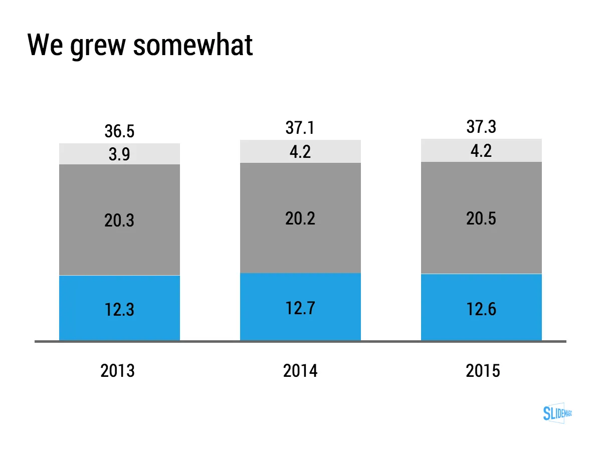
When things don’t change that much, a stacked column chart like this one might not be the best way to show the data, maybe a good old table is better. Stacked column chart show the relative proportion of values at the expense of legibility, especially for small categories that can be hard to read. If nothing changes in the proportions, a table will be easier to digest.
For these big companies, analysts do not focus that much on the absolute numbers, it is the differences in growth percentages that matter. To give the growth numbers more visual power, a combination of a table and a bar chart can be a powerful visual tool.
You can clone this chart and others that I used on the blog into your own SlideMagic account buy clicking this link.
