SlideMagic Blog

Frequent updates about all things presentations since 2008. Subscribe to never miss a post.

RSS
·Sales presentation

Sales presentation versus strategy presentation

They are different.

  • Strategy presentation. In most cases, the audience of a strategy project recommendation presentation understands the context. A large part of them probably participated in the project (steering committee meetings, interviews, doing analysis). Therefore, the presentation can be highly in your face, conclusions upfront, in a strict logical order. Pretty much like the classic consulting presentation.
  • Sales presentation. Your audience will be less familiar with the background, you need to drag them in a bit slower, show that you understand their problem, etc. And, logic only is unlikely to lead to a sale.
·Story

Confusing things on purpose

Some clients don’t want to be compared to, seen as, a certain competitor or market alternative. These type of companies might have a very low reputation in the market, typically charge very low prices, or there could be regulatory issues involved where lawyers recommend to change the tone of the pitch slightly.

What you put in, is what you get out. If you confuse, obscure, make it less clear who you are, your presentation will be less powerful. This is especially true for the cold audience who will first try to compare you to a company or concept they are familiar with. If you leave your pitch confused, they will be confused. “Hmm, they are sort of a company A competitor”.

The above is especially dangerous when it is not you who has to present the story, but a third party salesforce, if you confuse things, the salesforce will be confused, let alone the potential customers or investors down the chain.

It might be better to take things head on, and almost follow the thought line of the audience: “yes, this sounds a lot like company A”, but let me explain why this in fact is totally different". But that takes courage.

Art: Composition VII—according to Kandinsky, the most complex piece he ever painted (1913)

·Delivery

Learning from Seinfeld

Saturday, I visited one of 4 sold out performances of the stand up comedian Jerry Seinfeld here in Tel Aviv. The setting: 10,000 people in a covered basketball stadium with poor acoustics. Here are some of the things that Jerry did to get through to the crowd. And was interesting to see how effective he was in comparison to the warm up act who had less experience.

  • Timing of punch lines. Know when to keep the flow of words going, know when to pause, and when you pause, pause for a really long time to let a point sink in with the audience.
  • Immediately build a connection with the audience. This is more than speaking 1 word of Hebrew, and more than showing how you appreciate the country. Seinfeld build an entire series of jokes about the experience of fighting traffic and crowds to go to a major event (and leaving it). It created an instant bond with the speaker, but also a shared experience between the members of the audience. This was a good set up for the later sections in his show that often were derived from material targeted at a US audience. Started to throw these types of jokes into the crowd right at the beginning would not have gone down well.
  • Fake eye contact, there was now way that Jerry could see anyone in the audience because of the lights, still he was moving his eyes around and holding them left, right, front, and back as if he was connecting with a member of the audience.
  • It was interesting to see how Jerry ended the show with a punch line, and then boom, said goodbye and thank you, walking of the stage immediately after. There was no time for the “well, this was it…”
Continue reading →

Sales presentations versus investor presentations

There are differences:

  • The investor presentation contains more content than a sales presentation: financials, strategy, etc.
  • The investor presentation makes a competitive comparison explicit, while usually in a sales presentation you state your competitive advantage without explicitly mentioning competitor names and their strengths and weaknesses
  • A (summary of) the sales presentation should be embedded in the investor presentation to convince the investor that you can sell your product today (she will look at the content of the slides, but also - more importantly - how good a job you do at selling the product)
  • Sales presentations are often too “deep in the trenches” for the big picture investor presentation. Tactical and operational issues are addressed that are very important to close that deal, but add less to the investor pitch
  • Sales presentations are usually geared towards bigger customers (that merit a customised approach) and do not address self service sales to smaller customers (that could be an equally big, or even bigger part of your business).
  • Sales presentations talk about customer issues today, outside the context of a longer-term roadmap for the company.

Art: a recent painting by Andrew Stevovich, check out his blog, it has detailed backgrounds on how he creates his artwork.

·Typography

Calibri light

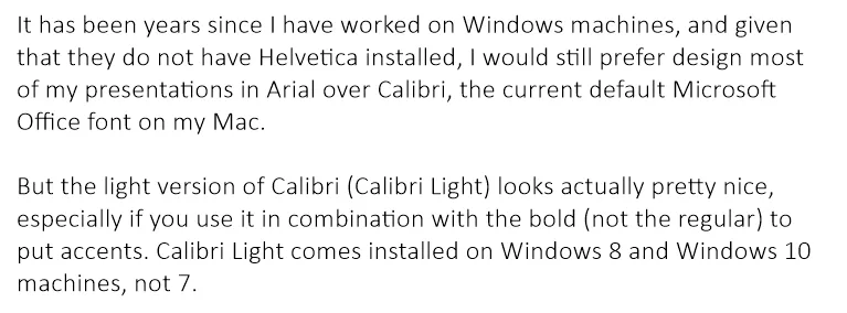
It has been years since I have worked on Windows machines, and given that they do not have Helvetica installed, I would still prefer design most of my presentations in Arial over Calibri, the current default Microsoft Office font on my Mac.

But the light version of Calibri (Calibri Light) looks actually pretty nice, especially if you use it in combination with the bold (not the regular) to put accents. Calibri Light comes installed on Windows 8 and Windows 10 machines, not 7.

Goodbye Arial.

Image on WikiPedia

·Story

Flatten those bullet point hierarchies

They appear often in business presentations: hierarchies of bullet points:

  • A summary point that partly repeats what is said below
    • A sub summary point that partly repeats what is said below
      • A sub sub summary point that partly repeats what is said below

The worst of all bullet point sins: the lone bullet point that jut hangs there without a brother or sister.

Breaking up a problem/story in its components is great for solving problems: you can get a hypothesis quickly and carve up your team to work on each of the individual bits. They might even work as the skeleton of a presentation story flow.

On actual slides though, it is a different matter. These hierarchies are hard to read and process. You read the summary, read the supporting points, then combine the supporting points to internalise the summary again. Too much.

For a presentation, you need to flatten the bullet points.

  • Kill bullet point hierarchies as much as possible, creating a linear flow
  • Then, spreading out each bullet point on a separate chart (as much as possible).

Ever wondered why my presentation app SlideMagic does not even feature the option of a bullet point?

·Images

Pushing the analogy too far

Analogies are great. You take a concept that anyone can relate to, and use it to explain something unfamiliar. But you can push it too far.

  • An analogy that is complex in its own right defeats the purpose
  • An analogy that only partly fits
  • An analogy for which you cannot find the appropriate professional visuals easily without an advance degree in Photoshop
  • An analogy that is number 12 in a series of completely unrelated analogies for every single concept in your presentation
  • An analogy that is not “serious”, it undermines the professionalism of your presentation, a bit of humour is OK, college humour is not.
  • An analogy that is a cliche

Or, like in the Accenture ad below, you are actually insulting your target group.

Good analogies are pretty much the opposite of the above. They are simple, fit the subject, are easy to visualise, and ideally, can cover all aspects of your story.

·Investor presentation

How to write a good cover email pitch

Cover emails that introduce a presentation are very important. It is the first thing the recipients sees. And given that more and more emails are read on smartphones that are not very good at handling attachments (still), they have become more important.

Here  are 2 poor cover emails:

  • One that says too little: “Please see the attached business plan”
  • One that says too much: the whole pitch cramped into the body of the email with out the visual support of your slides

The enemies we are fighting: getting ignored (the email is not opened), or getting deleted/archived before the whole message has had a chance to come across.

What can you do better?

  1. A good subject line. If it is a cold email, use the full space you have, almost like a Tweet. Good subject lines intrigue, they don’t have to  tell the whole story. Good subject lines tell more or less what you want.
  2. Write who you are, how you got to the recipient, what you do (no intriguing here, super factual and super short, let the recipient put you in a box) and say what you want.
  3. The body of the email is all about intriguing. Unlike when you are in the room where you can stand in front of the door to prevent people from leaving, here, it is you versus the mouse click:
  • Think very hard about what the intriguing aspects of your story are. Every pitch has usually only one, or two. (A completely counter intuitive approach to solve an issue, a truly unique team, etc.)
  • Forget about the classical business plan story line, you need to get these intriguing aspects across as soon as possible, BUT think of a story flow that allows you to do that. In most cases you need to educate the recipient a bit before you can deliver the key surprise.
  • As you add more content, think hard: does this line increase my chance of a response (pick up the phone, click the attachment, write a reply)? Sometimes the best is to keep things short. Cut buzzwords, cliches, any baggage.
  • Look at the typography, line breaks, paragraph lengths. Do the right things pop out?
Continue reading →
·Story

Catch those fresh impressions before they are gone

When someone briefs me on a new presentation design project, I usually do not scribble in a note book during the conversation. One, it prevents a direct dialogue. The client is not passing on his food orders to a waiter who looks down at a piece of paper all the time. And, when you write down, it is hard to inject questions. But there is a second reason.

Writing down your impressions after a discussion 10 minutes after the meeting is over is a wonderful way to let your brain do the first sorting of what is important, and what is not. I don’t write down the entire conversation sequentially, rather, I write down the big ideas that struck me. They are not in the right order, they are not at the same level in the story hierarchy, they overlap. Still they are all thoughts that "need to go in somewhere’.

Ten to fifteen minutes is the optimal delay, after that your memory starts fading and you will lose that thought.

Art: Jean Siméon Chardin, Soap Bubbles, 1733

How to clean up a PowerPoint presentation or template

PowerPoint (and yes, Apple Keynote as well) offers way too many styling and customisation options.

  1. Non-designers pick the wrong options: shadows, gradients, colours, fonts, and position things all over the grid without worrying about balance or layout
  2. There are technical complications as well: copying and pasting slides across creates a mess of different templates, with different defaults. And even if you want to change something because it looks bad, few people know how to do it (straighten out column sizes, fixing that hanging bullet).

The objective of my presentation design software SlideMagic is to free you of all this stuff. If you have to work in PowerPoint, my advice is: make things look like SlideMagic slides! The easiest way is to work in SlideMagic, then convert to PowerPoint. Second best alternative: stay in PowerPoint.

Here are some of the steps I go through when I am faced with the challenge of cleaning up 100 slides of PowerPoint in a very short time:

  • Copy the file, delete all but 2 slides, open the slide master, and delete all but 2 slides in it, so you are only left with a title page, and a regular page.
  • Fix the slide master
  • Create horizontal and vertical drawing guides in the slide master
  • Do a brutal font replace across all slides to get rid of any legacy fonts
  • Set the colour scheme, save and apply to all slides
  • Insert a blank text slide, and create a shape and and a text box. Fix fonts, alignment, line spacing, padding, colours, right click them and set them as default shapes.
  • Open the original file and copy all the slides, paste them in the small file you just created
  • Select all slides (except the title slides) and change its format to slide 2 in the slide master
  • Open the slide master and delete all master designs you don’t need (i.e., you are again left with 2 slide masters)
  • Do a global font replace again
Continue reading →