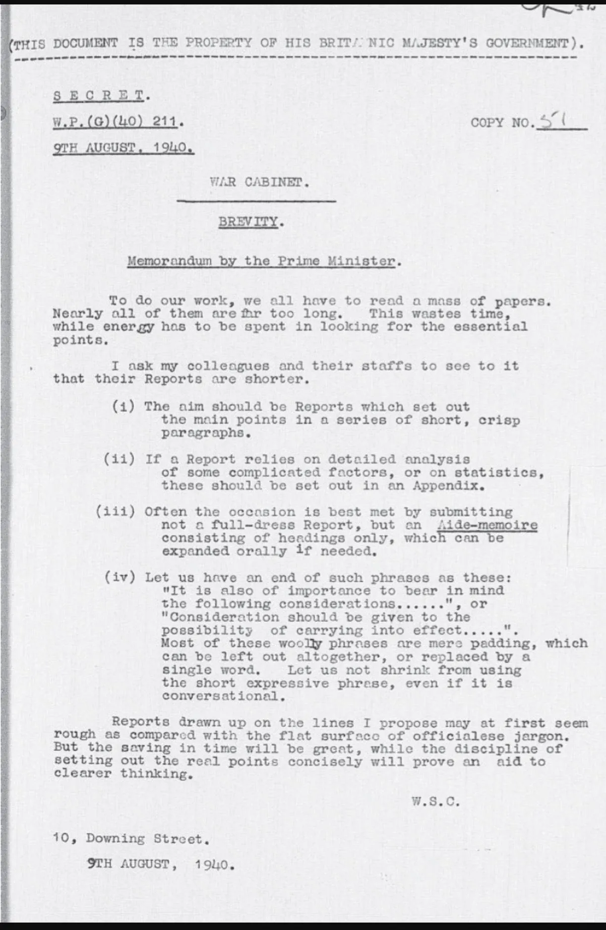
Brief memo by Churchill on brevity
Still relevant today:

Frequent updates about all things presentations since 2008. Subscribe to never miss a post.
Still relevant today:

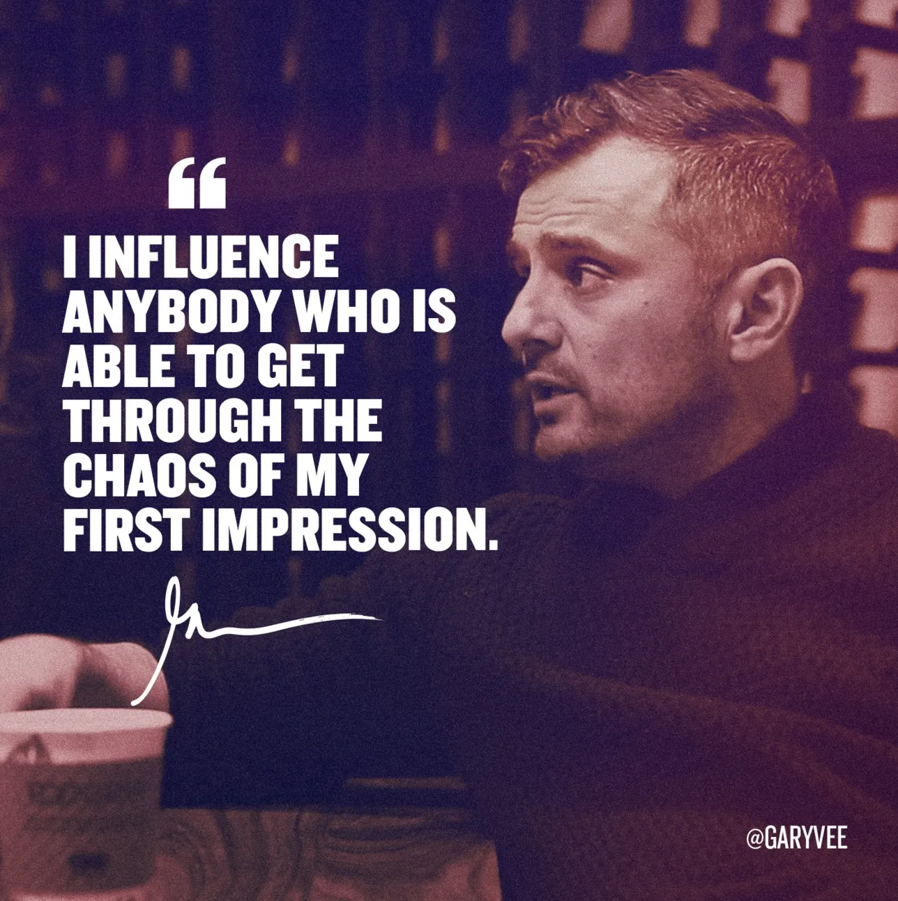
Quotation marks never come out right when you use large, bold, typography. Below is a nice idea by the designer of Gary Vaynerchuck. One huge, big, quotation market centred across the text. Note that the quotation mark is in a far bigger font size than the rest of the text.

Most quotes in presentations do not add to the story:
What can you do better? Find the right person, and get them to say something specific, clear, and simple: “This solution saved the launch of product [x]!”
UPDATE February 2018: I have added a new post about using quotes in PowerPoint to the blog
I get a lot of queries from startups on a tight budget that want the best presentation possible to raise their next round of financing that pretty much determines the survival of the company. Many of these projects I actually turn down when I see that the presentation is actually pretty decent. Extracting fees for a bespoke presentation design will not give them the right return on investment.
Here are some things I watch out for when deciding when a presentation is pretty decent for an early-stage VC round (which is a different audience than a major late-stage growth round, a TED talk, a pitch to a major customer)
Image from WikiPedia
Not every PowerPoint slide is meant for presentations to a big audience. Some charts are meant for pondering behind a big screen. The one below is an example (made by FirstMark Capital).

Venture capitalists love these industry overviews full of logos and sectors. You could make this chart cleaner:
But that chart would be less fund to ponder…
This blog is read by many fellow presentation designers. Here are some of my clues that warn me when a potential project could be difficult to get right.
Designers should look out for these warning signs and people tendering project should look in the mirror.
This picture by Anouk Zwager has an interesting list of common management vocabulary in the Netherlands. Part of these words sound perfectly fine to an English speaking audience, but in a Dutch context, with many words in the Dutch language available it just does not feel right.

I will try to translate, some of them might not work:
Imagey by Jaci XIII on Flickr
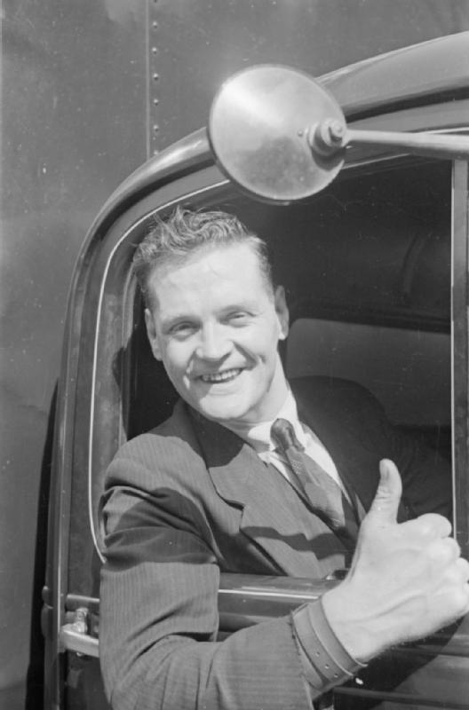
Cheesy stock photos look worse than a list of dense bullets. If you need an image of a normal-looking person here some things I try:
Image from WikiPedia
The standard cloud shape in PowerPoint is not very pretty. Especially if you need a different aspect ratio, there is no option but to stretch the shape, making it look even worse. My solution is to combine multiple cloud shapes into one to get a decent new shape (SHAPE FORMAT, MERGE SHAPES, UNION). See the example below.

It is interesting to see that merging shapes also kills the “inside” cloud contours.
You can get more sophisticated and design your own cloud shape based on circles. Here is my attempt in 2011 to recreate Apple’s iCloud logo in PowerPoint.
Art: View of Haarlem with bleaching fields, Jacob van Ruisdael, 1670
Chart loaded with detail are usually not the best way to convey a message. Except, when your message is that things are actually very busy, complex, interrelated. Then by all means make a busy chart. When presenting, don’t feel tempted to go into the detail of its content though, the message stays “things are busy” and [click] you can go on to the next chart.
Art: The Fight Between Carnival and Lent, by Pieter Bruegel the Elder in 1559