SlideMagic Blog

Frequent updates about all things presentations since 2008. Subscribe to never miss a post.

RSS
·Investor presentation

Dressing down the story

In many pitch presentations, I work hard to lift a story to its true potential. Show the bigger picture, put things in a historical context of where humanity is going, visualise the - dreaded word - vision.

In some presentations the opposite is required. The audience will get the dream, but will wonder whether any of this stuff is actually real, or happening within the next 2 years or so, because it all sounds too good to be true, or too expensive, or too science fiction.

Thinking about your audience before you start designing is a cliche from communication trainings. Maybe make it a bit more practical and try to imagine what stereotype people would assign to you after they see/hear you speak for 1 minute.

Image from WikiPedia

·Delivery

The problem with projectors

I have written about the poor quality VGA projectors that are still sitting in conference rooms of many companies before, but I myself fell into the trap again yesterday. A presentation that looked great on my computer screen was barely readable in a conference room, I have gotten used to high resolution screens and the option to use thin fonts and very subtle colour shadings. Reminder: these do  not come through on projectors.

Now we have a dilemma:

  • Presentations designed for retina displays are not readable on crappy VGA projectors
  • Presentations designed for crappy VGA projectors look “1990” on a retina display

My presentation app SlideMagic should be OK, it uses fat Roboto fonts and reasonably blunt shadings. For PowerPoint, think about where your deck will be used most: a person reading the attachment of an email or an audience watching things on the screen. If the latter, test your presentation before the all-or-nothing pitch.

Repeating yourself usually does not help

When a VC says “no, sorry”, she usually means it. Arguing and repeating your viewpoint over and over is not going to change her mind.

  • She heard the point before, thought about it, and did not find it convincing enough
  • You now come across as a nagging CEO, might be difficult to work with
  • You are arguing about a point that she says was the reason she turned you down, but the real reason might have been something else (“I simply don’t like you”) which she is not sharing with you.

What you can do is inject new information into the conversation. A new customer signed up. A similar company got funding. A new team member came on board. A new way to slice the customer data gives a new insight. Chances that it will work are low though.

Image: Franklin’s footpath by Gene Davis

PowerPoint 2016 for Mac bugs

I have written very positive reviews about PowerPoint 2016 for Mac, even calling it better than the latest version of Apple Keynote. But there a few annoying bugs inside. This blog is read by a lot PPT experts, so maybe one of you can help.

  • I encounter a persistent issue with setting theme colours. I tried to pick new ones and then save them as a new template, it refuses to do so. I go back to PowerPoint 2011 to set up new presentations.
  • Image compressions is now a crucial feature. In all my presentations I need to go down to 150 DPI to keep files below 10MB. But when I do compress images, often things go wrong. Especially with cropped photos. The image gets replaced by a big white box, with a miniature version of the original photo in the top left corner.
  • Many fonts have now more granular weight control: thin, light, regular, bold, black. This is great for design, but the good old “bold” button for a quick style edit does not work anymore for some reason.
  • Whenever I do copy-paste of a small item (a tiny arrow for example), an annoying dialogue box pops up, covering the entire object and making it impossible to move.
  • Still, PowerPoint crashes often, especially when working with data charts. (Here is a trick to recover your work)

Are these just me?

Image from WikiPedia

·Data visualization

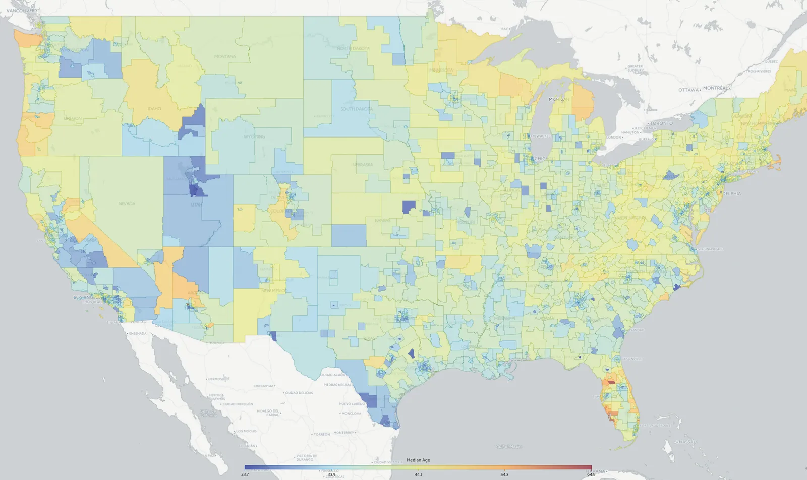
US maps with statistics

The recently joined web site Data USA (datausa.io) is a great source of maps that can serve as backgrounds for presentation slides.

·Story

"Ooff, but we answered you already"

Often, when I start a presentation design project, I find that the real message of a pitch is buried.

  1. Buried under buzzwords and jargon that make the pitch sound the same as any other presentation out there
  2. Buried under “short cuts”: this is a bigger problem. Over time, the company has developed an internal proprietary language where certain key terms summarise the entire concept behind the company. The insiders understand it perfectly, to an outsider it sounds meaningless.

As a result, I tend to get back to the same questions in a briefing meeting. “Why are you different again? What is the difference between your product and the one that company is offering?” My first version of a slide deck often contains deliberately blunt charts that force the client to react and correct a positioning that I think I understood (sort of).

Some people in the room fear that they hired the wrong presentation designer, who keeps on asking the same ignorant questions. Most of the time, I manage to convince them by the time my final product is delivered.

Image on Flickr by Nic McPhee

·Software

Keynote for iCloud, a mini review

I had the opportunity to spend some time in Keynote for iCloud last week. We were editing a Keynote file with many people and needed to stay on top of versions. Keynote for iCloud was the logical solution.

It is amazing to see how web apps have evolved. After a relatively long wait time to upload/open the presentation in the browser, it is almost as snappy as if you are working on a desktop app. Browsing through slides, dragging and dropping of images, all great.

The issue is that there are a few features missing compared to the desktop version that are really important to me:

  • Distributing objects horizontally and vertically. The one biggest mistake people make in slide design is incorrect alignment of objects on the slide. Keynote for iCloud has the “soft guides” that pop up when you drag an object, but as soon as you have to deal with a lot of boxes, there is no way to line things up properly. A similar problem happens in resizing table columns and rows (but you could argue that this is a power user feature that not many users will miss).
  • Manipulating themes, especially colours. You can’t set them in Keynote for iCloud, your only choice is to pick a template when creating a new deck. When uploading an existing slide deck, the theme colours get copied, but only for shapes. In tables they do not appear. And in data charts you cannot set them either.

A smaller issue is that an animation that my client created in the desktop version did not play in iCloud presentation mode. I am not a big fan of animations in presentations so in theory this is not a big deal. But, differences in PLAY mode can create unexpected surprises when you deliver an important pitch and all of a sudden your content is displayed differently in the heat of the discussion.

Continue reading →
·Creativity

Uncovering secrets

I heard the same thing from 2 sources this week. When we design, we are not really creating something new, but we are uncovering a secret that was there hiding in plain sight for billions of years.

Peter Thiel, co-founder of Paypal in the context of building innovative businesses:

John Frusciante, guitarist of the Red Hot Chilli Peppers, on creating music:

Image from WikiPedia

·Layout

Presentation design without the design

Most business presentations can be done perfectly without sophisticated and complex visual concepts. That image of an elephant balancing on a ball, or a 3 dimensional constellation of rotating database cylinders might not be necessary to get your point across.

Instead focus on the non-design challenges:

  • Finding nice full page images that can introduce the problem you are trying to solve
  • Recutting, regrouping, re-wording the key problems and your solution in a very clear and crisp table
  • Deciding what are the key statistics and data you want to use to show that your solution works and that the company is having momentum
  • Organising the more “boring” facts about your product/company in some decent looking tables in the back of the deck (team, product offering, pipeline, terms, etc.)

Full page images, tables, and simple graphs, that’s all  you need (and all you will find in my presentation app SlideMagic). Doing more complicated things is more risky:

  • A perfectly executed simple slide looks a lot better than an amateurish looking effort at something that is more than you can pull of.
  • You can hire an expensive graphics designer to do the concept for your, but her style will be dramatically different from the slides you want to add yourself to the deck last minute

Keep it simple, and do that really well.

·Software

Podcast

I gave a short podcast interview for Oscar Santolalla’s blog “Time to shine”. I give my perspectives on business presentation design, and explain the philosophy behind my presentation app SlideMagic. You can listen to the podcast here.

Image from WikiPedia