SlideMagic Blog

Frequent updates about all things presentations since 2008. Subscribe to never miss a post.

RSS
·Story

Presentations are short cuts

Many of a company’s operational processes have become a lot more efficient over the past decades, partly with the help of automation and computers.

Above the factory floor, middle management of corporations gets more efficient as well. Computers take over routine tasks, and slide/dice data so it becomes easier to make decisions.

Human communication among decision makers is pretty inefficient. People are bad at formulating and selling their ideas. Presentations have helped though: they have replaced long-winded memos and forced people to get to the point faster. Visuals are easier to digest, and more importantly, it is faster to skip through useless pages of a presentation (PGDN, PGDN) than looking for “the meat” in a text document.

This realisation might help you with the design of your everyday presentations. It should look decent. It should get to the point. It should show interesting, unusual, unexpected facts and insights. You want to get to a decision, you are not aiming to publish a complete, scientific document.

Here is where my presentation app SlideMagic comes in, adding even more shortcuts to make corporate decision making more efficient, and less cumbersome, boring and time consuming.

Image from WikiPedia

·Investor presentation

Beyond the presentation

The investor or sales presentation is not the only thing your audience will check out:

  • Do you have a proper email address or are you still using your gmail?
  • Is your LinkedIn profile consistent with the claims in the presentation?
  • Does your web site have the latest company logo and is free from cheesy stock photos?

If you do not have much to share with the public yet on your web site (you don’t have any customers yet, your product is not finished, etc.) it is often better to keep things brief (Coming soon, we are working on […]) in a really crips and professional look, than padding the page with marketing buzzwords and claiming that your are a Fortune500-like company with 20 offices, delivering flexible and scalable ROI to 100s of clients around the world.

Image from WikiPedia

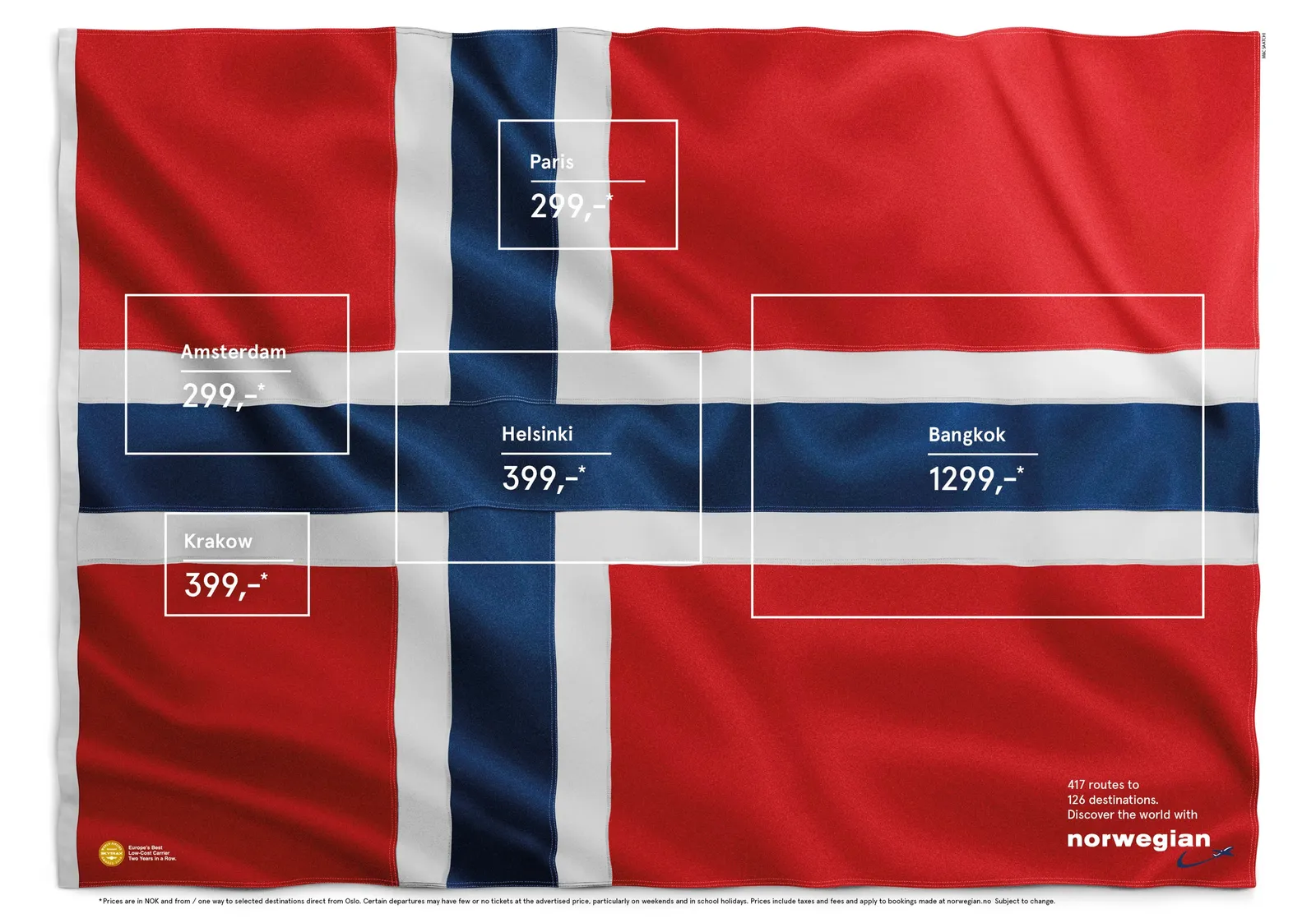
Flags in flags

I don’t think they were the first to use this concept, but is still very nice. A Norwegian Airlines ad.

·SlideMagic

The real competition

As a CEO you are paranoid with competitors who are doing things that are very similar to what you are trying to do. But that is usually not the competitive differentiation you need to emphasise in a sales presentation, especially if you are a tiny startup.

The real challenge will often be to get the client to break away from her current practice. Either a big established product, or maybe she is not investing at all in the sort of solutions you are trying to offer.

In my case as the CEO of presentation app SlideMagic, I could pitch it against other new and small presentation solutions that are out there in the market. But that is not the choice people need to make. I even would not consider PowerPoint to be my competitor for a feature-by-feature comparison. I am competing against the inefficient approach to presentation creation and delivery in corporations. And that is a real challenge :-)

Art: The Chess Players, by Thomas Eakins

Two ways to look at the valuation of your company

Two different storylines about the same company:

  1. CEO: I am running a great company: we are getting really good traction and be able to double sales to $1m in the next year.
  2. Strategic acquirer: these guys have a piece of technology that is the missing piece in my system back end that can generate $200m in revenue next year.

You are not pitching yourself, you are pitching an audience. Understand it.

Art: The Cholmondelay Ladies, by an unknown artist.

·Delivery

30 x 10 feet

A SlideMagic user asked the the other day what to do with a 30 x 10 feet (10 x 3 meter) projector screen that he was supposed to use in a presentation. A 10 x 3 meter screen has a 3:1 aspect ratio and is incredibly wide and “low”. Displaying a regular 4:3 slide on it will leave huge black bars to the left and right of the slide.

The first decision you need to make is whether you want to use the entire screen or not. Pro: you can create spectacularly large slides. But there are drawbacks:

  • A huge screen might overpower you, the speaker
  • It is actually very hard to design slides in this unusual format. Image crops are not natural, and there is almost no avoiding to putting content in boxes from left to right on the slide
  • Finally, it is work to do the above

If you decide to go for the full big screen redesign, then you do not need to create a 30 x 10 feet custom slide format in PowerPoint, any 3:1 aspect ratio will do.

No, my presentation app SlideMagic does not support custom screen aspect ratios, that would go against its philosophy.

·Investor presentation

Talking is the best briefing

A story line skeleton is hardly ever the best briefing for a presentation. It is useful for an analyst who has the fill in the missing pieces of data, not to convey a powerful sales or investor message.

The better approach is to set back and talk things over, that’s when big ideas come out.

Image from WikiPedia

The magic is still the same...

With some clients I am involved for many years. For example, for one client I designed the initial investor pitch when there was not much more than a screen mockup. Now years later, they are ready to raise another funding round with an operational product and paying customers.

Over the years, the company had tweaked their investor pitch and diluted it. Usage stats, go-to-market strategy, mile stones, a lot of “standard” stuff that buried the magic of the product. Sitting down with them, we discovered that this investor pitch will actually be very similar to the one we did years ago. Show the magic of the product, with one difference, this time it is for real.

Image from WikiPedia

·Story

The audio recording test

Next time when you do a pitch in a 1-on-1 meeting record the audio (obviously ask your meeting guest). Back in the office, play it back with the slide presentation closed. Hit pause after every major point and scribble/sketch a quick chart you would use to make that point. When finished, compare your scribble with your slide deck and make the required changes.

Image on WikiPedia

·Layout

But it looks so simple!

Often when I produce a slide with simple rectangular boxes and just once accent colour plus a black and white image (hey that looks like a SlideMagic slide), I get the comment that “things look really simple, unsophisticated”.

No icons, no shadings, Helvetica, no drop shadows, no rounded corners, no gradients, no nothing.

Here is the trick: it is the composition of the slide that makes things sophisticated. And that is the hard part to get right. Look at the work of the famous Swiss graphics designers of the 1960s. Most of them designed posters with the very same tools that you have in your hands when opening PowerPoint.

Look some of the simpler posters, look at your slide, look back at the poster, look at your slide. Spot the difference, and fix it!. It is layout, not fancy graphics.

And, my presentation app SlideMagic makes it a bit easier than PowerPoint or Keynote.