SlideMagic Blog

Frequent updates about all things presentations since 2008. Subscribe to never miss a post.

RSS

Creation versus polishing

Any creative software is full of distractions that give you excuses not to be creative. In presentation design this could be experimenting with fonts, colors, drop shadows, 3D rotations, or checking all those spectacular animation effects.

Creativity requires the opposite. A tool with few features, which you now inside-out, that enable you to jot down/capture your thought somewhere before it is gone. You have an idea how to tell your story, struggle with a PowerPoint feature, spend 15 minutes Googling tutorials, and fail to get back into the creative flow after.

Use a notebook (or my simple presentation design app SlideMagic) to capture your idea from start to finish before it evaporates.

Art: Fritz Stotz Mädchen beim Silberputzen 1919

·Investor presentation

Refreshing language?

It is tempting to describe your product in a completely new vocabulary to illustrate that you do things differently.

Still, the first thing that a potential customer or investor will do, is to translate that back to the old vocabulary in order to figure out what is different, and what is not.

Often it is better to do part of the work for them. This is especially true for impatient investors who are not always convinced that something that sounds completely different, is in fact, completely different.

Image: The Treachery of Images

·Investor presentation

That annoying junior analyst

Overheard in a meeting. “Don’t put in too much detail in the 5 year financial forecast. It can never be accurate anyway, and you run the risk to wake up that annoying junior analyst who has not said anything the entire meeting, and let her zap the entire momentum of the pitch”

Agree, super precise forecasts 5 years out can never be correct. But:

  • A consistent 5 year P&L with realistic margins and marketing spend is a sign that the company knows what it is getting itself into. It is not a test of accuracy, it is a test of management competence.
  • Analysts can look junior, but could actually be reasonably senior in an investment organization. Or, even if the analyst is junior, convincing rather than bypassing them is a required hurdle in the investment process. “Hey Sally, did their financial planning make sense? You looked at it right”
  • Maybe it is actually good news that the analyst did not ask a lot of questions about the other content in the presentation.

Image: Promotional photo of the cast of the CBS television series Whiz Kids

·SlideMagic

Smart row / column insertion

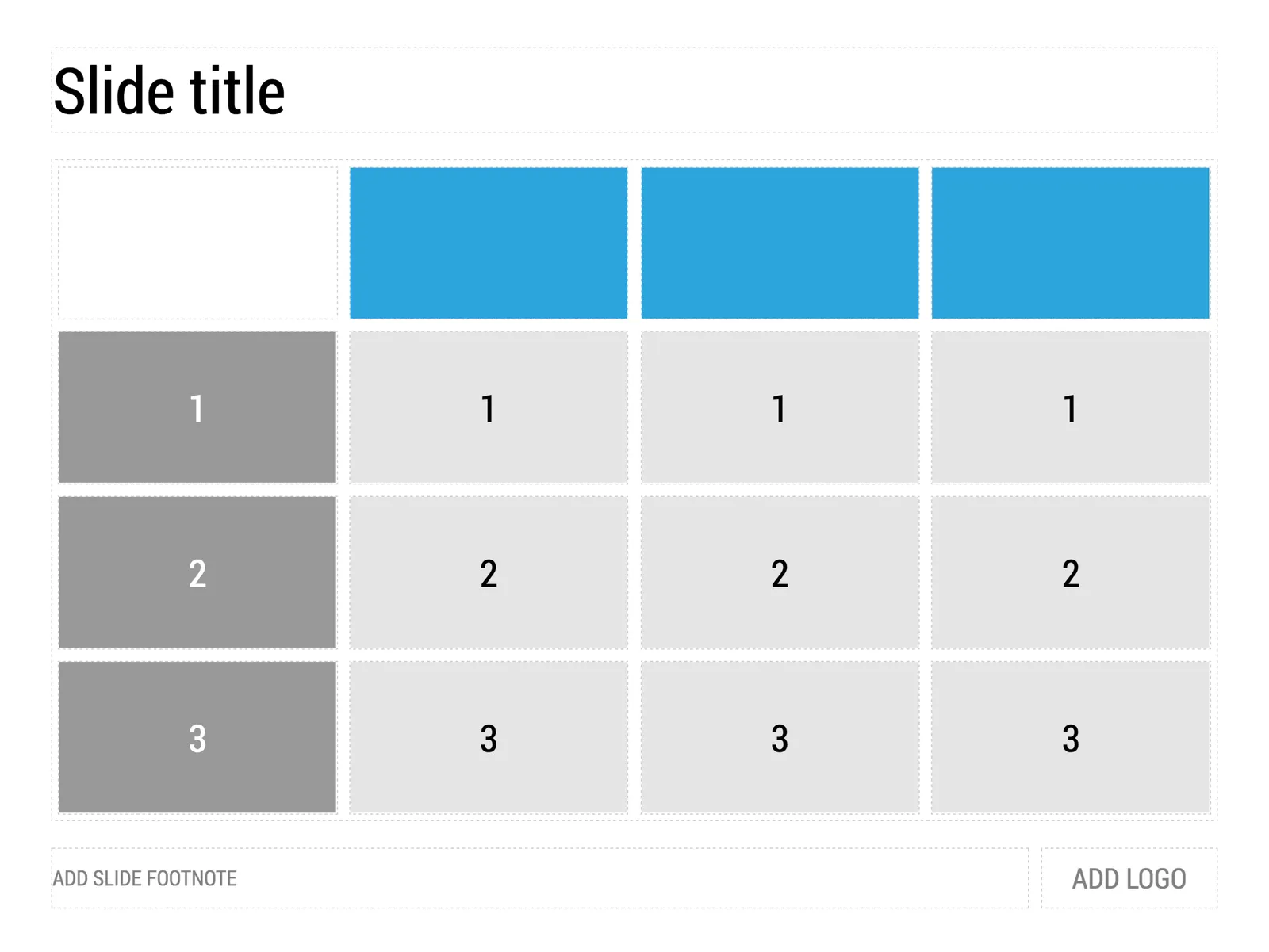
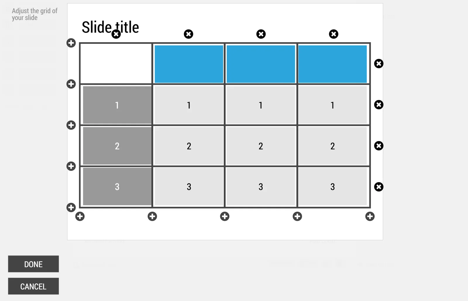
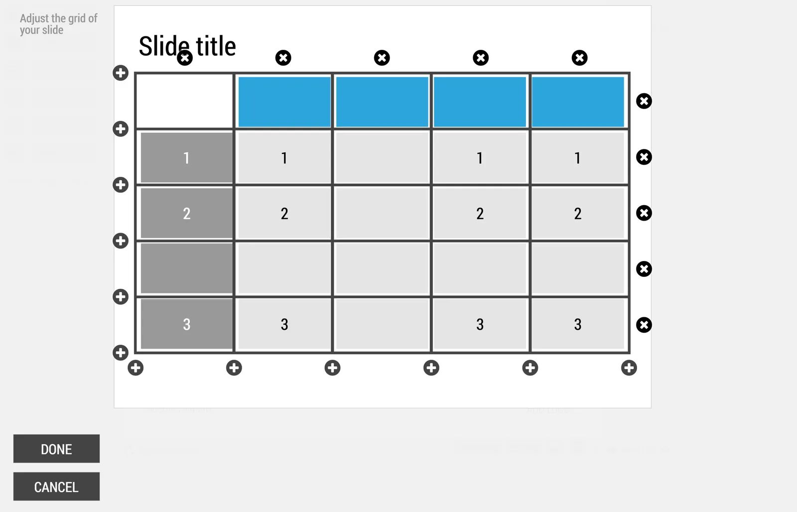
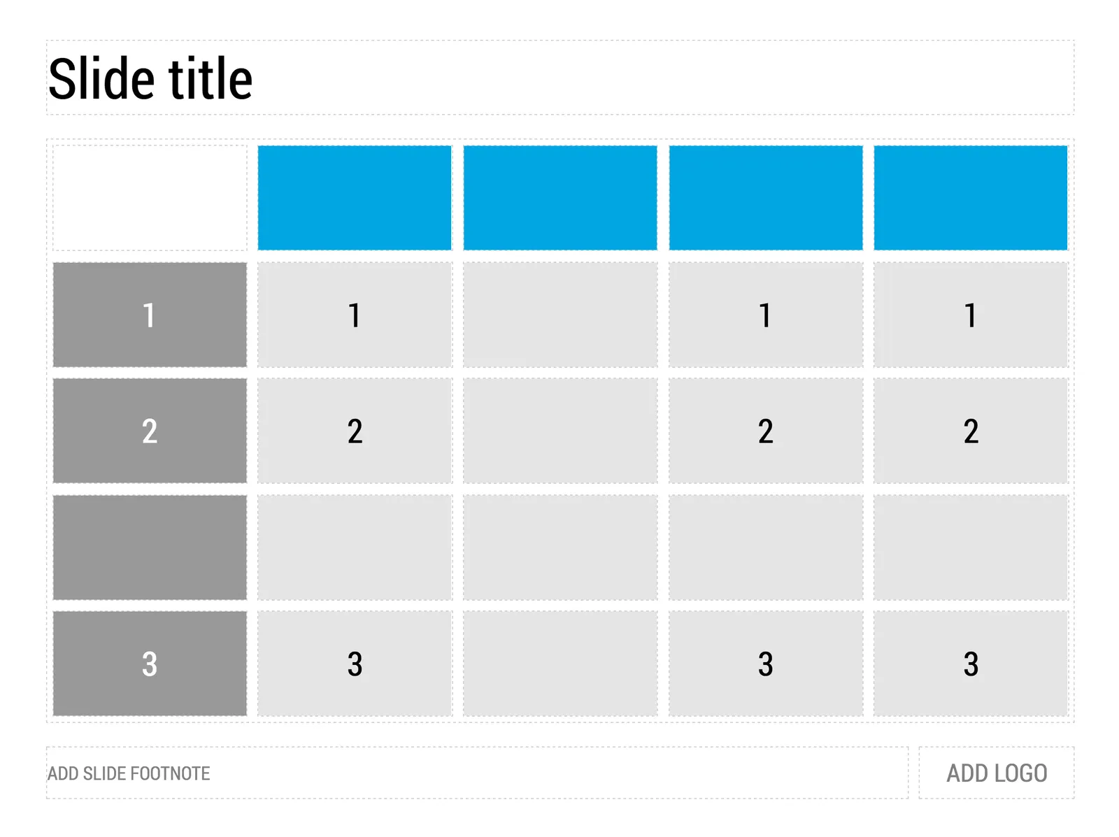
My presentation app SlideMagic is all about the grid. We have made some improvements to make the workflow (even) faster. Now, when you insert rows and or columns, it copies its design and structure from its neighbors. This will save you a lot of time in more complicated table layout with different background colors.

 1) Our starting point

1) Our starting point

 2) Open the grid editor

2) Open the grid editor

 3) Add a row and a column

3) Add a row and a column

 4) The result

4) The result

Image via WikiPedia

·Investor presentation

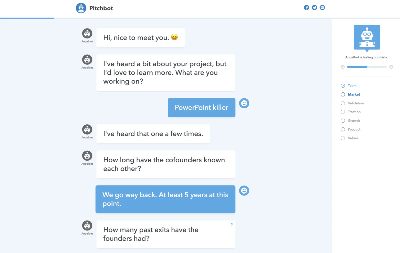
Pitchbot - chat bot to practice investor pitches

This is nicely done: pitchbot. It gives you a nice feel about what a discussion with different types of investors might look like.

Art to preserve dignity

Art is a subset of design, it wants to change you. The “Hope” poster from 2008 captured the feelings of many (not all expectations came true though 8 years later). The same artist is part of a broader group who has started a campaign to use design to remind us of humanity. I think it should appeal to everyone across the entire political spectrum who believes in human values, civilized debate, and pragmatic government.

"Marketing English"

Sometimes I get feedback from marketing communication consultants that the English in my presentations needs to be improved in order for it to become proper “marketing English”.

I consider this a compliment. “Marketing English” filled padded with buzzwords and long, elaborate sentences is making every product brochure or presentation in high tech sound pretty much the same.

I do recognize though that I am not a native English speaker, and that a native English speaker can figure that out after reading just one sentence on a slide. But I am not communicating in “proper English”, but rather “global business English”, which I picked up at business school back in France. It is a subset of English with a vastly reduced vocabulary, just enough to communicate important business concepts to other non-native English speakers. (I am not there yet with business Hebrew though).

If you are not a native English speaker, don’t try to force a “grander” language on yourself, instead, it is OK to keep things simple and direct. Fix those typos though (I admit that I can be sloppy here as well) and yes, it never hurts to ask a native English speaker to glance over your text of an important presentation. Then decide what advice to incorporate, and which suggestions to ignore.

·Data visualization

Investment bank memos

Investment bankers usually prepare the data rooms for due diligence in M&A transactions. Shelves full of information that is usually summarized in an information memorandum. I never found these summaries very useful. It is impossible to create a financial picture in hour head from just reading text with data. “Last year’s sales were x, growth for the 3rd quarter was y, the company is doing business in 3 product segments.” The only way to understand this is to extract the information and put it in tables or graphs to see what is going on.

And that is most of the times exactly what the buying side will do, hire a consultant/analyst to go through the material and start creating these charts, then someone more senior will go through the charts and select which ones are important, and which ones not.

You can accelerate the sales process by anticipating all of this, and do some of the homework of the buy side. In the process, you can spoon feed them the right insights you want them to have.

Similar but unrelated, this is also why wordy descriptions of company results in newspaper articles do not work for me. The journalist took the data tables and graphs and translated them into words, the exact opposite direction of where I want her to go.

Image by Andreas Poike on Flickr

·Story

What questions do you usually get?

They are an indication of what is missing in your presentation. They come in 2 types:

  • Easy ones. You think something is so blatantly obvious that you saved some slides by taking it out. Apparently your audience disagrees.

  • Hard ones. If everyone brings up this question, and you know it is one of the weaker point of your story, you might as well address things, since even if you had a meeting where the question was not asked for a change, it is highly likely that the audience did still have it.

Read your audience carefully. Does the same person ask the same sort of question again after she said that she understood a previous answer you gave? Does the person say she understands, but her eyes tell a different story

·Investor presentation

Elephants in the room

Client “I don’t want to talk about this, because it reminds people of [X] which failed. Let’s call that differently because there was that research project 10 years ago that did not work. Hmmm, let’s not put that on page 3”.

Me “But your technology solves all these problems from the past right?”

Client “Yes”

Me “And in meetings, where do you end up talking about all the time”

Client “People confusing me with technologies from the past”

Sometimes it is just better to take things head on and stop avoiding the big elephant that is sitting in the room but nobody wants to bring up in a conversation.

Image via WikiPedia