SlideMagic Blog

Frequent updates about all things presentations since 2008. Subscribe to never miss a post.

RSS
·Culture

All the slide templates you will ever need

With my presentation app SlideMagic I aim to change the communication culture in corporates. People spend too much time preparing slides. They produce documents that are unattractive to look at, and spend far too much time falling asleep in conference rooms.

The solution: splitting the communication tools: Excel and PowerPoint for logging the analysis, and a new tool 100% focused at communicating an idea and getting to a decision. A super simple visual language does not allow you to get lost in crafting complicated slides, or worse - give up all together and just use bullet points on every chart.

In a business presentation you need very few visual concepts:

  • Listing and organizing stuff (yes, the dreaded bullet points)
  • Comparing, contrasting, things
  • Showing growth, trends, forecasting
  • Showcasing things (products, people, clients)
  • Linking one thing to another, impact, cause/effect, from-to

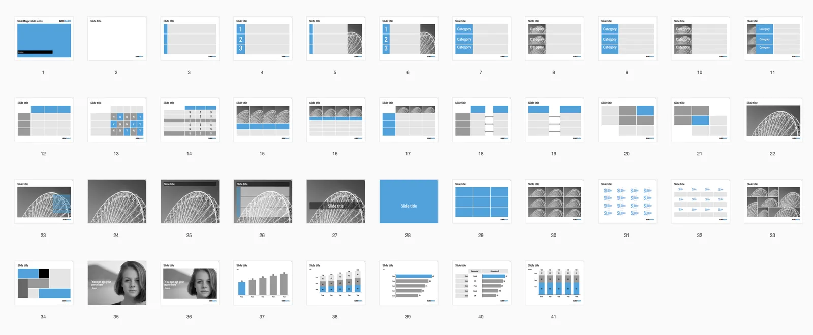
When you hit “insert” in SlideMagic, you get presentation with this list of slide templates. In my opinion they can cover 99% of your business presentation needs. Think about what you want to do (listing, comparing, forecasting, showcasing, linking), pick a template and adjust row/column counts and you are done.

If you want, you clone this entire slide deck in your own SlideMagic account via this link. Let me know which concepts that I have left out you cannot live without. Maybe processes, timelines?

·Advertising

"Messaging"

People ask me whether I take care of the “messaging” of presentations as well. I do, but I do not really connect to the concept. Maybe it is because I come from the world of engineering and consulting, not advertising.

“Messaging” is often used in a marketing context for a consumer audience, not an investor audience. Should we emphasize that this gadget is beautiful, or powerful? In marketing presentation you would say “now in 3 gorgeous colors.” In an investor presentation you would put a competitive analysis that show that the marketing strategy will focus on esthetics.

“Messaging” is often the basis for a design process that revolves around words and sentences. How should we call the benefit exactly. What slogans to use. I tend to think visual, and like to brainstorm concepts visually.

“Messaging” can sometimes come in the form of a prescribed flow of a presentation, we finished the messaging, now “just implement it”. Not my kind of brief.

“Messaging” can also mean sorting out the company/product positioning. This is a big piece of work that usually falls outside the scope of a presentation design project. No story, no presentation.

 Source: http://tpdsaa.tumblr.com/post/3106513440/submitted-by-copyguy

Source: http://tpdsaa.tumblr.com/post/3106513440/submitted-by-copyguy

So do I do messaging? It depends.

More work

As an employee you get “please do this, it will look good on your annual performance review”, “or do this, because your colleagues obviously have no problem with it”. As an independent freelancer, this is replaced by: “please do this project (more or less) for free, and we will have lots more work in the future”.

If you start out new as a freelancer, or if you have hired a few employees yourself, creating a fixed cost base that needs to be filled, this button still can work. But I think for most experienced freelancers with some sort of brand and a large base of existing clients, this does not work anymore. These people probably all work at capacity, and pick projects because they are interesting, push their skill level up, or help out a long standing client even if the work is not interesting.

Filling empty capacity is hardly ever rewarding. SEO, shallow “content” that is pushed on social media. It is better to do great work, get clients excited about you, and get them to refer you to more projects.

I agree that it takes some investment in the beginning. If you are in the early stages of a freelance career, maybe you can suggest to do this project for the full price, but the second one at a discount. The client said she has lots of more work, so that should not be a problem for her.

Art: Marie-Denise VillersSelf-portrait, Young Woman Drawing 1801, Metropolitan Museum of Art.

Podcast appearance

I did a 30 minute podcast interview with Sally Koering Zimney who runs the “This moved me” public speaking blog. Have a listen here. I talk about slide design and the philosophy behind my presentation app SlideMagic.

Where does your pitch go wrong?

I have seen hundreds, maybe even thousands of company pitches coming across my desk. Each has their strengths and weaknesses. Here are some stereotypes:

  • An overload of scientific data hides the brilliance of a invention (often in the healthcare field)
  • A very straightforward story of an Internet startup is perfectly clear, but somehow looks very amateurish, making the team look amateurish too.
  • Super long-winded description of the what this technology is going to do, without any substance on how it is going to be solved, and who is going to solve it by the 3 months time frame put in the presentation
  • Feature/benefit overload, making the audience doubt whether there is any distinctive benefit at all
  • Failure to explain what the brilliant idea actually is/does
  • Buzzword overload: “these people must be lacking substance of they need all that padding”
  • Default Microsoft Office color scheme
  • “Holy Grail” type of ideas, we will combine this, this, this, this, this, and this to stitch together the ultimate offer (we only do the stitching though)
  • Step 1 of the action plan: hire someone who is actually going to do the work
  • We started in 2003, then in 2005 we added, then in 2006 this happened, then in 2010 we hired, etc.
  • Let’s use the one dollar shave club video as an example
  • The bulk of the presentation consist of IT architecture diagrams
  • “This presentation is almost perfect, you just need to edit the messages a bit”
Continue reading →
·Creativity

Provoking input

In some projects I am literally stuck with lack of inspiration. The slides don’t look good, the concepts don’t pop out. To get going again I actually send the draft slides to the client, who inevitably will come back to me with “hey, we are not there yet”. But in addition, it is often the few other comments that she makes, that provide a way out of the impasse.

It is hard to force creativity…

"It is just an animation"

Many junior analysts are struggling to sell their minimal slides to a boss who is insisting on combing slides 2, 3, 4, and 5 into one “to save time”. Here is one line of thought you can try: convincing here that slides 2, 3, 4, and 5 are in fact already one and the same slide, it is just an elaborate animation that you spread out over a couple of pages to make editing easier. “The audience will perceive it as one slide”.

You can make your argument more credible by making sure that there are connecting elements on your slides that stay the same as you switch pages.

Image via WikiPedia

·Software

Struggling with Apple Keynote

I am currently doing a bespoke presentation design project for a client in Apple Keynote rather than my usual PowerPoint. Overall, Keynote is a great piece of software, but as a power user I seem to be hitting its limitations. Not in terms of features, but in terms of workflow.

In PowerPoint, I have developed a pretty rapid process to turn scribbled chart concepts in decent looking slides. (Confirmed by the occasional client who can look over my shoulder while I do some last minute edits close to a deadline). It is the simple things that you need quick access to: changing colors, resizing objects, aligning things.

In Keynote I am “tearing my hear out” to do a few things. I know this blog is read by many presentation design gurus, so maybe one of you can point me out what I am doing wrong.

  • Getting a shape color fill. I keep on clicking the rainbow circle, but it is not always clear whether it is active or not, and if it is, whether you are working on a font color, shape color, or outline color. The same with making things semitransparent: shape, text, line, or everything combined.
  • I can’t distort the aspect ratio of grouped items when scaling up or down. This is great for images, but not handy when you want to scale up an object composition to fit an entire slide exactly
  • When you select multiple items, you can’t scale up or down all of them together
  • You select items by “touching” them, not by including them in the entire selection box. As a result, you always hit objects such as the slide title by accident in your selection
  • I have not found a way to space out part of the columns or rows in a table evenly
  • For some reason, I cannot change the color of the left marker in a gradient. My solution is to put another marker on top of it. Again, this leads to frustrated clicking on the “fill” box.
  • In the full button, there is a nice arrow that activates a drop down menu with suggested colors, there is no way I can set these to some alternative color pattern.
Continue reading →
·Creativity

Adobe Illustrator designers vs PowerPoint designers

Now and then I encounter a PowerPoint presentation at a client which is clearly the work of a designer who comes from the world of Adobe / brochures / infographics. Here are the differences with my style:

  • Often, an incredibly spectacular opening slides (sometimes 2-3), lots of detailed artwork, lots of time invested. Serious designers with powerful graphics design tool out-design me easily.
  • But after a few pages, the design quality drops of, and you can see that these slides are created rather last minute, in a back and forth between the executive and the designer. Maybe there is the occasional icon, but most of it is text bullet points, which are formatted by a professional.
  • Usually PowerPoint’s template functions are ignored, guides, color schemes, defaults, making it very hard for anyone but the designer to add/change slides. “Insert new slide” gets you a blank standard PowerPoint page with nested bullets
  • Heavy use of custom fonts, looking way better than the standard PowerPoint fonts, but they cause issues when displaying the file on other computers without them. Versions of old presentations usually continue to live through the organization without people even realizing that their headlines show in Arial rather than the intended font
  • Massive file sizes as the images are kept in at their highest resolution

Business presentation design is a blend of practicing good design, and making compromises to deal with the practicality of working with lots of non-designers. Being able to deal with frequent changes, keeping design standards up (also on page 5 to 20), and making sure that everyone can make decent looking edits in the presentation.

Continue reading →

Bottom up or top down?

I do both.

Story design. Contrary to good practice I usually start bottom up, designing one or two slides to get the look and feel of the presentation master right, then usually the “killer slide” that captures the most important message of the presentation. After that, I go top down and layout the entire presentation.

Slide design. Contrary to most people I go top down, loosely putting slide elements and scribbling text that is imprecise and not final yet, cleaning things up later.

Image via WikiPedia