SlideMagic Blog

Frequent updates about all things presentations since 2008. Subscribe to never miss a post.

RSS
·Story

Write for your audience

Every communications books and marketing strategists says it. Who is your audience? And many presenters would answer I know: the “C-level executive who is eager to get efficiency and transparency benefits for a better price than the current offerings in the market segment in between premium and super premium”.

That does not sound like a real person to me. Maybe it is someone new on the job who wants to impress her boss. Maybe it is someone buried under so many projects that she does not see how she has time to take on another one. Maybe it is someone who does not like that you get back to emails only after 5 days. Maybe it is someone who ia upset that you still keep talking about things she said she was not interested in. Maybe it is someone who needs to convince a colleague to use your product.

If you cannot visualize your target audience as a person, you might not have found it yet.
·Typography

ALL CAPS

Some people use ALL CAPS TO MAKE A TEXT STAND OUT. That’s not a good use of all caps. It looks busy/messy, especially when used frequently on the same page. A subtle use of bold is better, and if you find yourself bolding every other word, maybe it is a signal to reconsider the design of the slide.

I like using all caps for labels or tags, especially if the text in these tags has similar length. The consistent height of the characters creates nice and stable elements on the page.

Consider reducing the font size of your all caps tags though, from the font your are using for the rest of the page. All caps look bigger (by design).

·Story

The song is always too long

Advice from a music teacher to amateur musicians: “You think the song is too short, the audience (almost always) will perceive the song as too long”. When you are an amateur musician, who sticks her out by performing on stage, you get instant sympathy, even without having heard a single note. If you play decently, people will enjoy your performance as well. But, because you are not (playing like a) famous rock star, patience / novelty might run out after a while. “Ah, she is going for another verse”.

Have the courage to keep it short.

·Delivery

Huge audience speeches

The protests against the attempt to weaken the Israeli democracy are continuing. Every weekend there is a 100,000+ demonstration in central Tel Aviv (14 weeks and counting). As a result, I have heard my fair share of speeches made by politicians and activists.

The bar for a good speech gets higher. A politician who tries a very long sequence of cliche sound bites (we will win, it unfair, we won’t let them), is unlikely to excite the audience anymore. What can work?

  • Crowd managment, some people have the charisma, voice, and ability to time sentences to sweep up a crowd.
  • Personal stories. Some speakers, even with weaker voices and/or a smaller stage presence, manage to connect to 100,000 people who listen quietly
  • Original plots. Coming at things from a different angle, drawing possible future scenarios, rather than cliche sound bites / one liners
  • Keeping it short. Most speakers fall in the trap of repeating themselves, and taking too much time. Shorter, even very short, speeches are way more memorable.
·Layout

Selective highlighting

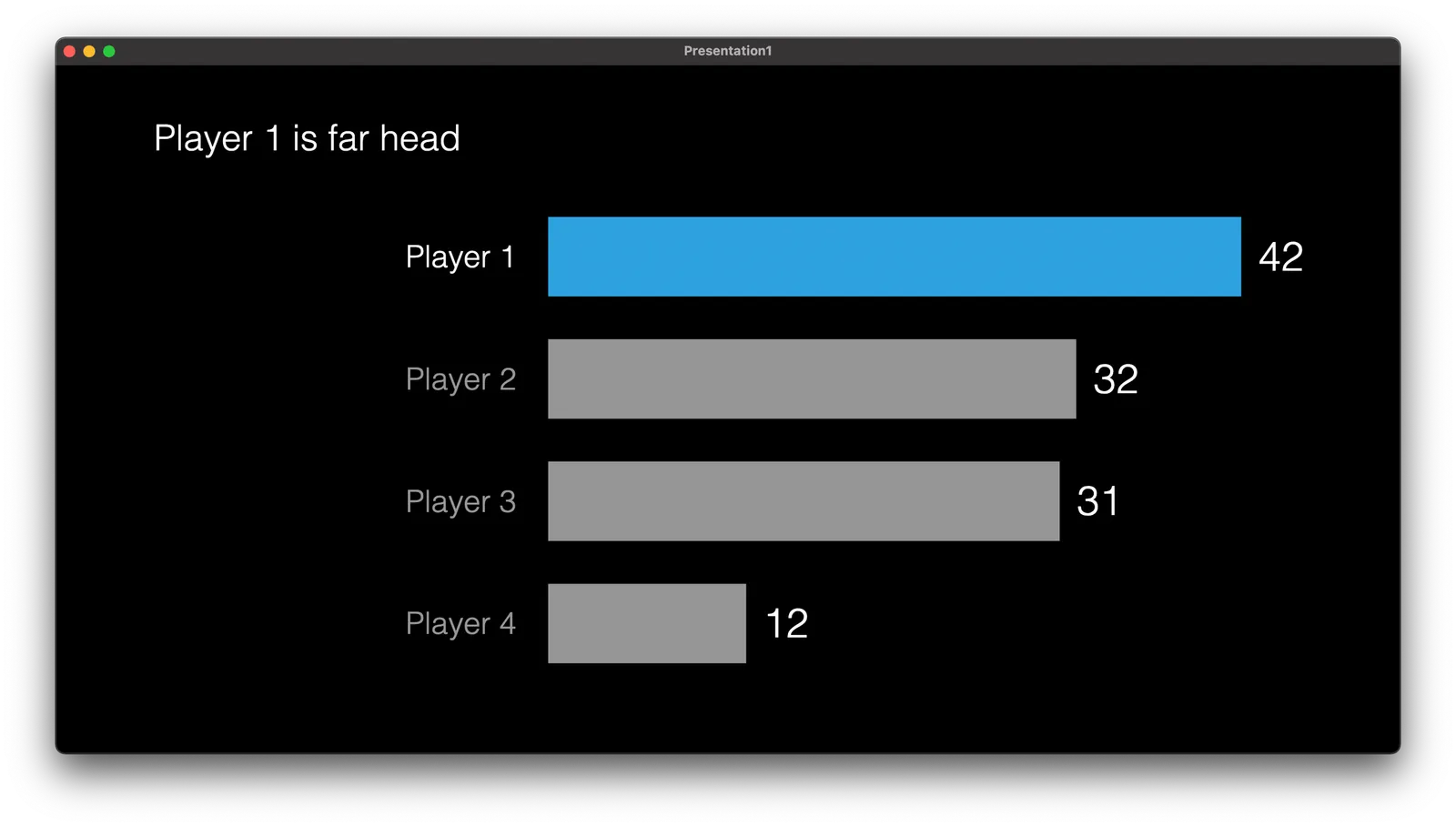
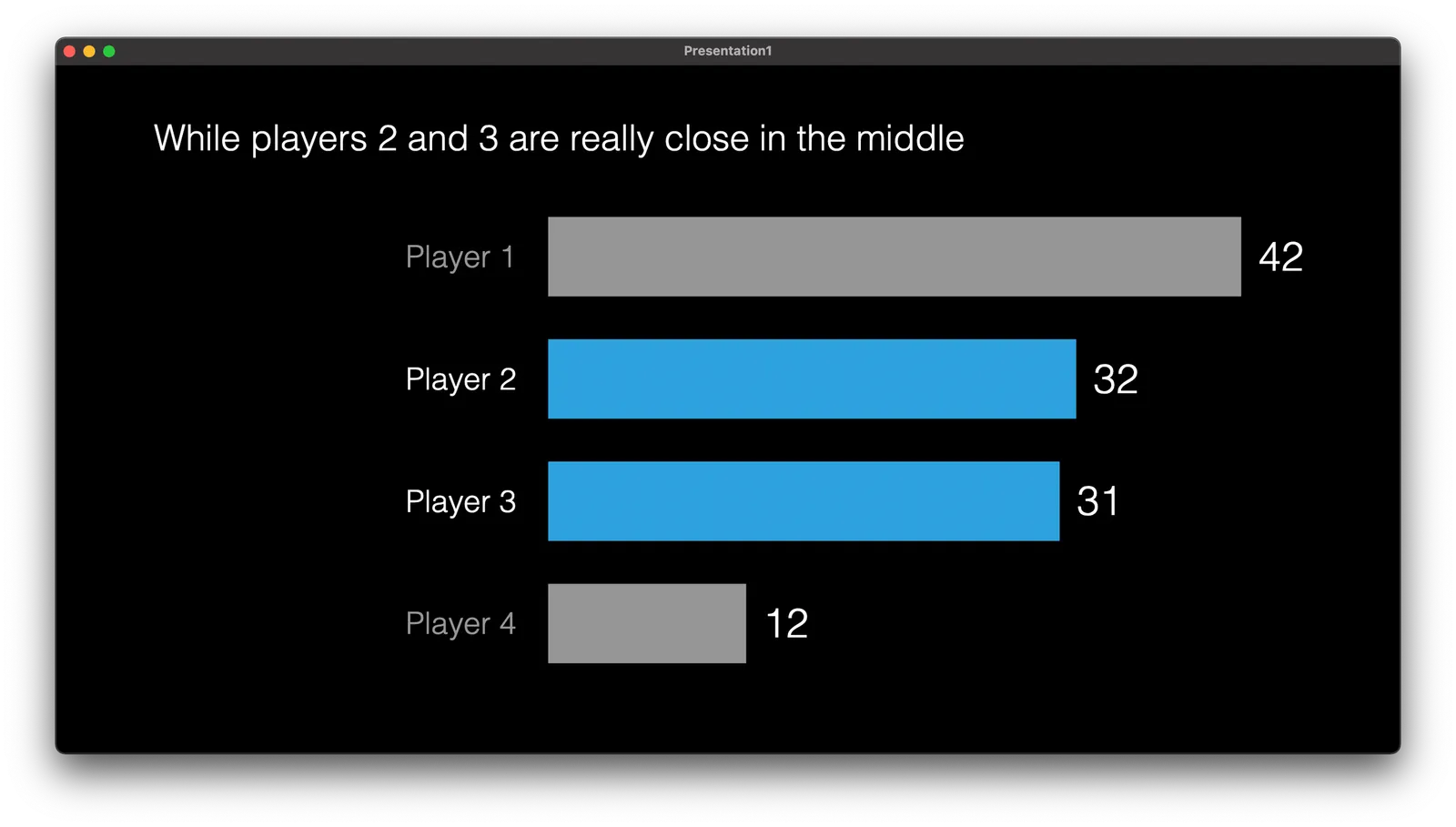
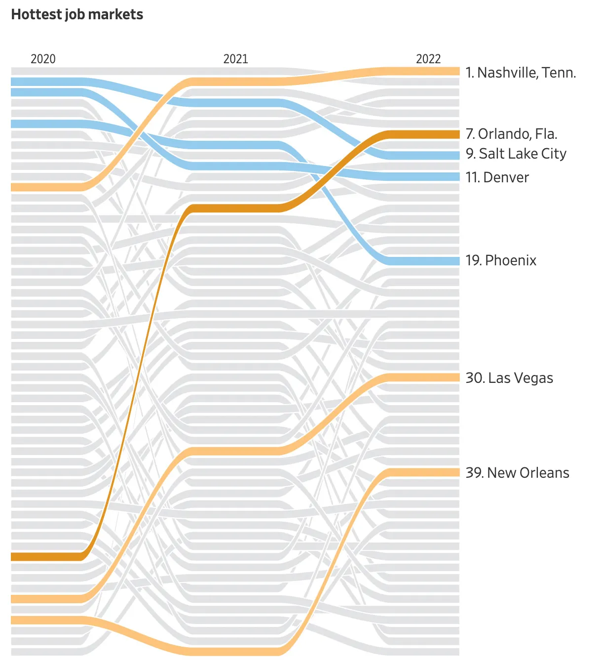
This chart in the WSJ shows how you can focus on data points that matter to your story, while literally ignoring other data points that are less relevant.

This slide is obviously super complex, but you can also apply this style with more mondaine, everyday slides.

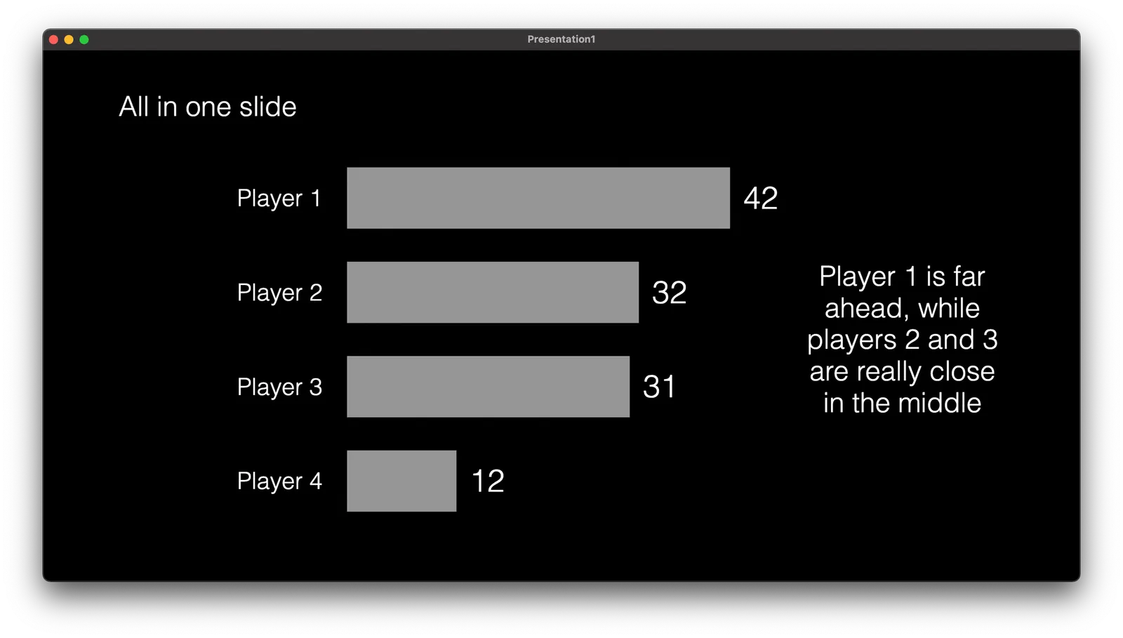
Instead of complex animations, it is easer to copy a version of your chart in consecutive slides, and adjust the coloring and messaging to highlight the points.

This approach also makes sure that your story is visible in environments without animations (PDF, mobile devices)

·SlideMagic

Student plan applications

SlideMagic offers free Pro subscriptions to students (sign up here). For many countries there is automated, instant approval if you log in with your university/school credentials. For some countries, reviews are still manual. Make it easy to get approved by filling out the form correctly if you are in the latter box. Use your university email address, and provide a link to a profile (LinkedIn, school/university) so we can verify your status. We see many anonymous gmail addresses, and empty profile links in the applications, and we won’t switch these account on to the student plan.

·Layout

Designing with actual data

There is a reason why many presentation templates and data dashboards look so bad: they have been designed without actual data.

Most corporate presentation templates are the result of the work of a designer who has been given a white page to add some stuff to. The resulting white template page might still look OK, but when it is filled up with typical slide content…

Information dashboards looked great in the mock up screens: dials, tables, buttons, graphs, until they are populated with typical data: text blocks are longer shorter than in the mockup, important data is actually not there, non-important data is, all graphs look flat, and all dials have more or less the same color because the values don’t change that much.

Presentation template designers, ask for an actual deck to start working on. Dashboard UI designers, ask for a real data set.

And we are back

The past few weeks have been quite a roller coaster here in Israel. I spent a lot of work, and emotional energy on preventing that Israel would loose its democratic foundation. It looks like we are out of the woods for a couple of months and I will try to pick up the blogging effort. From a communications perspective, I learnt some interesting things over the past weeks.

·Data visualization

Women in the workface

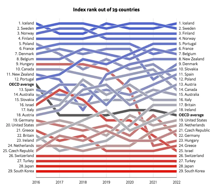
On women’s day, here is an interesting visualization by The Economist to show the role and influence of women in the workforce:

What is used:

  • Big, bold, fat lines
  • Color coding using a gradient based on the last available year’s ranking
  • (Not visible on the static image) When you hoover over a line, it lights up with the rest being faded out

Lines that break the pattern will pop out (Israel, Hungary).

One caveat though, these are all 29 reasonably wealthy countries. The situation might be a lot worse in the other 150+ countries that are not on this list.

·Delivery

The first take

On many famous music recordings, an artist’s first take often made it on the final record:

  • A stress-free, we will just try something, approach
  • Some happy mistakes that turned out great
  • A clear mind, free of tangents

In presentations, something similar often happens. After weeks of work, you sit down and say “OK, this is what it actually boils down to”, and out comes the perfect story.

This only works after, you invested in the hard work and really understand what you are talking about. It is a first take of telling your story, not a first take of doing the project.