

The F1 graphics designer has the same problem that we presentation designers face: how to deal with logos that have completely different aspect ratios. Very long ones vanish in a square tile, square and round ones don’t look good in a wide rectangular box.
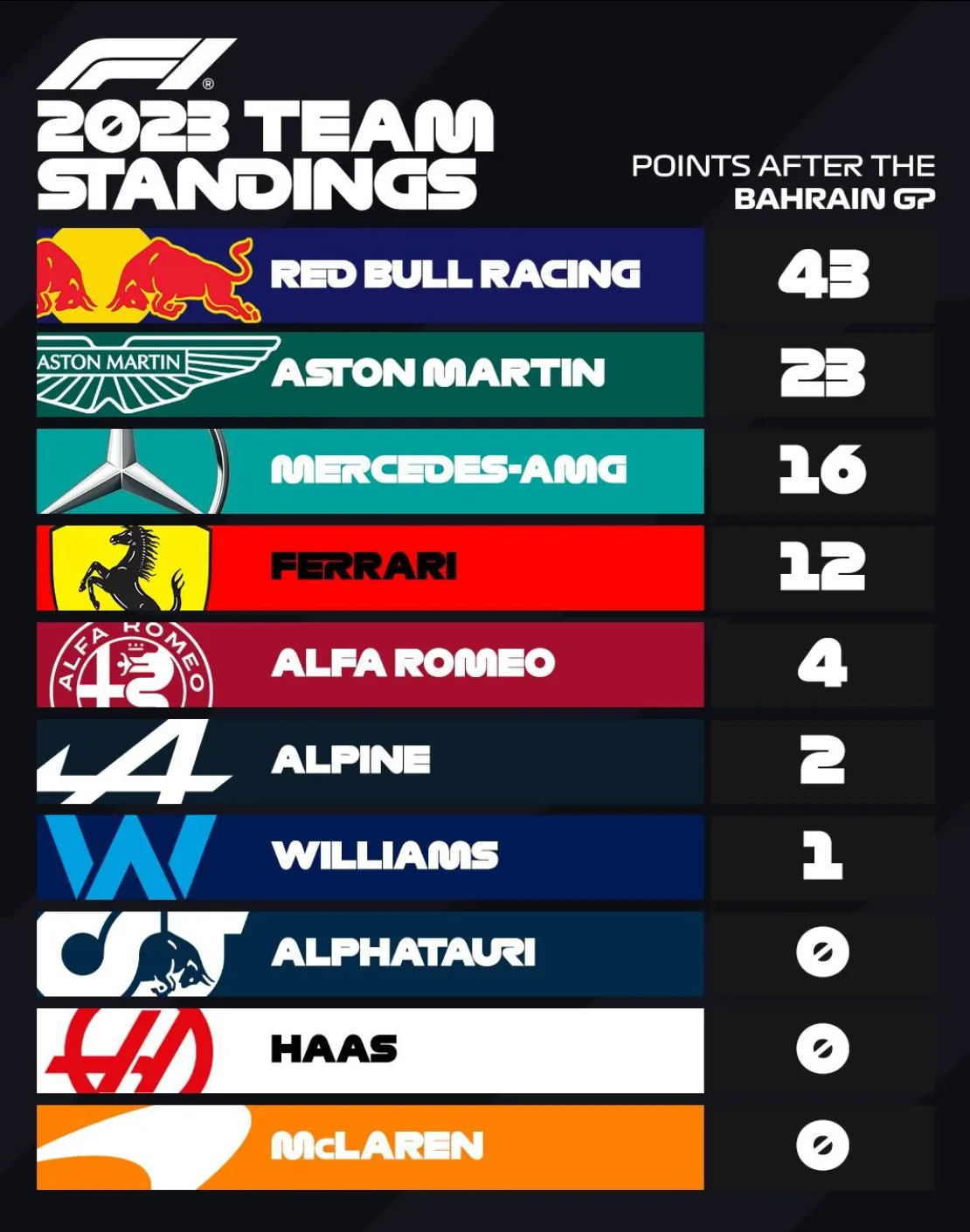
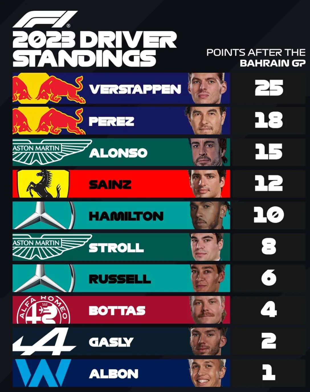
Their solution: let go of the requirement that the entire logo should be visible. Carefully crop out parts of the logo while making sure that it can still be recognized and read. All this is supported by borrowing the dominant color of the logo in the text box.