SlideMagic Blog

Frequent updates about all things presentations since 2008. Subscribe to never miss a post.

RSS

PowerPoint template management

PowerPoint templates in big companies are a mess. When thousands of people start sharing PowerPoint files it will take less than 3 months for a corporate template to be vanished due to the many personal modifications and mistakes people make. Here is a survival guide.

  • Create a simple template
    • Use a PowerPoint expert to create it, not an Adobe Illustrator master, because you need to know how to set default colors, shapes, text boxes, page numbers, left-to-right orientation, etc.
    • Create some sort of a box of drawing guides to limit the canvas and leave white space around the edges. Many people might ignore it, but they will have a mental urge to put things inside that box. Put the drawing guides on the master slide so they can’t be moved by accident.
    • Keep it super simple, I would go for one title slide and one regular slide maybe a separator
  • Teach hygiene (this is the hard part). Ask employees every time they create a new presentation to start with this template. Every time. Even if they want to reuse 90% of an existing deck, have them open the clean template, copy paste the charts from the old file into it and save the file.

I wonder whether it is possible to do the hygiene thing with a macro button in PowerPoint automatically, it must be.

Given the above mess, you will understand why it is not possible to modify the slide template in my presentation app SlideMagic.

Continue reading →
·Video

Corporate videos

As a presentation designer, I get to sift through a lot of corporate introduction videos, most of the time, I am looking for some decent still images that I can use as a background for an introduction slide about a customer or strategic partners.

A lot of money is going into these videos. Sophisticated motion graphics, upbeat music, soothing voice overs.

Most of these are hosted on YouTube, so you get a sense of how many people actually watched them. In most cases: a few thousand at best, but many have far, far fewer views. The majority of which is probably the creative team and the people reviewing drafts at the client.

Why? I do not have scientific evidence, but here are some possible causes:

  • There is actually not that much information in these videos, except for the usual buzzwords about helping improve the environment and making the world a better place. An analyst who wants to know what the group is all about, can spend the 3 minutes it takes to watch the video better in other places on the web site.
  • (Related) These videos are full of stock video cliches: pretty board rooms against a view over the park, happy families running in that park, a drone going up the corporate sky scraper.
  • In the case of conglomerates, a large part of the video is spent on justifying the existence of the group, what ties them together? This is a hugely important issue for the conglomerate management, but for the student, investor, journalist, customer, potential employee, it does not merit 50% of the 3 minutes.
Continue reading →

Let go of stale diagrams

Sometimes, an industry sector is used to specific diagrams to describe their environment. The same mental and visual mindset frame shows up over and and over. In some cases, it might be worth chucking that all way and start fresh.

Write down on a piece of paper what are the 3, 4, 5 elements that should pop out in your presentation. No go back and think of a framework, diagram, composition that can fit all these elements (and nothing else/more). You might be surprised what you can come up.

If stale frameworks complicate your ability to explain, it might be time to let go.

One exception, competitive market positioning diagrams. Investors, clients, might be used to a certain representation of reality, it is useful to have a backup slide that shows your position in a conventional industry map.

·Investor presentation

Wobbly propositions

Internet / mobile consumer propositions can be constantly changing, and ambiguity can be a great driver of the creative product development process. In investor pitches though, you need to freeze the brain storming and present one consistent, stable product.

Investors need to make 2 leaps: understand what your product is about, and get a sense for the product you want to offer. In 20 minutes, you can’t introduce 3 variants, discuss 10 other cool ideas, leave that for the follow on meetings.

These type of app ideas are very hard to describe in bullets or even pictures. The best way to get things across is to create a very specific user case example and describe a sequence of events, interactions between users. You can alternate between images, mock ups, etc.

The priority of all of this is to explain and show things, “pretty” comes in second. Sometimes investing a lot of energy in making screen mockups with buttons and sliders actually makes the app idea harder to understand. To show that you have design skills in house, you could take one app screen and turn it into a pretty mock up.

A side effect of this effort in an investor presentation might be that you get more clarity inside your senior team what your product should look like.

Image by Nicolas Henderson on Flickr

·Software

Watch out: converting DOCX to PDF

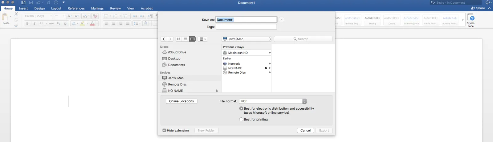
In a recent update of Microsoft Word (Mac version 2016), a new option has been snuck in when saving DOCX document as PDFs: “best for electronic distribution”. and it is the default choice. This will probably produce documents that are smaller, but it comes at a price: custom fonts are not embedded correctly. Pay attention which option you pick and do check the PDF document before sending it to see if all font renderings worked out correctly

·Investor presentation

Investors pitching themselves

Investors need to pitch themselves as well to raise money for their own fund. I get to see many of these decks from clients. And in them, investors make the same mistakes that they advice potential and actual portfolio companies not to make.

To be honest, they might even be worse. Unlike a normal company, there are very few things that differentiate the operations of one PE, VC, hedge fund, from another. And secondly, the presentation culture in finance is very conservative, most institutional investors (the ones investing in PE funds), want a sit down meeting with a paper document in front of them.

Here are some of the bullet points that will show up in any investor presentation:

  • We are a highly experienced team
  • We delivered great returns
  • We do really thorough due diligence
  • We do extraordinary risk management
  • We have a very sophisticated modeling capability
  • We are hands on with our portfolio companies
  • We have proprietary deal flow
  • We are being loved by our portfolio companies
  • We have a unique network of partners

Think about an institutional investor who receives hundreds of these decks, all making the same points, written in the same style, using the same (blue and grey) colors.

As a fund wanting to raise money, you need to decide which of the above are hygiene factors for which you can tick the box, and which are truly special in your case and build a story around that is consistent.

Continue reading →
·Story

The stumble chart

I am in the business of designing presentations that I hardly ever need to deliver myself. Now and then I come up with this brilliant visualization/analogy that simply does not stick with the client.

First she asks what it means. I explain. “OK”.  In the next call: “remind how that chart works again?”. I follow up with a passionate explanation. During rehearsals: “So, here we have an [um] great example”, and the energy in the pitch grinds to a halt.

Time to take the chart out.

Making great diagrams

It is tricky to make a good technical diagram. Challenge one: make sure it is technically correct, challenge two: make sure it is easy to understand, challenge three: make sure it looks good. An engineer usually gets to level 1. Most software tools such as Microsoft Vision help you… only to get to level 1. How to reach the next 2? Some pointers:

  • Identify the main flow in a diagram: a user buys a product, crude oil gets turned into plastic, a patients is cured. This should be the big and bold in a straight line somewhere in your diagram. This is what it is all about.
  • Draw 5000 version of your diagram until you get a layout of boxes with minimal line overlaps/crossings or bends. We want straight lines that do not cross as much as possible.
  • Harmonize sizes. Unless there is a compelling reason not do so, boxes should have the same size, same aspect ratio, same shape.
  • Space out, distribute everything where possible, distances between boxes should be the same there is a good argument to break this rule
  • Think of every word of text you put in, can it be shorter, do we need the text at all. And align, center, distribute the text labels wherever you can.
  • Take out the noise. Do you need lines around boxes? Do the connectors and text need to be that hard black, or could they be grey. Do you need so many different colors?
Continue reading →

"Hmm, he does not understand it..."

Some potential clients walk away after a first meeting to discuss a presentation design project, and you can read the face that clearly says “he does not understand it (and how does he have the courage to charge such a fee for the project”.

Well, that is exactly the point. If you failed to explain things to me in a low risk 1-hour briefing of a presentation designer, you will for sure fail in a high-stake 20 minute investor pitch.

There are 2 important milestones you need to pass as a presentation designer:

  1. A certain level of visualization skills
  2. The confidence to know that if you don’t get it, nobody will, i.e., the target audience also does not get it. “Not getting it” is not your problem.

Getting number 2 right is a lot harder than number 1.

The most expensive part of the project is getting me to a level where I understand things, once that happens, designing the slides is the relatively easy part of the process.

·Data visualization

Tedious number updates

I am not a believer in copy-pasting Excel numbers into PowerPoint. Excel is for analysis, PowerPoint for presenting, and presenting numbers is different from analyzing them. The charts I use to present are often so simple (only one data series, rounded digits) that I tap them in by hand.

There is an exception though. If you are the junior analyst on the team, and you are the last step in the “supply chain”, i.e., constantly updating charts with new versions of numbers that roll out of the spreadsheet, it might be time to change working practice. Personally, I remember many McKinsey projects I did as an analyst where I designed a model in week 1 of a project, and ended up updating numbers on slides for weeks after that.

In these cases, add a worksheet to your Excel file, and pull the numbers from the analysis. Apply all rounding, i.e., if the chart or table requires millions, divide by 1e6. For tables, put all numbers in the right order, invert rows, columns if required.

You can go further and actually create objects in Excel that can almost literally be copied into PowerPoint. Create data charts, fix fonts, colors, etc. exactly as in the PowerPoint file. Format Excel cells exactly as the table in your PowerPoint document.

The cost of this effort is time: it will take some effort to get it right, but it will pay off in subsequent number update rounds, and it can prevent you from making mistakes in last minute model changes.

Continue reading →