SlideMagic Blog

Frequent updates about all things presentations since 2008. Subscribe to never miss a post.

RSS

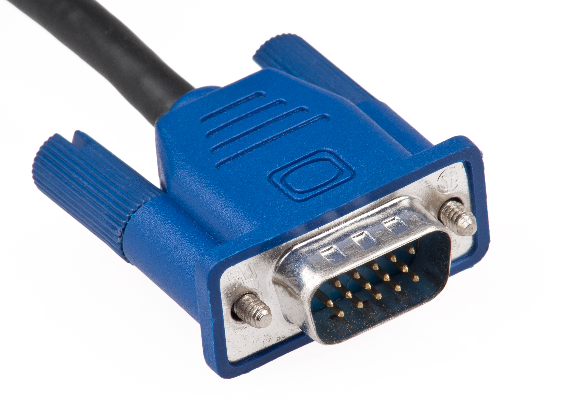
The print and VGA versions

The number of screens on which your presentation will be viewed is expanding:

  • Laptop screen (office)
  • Mobile device (airport)
  • High quality desktop screen (the one the designer is using)
  • Crappy VGA projector (conference room)
  • Old Plasma screen (conference booth)
  • Super High Definition giant LCD monitor (CEO office)
  • Crappy office paper printer (old school manager giving handwritten comments)
  • High quality paper printer at a print shop (investment bankers)

Do a test run on one of these devices if that is the one that is critical to your presentation, and adjust colors accordingly. The result might be a presentation that only looks good on that display, you have to keep separate files. The crappy office printer version has gray shadings that are far too blunt for the HD monitor, the crappy VGA project version has no thin fonts.

Image via WikiPedia

Investors only need to see big $, right?

Some entrepreneurs think they can leave out the “details” of the technology, or the mechanism of action of a new biotech drug: the potential market size is all that matters. “Technology is detail for nerds.”

Not really. It depends on the stage of your company, if your company is early stage and the only asset it has is basically a PowerPoint presentation, technology is not really a small detail, it is the main thing the investor puts her money in.

“Will it work, what are the risks?”

“Does this person know what she is doing?”

“How much does it cost to develop it?”

These are fundamental questions, and a good way to address them is a deep dive in one part of your solution to give investors confidence that the risks can be managed, and that you can trusted with doing that.

·Investor presentation

"This chart says it all"

One chart with a few circles explains the product roadmap, pricing strategy, customer segmentation, and competitive differentiation. Perfect!

When I push back, clients are often surprised. The problem: the chart works perfect for people who have been sweating over it for 6 months. They remember how they inverted the direction of the arrows back in December, how they added the color layer, how they got rid of these long sentences that used to sit at the bottom left.

The person who sees the chart for the first time misses that context. It is the visual equivalent of the poetically beautiful but utterly vague mission statement.

Two solutions:

  1. Go for a completely different visual approach
  2. Use the existing concept that the presenter got used to, but carefully layer all the concepts one by one

Art: Malevich, “White on white

Looking good vs explaining well

Experts, anyone who is deeply into a subject, usually finds it very hard to explain a concept to a layman. They no longer see what is obvious to the novice and what is not, and lack the full, rich, memory picture that is associated with a buzzword or industry jargon term.

So often when I sit down with a client, they will point me to a website or presentation of a competitor / similar company that is beautifully designed: nice pictures, nice fonts, nice infographics. “I want something like this”.

They forget that these marketing materials are mere pretty packaging of the same buzzwords. Yes, they look pretty, but as a layman, I usually still do not have a clue what it means.

In these cases, I usually start asking questions. The client explains without noticing initially why I am asking the questions. After 10 minutes. I remind her what I asked her about and give proof that a pretty presentation does not equal a clear presentation.

Image via WikiPedia

·Investor presentation

Writing good emails

“Cover letters” that introduce a pitch are often poorly written. Think about the latest spam email that you received from a head hunter offering to help you with recruiting staff for your startup. You open it (maybe the subject line was decent), and as soon as you started reading 3 words you knew what was going to come and deleted the message.

A cold email is a shot at someone who is looking for the earliest opportunity to shorten the email inbox with that satisfying “delete”, “archive”, “done”. The skill is to postpone that moment.

  • If your email is a huuuuge amount of text, people don’t read but eyeball and hit “delete” after spotting the usual “that’s why you should invest” at the bottom after pagedowning the text. A lot of text in one block is scary.
  • How did you get to the person? “[x] gave me your name”, is OK, but “[x] told me that you should be really interested in this” is better if that is what she did.
  • Line break, then a super short and to the point sentence what you are: “Startup raising series A, with x in sales, in the drone market, with [famous investor] as a Seed investor”
  • Line break, this is a critical moment where you can feel the finger going to the delete button. You need to present the hook. “Yes, everyone know that drones will be big, but there is something that is blocking progress and we fix that [name of thing you fix]” Or "our team consists of [famous person, famous person, famous person]
  • Then point to a short slide deck that you attached that explains your company. The objective of that slide deck is not to land the investment, but to create enough intrigue to initiate a phone call. (Confidential) product details and financials, long market backgrounds, detailed implementation plans, are all for a later stage of the dialogue.
Continue reading →
·Investor presentation

The pitch to the entire VC partner group

These observations by Jason Lemkin are spot on. By the time you have made it to final presentation to the full partnership of the VC, it is likely that the partner you were in touch with until then wants to do the deal. The main challenge in this presentation is not to make mistakes in front of an audience who has done far less homework than that partner. Do your thing that worked before, and treat ignorant questions with respect.

·Story

Sizing IT markets

The Internet is full of IT market forecasts with highly precise predictions of product sales 5 years from now. Will citing a piece of research convince an investor? No. A $1b market forecast in 2021 does mean that the investor should open up the check book and invest in your startup with zero sales.

How to use these market forecasts? Here are some thoughts:

  • Always approach market sizing from multiple angles. A top down market research estimate is one source. Trying combining it with a bottom up analysis, look at how the IT budget of one company could change and extrapolate that to the entire market.
  • While forecasts by market research companies might be highly speculative, their quantification of today’s market is probably reasonably accurate. Established firms have been around for many years, gathered input from many sources, including sanity checks such as adding up the turnover of all the suppliers in an industry. Your company is unlikely to be the size of IBM in 2 years.
  • IT as a whole does not grow that fast anymore, single digit % growth every year. What fluctuates are sub segments inside the overall IT spend. When you are sizing your market, think about which IT spend category are you going to cannibalize?
  • Market research is a useful source of “boxes” in which a VC can put you. “Where do you sit?” is probably a question you get often. While the numbers might not be 100% correct, market research gives a shared vocabulary about how to think about a market, and whether things are roughly big or small.
  • Related to this, while VCs might not believe the point forecasts of market research reports, the junior analyst at the VC firms is likely going to use them as a starting point in due diligence. It is good to be prepared and go through the same process as she will.
  • When selecting which market research firm to use as a source, think about not only whether they produce data that exactly matches the category you are in, but also look at the breadth of their overall coverage. A firm that covers a lot of ground will provide a nice broad, consistent definition of the world of IT.
·Software

Chart hygiene

Here are some slide make over suggestions for messy PowerPoint presentations that do not require any changes to content. They fix basic graphical hygiene:

  • Make sure all slides use the same slide master template: titles, page numbers, logos (if you want to use them), all sit in the same place
  • Find/replace fonts: make sure all fonts in a deck are the same
  • Create a frame of guides in the master slide and make sure all slide content fits inside the frame on each slide
  • Apply a consistent color scheme to all the slides
  • Eliminate italics
  • Make sure that characters in the same box, paragraph have the same font size (huge differences are OK, but very small size differences do not look good)
  • Un-stretch photos with the wrong aspect ratio
  • Align and distribute slide elements where ever you can
  • Play with line breaks and font size to avoid orphan words on a second line
  • Remove multiple, overlapping “confidential” labels and page numbers from pages
  • Draw a shape, set proper colors and fonts, and make it the default shape, delete the shape, repeat for a text box and a line

That was presentation make-over V0.1, the content might be bad, the layouts could be poor, but it will look organized.

If you have been working in my presentation app SlideMagic, you will have noticed that is almost impossible to make the mistakes I am correcting in the above.

·Delivery

Getting stuck on page 1

Often, presenters get stuck on page 1. The long list of bullet points which are supposed to summarize the story becomes speaker notes to deliver the entire presentation verbally without the visuals.

Well, that is great right? A captivating story standing on its own with out the need for slides. Things are usually not that perfect. Instead of a captivating story, the presenters reads out the summary bullets, adds some “uhms”, hints a bit at the key points but stays at a generic level, saying that the real story will follow. After 15 minutes, the actual presentation starts, which the audience has already heard, more or less. And then, when the presenter reaches the final summary slide, the whole things gets repeated again in 10 minutes.

When presenting live, it is best to consider your first slide a teaser slide, not a summary slide. Hint at what is about to come, but resist the temptation to spend too much time on it. Instead, run the presentation using the visuals.

For presentation documents that are meant for reading a summery page is appropriate (not a teaser page), and in that case I would actually add more text in a smaller font for someone to get the full essence of a story in 1 page, just in case she does not click through to the end.

·Creativity

Business document production workflows

Production of documents and reports inside corporations is a hugely inefficient process, because of a number of reasons:

  • Using the face-to-face meeting format to discuss small text edits
  • Do zero preparation for such a meeting, and start reading analyzing the text with the junior analyst in front of you
  • Because of this lack of preparation, completely upend the start of the presentation because critical bits are missing, without reading things to the end
  • Having too many people involved: lots of captains on the ship giving contradicting input
  • Refusal of senior managers to make tiny text edits directly into the text themselves

I remember this from my early days as a junior analyst at McKinsey. Fight 1 hour of traffic to drive to a meeting with a senior client and/or partner. Listen to small talk, get send out to make paper copies, multiple people making edits to slides with pens, make copies again, back into the car, in the office at your desk failing to read the hand writing, going back and forth via fax machines until you get it right. Technology has moved on a bit, but document editing is still pretty much the same today.

When I start to work with a new client there is usually a small adjustment process, especially when we are on different continents. Am I a junior analyst who needs paragraph by paragraph instructions? He is 7 hours ahead, but hey, I am the client and get to set the meetings. Better schedule frequent update calls to make sure he stays motivated to press on.

Continue reading →