SlideMagic Blog

Frequent updates about all things presentations since 2008. Subscribe to never miss a post.

RSS
·Delivery

How to practice?

If you have a few hours left to prepare for your presentation, they are better spent rehearsing than fine tuning the design of your slides.

How to practice? I prefer to run through a presentation as if it were the real thing. No stopping, no stepping back, no rephrasing. Present it once start to finish, think what went well and what went wrong, and do it all over again.

In this way, you get used to the feeling of being on the spot, and that extra mental challenge will help you prepare better for your presentation.

Back from a break

I just returned from a wonderful sailing holiday in Greece. I have been disconnected from social media streams most of the time, but the few times you check in, I was reminded of the stream of “verbal fillers + click bait headline” the content marketers of the world are writing. You don’t seem to care/notice that much when you are in the middle of it all day, but when in relative quiet, it really gets to you. I will continue to try to write things that do not fit in this category.

Summer posting schedule

Work will slow down a little bit over the next few weeks, so expect posting here to be a little bit less frequent as well. I hope you are having a great summer as well!

·Images

Robo photo shoots

I was always wondering why it is that whenever I look for images of the exact same person, in the same outfit in different positions, I always end up with a search screen full of Asian models. Via Petapixel.

·Concepts

Fusion chart

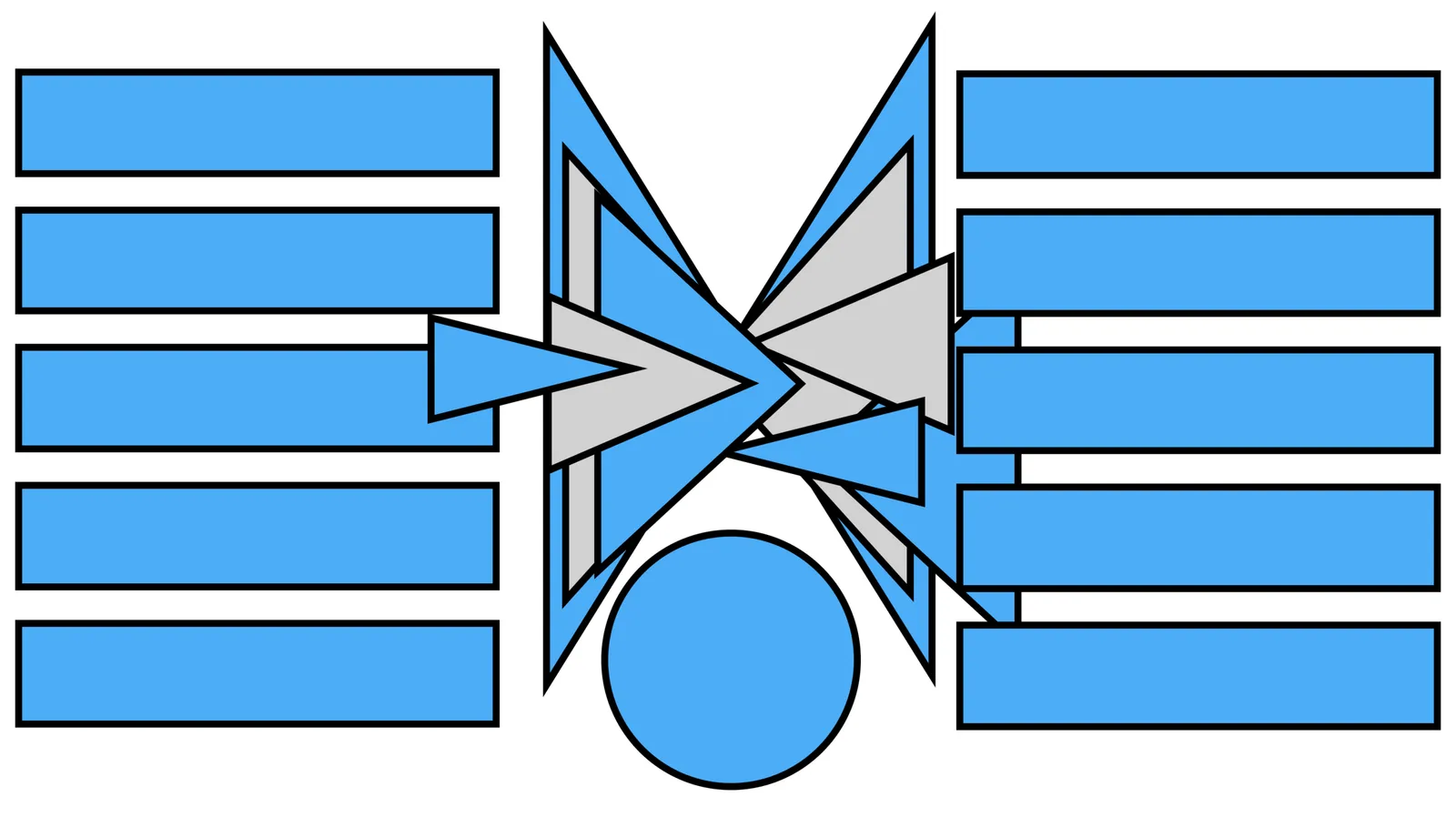
In the 2 images below you can see how to create a “fusion chart” where lots of stuff flows into something central. In the second image, I changed the color of the white triangles to grey and drew strong border lines so you can see what shapes are involved.

UPDATE: You can now download this slide concept from the SlideMagic store

·Images

Building image grids in PowerPoint

Making a grid of images in PowerPoint is tricky. Images never have a consistent aspect ratio, and when you place a lot of them on a page, the guide suggestions always snap in the wrong place somehow. Here is a survival guide.

  • Copy all your images inside the page and select them all
  • Right click and go in “format picture”
  • Tick the “size” icon, and click “size”
  • Hit “reset” to kill any aspect ratio distortion
  • Hit “lock aspect ratio”
  • Now select each image one by one, hit “crop”, hit “aspect ratio” and pick one
  • After this, select all the images again, and give them the same width with a numerical value
  • Position the images on your grid
  • Take each image in turn, select “crop” and move/zoom the image mask for the right composition

The above was a major consideration when designing the image grid system in my presentation app SlideMagic.

·Investor presentation

Tech research for the outsider

“Oh, [tech research company] must have a chart on that!”. Many startup pitch decks features charts, forecasts, and quotes by Gartner, IDC, Forrester, and others to back up their market claims. Here is how a potential investor looks at these charts:

  • Every deck they have seen over the past 10 years probably includes a $1b market forecast by one of these. Most of these companies are not $1b businesses.
  • These research agencies do a reasonable job at mapping out what people are spending today on technology, forecasts are based on this picture of today, where an analyst applies different growth rates in an Excel sheet to get to a number that is 3 years out. It is an extrapolation of market trends, not a thorough research about how IT could change fundamentally
  • Research relies on a categorization of the IT market with ambiguous names, it is never clear what is included, excluded, where a new technology fits, whether markets are double counted
  • Overall IT spend grows at a steady pace, that’s how corporate IT budgets work. So a revolutionary new technology cannibalizes investments in other technologies. Research reports hardly ever show sharp drops in the size of market segments. Rather, when a new technology emerges, people relabel, redefine the market segments to reflect the new reality. So again, not a helpful basis to forecast the future.
  • The quotes in the research report are loaded with jargon, but most importantly, all sound the same. A product manager might be really excited that a Gartner quote includes “it will definitely think about considering making my IT infrastructure more scalable next year by investigating [technology X]”, but for an investor this sounds all familiarly vague.
Continue reading →
·Images

Soft edges around images...

…never look good. At least, I have never seen ones that do. Soft edges are right up there with standard PowerPoint colors, low res images, clip art, and distorted aspect ratios: all tell tale signs that it is going to be “that kind of” presentation.

Leaving out some key statistics

Sometimes it can be tempting to leave out a key financial metric, because it does not look very good. So instead of “revenues”, we show “bookings adjusted for inflation, excluding south east Asia and before sales commissions”, which go through the roof in terms of growth.

Someone who sees the chart will immediately turn suspicious and ask “what about revenues?” If you are there in the room, you can explain things, if the person is reading the chart as part of cold email, you probably won’t have the opportunity to recover your credibility and integrity.

If you show financials, you have to show them properly. If there is a need to explain things, do it transparently. The alternative, leave them out in your first deck and save them for meeting #2.

·Layout

The bullet points are your starting point

Most finished slides show a list of bullet points as the final design, they are the finished product.

Instead, consider them the starting point. Ignore that guilty feeling of writing bullets, ignore the worry about a poor slide. Write all out, re-write it, write it again, and again. Take a step back:

  • Is this actually what I want to say? If not go back to step 0
  • Do I pad too much, can I cut fluff, buzzwords?
  • Do I write too little, can a layman understand what I mean?
  • Do I say something 2x? If so, delete one
  • Is one point a sub point of another one?
  • Are all points equally important?
  • Do I combine 2 important points into one?
  • Do I make 2 completely different points, if so split the slide
  • What is the basic structure of my story: a contrast, a ranking, a cause-effect, a trend, a missing puzzle piece, best of both worlds, an overlap?

After this process you should have a razor sharp list of “what should go in”, plus a good understanding of the structure, the “verb” of the slide. Now create a composition solely based on that info.

When you insert a new slide in my presentation app SlideMagic, you are presented with a number of slide templates which are not put in randomly, I thought about every single one of them pretty hard. These are the usual “visual verbs” I encounter. Try using them as the basis for your next slide design.