SlideMagic Blog

Frequent updates about all things presentations since 2008. Subscribe to never miss a post.

RSS
all posts

Search results for “pencil”

·Hardware

Apple pencil, finally there

I have been trying electronic pencils for years and years: different 3rd party iPad styli (is that the correct plural?), the previous Apple pencil itself and previous solutions by Wacom. None of these worked good enough for me to get rid of my note book.

I think has changed with the latest Apple pencil that works on a 2018 iPad Pro. The updated pencil solved a few annoyances when compared to the previous one:

  • It snaps to your device (but still falls of in your bag)
  • When snapped, it charges, no more need to stick it in the iPad connected
  • It no longer rolls
  • It has a matt finish and feels nicer to work with

The biggest issue though used to be work flow, with 2 poor options:

  • Log into your sleeping iPad all the time when you want to jot something though in a meeting
  • Keep your notes app running all the time and thereby letting the graphics intensive app drain your iPad battery.

That has been solved by a feature buried in the settings of the Apple Notes app: a simple double tap of the pencil on the screen wakes up the Notes app. The iPad is still locked as a security precaution, you can set the time it takes for the iPad to open a new note instead of displaying the last note you were writing to anyone who taps the screen.
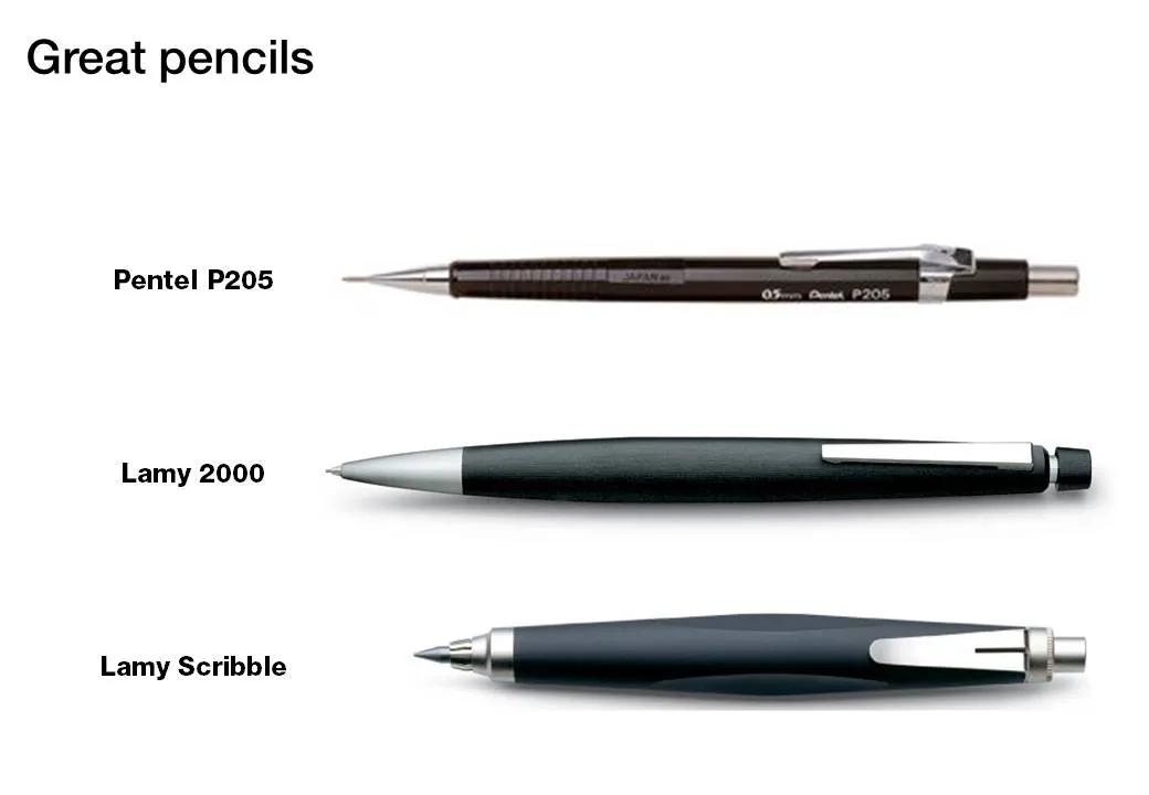
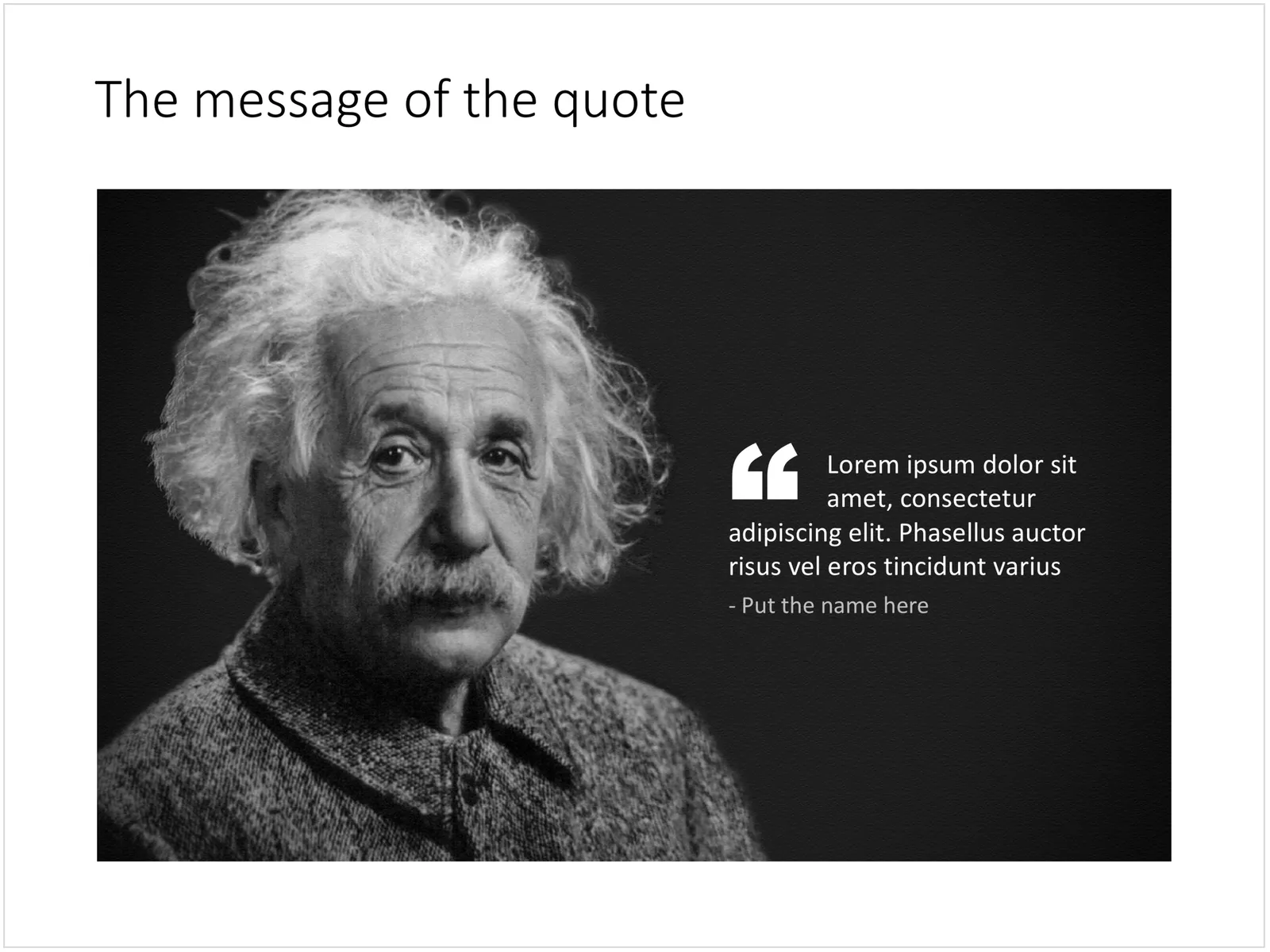
Photo by Kim Gorga on Unsplash

·Creativity

Back to pencils

I have tried many tablet note taking apps, but have gone back to the pencil. And of the many pencils I have tried, the Lamy 2000 propelling pencil is my absolute favourite. It is made out of plastic, but has a great feel to it, it has the right thickness, the right balance in the hand and looks great! The origins of the pencil go back to the mid 1960s when the Lamy pencil called in the help of a Gerd Mueller who has previously been designing for the Braun electronics company.

·Design

Going analogue with mechanical pencils

Most of my charts start with a pencil sketch. I burn literally through piles of paper when designing a presentation (a good use of those 1-sided print outs you do not need anymore). So what are my favorite pencils?

When I started at McKinsey, the Pentel P205 was my initial favorite. Per pencil, it is actually very cheap. That was exactly the problem, people considered it cheap enough to borrow it all the time. I kept on buying new ones.

I experimented with various much more expensive pencils only to discover that these are actually pieces of jewelry rather than sketching instruments. Beautiful to look at, but not very useful. Check out the site of Joon Pens in New York to see some examples.

Recently I discovered Lamy pencils as the perfect in-between. Two pencils are my favorite. First there is the classic Lamy 2000. Designed at the end of the sixties, and still in production pretty much unchanged. A beautiful minimalist look, very light and a nice, almost wood-like feel. People say that over time the mat finish will wear off at those spots where you hold the pencil though.

I use a 0.7mm pencil for regular writing. But when it comes to sketching a wider pencil is much better. The Lamy Scribble comes in a version with a 3.15mm fill. It has a very nice grip and is beautiful to let your creativity go.

(All links to Amazon are affiliate links).

·Creativity

Back to basics: going analogue using the pencil (+ a bit of self-relativation)

A nice presentation by cartoonist Betsy Streeter on the front page of SlideShare today:

Ten Great Uses for a Pencil

Two “so whats” for me:

  1. Go back to the pencil when designing presentations. Sketch, erase, sketch, sketch again. A much better creative tool than opening the PowerPoint standard template. Design your slide offline, PowerPoint is a production tool to get your original idea in digital form. Nothing more.
  2. A bit of self-relativation: it is amusing to see how professional presentation designers (ME INCLUDED) increasingly resort to using “back to analogue” techqniques to make their point. We’ve come full circle when we start pasting 10MB high-res scans of a piece of paper, a sticky note, etc. into PowerPoint.  Why not bring the physical flip chart page to the presentation event and leave the laptop in the office? This reminds me a little bit of the joke of the investment banker who worked 100 hour work weeks to retire at 45 and settle in a Mediterranean village to spend the day fishing. His fellow local fisher man has been doing this since he was 15 without going through the trouble. (A better, longer version of the joke here).
·Software

"Good with computers"

Being “good with computers” had different implications when it comes to presentation design over the years. From my experience as a management consultant:

  • Pre 1995: professional graphics designers produced your slides, you could simply sketch ideas on a piece of paper. As a junior analyst you marvelled at how senior partners seem to be shaking new frameworks out of their pencil with zero effort
  • 2000: if you demonstrated that you understood PowerPoint, you were instantly designated the entire team’s graphics designer, but only during out of office hours (18:00 to 09:00, and weekends)
  • 2005: Everyone starts to produce their own charts, and being proficient in PowerPoint could actually give you an edge. Including images, even videos, complex data charts.
  • Today: technical proficiency is no longer required, as more and more people understand that the best slides are really simple slides.

Photo by Museums Victoria on Unsplash

Pens!

I love investing in good writing instruments. Here is the current line up (with a new addition):

  • Apple pencil for notes I need to keep (meeting notes, important concepts for my app development, ideas for new blog posts)
  • Mechanical pencil for sketching disposable charts, diagrams, concepts that either need partial creative erasing and/or a ruler (read the review of my trusted Lamy 2000 mechanical pencil here)
  • And now: a nice roller pen for other “disposable” notes.

Since I started my career at McKinsey back in the 1990s I have been using pencils for everything. Back in the day, all charts and slides were sketched by hand before being produced by a graphics designer who understands PowerPoint (or Solo before that). But, pencils leads break easily when writing enthusiastically and have low contrast, hence the addition of the pen.

The Lamy 2000 roller pairs nicely with my pencil. The design is almost identical to the classic fountain pain, but with less staining (I am left handed), and the need to get that writing angle perfectly right. I think a roller is better for short notes than a proper fountain pen. The Lamy has a perfect balance (wit the cap placed on the back), and somehow the plastic that is used in the pen gives it a really nice brushed feel, and a perfect weight. Only drawback, those two tiny grips that were part of the original design and produce that satisfying click when the cap is closed.

·Hardware

iPad Pro 2018

I upgraded my 9.7” iPad to the new 12.9” version after trying one out. Here are my observations:

  • The size and weight of the bigger iPad is now manageable (unlike the first models). It is so light that the programmed weight to size ratio in your head gets confused. Still, this remains a “2 hand” device in most cases. If you need a 1-hand device, this one is not for you.
  • The size is the main reason I got it, it enables me to read “magazines” by smaller publishers do not have the resources to invest in proper iPad apps and simply send out a PDF every month. For this purpose it is great. An A4-sized PDF on iPad is now one on one comparable to a paper one, probably even better.
  • The best way to get a feel for the screen quality is to go back to your old device that you thought was great. It is not yet as stark as the iPhone 3 to iPhone 4 jump, but it is a huge step up.
  • The thing is incredibly fast and snappy
  • The pencil is a huge improvement. I tried working with styli and pencils right from the launch of the first iPad, none of them really worked for me. This one snaps against the iPad with magnets (although it will fall of in your bag), has a matt feel, cannot roll away due to a flat side, has a tap function to quickly change pens, and charges on the side of the device rather than sticking out of the connector. Writing and drawing is awesome. The killer question will be how it behaves in an hour meeting: unlocking the device, battery life, both of which were wrong in the previous version. Constantly messing around with buttons and passwords to jot down something, and then leaving your meeting with a drained battery. Face ID should help (hopefully).
  • I did not get the keyboard, I still believe that writing long texts can be better done on a proper laptop.
  • The iPad is expensive, but you can save on storage if you restrict your movie downloads to those you need on one long haul flight.
·PowerPoint

Quote slides in presentations

Quotes can add credibility to your presentation. If experts, celebrities, and/or customers agree with you, you must be right. But, not all quotes have equal weight. They have been overused in many PowerPoint decks. (Anyone can find a picture of a serious-looking person and get her to say what you want her to say in a few mouse clicks).

Here is a check list:

  • The person needs to be relevant and credible (third tier social media “experts” do not carry much weight)
  • The person needs to be identifiable (“Senior marketing executive at major high tech firm” can be anyone and is most likely you)
  • The quote needs to be interesting, cut the buzzwords and marketing language, cut the cliches (“Wow,  these guys really have a targeted value proposition that resonates with my medium-term return on investment objectives”)
  • The text needs to be long enough that it is specific, and short enough that it reads like a headline. A full page of verbatim will not come across
  • The quote needs to be relevant, a generic motivational quote might not help close that enterprise software contract.

Quote slides are (and should be) pretty simple: a nice big image with a big text overlay. Still there are some things to watch out for. Below is a quote slide that I have added to the SlideMagic template store. Let’s go through the design process.

 A template for a quote slide

  • The image should have a calm background with enough “white” space for text. You don’t need to be a Photoshop guru to extend the background of an image in PowerPoint, it is easy to add a black or white box next to images. You can use the colour picker to match the precise colour, or use semi transparent overlays for the best effects
  • Make the quote symbol stand out. Regular quotes are too small, and the layout does not look good, as the quote pushes the start of the paragraph in. There are endless ways to do it and I settled on this one. One big quote at the beginning of the paragraph with a text indent. Take some time to find a quote in a good font. In the above slide, the text font is the Microsoft Office standard Calibri, but the quotes of this font don’t look that “fat”, I used Arial.
  • This slide is a framed image slide, which gives me the opportunity to add a big headline at the top of the slide with the main message (the headline can say “Customers are really happy”, the quote can say “With product [x], I no longer need to use a pencil”.
Continue reading →
·Layout

Slideuments and graphics designers

Many designers with excellent skills in web and/or print design somehow cannot deploy their talent very well in PowerPoint/business presentations. I have been thinking hard about why this could be.

The key challenge I think is the tight relationship with content and design. In print/web the design of a page does not really change that much if the content changes (it is still a block of text, an image, and an icon that fit in the same overall grid). In a business presentation, everything goes upside down when your competitor analysis needs to include 3 instead of 2 dimensions.

The second reason is - I think - that both people who write presentations and designers who polish them, stick to the conventional slide format: title across the top, list of bullets.

Now here is an interesting experiment for a 100% graphics designer who is not allowed or does not have the knowledge to touch any of the content (the classical print graphics designer situation). Assuming the presentation is a slideument (meant for reading rather than presenting).

Hand over the material in a word processor, as a long text file rather than a partly finished PowerPoint presentation. Now give the designer total freedom to present this material in any form she wants, even in any software she wants, using any page layout she wants.

Changes are you might get a pretty good lucking slideument by taking “PowerPoint” and its familiar layout out of the equation.

Image via WikiPedia

·Story

Too many things in your head

When you are deep into your own story, your mind has hard-wired all aspects of it in one complex mesh network. Everything is related to everything, everything is connected. The upside: you are the expert and know what you are doing. The downside: it is extremely hard for you to explain your idea to someone who comes in cold, without the bits of information, and without the connections between them.

After I return to my office after a client briefing, I usually open a blank piece of paper, take a pencil, and jot down the big ideas I heard in the meeting, after I have given the brain to calm down in the 30 minute journey back. No worry about story lines, no worry about structure, no judgement about what is detail and what is a big message, and no going back to my meeting notes.

These thoughts often become the core building blocks of the presentation. These are the points that I want others to remember when leaving a meeting.

Many people get to this point, they figure out the key messages of a presentation but make the mistake of communicating them in an overly simplistic, or minimalistic way. Just writing “the competition is not flexible” as a big, minimalist statement in a nice designer font is not going to make it stick. Many times, proven/showing these high level messages actually requires going into some depth.

So, a good presentation does not dumb down content. It unravels the wool ball in your head and creates a sequential line of ideas that can ultimately form the basis for a wool ball in the minds of your audience.