SlideMagic Blog

Frequent updates about all things presentations since 2008. Subscribe to never miss a post.

RSS
all posts

Search results for “web design”

·Data visualization

Visualizing contrasts

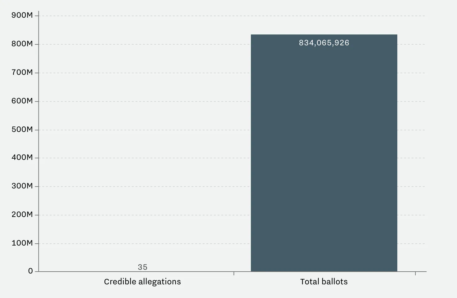
This article on Vox tries to find statistics on voting fraud in the US. I will stay out of politics on this blog, but the 2 graphs it uses show the power of a good visualization.

 A column chart shows the relative difference, but fails to communicate the large overall absolute value of the right column

A column chart shows the relative difference, but fails to communicate the large overall absolute value of the right column

 The image does a better job to depict the statistics. It requires some math and Photoshop skills though to produce

The image does a better job to depict the statistics. It requires some math and Photoshop skills though to produce

The column chart is the correct representation of the 2 values, but it fails to communicate the huge amount of ballots we are talking about in the right column. The image does a better job, but it will be hard to construct for a layman designer.

Image from WikiPedia

·Software

Keynote 7.0 - first impressions

Now that all my data is backed up constantly to the cloud, I have been become more daring when it comes to updating machine operating systems. So, over the weekend I upgraded my client production machine to Sierra, and I could upgrade the iWork applications (I only use Keynote) as well.

Keynote become “7.0”, a big upgrade number. PowerPoint and Keynote are both highly mature pieces of software, they work very well and have not changed that much over the years. The big new features in Keynote 7.0: realtime collaboration and live presentations.

Real time collaboration is the main advantage that web app Google Slides has over desktop applications Keynote and PowerPoint. Earlier, Apple launched an iCloud-based version of Keynote where multiple people could access the same file in a web browser. The problem with this format was that the iCloud version lacked a few crucial features compared to the desk top version. If you started out working in iCloud only, there are no issues. But in most cases, you would group-edit a document online that was originally created on a desktop. I struggled finding certain formatting coloring functions which made it hard to keep slides in consistent look, and missed certain table and data chart manipulation functions online (making it hard to edit existing tables and data charts).

In Keynote 7, collaboration is now done right from the desktop app, all features are supported. During the Apple product announcement (video) it all worked perfectly. I tried things, and it worked less perfectly, but maybe because I was trying to collaborate with myself (trying to edit a test presentation in parallel on my phone). I did not get to invite people via iMessage, the email link worked, but there was a significant delay in syncing of the edits, creating sync conflicts. I assume that Apple being Apple will iron these issues out (and they might not happen in a proper collaboration set up where I am not trying to trick the system in collaborating with myself).


Continue reading →

Breaking the axis

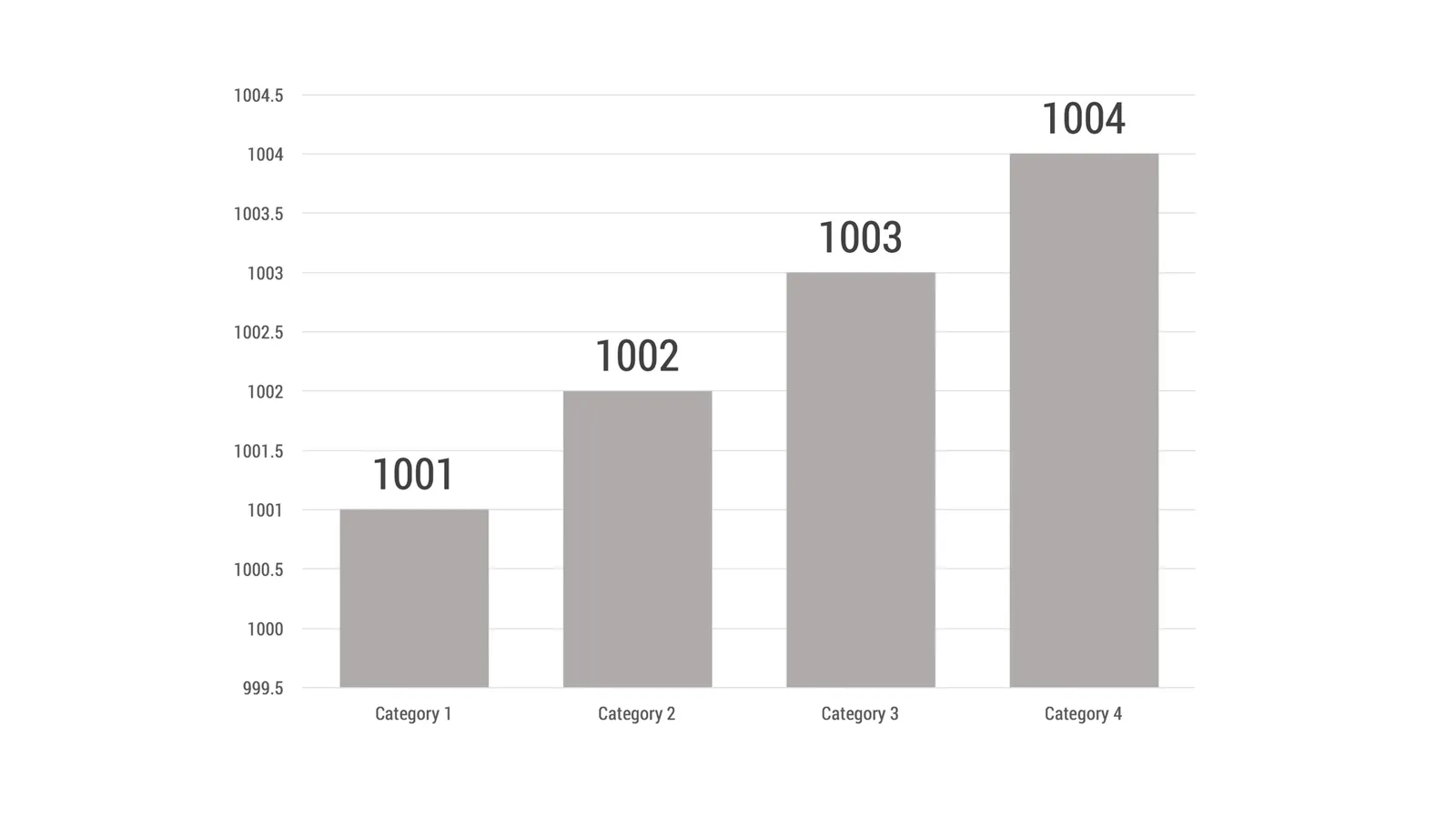
One way to cover up poor growth numbers is to break the vertical axis of a column chart and start it at a high number. It is even PowerPoint’s default, see the chart that comes out when entering, 1000, 1001, 1002, 1003 and 1004.

The smart audience will instantly recognise it and discount your ethics. “If she is trying to cover up this one, there must be other skeletons in the closet inside the deck as well, better start looking for them.”

The best option in these situations might be to stay honest. Maybe show a table of numbers rather than a column chart that stays flat. Maybe break down your sales by subsegment, and show that there are promising products out there that can contribute to future growth.

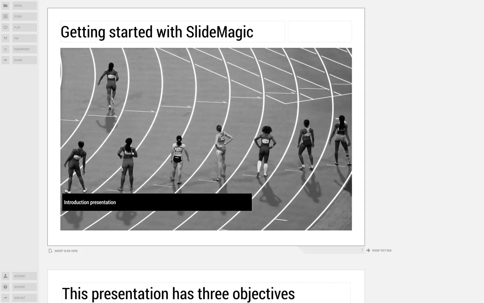
When you use my presentation app SlideMagic, you will notice that it is actually not possible to break the vertical axis.

Image from WikiPedia

iOS 10 typography

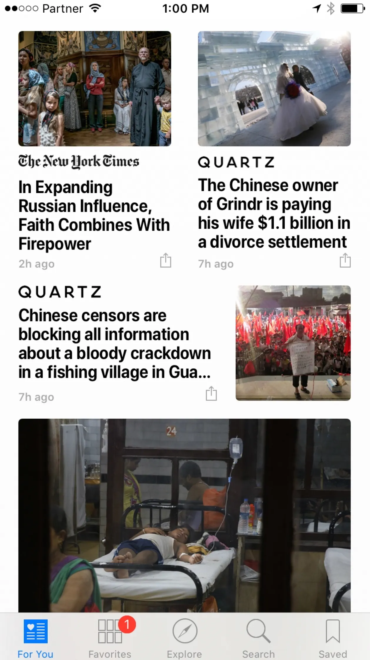
Apple made changes to the screen typography in yesterday’s release of iOS10. It now faces the same challenges as I have in presentation design.

Apple broke the look of elegant, thin fonts and added a narrower bold font. These fonts have good readability, and you can fit a lot of information on one line (or better: increase the font size without needing another line). It comes at a price though, as things look more cluttered.

In my presentation app SlideMagic, I still went for the narrow bold fonts (Roboto Condensed). When applied in a strict grid, and in the right sizes it works.

In the screen shot below for example, something is just not right. Not a lot of white space. Unclear grid. And the logo type of the newspapers interfere with the narrow bold headlines.

·Investor presentation

Example startup pitches

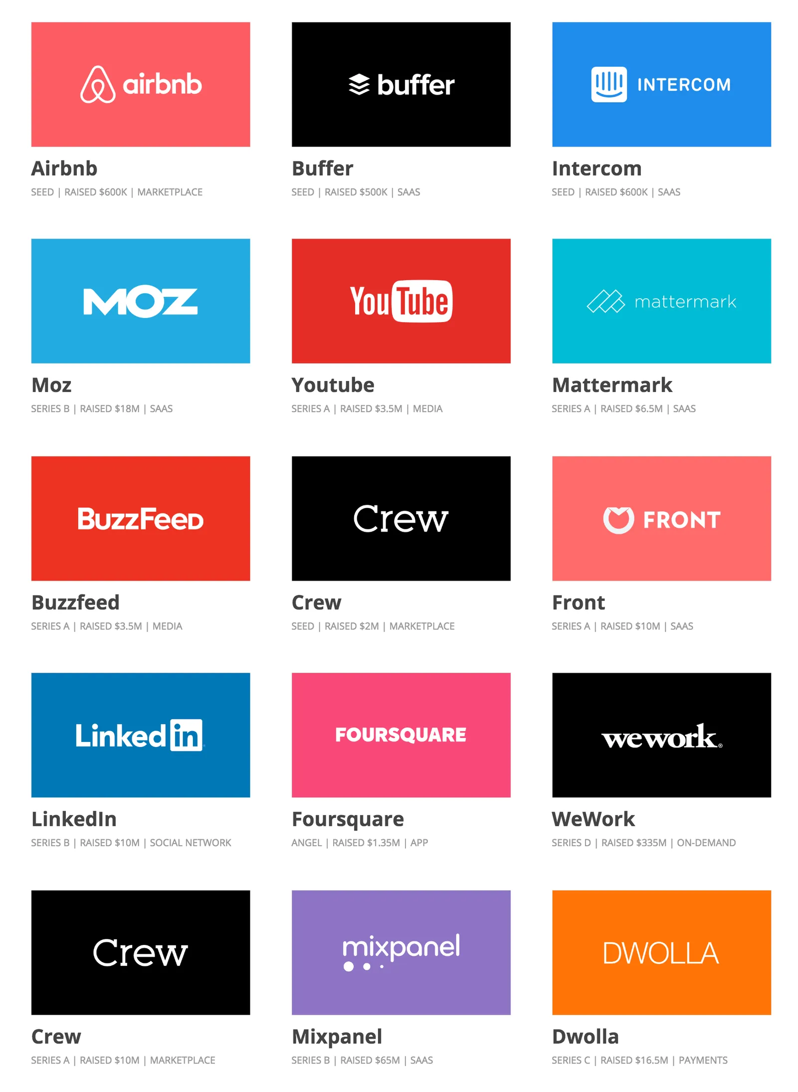
Here is a nice collection of early-stage startup pitch decks that managed to raise money successfully.

There are some common concepts in all of them:

  • Most importantly, they are actually great ideas. LinkedIn, YouTube, AirBNB now look like totally obvious concepts, but back when they started out they were not.
  • They explain clearly what the company/product actually does, often via a demo of screen shots. Many startups omit this important part of your pitch (surprisingly).
  • Often, there is a very powerful traction slide inside. If you have grown your business from nothing to millions of dollars in 6 months, investors will pay attention, and forgive you if the rest of the slides in the pitch deck are not that good.
  • All these decks are email friendly, you get the idea without the need for a presenter to explain it to you. (That is now actually the main type of presentation I design for my clients)
·Advertising

Tone down the ambition

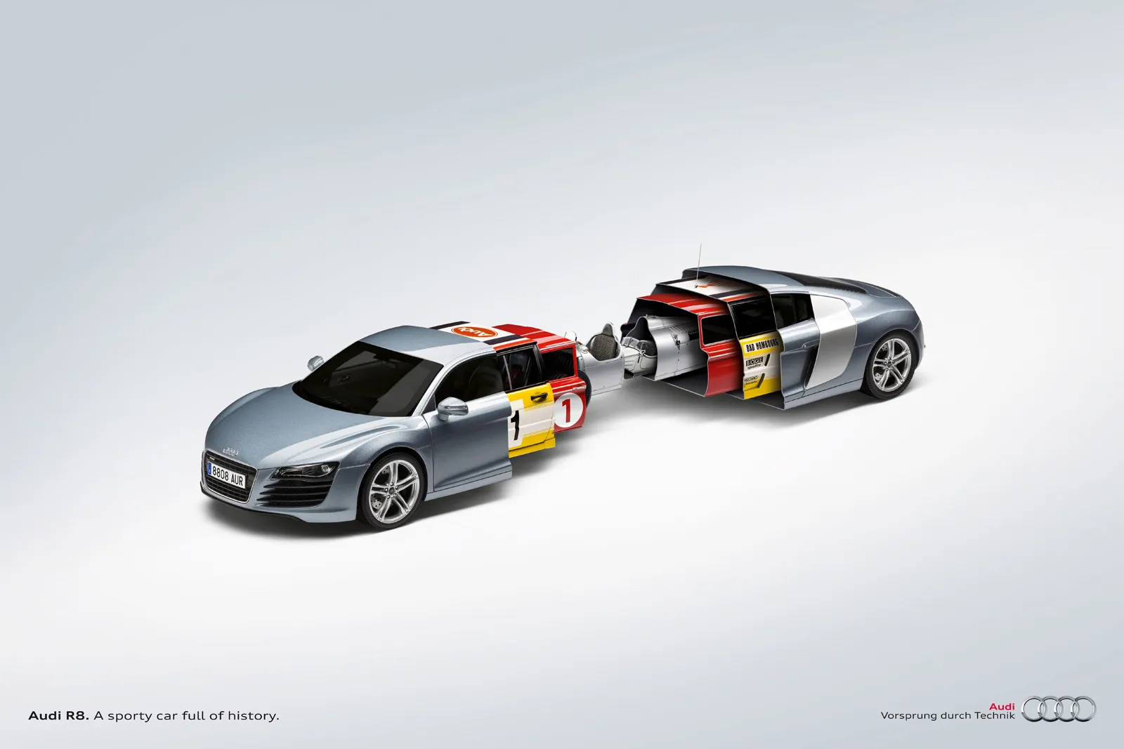
Below is a professional print ad for Audi, trying to convince us that its heritage of cars is still present in today’s models.

The concept is a very simple one. The way it is visualised is highly complex. To pull off something like the above requires a significant investment in a designer who knows what she is doing. Any attempt to DIY it will make your slide look amateurish.

But if you are not a global car brand with a million dollar advertising budget, you can still get that visual concept across.

  • A simple time line of cars
  • Overlapping circles with car images
  • Shapes around the current car with images of vintage cars

You can relax the ambition level of the type of visualisation you want to use. You cannot compromise on the professionalism of your slide.

Image from WikiPedia

·SlideMagic

SlideMagic just got more minimalist

We deployed a new version of my presentation app SlideMagic that eliminated the TEMPLATES menus. It makes things even simpler. Templates are now more integrated in the workflow

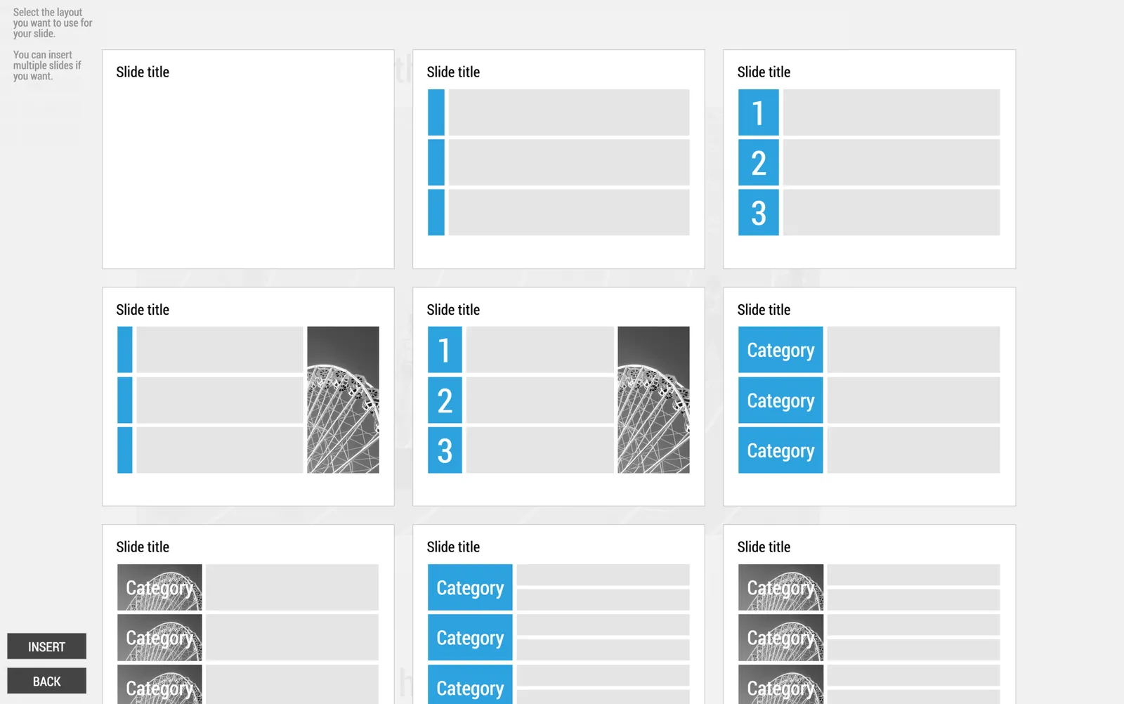
  • When you click INSERT SLIDE HERE, you get presented with a number of pre-designed layouts in addition to the 3x3 blank grid.
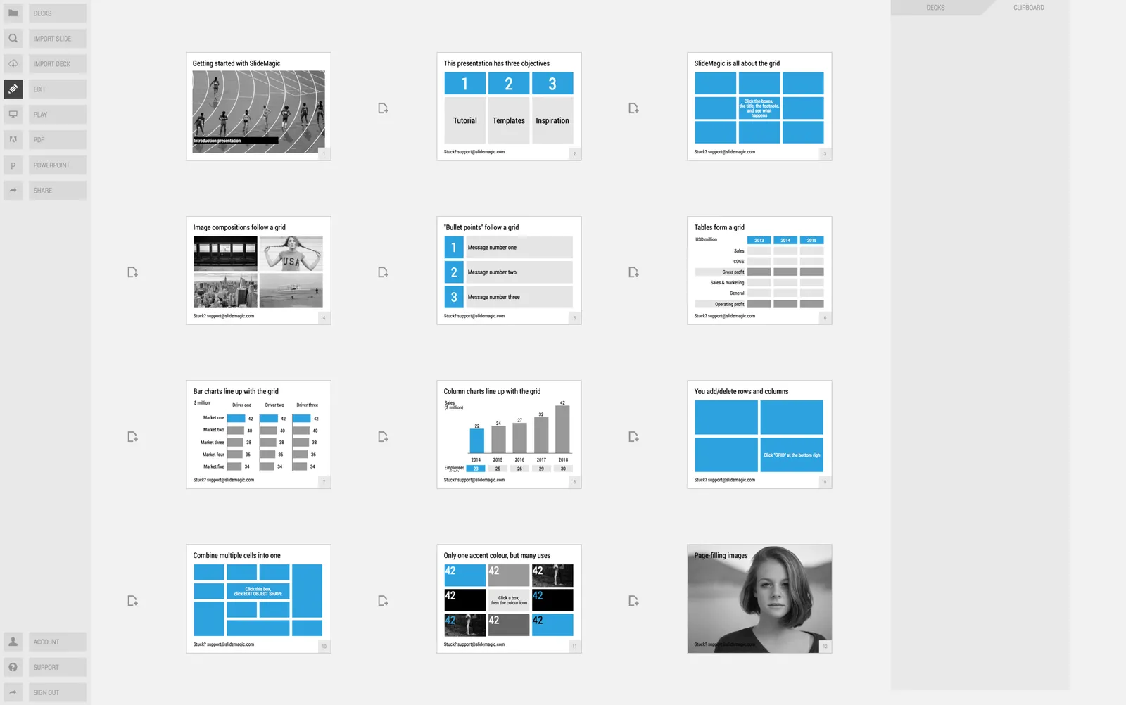
  • In your file browser (the DECKS menu), you have access to a number of featured presentations at the top of the page. These are example presentations designed by me that you can duplicate.
  • In the STORY mode, you can import individual slides or entire presentations (including featured presentations) into your own presentations

A different slide layout for 16:9

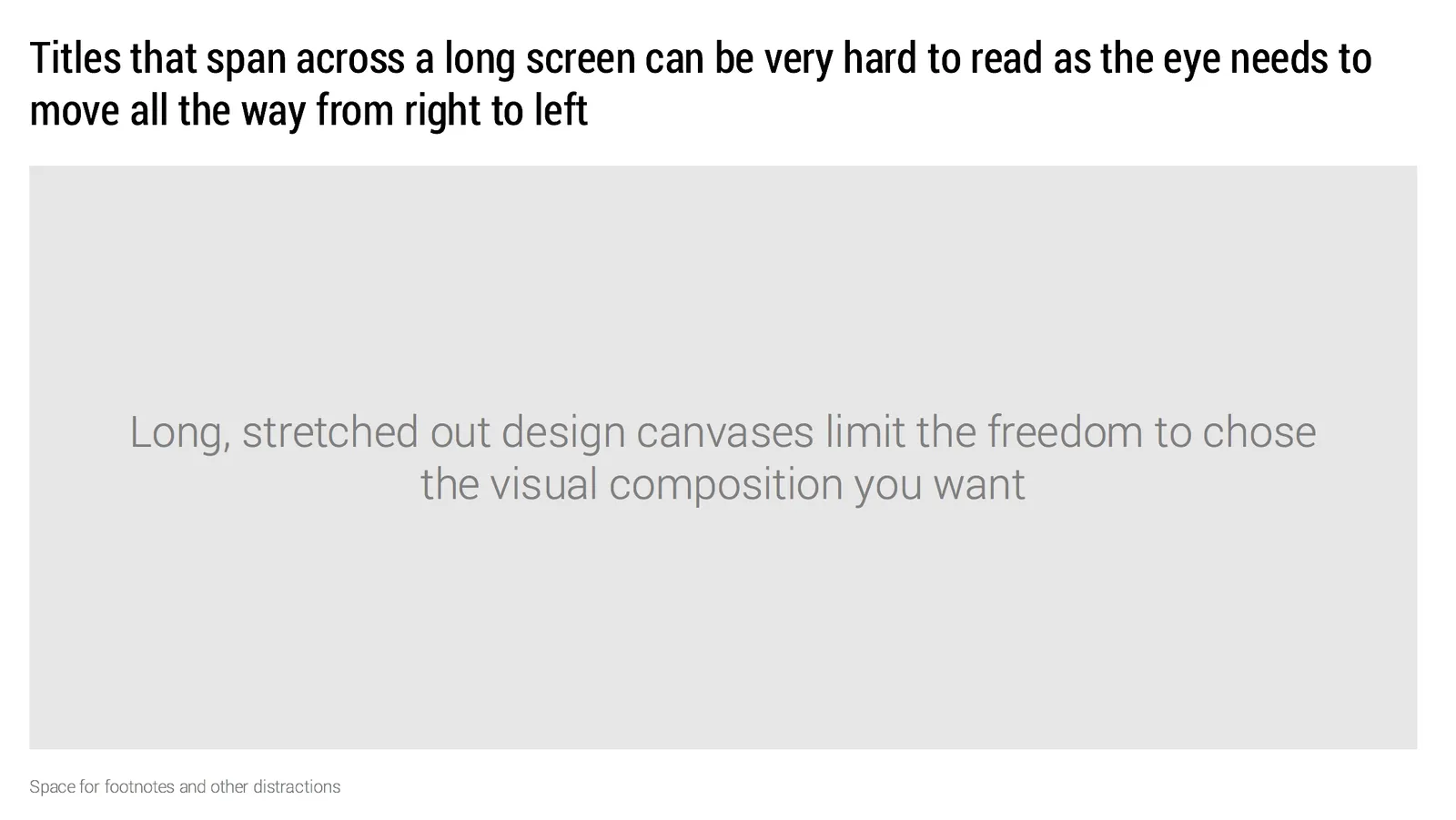
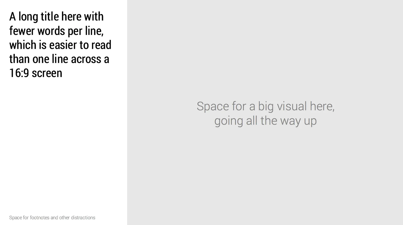
Wide 16:9 aspect ratios are great for movies as we can follow the car chase across the full width of the screen. For slide design however, they cause problem.

  • Looooong titles across the screen are hard to read as the eye needs to move over a long distance
  • A stretched rectangular design canvas limits the amount of compositions you can create.

Maybe it is time to experiment with an unconventional slide layout, where we put the slide title on the side of the design canvas.

In my presentation design app SlideMagic, I took a different approach. The app sticks to 4:3 slide aspect ratios, with a title in the traditional top position, but the user has the option to add a slide out panel on the right with a verbal explanation of the slide for those cases where the presenter cannot be there to explain an abstract visual.

Image from WikiPedia

Book tip: Porcelain by Moby

The biography “Porcelain” by musician Moby is a nice addition to your summer reading list. The book covers the period from when he left home to the eve of the release of his album “Porcelain” that was his major breakthrough.

Many celebrities use ghost authors to write their books. This one is written by himself. The style of the sentences exactly matches those of his social media posts and video interviews.

The book paints a good picture of the prolonged creative struggle you need to go through in order to find your individual style. If you look at his career from a distance this is the picture that I get:

  • Moby got an extensive classical guitar training (not at all mentioned in the book) which his musical foundation
  • Then he got his decade or so to look for his style:
    • DJ-ing, absorbing a huge amount of music
    • Playing around with sequencers, drum machines which were relatively new inventions in the late eighties
    • Because of his low “burn rate” (living in abandoned factories) he could somehow sustain himself without a daytime job, freeing up time for creative experimentation
    • Again lack of financial resources forced him to extract the maximum out of the equipment he had.

My own efforts to get SlideMagic off the ground feel a bit like this. I try to process all those presentations I designed during my decade at McKinsey, and the decade as a professional presentation designer into a useful tool. In V2.0 I am now slowly moving from a pure focus on grid-based design to a generic, minimalist, visual language to express business concepts. Work in progress.

·Delivery

"We don't care"

The little details in a presentation might not make or break its message, but they do count. A spotless presentation shows you made an effort, that you take your audience seriously.

 The result of some maintenance work downstairs in the parking lot of my building

The result of some maintenance work downstairs in the parking lot of my building

Here are some things to look out for: typos in common words (if your spell checker flags something, there is probably something wrong), typos in names of people, inconsistent use of fonts and/or colours, small misalignments of objects, a text wrap gone wrong, or making sure that the positions of titles on all slides is the correct. I remember the senior partner on my first McKinsey project coming into the graphics design room to hold all the paper slides against a strong light to check these things.

Yes, I know that I am contradicting myself now and then as I get reminders about typos in my blog posts…