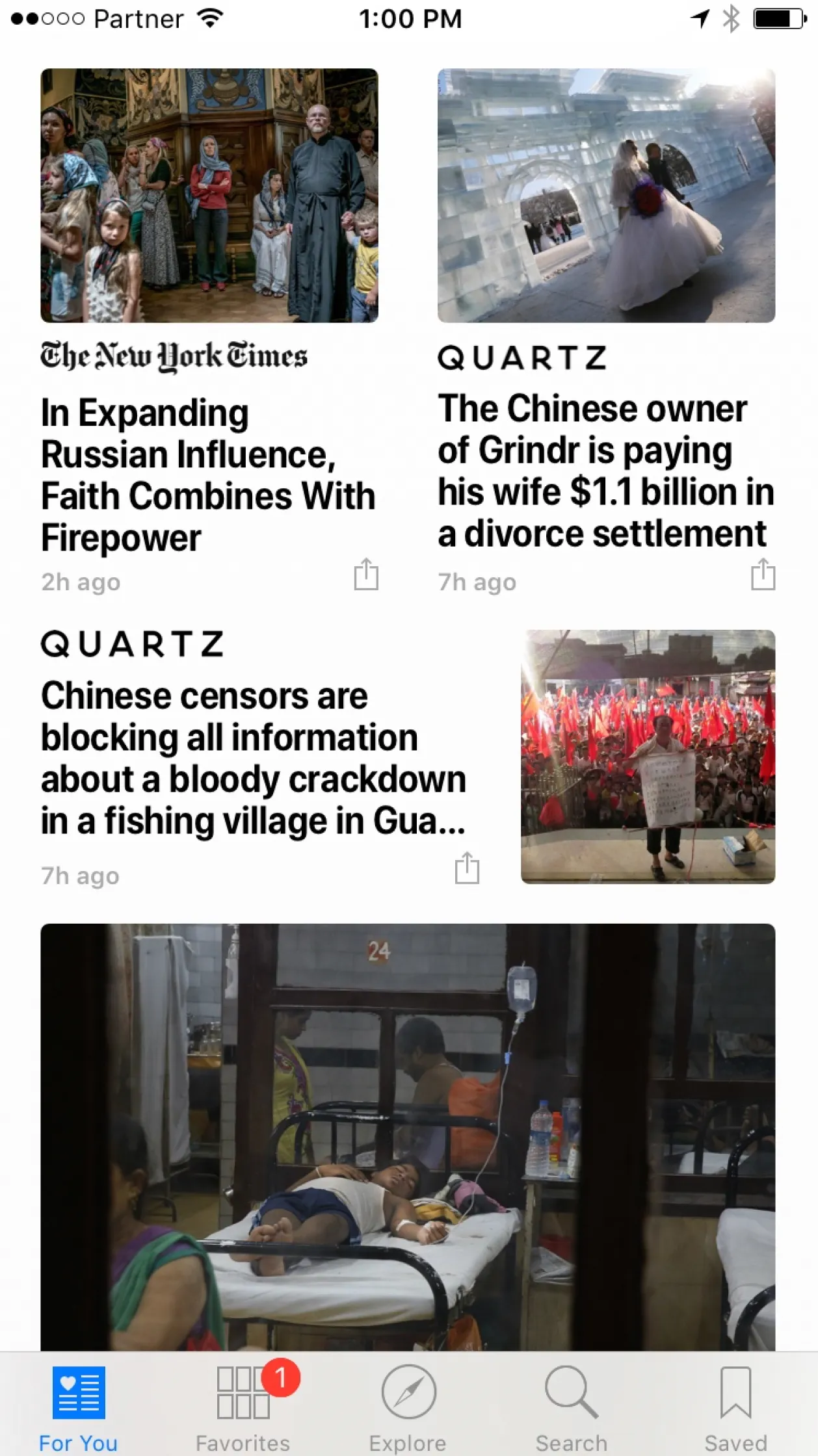
Apple made changes to the screen typography in yesterday’s release of iOS10. It now faces the same challenges as I have in presentation design.
Apple broke the look of elegant, thin fonts and added a narrower bold font. These fonts have good readability, and you can fit a lot of information on one line (or better: increase the font size without needing another line). It comes at a price though, as things look more cluttered.
In my presentation app SlideMagic, I still went for the narrow bold fonts (Roboto Condensed). When applied in a strict grid, and in the right sizes it works.
In the screen shot below for example, something is just not right. Not a lot of white space. Unclear grid. And the logo type of the newspapers interfere with the narrow bold headlines.