SlideMagic Blog

Frequent updates about all things presentations since 2008. Subscribe to never miss a post.

RSS
all posts

Search results for “web design”

·Design

Car dashboards

I grabbed this screenshot of the evolution of dashboard design in Mercedes cars (can’t find the source anymore). I think the fake “analogue” looking displays do not look good at all in modern cars. On top of that, information that you don’t always need is screaming at you. combined with shiny interior materials and LED lighting makes the whole cabin look cheap. It does not look good today, for but will for sure age pretty poorly.

(The first one though would look a lot better without the wooden background though).

·Colors

Changing the color of the French flag

President Macron of France changed the blue color of the French flag. He made the blue darker again, after it was set to be the same blue as that of the European Union flag back in the 1970s. (Then president Giscard d’Estaing thought the different shades of blue clashed during photo ops).

I agree with Macron, the darker blue looks better, flags have a history, and i don’t think the two shades of blue clash at all. When doing design work, pay attention to flags. They have very specific colors (like logos), and very specific aspect ratios.

·Advertising

Using brands in presentations

It is usually hard to find good images of products made by well known brands that are of high quality, not obstructed by advertising copy and free of copyrights. Free photo site Unsplash is trying to change that by building up a revenue model where photographers post (and get paid for) posting images with brands in it. (Curated for quality by Unsplash and endorsed by the brand in question).

This is very useful for presentation designers. Looking for a nice Harley-Davidson motorcycle? Here you go.

I agree with Unsplash’s observation that advertising has deteriorated in quality over the years.

But on their own web site, they can do a bit better with ads for their new shareholder/investor….

Photo by Harley-Davidson on Unsplash

·Concepts

Chart make-over: UK vaccine priorities

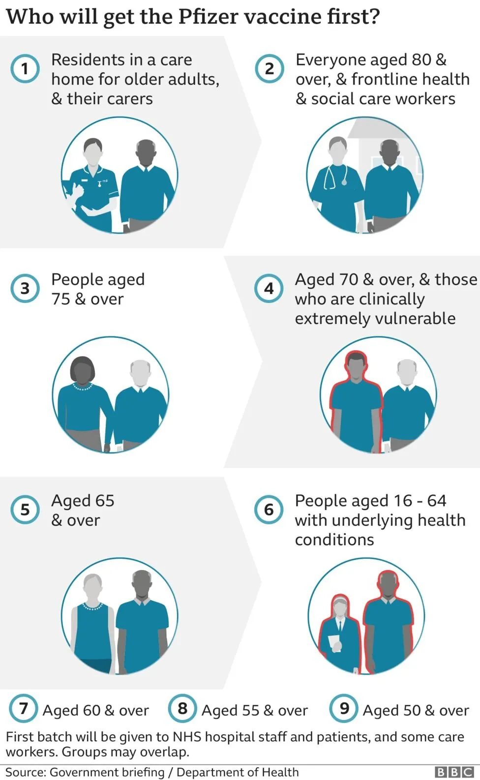
I took on the challenge from this tweet:

The embedded tweet is obscuring the image, here is the original taken from the BBC:

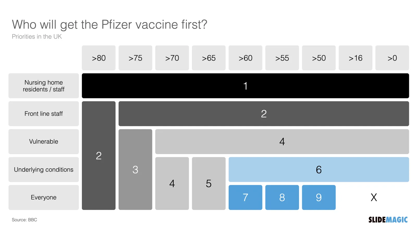
I think these icons are very cute, but are very hard to understand. I quickly put the following together in SlideMagic.

In the philosophy of SlideMagic, not the design of a pro, but very clear and very quick to put together. Notice how I kept things simple, by including the theoretical 0-16 years in nursing home residents, there won’t by any but the big horizontal bar shows the message “everyone” and maintains the visual harmony.

I have added this vaccin priority slide to the SlideMagic template database. You can access this slide for free by simply searching for “vaccine” from within the SlideMagic desktop app.

·Data visualization

Architecture diagrams

I am starting to experiment with different chart types in SlideMagic. One experiment: IT architectures that consist of users, servers, databases, clouds and lots of lines.

The built-in icon search, combined with the new line drawing feature does a pretty good job actually. And while SlideMagic is not a dedicated tool to design network architectures, it might actually force you to make better architecture diagrams in presentations. Let me explain.

Detailed network diagrams have the same problem as detailed spreadsheets when it comes to presentations. They are project work tools to run analysis and plan work, they are not tools for communication. When I need to make a data chart, I always disconnect from the spreadsheet and resist the temptation to copy-paste. Instead, I pick the 10 numbers that matter, round them up to the relevant precision, and plop them in a very simple bar/column chart that tells the story.

The same is true for IT architectures. If you want to present an architecture overview on a slide, that slide needs to be understood almost immediately when putting it up (like all slides in your deck). If tangled connections, boxes, servers make that hard, then the only thing your slide communicates is that your architecture is complex, not much more.

Again, disconnect from the working papers. Think about your message: ‘my architecture has 3 layers’, ‘my system connects the systems of 15 suppliers’, ‘my system is entirely on premise’, whatever that message is, make a simple chart that supports it.


Continue reading →
·Design

Update

I have entered my usual summer blogger schedule (fewer posts) and am now working really hard to get SlideMagic 2.0 right. The feature list for SlideMagic 2.0 is now almost completely implemented. In software, there are always more things to add, but the product as it stands at the moment is starting to get very useful. Over the last 2 weeks I put in very big changes that might not look big from a user’s perspective, but required huge changes under the hood:

  • The new '“side title” layout (my preferred)
  • Slide search previews in your own preferred colour, layout, font style
  • Horizontal and vertical waterfall charts
  • Dynamically generated slides with a relevant image (i.e., unlimited slide in the template bank)
  • Better rendering of slides and images on higher resolution screens
  • Useful image compression in the background

The only big one that remains outstanding is a better way to make diagrams with lines and arrows, the connector solution is not perfect.

In the background I am now tweaking lots of user interface details: how borders fit around thumbs, mouse behaviour when hovering over things, an “endless scroll” is now working for image search, messages that warn you when things go wrong, or when your app is busy searching, making sure that thumbnails distribute nicely over the screen when zooming, minimising the times when the app needs to re-render a slide or image to make the workflow calmer, etc. etc.

I start to look at app design the way I look at slide design. Things need to be absolutely right, and even tiny deviations, irregularities, small mistakes, can really upset me, while most people won’t even notice them. This is what I think ultimately leads to good design, one by one, these details do not matter, I you add them all though, something works without you having an ability to point your finger at exactly why.

Continue reading →
·Concepts

Pretty template, ugly slide

Most corporate presentation templates are designed starting from an empty slide. The designer feels the urge to spice things up a bit with logos and other graphical elements. Now when you actually use that template (designed for a blank page) with everyday presentation content, things start to clash.

The same things must have happened to the designers at BMW, who forgot the license plate that would be plastered over the front of their new car design….

The next time you brief a designer for a new PowerPoint template, give her a full slide deck including content, let her create a design you like, then strip out all the elements and see what you are left with.

<!— Sponsored content: with SlideMagic, there is no need to worry about a presentation template that fits your corporate branding —!>

·Keynote

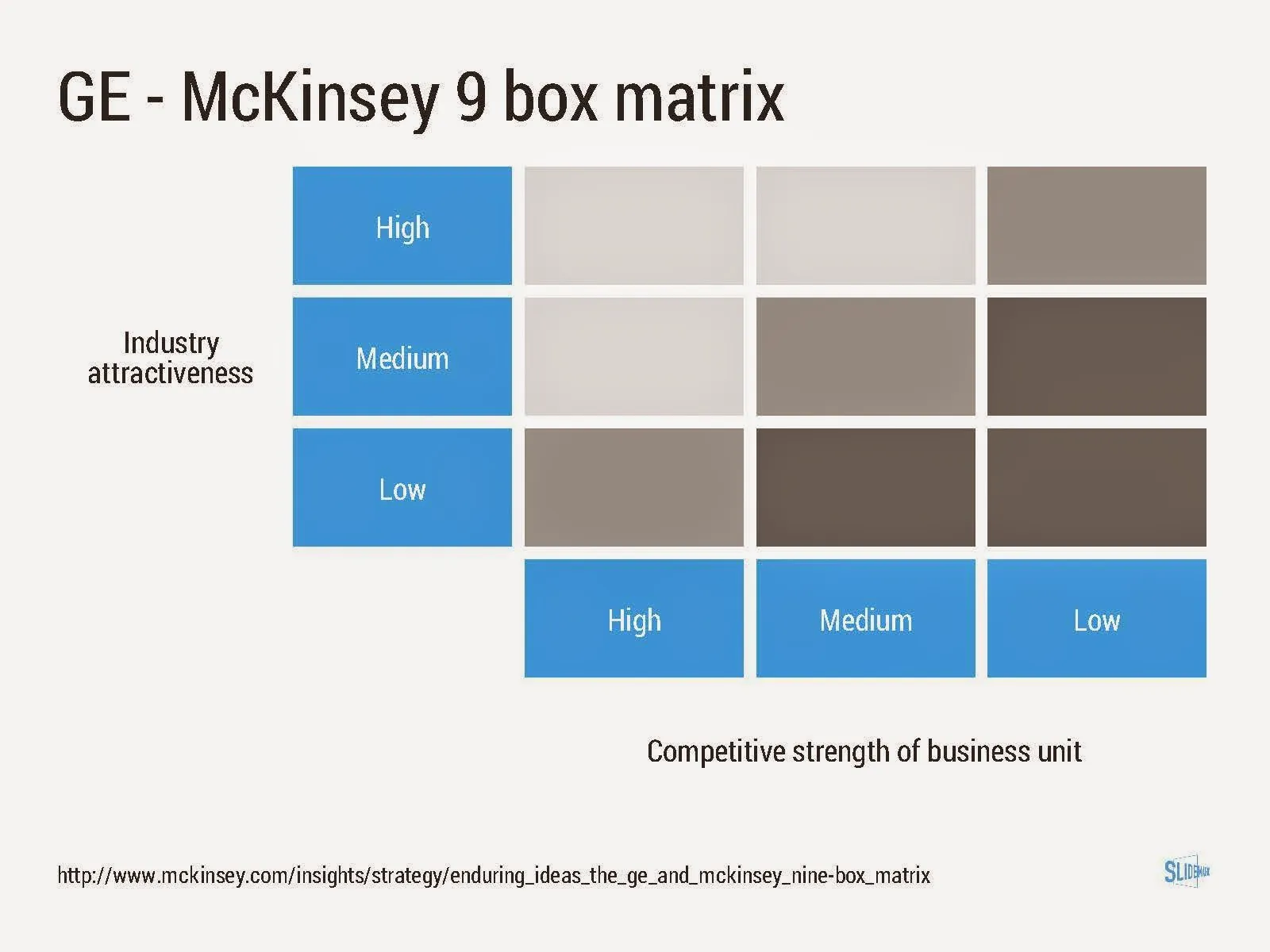
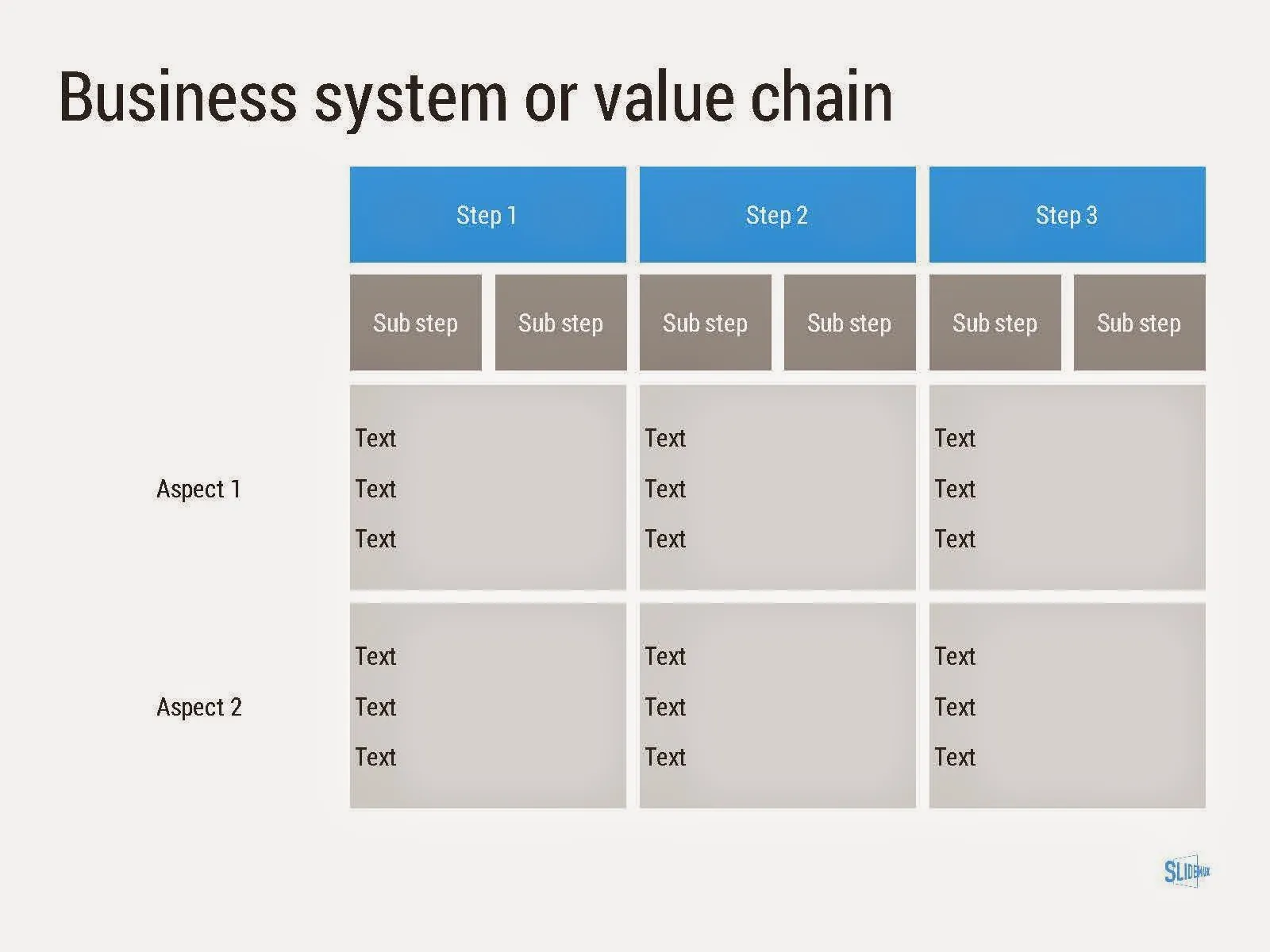
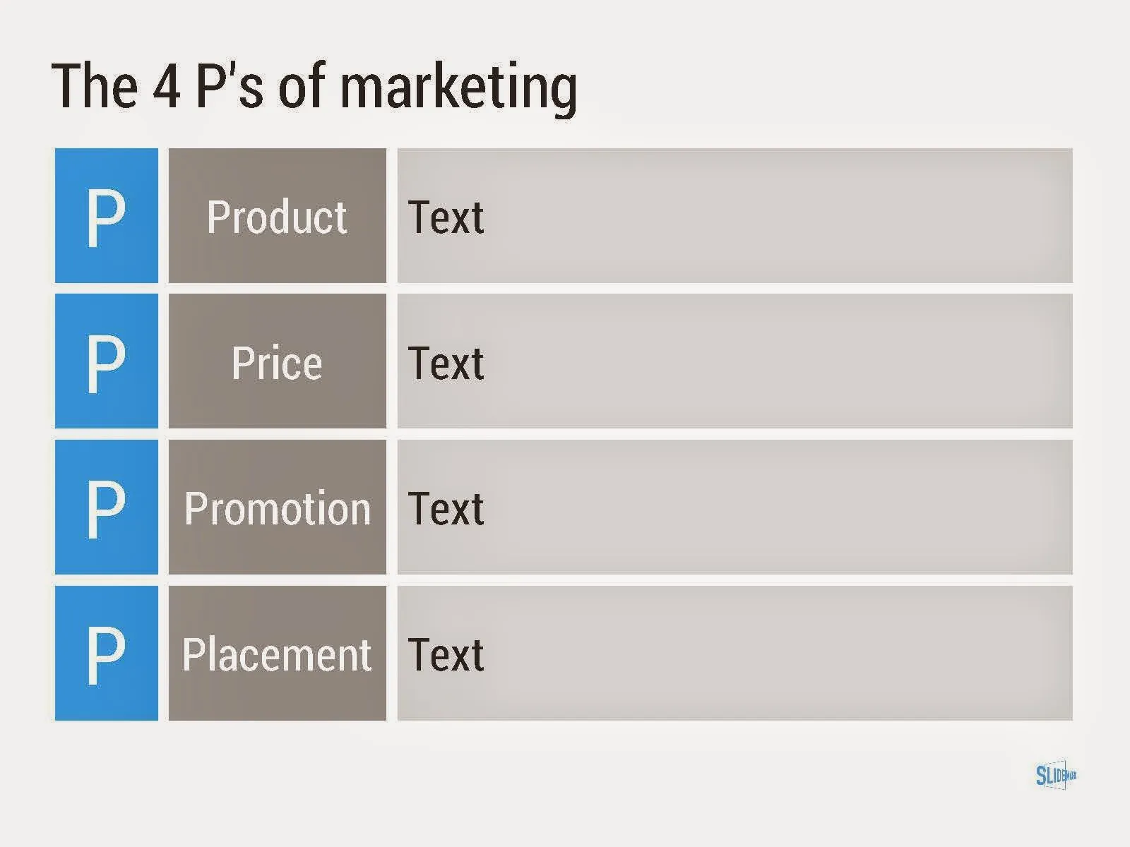
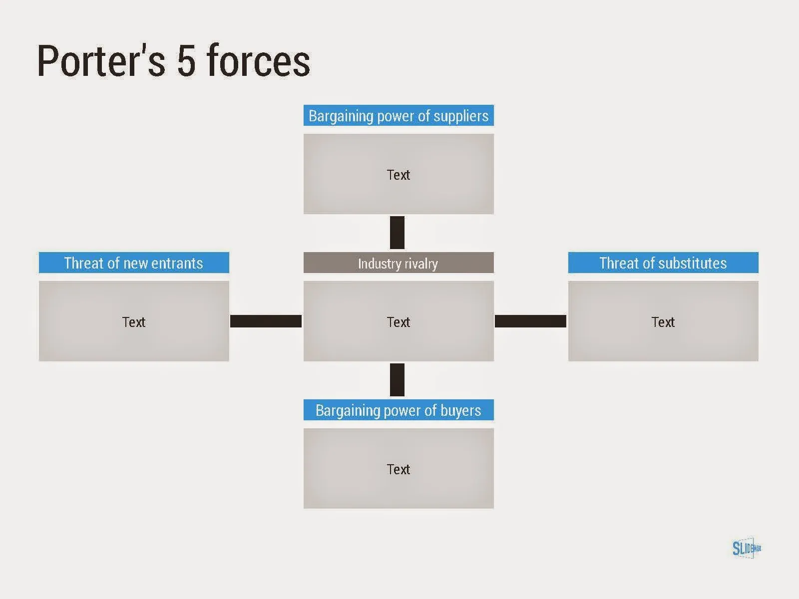
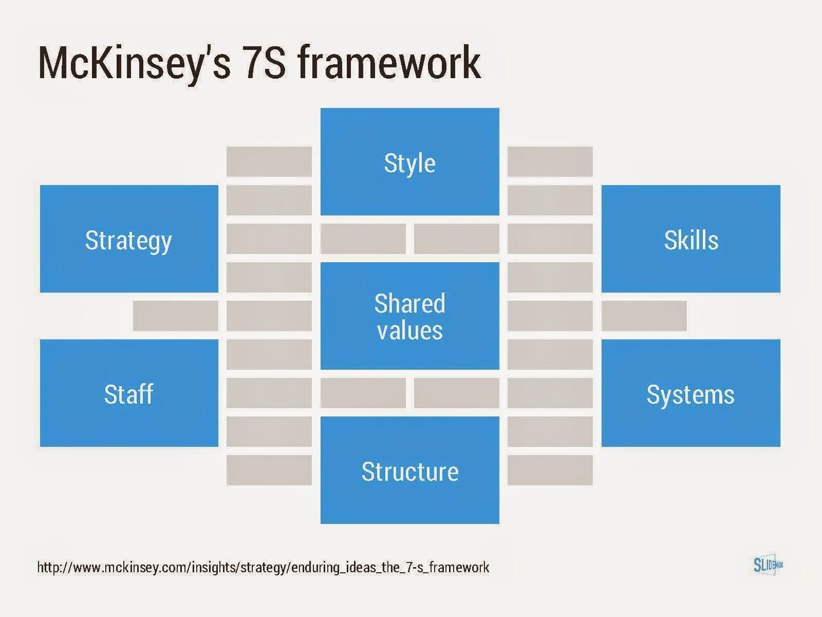
Consulting frameworks

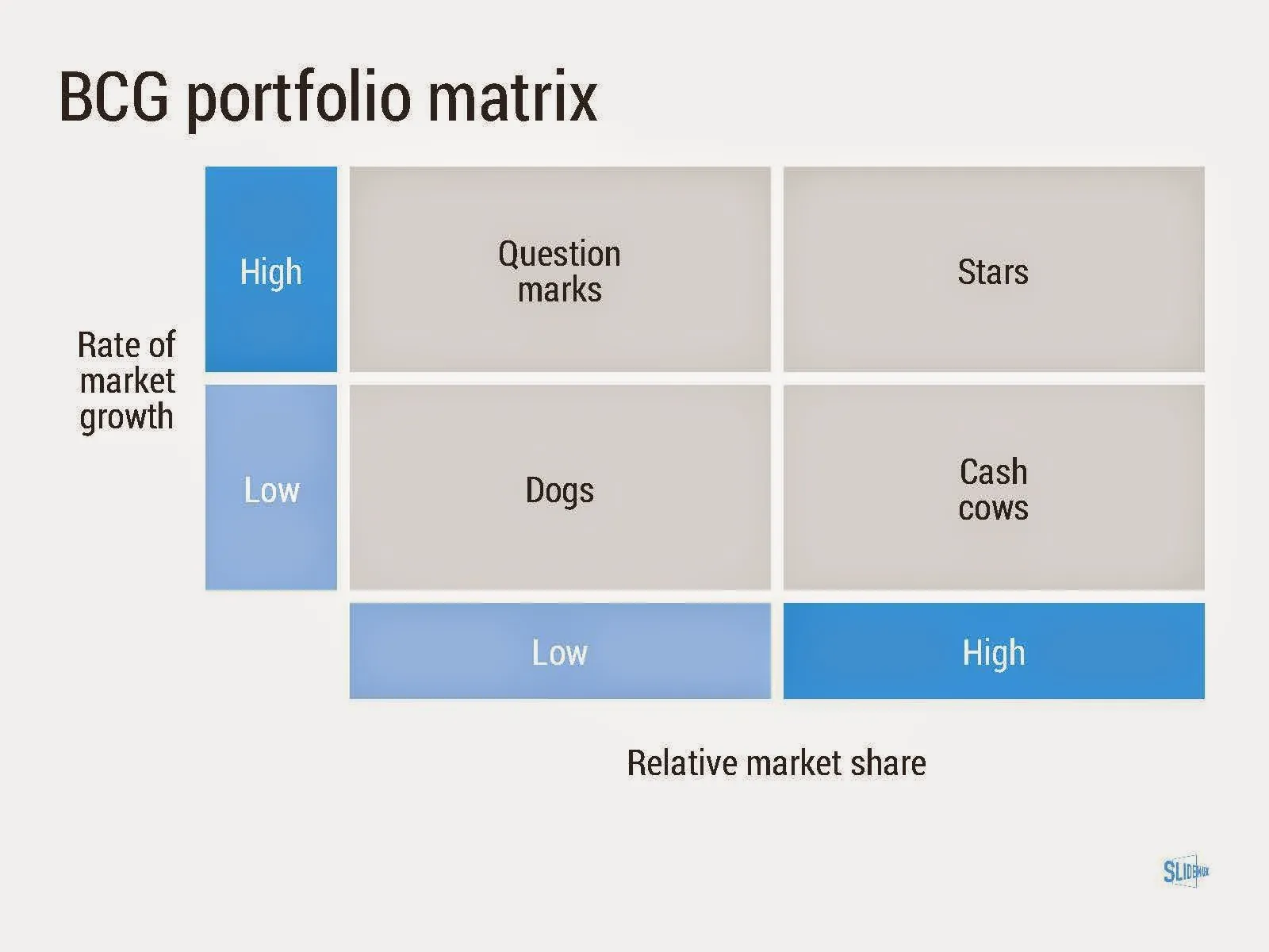
I added a new set of templates to my presentation design app SlideMagic: consulting frameworks. It was an interesting journey back in time (I used to work for 10 years at McKinsey back in the 1990s).

Putting them in SlideMagic was interesting, it shows exactly what SlideMagic is supposed to do for business presentations. Take unnecessary complexity out of visual designs down to a level that the chart still says what it needs to say, but that you do not need to have a degree in graphics design to make them. I had to make slight deviations from the original here and there (Both SlideMagic and layman designers do not like curved shapes for example), but the end result is pretty good.

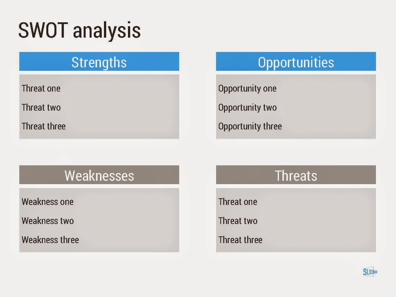
As to the content of these frameworks. They are more tools to help you think about a problem than slides that will get your audience jumping out of their chairs. Many of them are linked to classic micro-economics theory (demand/supply/competition). I think the strategic issues of many companies today have moved beyond these problems. Still some frameworks can work to kick start a discussion, they good old SWOT works great in group white board discussions.

·Investor presentation

Getting used to the image

In conservative industry sectors such as finance, the use of images in presentation is not very common. When I put on in, the immediate reaction is one of: that is not how things work here. But usually, over time, people get somehow used to the image and realise that even serious presentations do not have to be boring.

This slide was created with  presentation design app SlideMagic for presentations that mean business

·Investor presentation

The bar is rising

The average investor pitch deck gets better and better (bad news for presentation designers like me). SlideShare, video streams of startup competitions, TED videos, all create examples of good presentations that people can copy.

Five years ago, version 1 would be a horribly looking bullet point document with standard Microsoft Office fonts/colours, full of small low resolution images scraped from Google with their aspect ratios distorted, that is changing.

Many startups have some sort of designer involved, she gets pulled of the web site work to give the slide deck a much needed make over. The result: decent looking slides, decent colour scheme, decent story flow, still lots of bullet point slides, but at least they are written properly, newspaper heading style.

How to push it one more level up?

Focus on the content, not so much on the local and feel which is already pretty OK. Here is a check list of possible mistakes:

  • Think about where to focus your time/slides. Many of these decent presentations spend too much time stating the obvious. Instead go one level deeper: everyone seems to understand the problem, but why is it that in 2014 we sill have not found a solution for it?
  • Add more substance to your competitive differentiation. A simple 2x2 matrix with generic sounding axes is not always enough. Why are these other companies doing something different while it sounds like they do exactly the same thing you do? And why do they do it differently? Very rarely, this will because of stupidity, there is probably another reason these companies focus on a different solution for a different customer segment.
  • Even if your bullet points are short and well-written, remember that as soon as you start listing more than 3-5 benefits/differentiators, the audience will perceive this as no benefits/differentiators. Bla, bla, bla
Continue reading →