SlideMagic Blog

Frequent updates about all things presentations since 2008. Subscribe to never miss a post.

RSS
all posts

Search results for “web design”

·Concepts

Using heat maps in your presentation

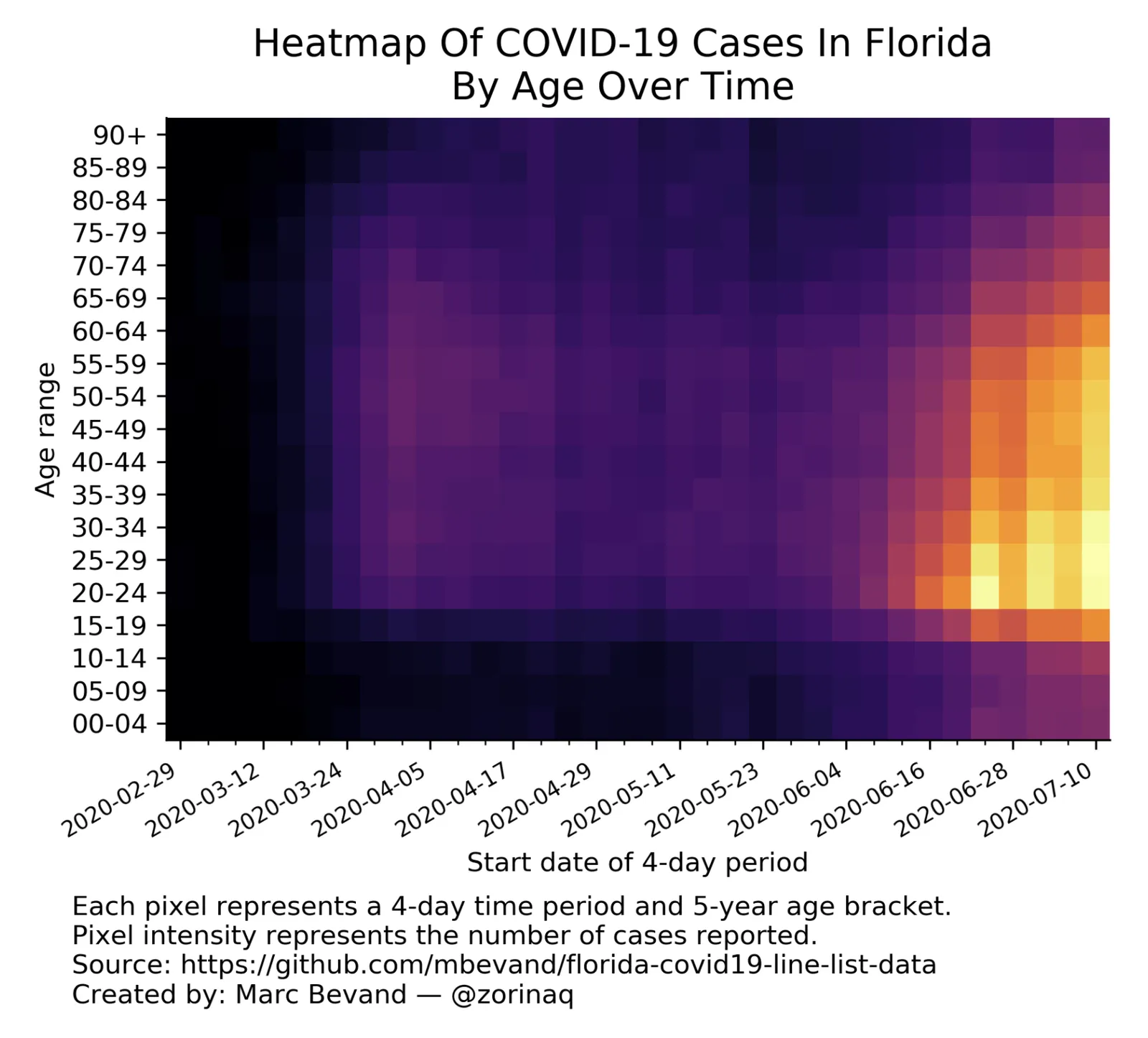
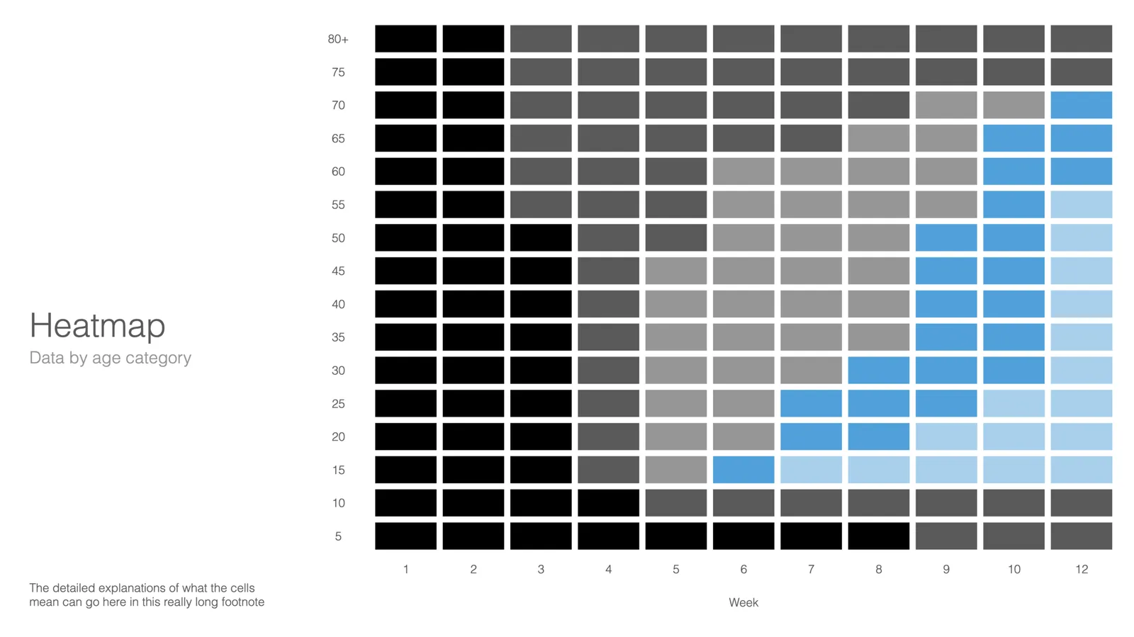
This is a neat visualisation of the COVID outbreak in Florida:

Why does it work?

  1. It uses colour intensity to introduce another dimension of data in a column diagram: time, number of cases, and age range.
  2. The colours are nicely chosen so the chart gives the impression of some sort of fire being lit (which is unfortunately the case).

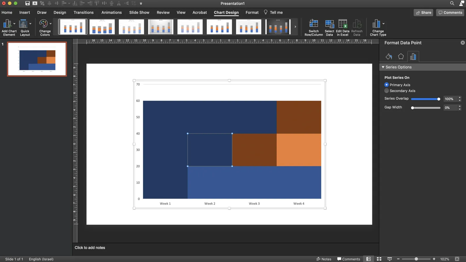
These charts cannot easily be created in PowerPoint, this one is generated by some code. But you could give it a go in PowerPoint.

  • Take a standard column chart in PowerPoint
  • Make all the data series have the same value, the age brackets you want to use
  • Set the gap between the columns to zero
  • And now comes the hard part: manually add different colours to each data point. To select a data point click it twice in quick succession (one click will give you the entire data series wiping out your detailed painting effort in one go)

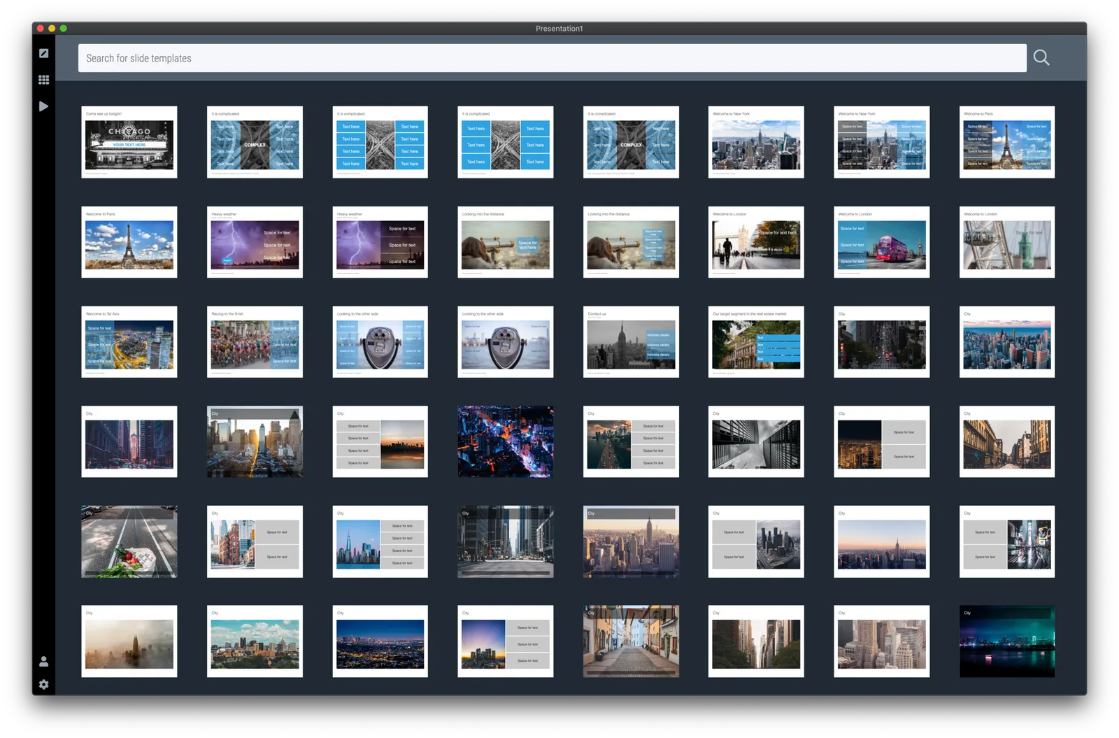
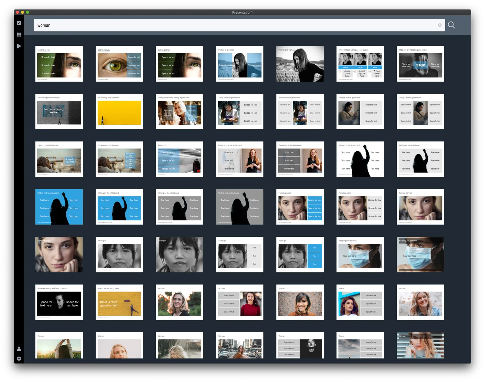
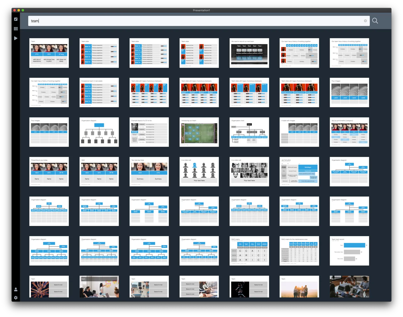
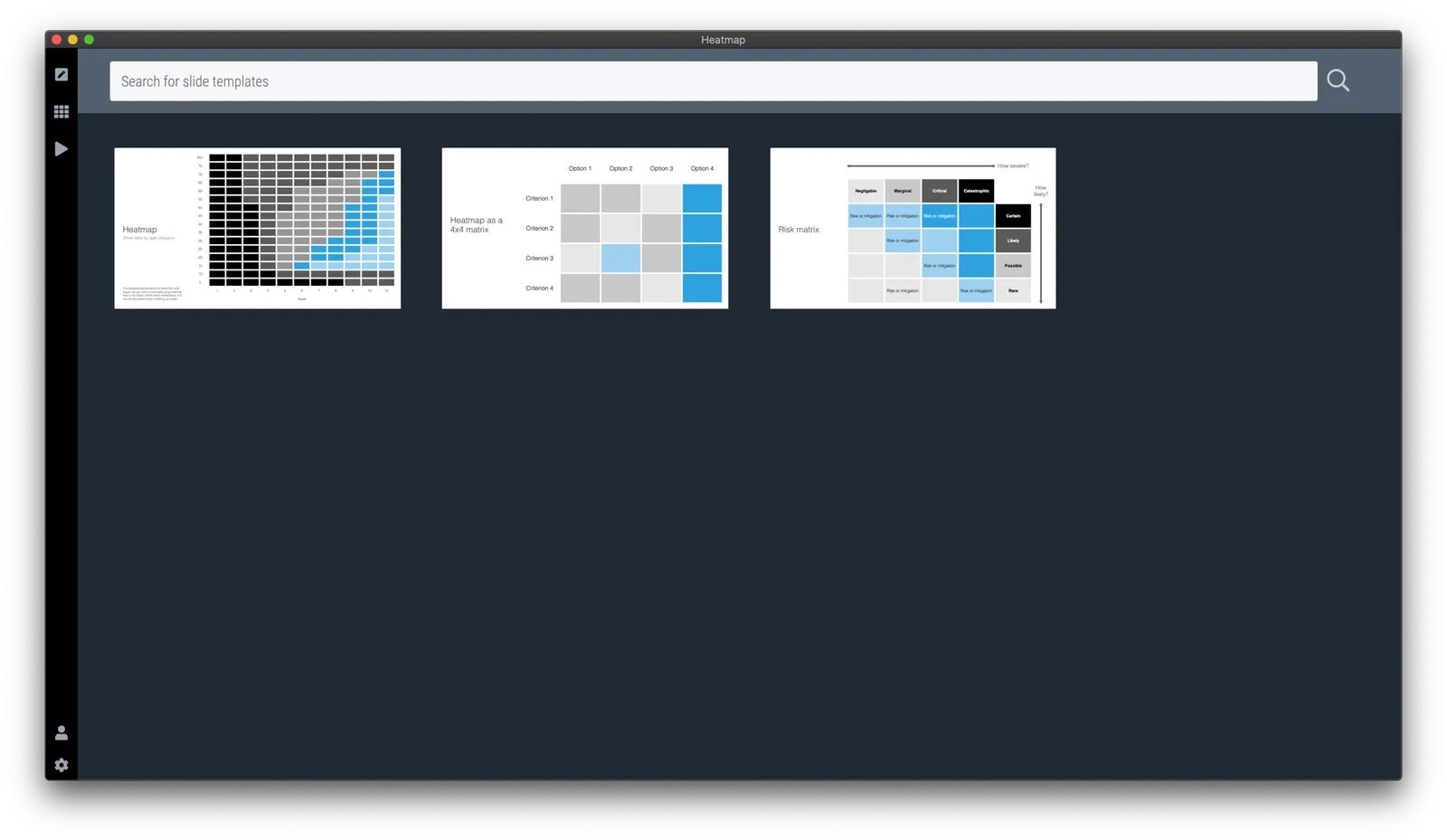
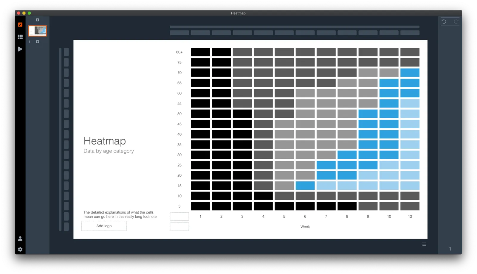
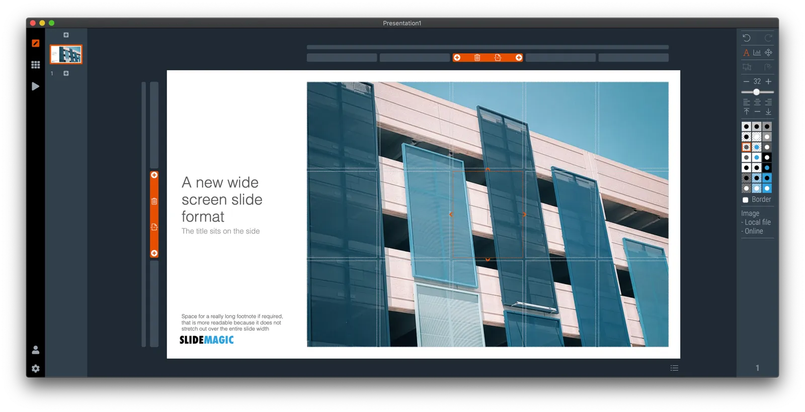
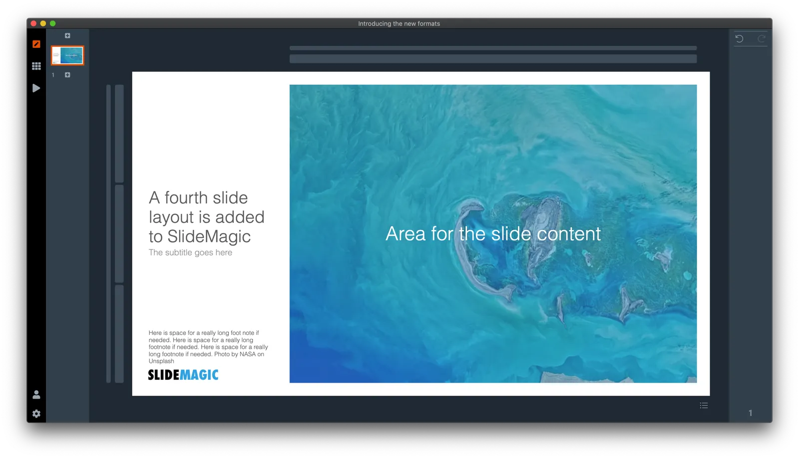
Here is a quick search for heat maps in SlideMagic, I added one design that sort of resembles the COVID chart. You can see how the new slide layout with the side title I introduced a few days ago comes in handy to create more vertical space for data.

·SlideMagic

Coming soon

Search results in the SlideMagic app show up as small screen shots of slides in SlideMagic’s blue colour at the moment. It would take a lot of bandwidth to send over the full slide designs when previewing templates.

I am making changes now on the server to make it possible that slide previews show up in your own colour scheme, with your own corporate logo on it, and in the layout you prefer(4:3, 16x9, black background, dark background).

The app will be upgraded first, after which I will make the feature available for paying subscribers on the web site as well. Users who prefer PowerPoint downloads will be able to download PPTX layouts with their own colours and logos already activated.

Work in progress.

Photo by Lindsay Henwood on Unsplash

·Layout

My preferred 16:9 layout for presentations

I just pushed a big update to SlideMagic (2.4) to the server and it contains a brand new 16:9 slide layout, the slide title. Most monitors today are widescreen, but unlike movies, I think 4:3 slides look much better. Text lines that run across the entire slide are hard to read, and wide screen slides always force you to make very “stretched” slide layouts.

The side title is the best of both worlds. The title of the slide is moved to the left, and the slide contain area is scaled up now that it has more space at the top. It stays in a 4:3 ratio though. The footer and logo is also moved to the left, creating even more space. The entire design shows up without black bars on a wide screen monitor. Below is an example.

It follows an approach I already blogged about in 2016

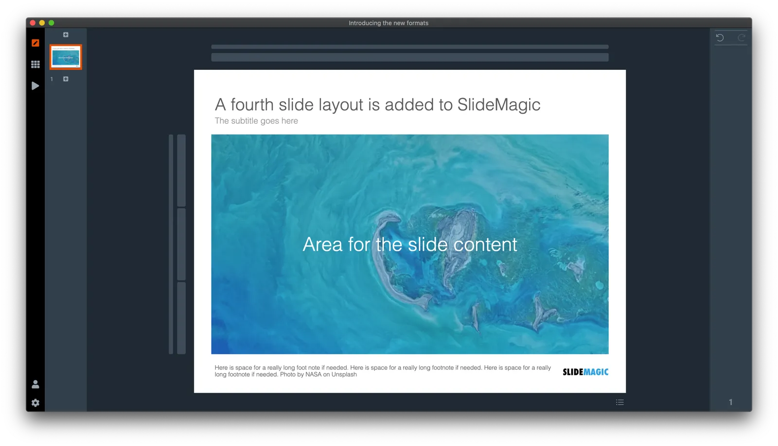
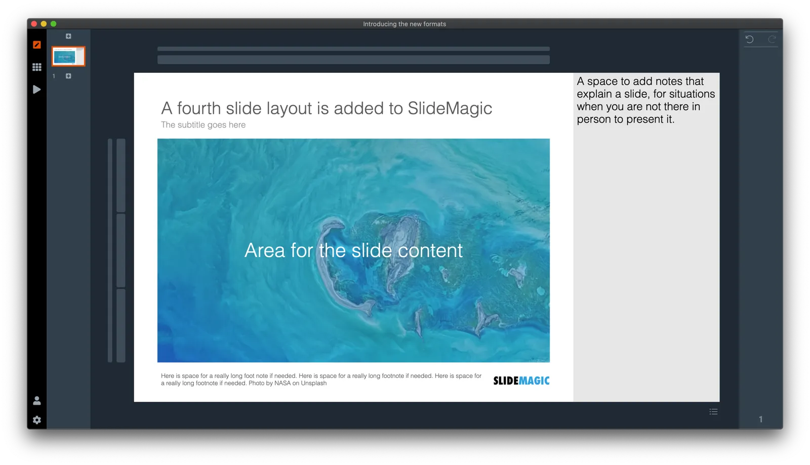
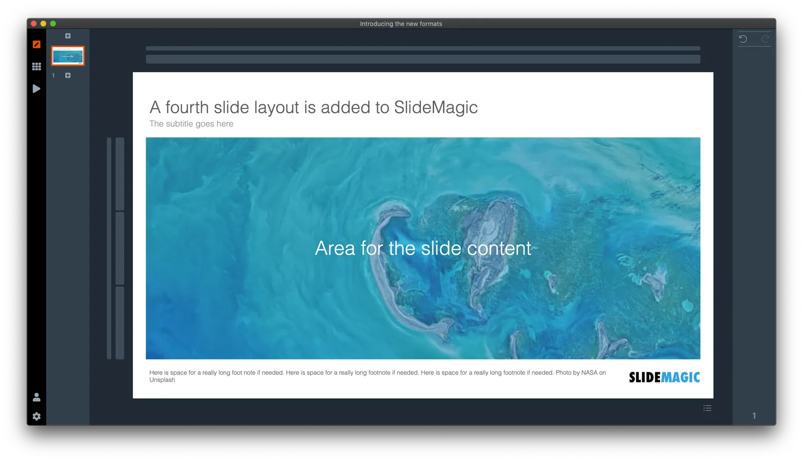
SlideMagic has now 4 screen modes, and you can switch instantly between them:

  1. Traditional 4:3 narrow
  2. 16:9 wide screen
  3. A 4:3 slide with an explanation panel to the side to leave notes for when you are not there in person to present the slide
  4. The new and shiny 16:9 side title

Soon, I will rerun the PowerPoint conversion algorithms on the server to increase the size of the SlideMagic PoiwerPoint template database with 25%, each slide will now be available in the new format as well,.

(Hmm, the side panel needs some more padding, I will fix that [Fixed in 2.4.1]). There are a number of other new features introduced in version 2.4.

Continue reading →

Borders!

I succumbed to pressure from some users of SlideMagic and added the ability to put a small border around a shape. In general I am not a big fan of borders (hence my initial hesitation). Most of the time a slide element just looks nicer when its shape is carried by its colour rather than a surrounding line. In nature, things do not have lines around them.

But.

I can see situations where you might need them. Especially when working with a grid of images of irregular sizes on white backgrounds (for example logos). Adding a tiny box around the shape makes the page look more balanced.

After installing the latest version of SlideMagic (V2.3.24), you will see a tick box appear under the colour menu. The tick does what it expects you to do. Let me know what you think, or update me if you find glitches in the .magic file rendering, or in PowerPoint conversion.

I will now also start using this new design element when I add new templates to the SlideMagic slide database.

While we are on user pressure, other requests that are being lobbied hard:

  • One, just one, more colour…. Please.
  • If we could somehow make something round (not boxy) in your app… Please.
  • Yes, I know that the “connectors” are a bit cumbersome at the moment

Let’s see…

Photo by Spencer Davis on Unsplash

·SlideMagic

How to change the default colour in SlideMagic

SlideMagic has a simple colour scheme: lots of variations of white, black, and grey, and one strong accent colour. Why?

SlideMagic is all about making presentation design efficient. This simple colour layout almost always looks great, and is very recognisable when you set the accent colour to the dominant colour in your logo.

How do you customise SlideMagic to your own preferred colour instead of SlideMagic blue?

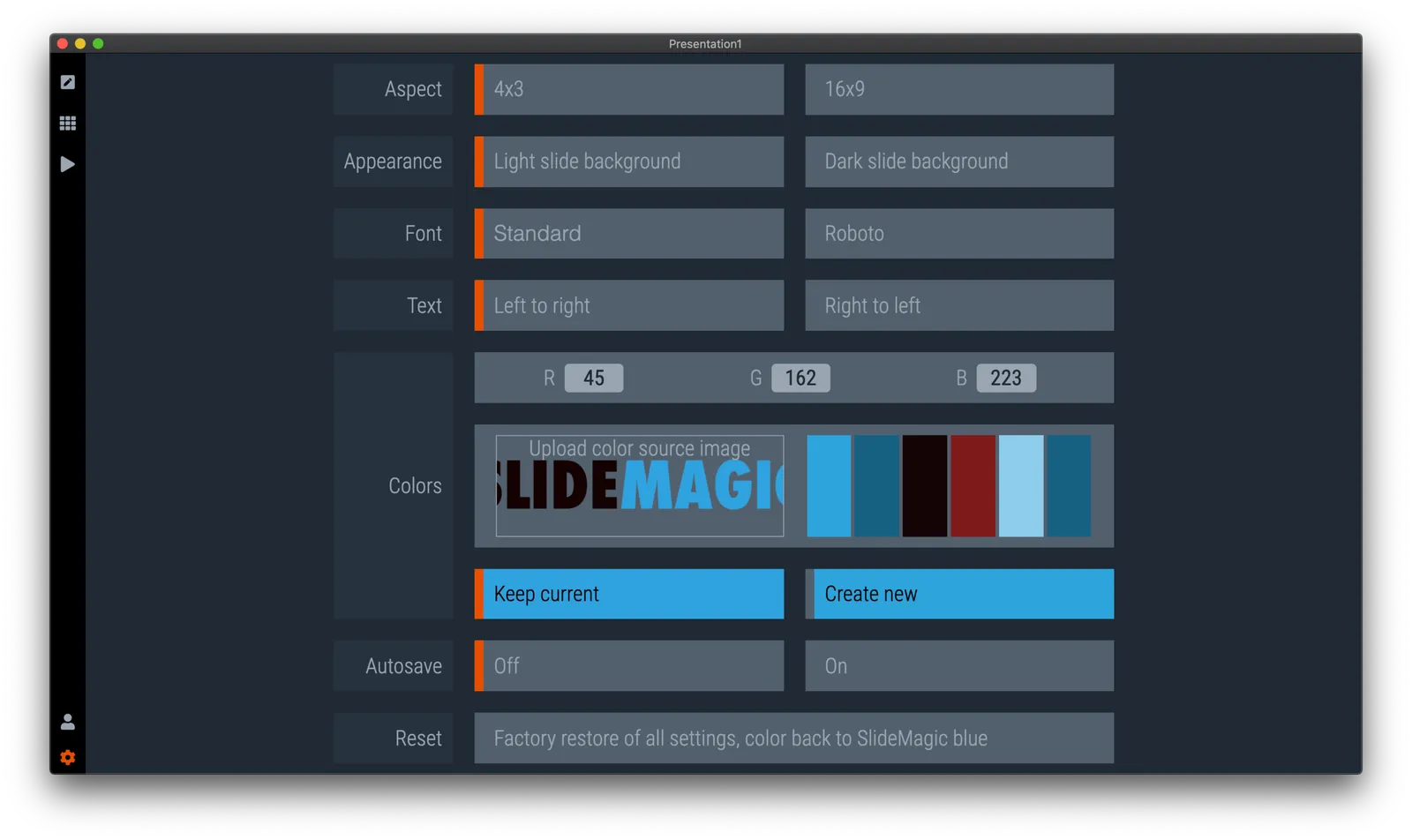
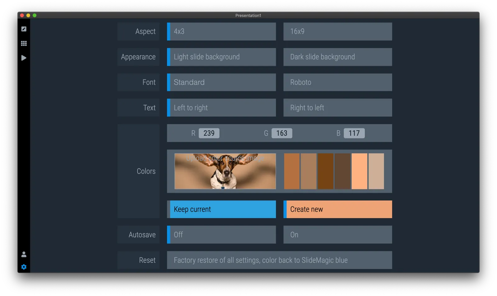
  1. Go to the settings menu by clicking the cog wheel in the bottom left of the screen

  2. You have 2 options to set the new accent colour:

    • Upload an image, after which the app will extract suggested colours from the photo (pro-tip: upload your logo)
    • Enter an RGB code directly
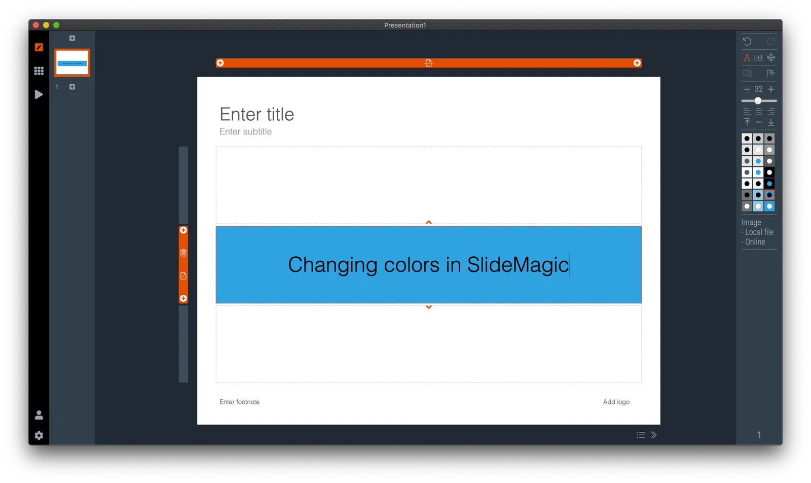
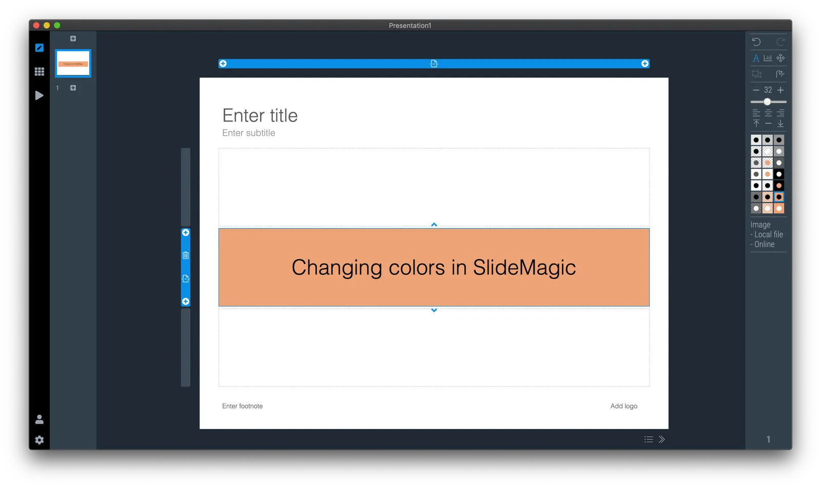
  3. Go back to your slides and the whole deck will be set in the new colour scheme. Also notice that the app itself changes its user interface colour to the complement of the presentation colour you picked.

How to get all the slides...

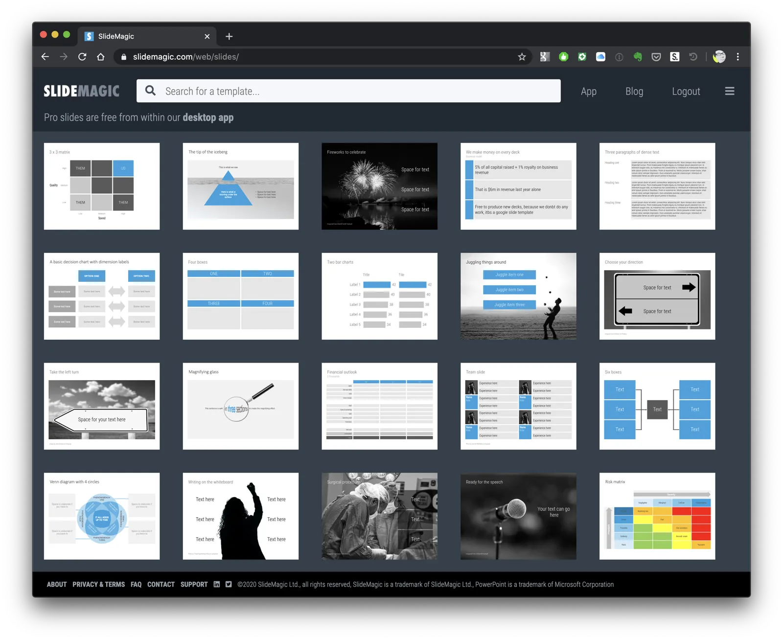
Many users ask for this. It is possible today to browse slides in the template bank by simply hitting an empty return in the search bank, you get served a dozen of random slides.

Still, I am not making this the core of SlideMagic. “Getting all the slides” is a very PowerPoint-like workflow. In PowerPoint it is hard to customise templates (adding/deleting boxes), which encourages you to eyeball a large number of slides you designed previously and pick the one that closest matches what you need today.

SlideMagic is different for a number of reasons:

  • It is super easy to customise templates: no need for eye balling. Simply start with a layout that is vaguely in the right direction and make a few adjustments
  • Many slides in the SlideMagic template bank are image-based, which generates a huge number of slides that are only usable for very specific situations. Eye balling to get inspired will take too much time and might give you a headache.
  • The database starts to get lots of slides that are almost-duplicates: title pages with different titles, small variants of the same concept. Not good for browsing

In general, the template bank gets too big for browsing, and I am only just getting started….

Photo by HelpStay.com on Unsplash

·Images

Working on improved image cropping

Working with images is turning out to be one of the most powerful uses of SlideMagic. The built-in image search gives access to an endless flow of great images, and the grid makes it really easy to layout these photos in a beautiful and consistent way on a slide.

Aligning images has always been difficult in presentation software (it is only worse in word processors), and that bit is solved by the SlideMagic grid. Next up is image cropping. Most design tools use some sort of overlay that allows you to mask/reveal an image. Even as a professional designer, I still struggle with this.

In SlideMagic, you simply drag an image around in a box to decide what part of the photo you want to reveal. I am working on 2 improvements:

  • Showing the entire image in semi-opaque when you are editing/dragging it around to give you. a better orientation of what you are doing
  • Creating a way to keep the image focused on the most relevant part regardless of changes to aspect ratios or zoom levels of the photo. At the moment, I store to image positioning versions (one for 16x9 and one for 4x3), but in future releases I want to automate this

The challenge here is to offer something that works without turning SlideMagic into a complicated photo editor. Work in progress.

·Concepts

Organisation charts

Organisation cultures are changing. Traditional hierarchies becomes less important, and project teams often become the engine of doing things. Also outsiders such as freelancers do not fit in nicely in big structures. At my time in McKinsey in the 1990s, we could have full meetings about whether a line should be dotted or not, and who would have to be drawn slightly higher than someone else on a page. Mistakes here were especially painful in a presentation to the management team.

Organisation chars in presentation are tricky for two reasons: it is hard to get all the boxes right on the page from a technical point of view, and it is hard to make everyone happy that the hierarchy and lines of the boxes reflect reality.

At the request of a user I have added a few more organisation charts to the SlideMagic slide template database. Complex organisation diagrams are not SlideMagic territory (if they are. hard to draw, the audience must also find them hard to understand). Instead, I created a few simple templates that can lay out the structure of an organisation in simple way, cutting the amount of lines, and increasing the size of text boxes.

If you present your chart as a a rough summary of the organisation rather than an exact reflection of hierarchy, you might just get away with it. If you pretend to be precise, people will nitpick…

The “connector” element in SlideMagic is still the weakest drawing tool and I am thinking about a new diagramming user interface now that my front end HTML design skills have improved significantly over the past year. As usual, the problem is not technical. Also in PowerPoint with its more sophisticated diagramming interface, it is hard to get connecting. lines to do what you want. They always angle and bend in a different way than you want them to.

Continue reading →
·SlideMagic

Dynamic slides generated on the fly

Version 2.3.16 of the SlideMagic presentation app went up last night (download it here for either Mac or Windows). The major new feature in this release is the dynamic generation of slides (at least, the first steps).

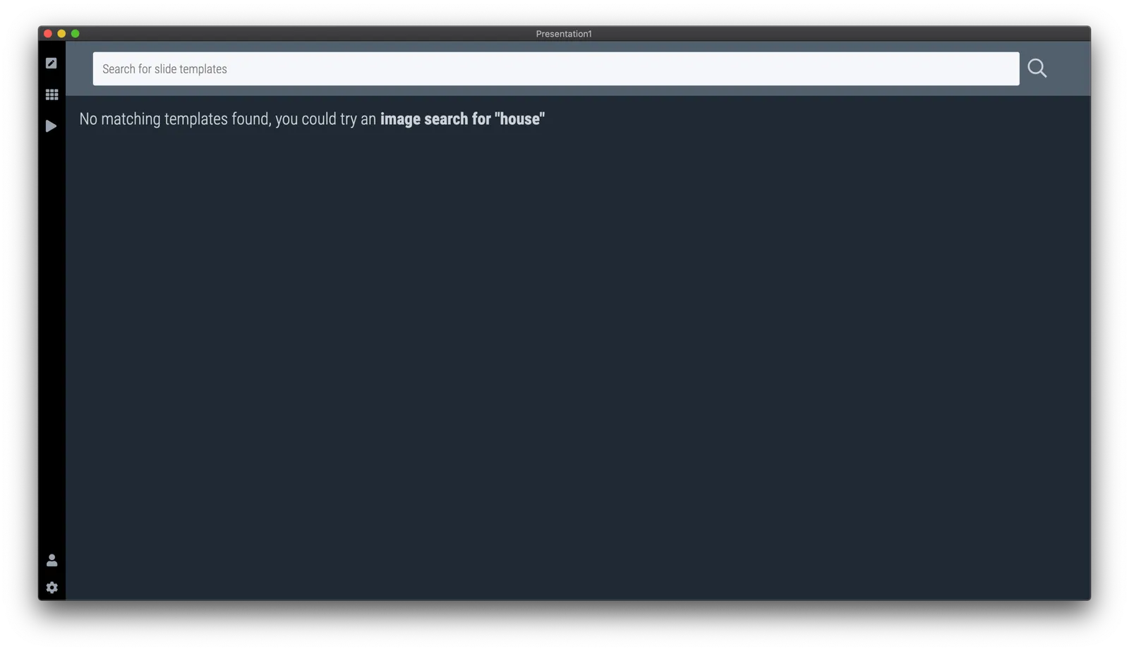
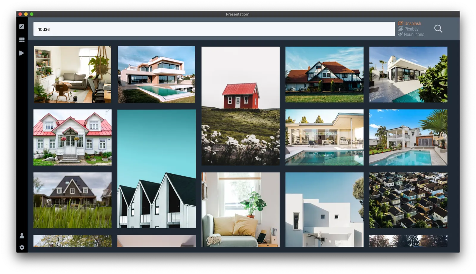
There are different types of template search queries entered on the SlideMagic server. People look for a specific framework (e.g., ‘BCG matrix’), a specific layout (‘3 bullet points’), but then there is a whole lot of more descriptive queries to are a better match for an image search site (‘house’ , ‘diabetes’). While I could populate the database with hand-made slides for each of these terms, it is more efficient to let technology do the work for you.

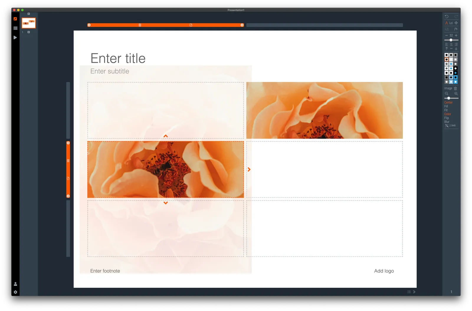
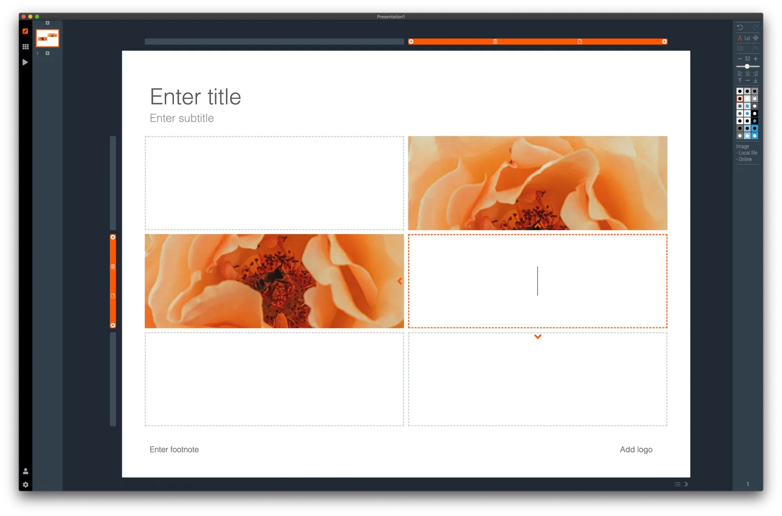
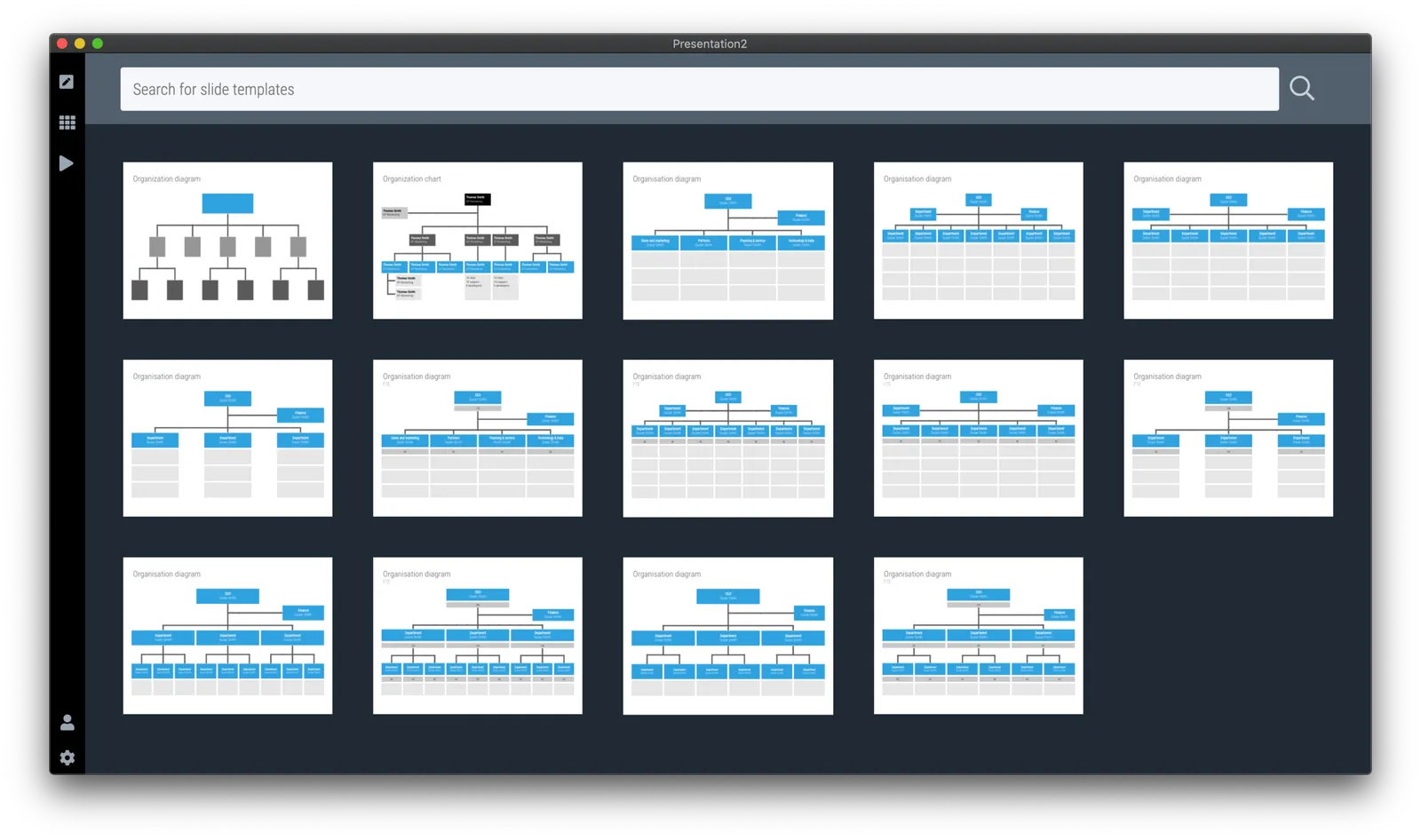
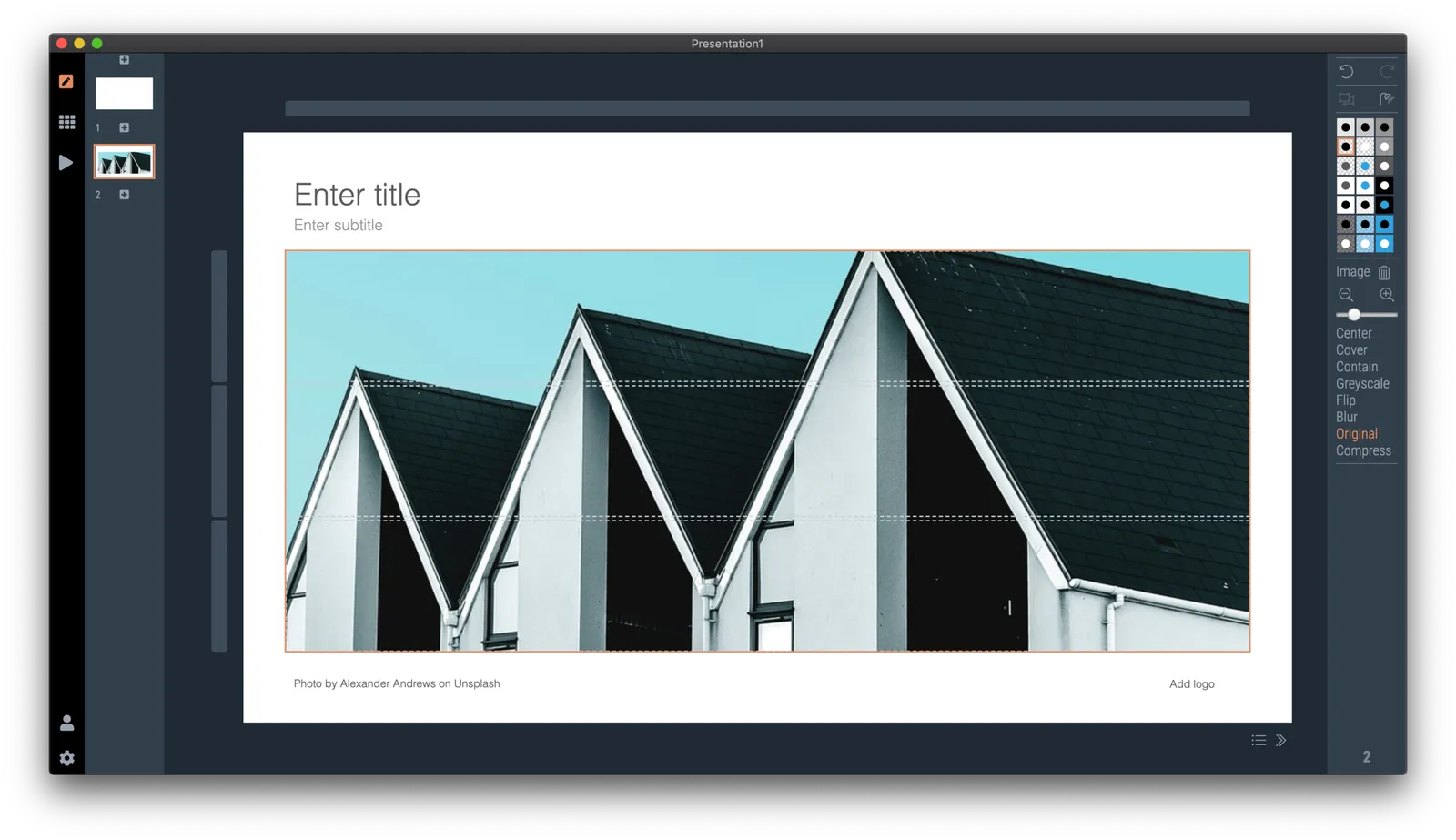
So at the moment, when the server gives up and returns a “no slides found” message, the user gets offered the option to run an image search instead with the same keywords. After picking an image, the SlideMagic app turns it into a framed slide with proper image credits that can form the basis for a new slide design. This slide is created on the fly, without the need to store templates on my server. So the number of slides that SlideMagic can produce now goes into the millions rather than hundreds.

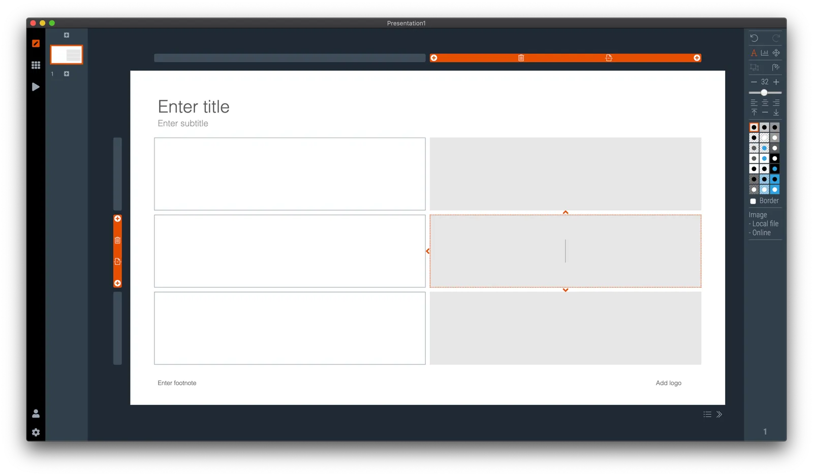
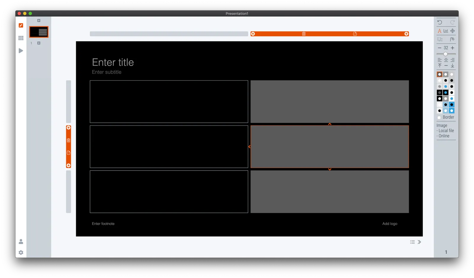
The screen shots below give an overview of the flow as it stands at the moment:

Obviously a slide with a simple image is still pretty basic. I am looking into expanding this approach with colour matches, and more interestingly analysing images for white space, with suggested pre-population of text placeholders on the image.

Continue reading →
·Layout

Make any presentation look better

I took a recent draft presentation that came across my desk (in PowerPoint) and took out all the specific / confidential information and images, replacing them with dummy text and boxes.

This was by no means a final deck, but it highlights something that most people get wrong when creating a slide deck: tidying up your layout.

Some slides have a white frame, others having images bleeding off the page. Icons are different sizes. Things are not properly aligned. Get all these things right, and your deck will instantly look good, even without fancy fonts, graphics, colours.

This is easier said than done. In PowerPoint, you have the freedom to place anything, anywhere you want. You realise in the last minute that that particular text needs to go in, well it will always fit.

SlideMagic will not let you get away with this. Grids are strictly reinforced. Many users complain about that lack of freedom. I need that 5th box, and now the whole slide layout cannot handle it. And this, exactly, precisely, the process a professional designer has to go through. Unlike you, she does it instinctively and switches the slide layout. With SlideMagic, you will be reminded (kindly) as well.

Here is a quick layout of what a deck like this in SlideMagic should look like. This is not “super design”, SlideMagic helps you make a decent looking deck in the minimum amount possible. “Super design” requires a lot of investment (time and money), which gets you a great looking deck, but one that is sort of set in stone, it is very hard hard to make changes to it. Great for your IPO road show, less so for an every day presentation.

Continue reading →