SlideMagic Blog

Frequent updates about all things presentations since 2008. Subscribe to never miss a post.

RSS
all posts

Search results for “web design”

·Books

My iBook abour presentation design is now free

I now marked down the price of my iBook “Pitch It!” down to $0. The whole iBooks experience has been an interesting one. First I thought that publishing a book through Apple’s platform would be like writing software: updates would automatically be pushed to all readers. The iBook format would also use all the interactive/touch features of the iPad.

Two and a half years later I must conclude that web design engines such as Squarespace have now become so powerful that they match iBook’s interactive capabilities. I have ported my entire book here (it is free as well). It works great on iPad, but also on other tablet devices, mobile phones, desktop screens. The source code is also easier to maintain and update.

Art: Degas, The Rehearsal, 1873
·Investor presentation

Design DNA

Design DNA is engrained in a company. It shows in presentations, in the web site, in the way the office is laid out. When a visitor/user/viewer gets in touch with a company, she makes up her mind in the first millisecond about the design DNA of the company, by comparing it to all other presentations, web sites, and offices she has seen. We have all seen these stereotypes:

  • The bare bullet point presentation in the standard Microsoft Office 2007 format
  • The over-designed PowerPoint template with gradients, images with faded edges and huge logos at the top of the page
  • The social media expert website full of call to actions to buy her $5 ebook on being a social media expert
  • The traditional, hierarchal office with too many big leather board seats crammed around a too small board table in a board room that doubles as a storage room for exhibition displays
  • The hipster I-don’t-really-say-anything web site
  • The girly office full of plants and cute natural-material furniture
  • The macho office with an impressive collection of booz in the lunch room
  • The 1990s tech company web site: takes 40% of your screen and has detailed product hierarchies that get to pages that don’t really say much about that specific product
  • The startup web site where “tour”, “about us”, “benefits”, and “product” tabs pretty much say the same thing

At every point you come in contact with a client, user, investor, make sure you look the way you want to look. Even if your investor presentation looks right, that impression can be undone in one second when someone opens your web site.

Continue reading →
·Layout

Learning from Swiss graphic designers

Most presentation design software today is the result of someone in the 1980s thinking: “hey, this mouse is cool, you can use it to draw things!”. We can move, drag, stretch, place things freely across our drawing canvas.

Presentation software SlideMagic aims to close this tangent and go back 20 years earlier to the 1960s when graphics designers in Switzerland developed a clean and crisp style of communication and design that does in many cases the exact opposite of the freedom the mouse offers: tight grids, limited font choices, limited colours. simple shapes.

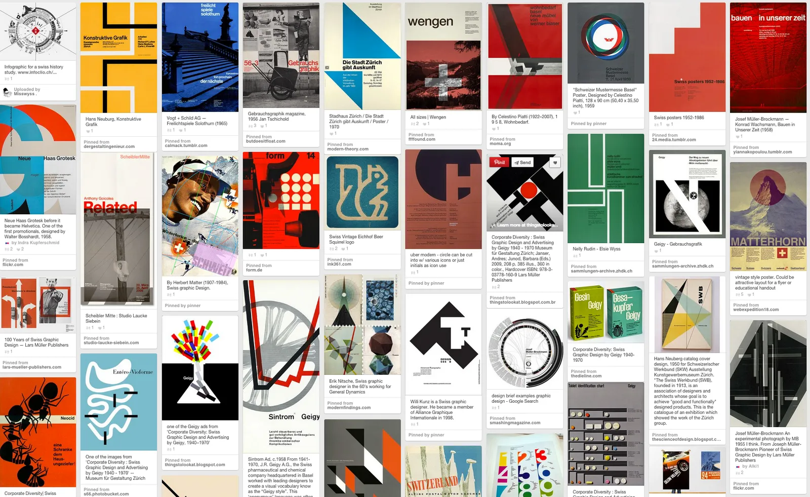
Eyeball the posters on this Pinterest board by Misswyss and see what you can learn form them for your own designs. Which one do you like? Which one does a better job at communicating than others? Why is it that some of these very simple designs look very pretty?

 Examples of posters designed in the Swiss style

Examples of posters designed in the Swiss style

Some of the features they have in common:

  • Limited number of colours
  • Sans serif font (only one)
  • A strict grid alignment throughout the page
  • Relatively small headlines
  • De-emphasising (making things grey) rather than emphasising (making things bold) text
  • Flat shapes, no gradients, drop shadows, textures
  • Big silhouettes, simple shapes

Why not steal some of these ideas in your slide designs?

Art: Albert Anker, The walk to school, 1872, 90 x 150 cm Subscribe to this blog, follow me on Twitter

·Books

Useful presentation design tools and resources

As most of my clients outside Israel are enjoying the X-mas break, I have some time to clean up my web site further (no holiday here in Tel Aviv). I added a bunch of presentation design resources on the site.

  • Presentation design books. The flurry of new presentation design book releases seems to have faded a bit over the past years. Has all that needs to be said, been said, or did I miss anything?
  • Presentation design tools. A few neat software tools that can make the life of a presentation designer easier.
  • Sources of presentation images. There are more and more sites out there that offer free stock images under a creative commons license. These images are free, look real, BUT the library sizes are still small, and search is limited.
  • The blog search archive. Now that I moved away from Blogger, it is harder to add sidebars with search boxes, archive links, and tag clouds to the blog. Hence, the dedicated search page for access to 6.5 years of posts (more than 1700 in December 2014).

I hope you find it useful, and let me know suggestions to add more resources.

Art: Gustave Caillebotte, Les Raboteurs de Parquet, 1875

Click here to subscribe to the blog

My book can now be accessed free on the web

To support the launch of the SlideMagic presentation design app I have started to remove the paywall for my book Pitch It!, you can read it here.

I am making slow progress because it requires a rewriting and reformatting of the content. First there was the iBooks version written in iBooks Author, then the PDF version written in InDesign, and now I am converting the content to HTML using squarespace.

Web templates have moved a long way over the past 2 years. The squarespace version looks as good, if not better, than the iBook version. I have all the freedom to design interactive content, and the adjustments between wide screen, iPad, and mobile phone are phenomenal. No app stores, no pass words, just click the link and you are in on any device.

This says something about the blurring of visual communication formats beyond the slides used in a stand up presentation. Scrolling down on a tablet is much more intuitive than clicking through slides (part of the reason why in SlideMagic things are fluid). Like reading a magazine or a newspaper, there is value for big picture, wow visuals, and a 12 point story here and there. A big bold chart and a detailed diagram. Maybe a nice magazine-style website behind a password is a better to present your idea than a PowerPoint attachment?

I can now also take the opportunity to update the content of the book, some of which has become a bit stale since December 2012 (and the biggest missing piece of information is SlideMagic as a credible alternative to PowerPoint and Keynote of course!).

Flat design

I never liked gradient fills, reflections, and bevels. But recently I am increasingly letting go of drop shadows as well, only using them for objects that really need to pop out. I guess I am influenced by the current trend of flat design in web/UI design.

·Sharing

Flowgram - stitching web content together into a presentation

Ars Technica is featuring this review of Flowgram, a tool to create a sequence of web content (sites, Flickr photos, audio voice over) into one presentation-like format. Flowgram’s founder has written a flowgram about - you guessed it - what is a flowgram here. This new tool seems particularly useful to develop presentation content that is loaded on a web page and designed for individual viewing. In a strange way, some of these web 2.0 presentation tools take some of the interactivity out of the internet and bring the online experience back to something that is called TV… Sit back and enjoy. UPDATE: Tony from Flowgram has a good point in the comments, Flowgram preserves the ability to click links during the presentation, so not that passive after all.

Professional presentation design - impossible skill mix

A good presentation involves good substance,a good presenter, and finally good supporting graphics. Many people are in the business of presentation design, but it is hard to find people that combine all skills under one roof.

  1. Statistician - visualization of data in charts
  2. Illustrator - for beautiful illustrations and images, consistent colors
  3. Designer - someone that can take a (business) concept and translate it into an original graphical metaphor, i.e. using an image of a rope that is about to snap to show a business being torn apart by 2 forces
  4. Story writer - for an engaging argument
  5. Rhetorician - for the perfect logical argument
  6. Strategist - for understanding a business audience and making the business content actually makes sense

I am 6. (by training), mixed with a bit of 1., 3. and 5., trying hard to learn more about 2. and 4. In my work I usually come across the “pure 6.” writing bullet point charts distilled from a 100 page business plan, or the “pure 2.”: great at designing graphics but with limited business understanding.

·Data visualization

How to design management dashboards

The number of app installs of SlideMagic 2.0 is still small, but the graph has a similar shape as the exponential graphs we all have gotten used to over the past weeks.

Modern analytics tools allow you to track literally everything under the sun in your app and/or web site. Instant information overload supported by colourful graphs that look good, but don’t say much. This overload of data is similar to the ones I would encounter as a consultant at McKinsey. And now, 15+ years later, I find myself following a similar approach to making sense of it for my own app.

Most case examples about analytics are built for established apps and web sites with huge customer flows you can micro analyse whether the check out button should br green or red. SlideMagic is not there yet.

  • I find myself going through a certain cycle. It starts with a basic question, “how many people did actually install the app”, which results in a daily manual routine to find the latest number, which then gets translated into a proper query in an analytics app. I check whether my analytics tool is consistent with the numbers I can dig out of my own server. Slowly, slowly, I get a sense of how the app behaves with a consistent set of data that I can recognise.
  • Slowly, slowly, I start adding more questions to the picture, and make sure that I keep a picture of how they relate.
  • Each factor has a specific visualisation: some are lines, some are bars, some uniques, some totals, some cumulative, you need to play around with it.
Continue reading →
·Design

Parking allowed?

Tel Aviv is trying to improve the clarity of their parking signs, who can park when. The sign below is the new format. (If you do not read Hebrew, you will get tickets…)

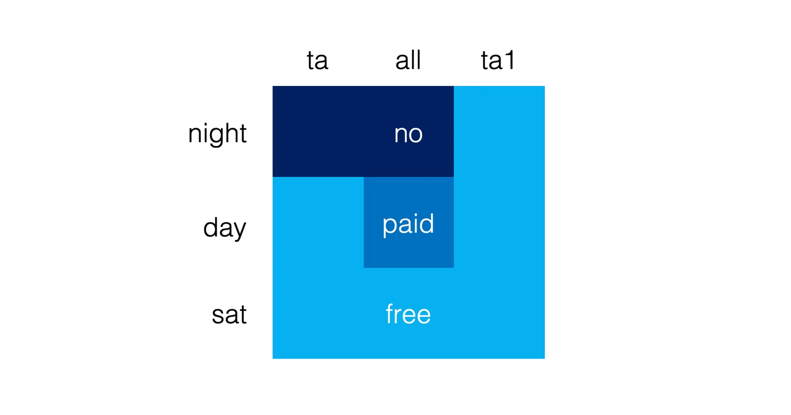
I would have gone for a much simpler shape that would make the table easier to read. Here is a sketch (obviously not a final design)

Put all the details (hours of day and night, etc.) in a dense footnote at the bottom. Once you have read the footnote once, you can just glance at the shape anywhere in the city and now what you are up to.

My guess is that the detailed table with explicit instructions was selected to make it easer to deal with law suits of people disputing their tickets.