Poster design goodness
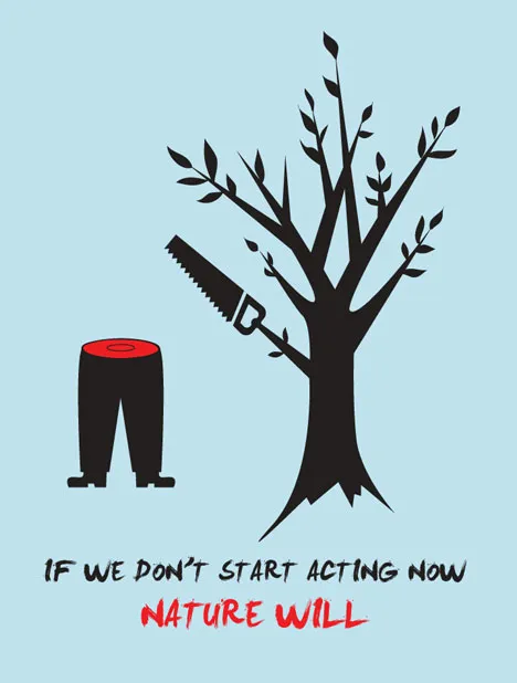
Some interesting visual concepts in a Core77 poster design competition. I borrowed the image by the winner Miryam Melkumyan, you can see all entries here.


Frequent updates about all things presentations since 2008. Subscribe to never miss a post.
Some interesting visual concepts in a Core77 poster design competition. I borrowed the image by the winner Miryam Melkumyan, you can see all entries here.
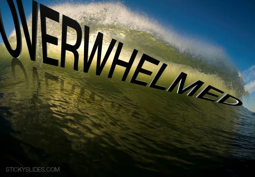
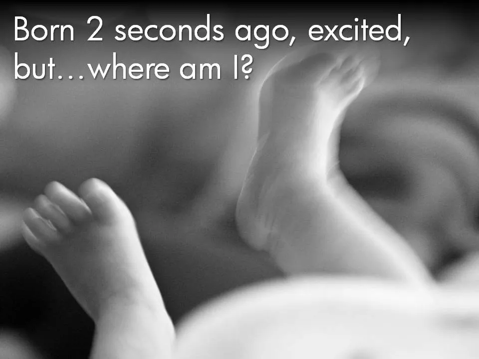
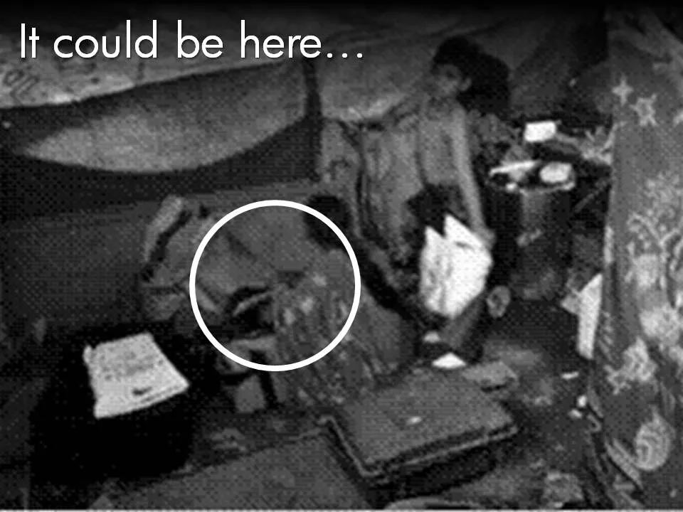
I think there are 4 different type of visuals, Have I forgotten any? (The images below are taken - out of their context - from previous posts on this blog)
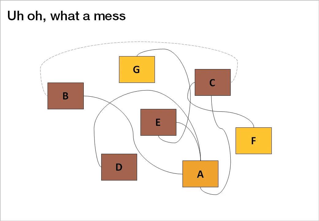
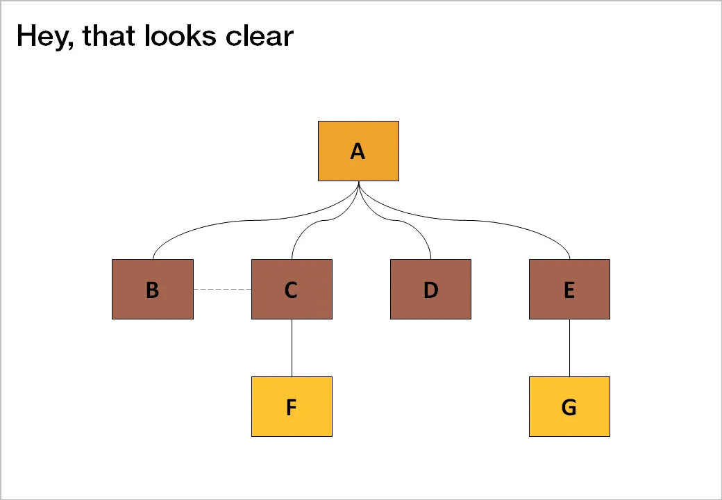
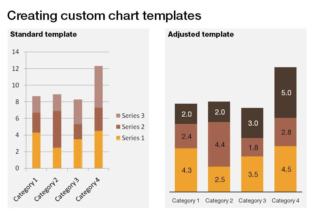
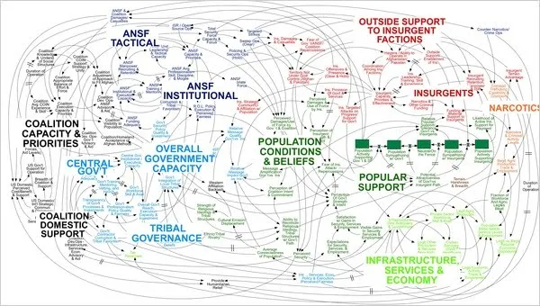
An incredibly dense relationship or data chart should actually be in the “location port” category, the U.S. army spaghetti chart is an example: it is not so much about understanding the chart in detail, rather the viewer understands immediately that “it’s complex” (earlier post).
Anyone interested in presentation design will have heard about or bought Nancy Duarte’s latest book: Resonate. I managed to read it over the weekend, here are my impressions.
While her previous book slide:ology was mostly about slide design, Resonate is about stories, stories that get your audience to change their perspective, and take action, do something, change something. It is actually the right order of learning how to become a good presentation designer: first acquire the skills to visualize a single concept in a chart, then focus on weaving those charts together to build a powerful story.
This is what I see happening around me. The current Slideshare presentation of the year competition shows that thousands of people have acquired the skill to make “stunning visuals” using images. But most story lines are still relatively simple: sequences of chars showing how big something is, or sequences of images that show emotions/feelings that we all recognize. Great movie directors or authors posses the art to take you along a more complex path that will change you and the perspectives you have of the world. This is what Resonate is trying to get to.
Slide:ology is a reference book that I still use when designing slides, Resonate is different. It is a book with an idea, looking at the cover on the book shelf will remind you to check whether this is the best story line you could come up with
Large parts of the book are written using reverse engineering, analyzing great presentation and speeches and see why they had so much impact on their audiences. But on top of that, Nancy threw in her own presentation design experience, and embarked on a significant research effort in areas such as movie scrip writing and classic rhetoric. A few of the interesting points that were highlighted in the book (just random examples, not a MECE (what’s this?) summary of the book’s contents):
OK, the comments on my post from 2 days ago showed that I should think a bit more before writing about the last slide in a presentation. Here we go:
A good story does not need a slide that says “that was it, please applaud”, the story flow in itself should let the audience feel that you have come to the conclusion of your talk. (And what if the audience does not applaud when you ask them to? Awkward.
It is good to recap what you discussed though. But recapping does not mean telling the entire story again. Rather think of it what you want people still to remember 4 hours after the presentation. Leave out the buzzwords and the fluff.:
Much better than:
Many of the readers of this blog are - like me - designing investor pitch presentations. This 30 minute talk by Paul Graham of Y Combinator gives some interesting perspectives on how the competition between “super angels” and regular VCs has an impact on startup valuations and the startup fund raising market in general. If you are here just to learn about slide design, skip the video.
The recent post on the Google blog about an update to the search algorithm is an excellent example of how to explain technology:
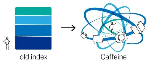
In case you missed, an earlier post on how Google uses cartoon characters to explain why its Chrome browser beats the competition.
The BP logo was a very powerful one: an environmentally green flower/sun beaming with lots of positive energy. (Apparently it is based on the symbol of Helios, the personification of the sun in Greek mythology).
The fact that it was so good is proven by the enormous number of logo redesign contests that are being conducted now after the oil spill disaster. See this Google search. Here is one that offers a $200 bounty (still accepting entries), and here is a Flickr page with the entries from a contest organized by Greenpeace. The illustration below is taken from Draplin Design.
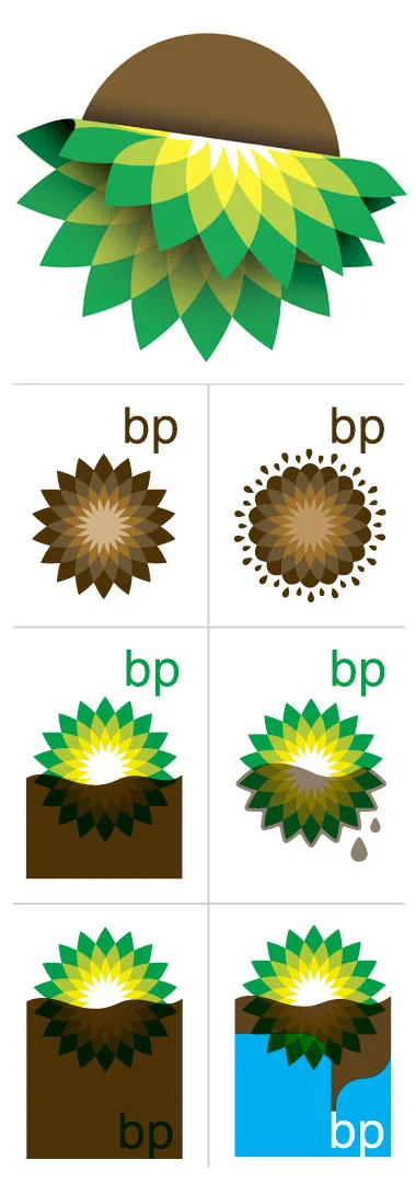
It is good to see that graphics design can spark so much emotion. Just a shame that is not a more positive one.
Recently, I spoke for the finalists of the BizTec business plan competition in Tel Aviv on how to pitch to VCs. The slides were an adaptation from an earlier talk on the same subject. Here they are.
The more you practice, the more you rehearse, the more you get on top of your story. And the more comfortable you get with your material, the more confident you get in delivering it. Confidence goes beyond getting rid of fear of public speaking, confidence enters chart design and story telling as well.
It is a bit like the abstract painters of the last century: having the confidence to communicate emotions and ideas without relying on realistic techniques. For example Piet Mondriaan’s Broadway Boogie Woogie painted in 1942-1943.
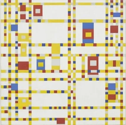
The pulse of a Jazz beat, and the energy of the New York traffic squeezing its way through the city’s grid all captured in one painting without showing Jazz bars, Times Square neons, and/or New York traffic jams.
Sometimes a reader emails me with a question about a chart makeover. It is hard for me to free up the time for personal 1-on-1 answers, but if I can discuss them here for the benefit of everyone, it is a good deal. So here we go, I am obviously removing any reference to the specifics of the situation.
This case example is about supermarkets. There is a plan to open a new one, one that will be far bigger in floor space than all the surrounding super markets. This floor space will be the main competitive differentiator.
Before
Because of confidentiality I cannot post the actual image, so I will describe it (apologies for the bullet points):
My suggestions
Ideally you want to break up this chart into at least 2 charts with different messages: