SlideMagic Blog

Frequent updates about all things presentations since 2008. Subscribe to never miss a post.

RSS
all posts

Search results for “web design”

·AI

Nano Banana

I just played around with Google’s “Nano Banana” AI image generator, and it is incredibly good and useful for presentation design.

Current AI image generators take a prompt and predict pixels. Ask for a modification, and a whole new bunch of pixels get generated, redoing the entire image. Nano Banana (we need a better/shorter name), seems to work with layers and objects, and keeps things consistent.

Below 2 quick examples:

 “White Porsche in Hoogeveen”

“White Porsche in Hoogeveen”

 “Turn it around”

“Turn it around”

Some observations:

  • Super fast, the first image was an almost instant response
  • Hyper realistic image, does not look cartoonish
  • Correct text: the name of the cafe, the license plate, the branding of the car
  • (That town looks Dutch, but it is not Hoogeveen)
  • But most importantly: isolated editing, changing one thing and leave everything else the same

Photoshop, it was nice meeting you…

I will study the API structure of Nano Banana and see whether I can swap out the image generator in SlideMagic.

Impressive! You can try it out in Google AI Studio

·AI

SlideAudit - Academic research to improve slide layouts

I am following academic efforts to use LLMs to improve / automate slide design with great interest. Each takes a slightly different approach. SlideAudit was recently published by Zhuohao Jerry Zhang and others.

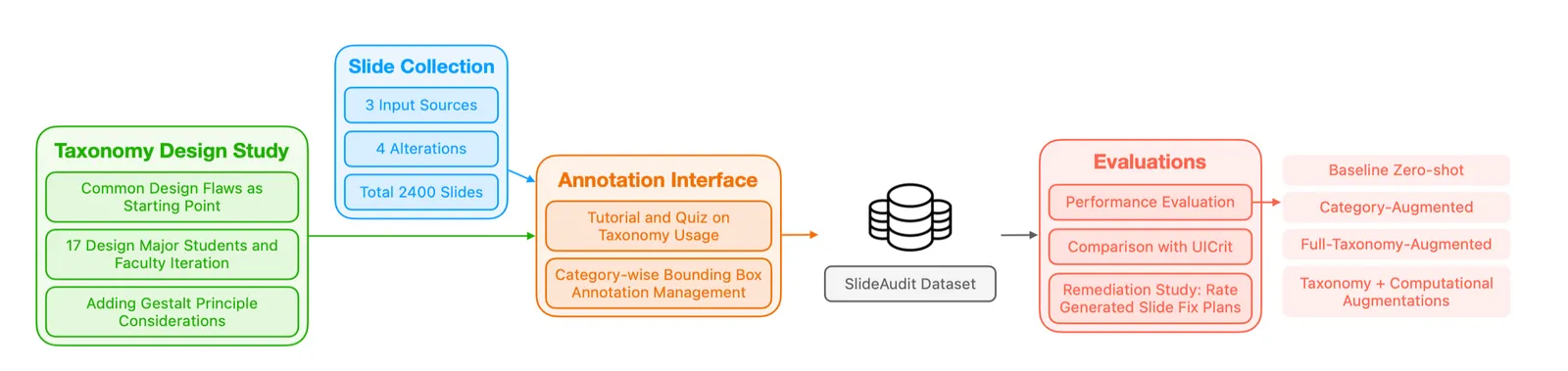
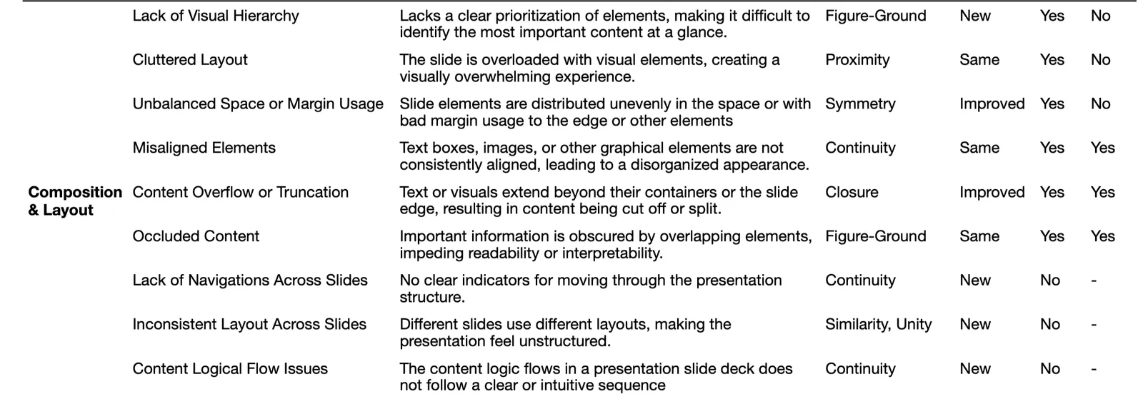
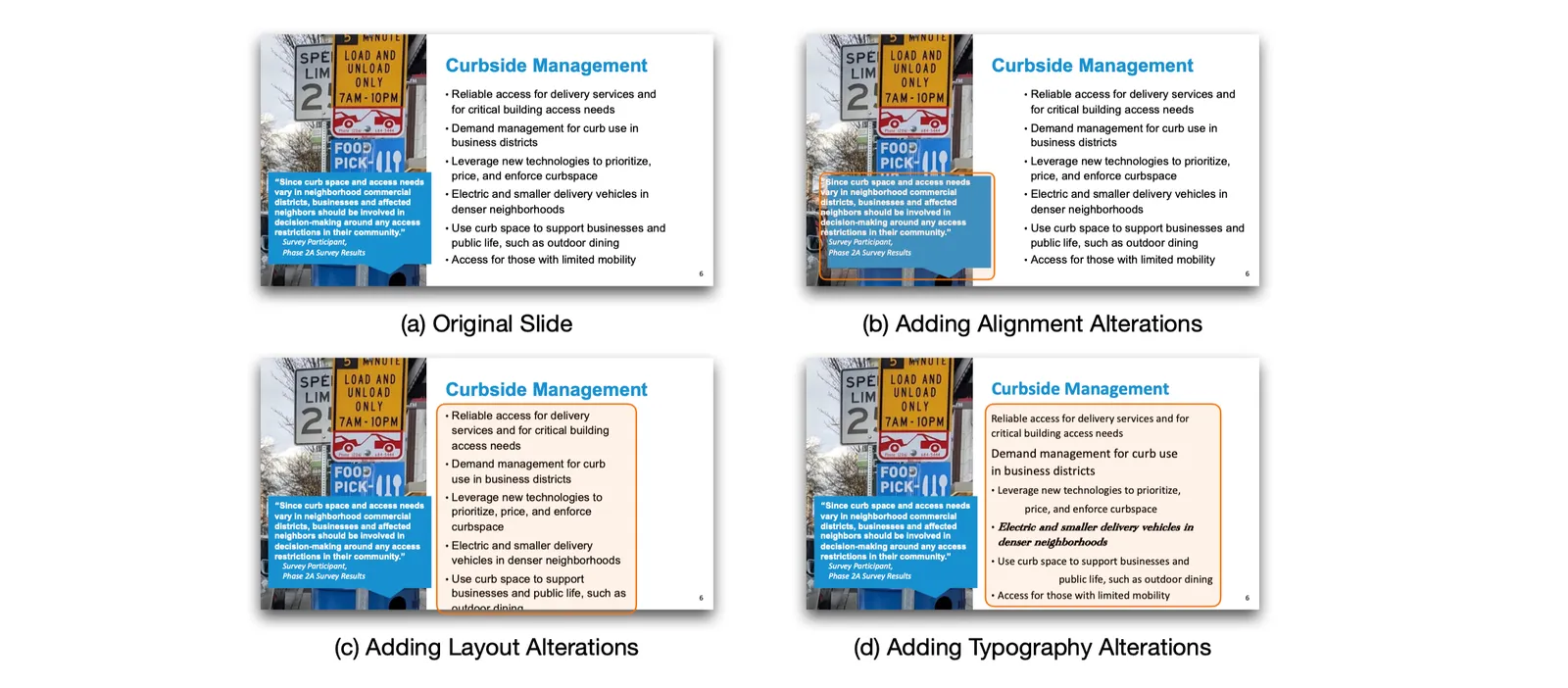
SlideAudit teach LLMs what good design is by teaching it rules and principles. A lot of effort goes into building a bank of slides, identifying design flaws for training, synthetically introducing slides, letting the model run and evaluate the results.

I think this approach can work well for publications that resemble print: designs with lots of text in smaller fonts, and images / graphics that are placed in some sort of grid. Books, magazines, newspapers, but also web sites.

Presentation slides are trickier. It is harder to describe what makes a slide a good slide. You know when it when you see a good one (or a bad one), but pinpointing and automating the steps to go from bad to good is tricky.

Political ad makeover

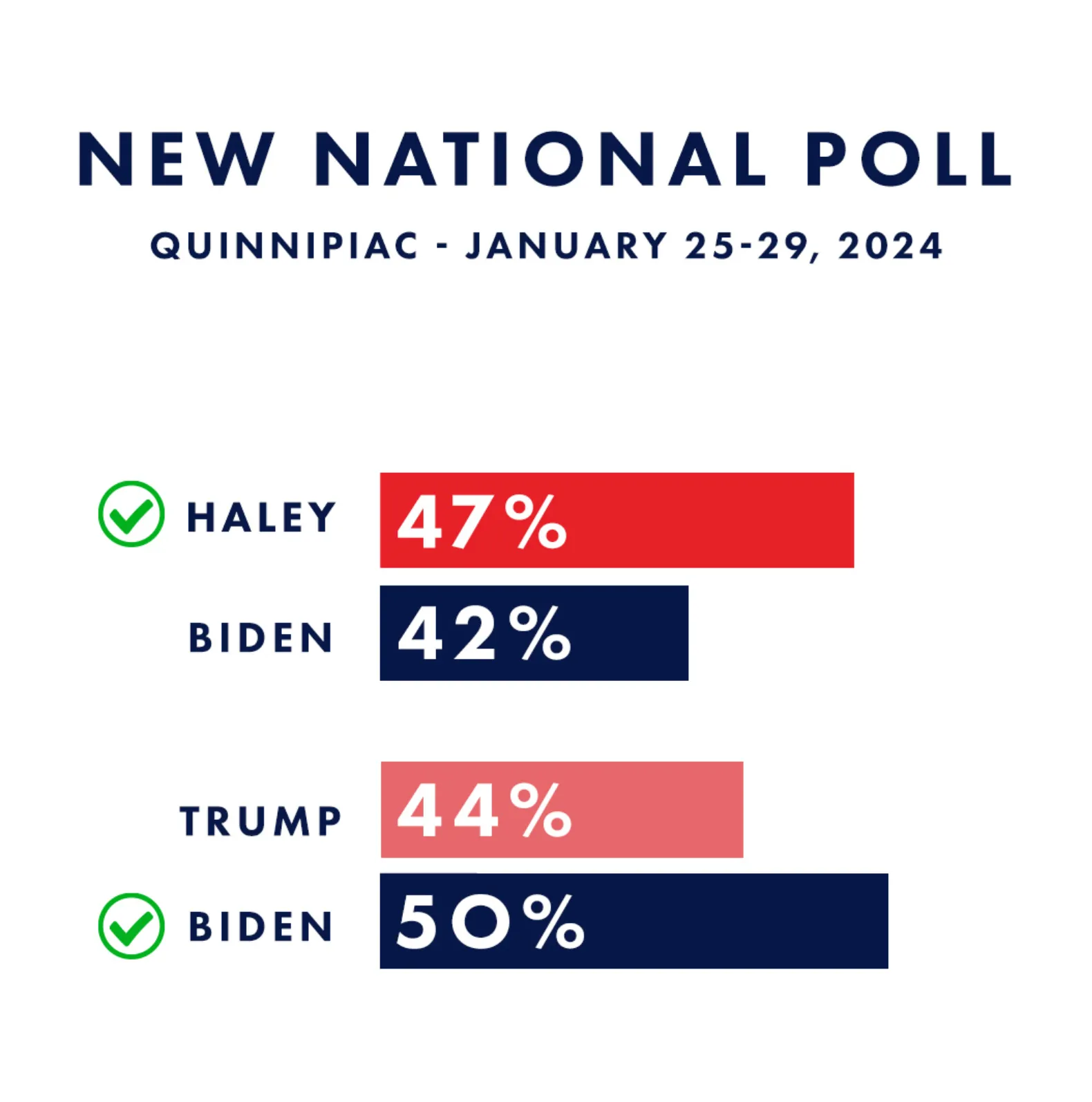
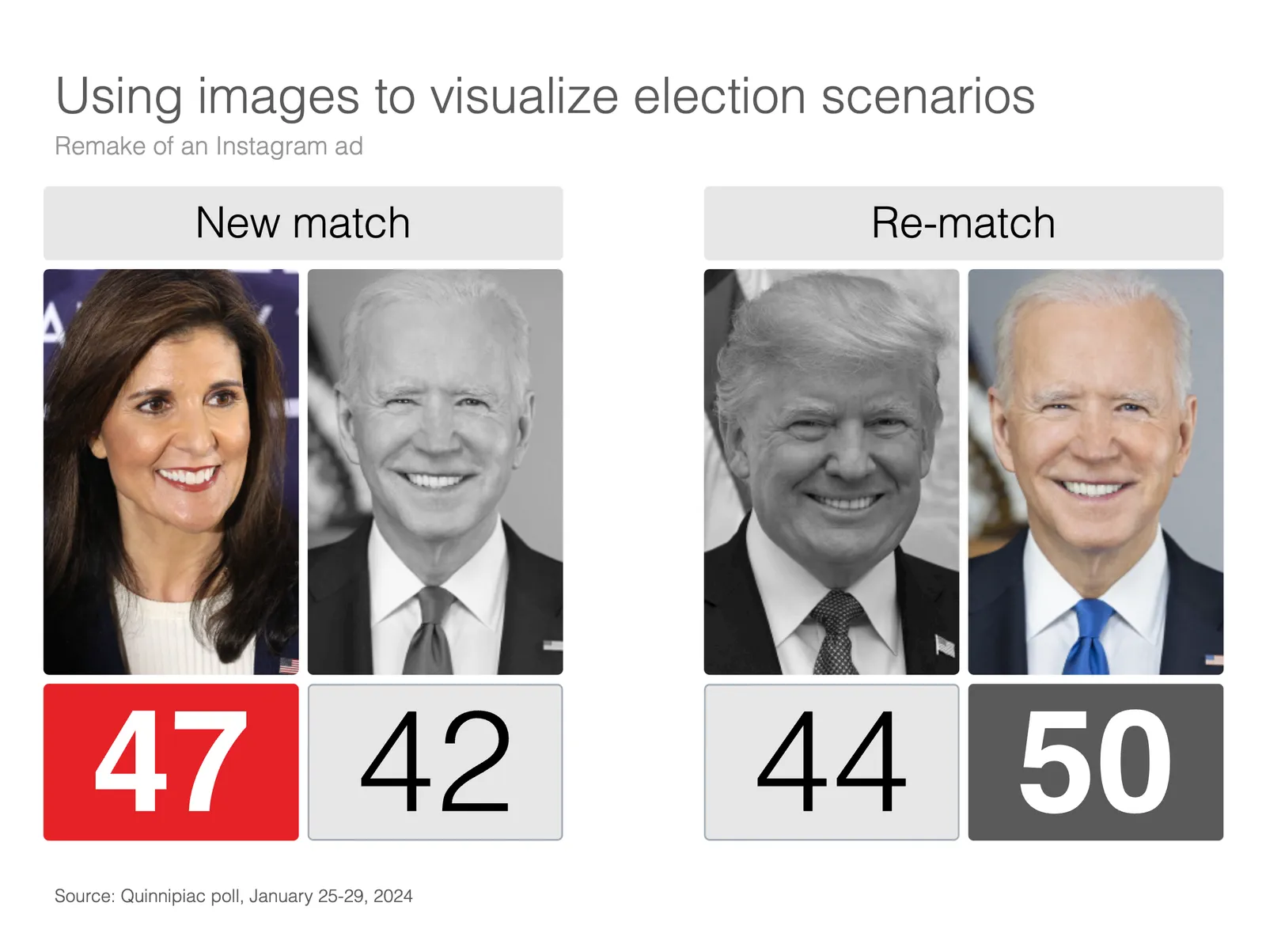
Here is an attempt to redesign a Nikki Haley Instagram ad. I removed the bar charts (with the skewed axes) and added images to make the viewer really visualize the 2 scenarios.

I added the following slide to the SlideMagic library, search for “Biden” in the app and it will show up. Alternatively, find it here for download. Pro subscribers can convert slides to PowerPoint.

·Layout

When (not) to hyper link

Clickable links are the fundamental building blocks of the web page format that was developed in the 1990s. In the early days of the web, you could spend hours getting lost in clicking the blue links in text pages. In modern web design, these pure text links are less useful though.

Sometimes I see them as a reference to a core element of the story. Our product has a key competitive advantage that helps drive our amazing financials<.ink>. He user who clicks links is leaving your story line flow. Seeing messages in the wrong order, tripping up a sequence of big picture versus detail, and is probably not returning to the point she came from.

Web design guidelines in the 1990s also prescribed not to add the work “link” to a URL, but rather put descriptive text: “the 1996 financial results” so that Google and other web search engines would index the page correctly. The result is a page where the reader never is completely sure where it ends up when clicking a URL.

How do I use plain text links? Mainly for references, in the same way academic papers use numbers to refer to relevant resources. A home page of a company, a link to a photographer for credit, download links for documents, references to previous blog posts. And often, I violate the 1990s guide line and call the link what it is, a link, so that the reader knows what to expect.

·SlideMagic

SlideMagic and generative AI update

I am continuing to experiment with OpenAI to see how it can help us make presentation design easier. Generative AI feels a lot like the early days of the Internet in the end of the 1990s. People did not really see that “Internet” was not really a unified tool that could do wonders for business, but rather a description for hundreds of different applications and use cases that happen to rely on a web browser.

The same is true for generative AI now. I don’t think that I will come up with the ultimate AI-based presentation tool overnight that can read your thoughts and deliver the slides at the press of a button. Instead, I will try to release bite-size features that can make the life of a presentation designer easier.

And some of these might not even be very clever. Anyone can go to ChatGPT and get it to produce some presentation skeletons or summaries of text. But there are ways to make prompting of the engine better for presentations. You can save a lot of time by having a user interface straight into SlideMagic, and most importantly, it saves a lot of time when SlideMagic creates the slides for you (in .magic and/or .pptx). The latter has nothing to do with AI, but rather improving the slide generation engine that I already built.

Watch this space.

·Layout

Wide screen <> wide columns

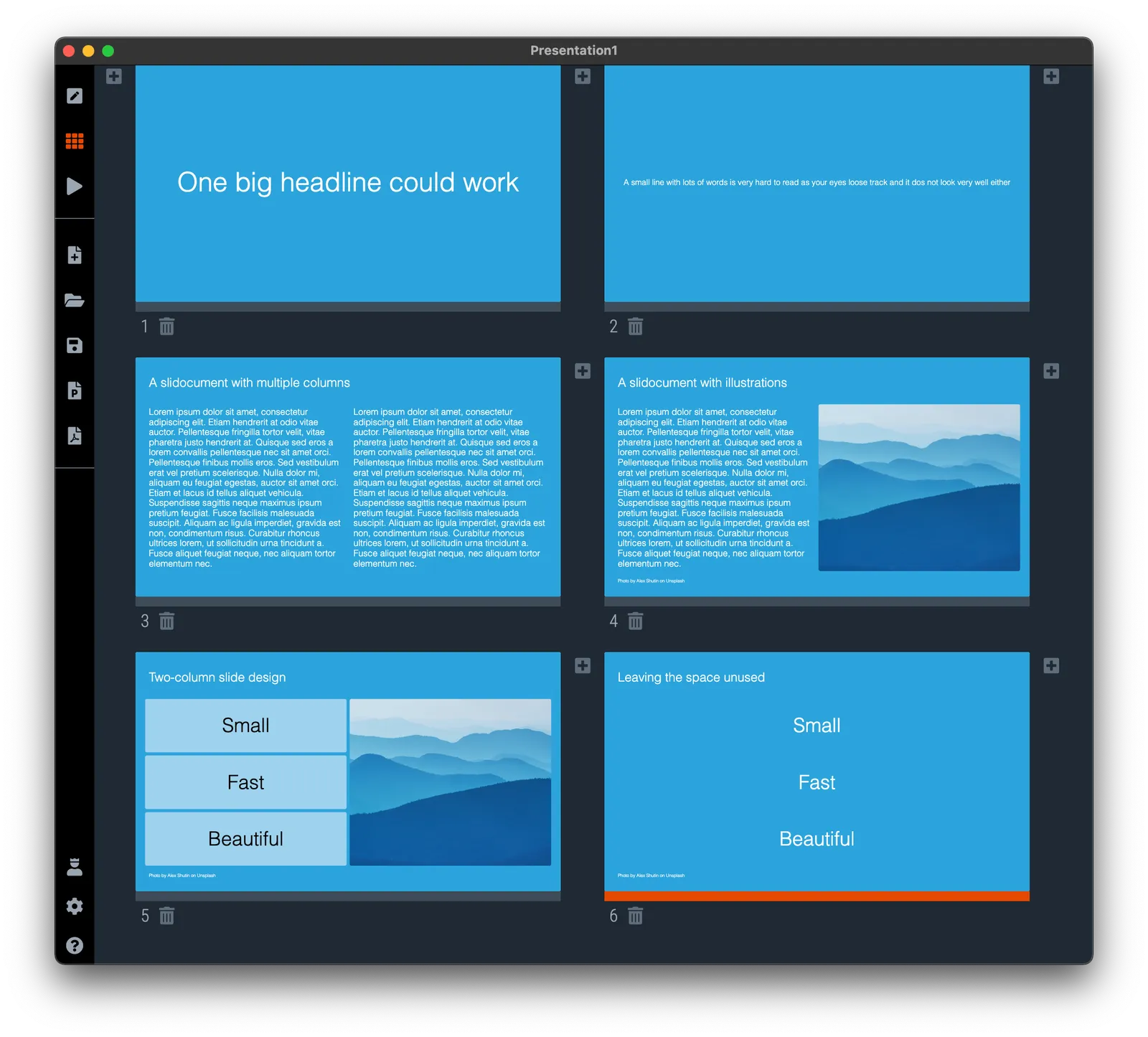
Wide-screen televisions are great for watching movies, but not for reading text. A line that spans across the screen is hard to read and does not look very pretty. There is a reason that print newspapers use columns to limit the number of words on one line.

Think about this when designing slides, switch to a multi-column grid, or simple leave space unused left and right of your text (something that many web pages do), see the examples below.

·Images

More logo cropping

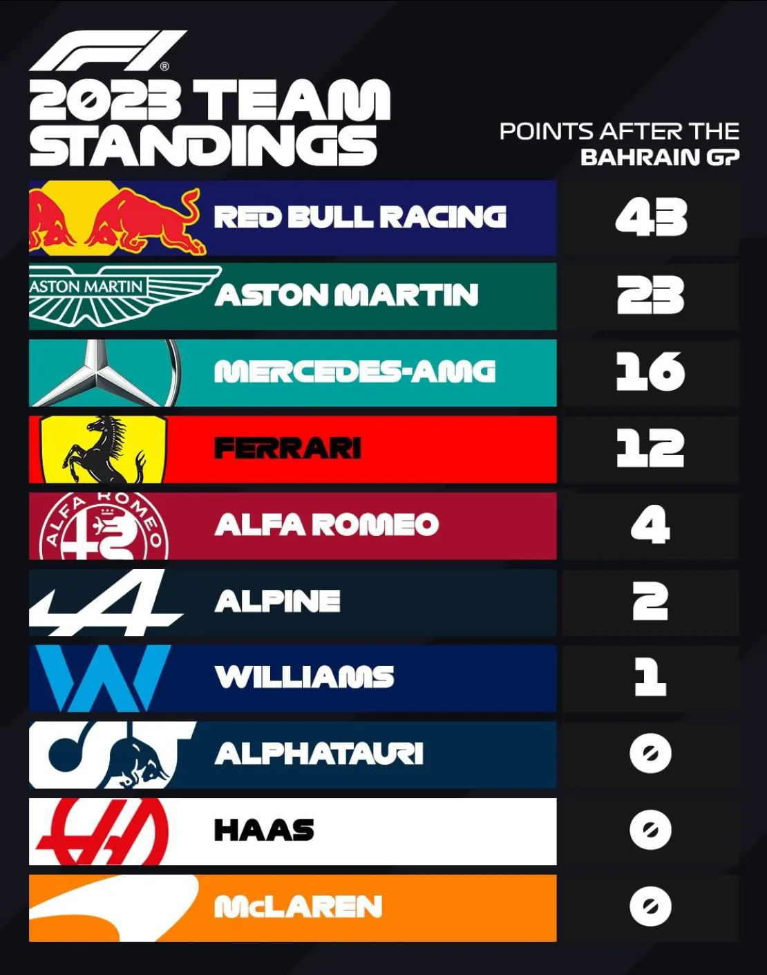
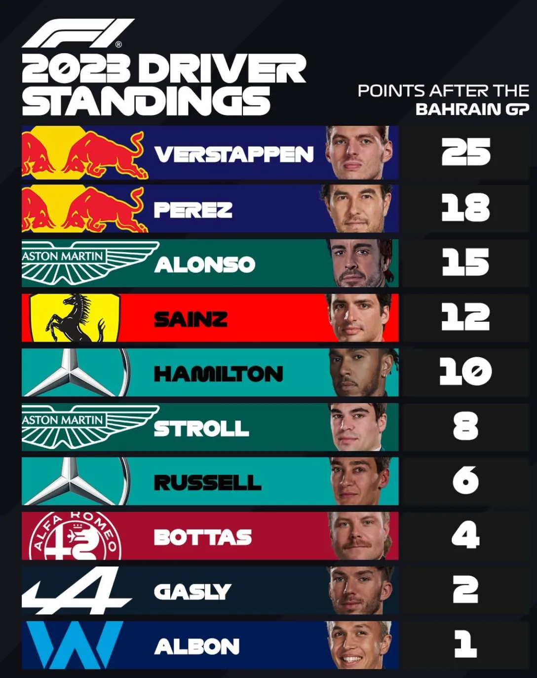
The F1 graphics designer has the same problem that we presentation designers face: how to deal with logos that have completely different aspect ratios. Very long ones vanish in a square tile, square and round ones don’t look good in a wide rectangular box.

Their solution: let go of the requirement that the entire logo should be visible. Carefully crop out parts of the logo while making sure that it can still be recognized and read. All this is supported by borrowing the dominant color of the logo in the text box.

·Layout

Aligning logos in presentations

Getting logos to line up properly is one of the hardest things in slide design. I have not been able to come up with a set of rules to do it, every time I need to eye ball things to see whether things somehow look right. Below is an example from the 9xchange web site:

There are a number of (conflicting) inputs:

  • The middle of the image file
  • The typographical baseline of the text
  • The middle of the non-text part of the logo
  • Tag lines above or below the brand name

Always fine tune logo pages because any automated adjustment will for sure not get it right.

·Software

Side panels in separator slides

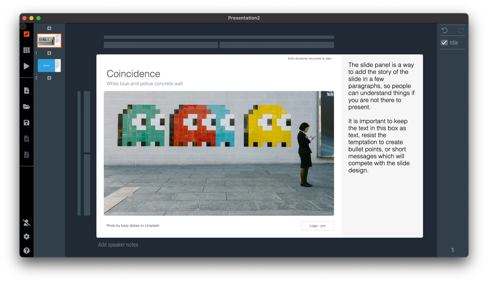
The slide panel is a way to add the story of the slide in a few paragraphs, so people can understand things if you are not there to present. It is important to keep the text in this box as text, resist the temptation to create bullet points, or short messages which will compete with the slide design.

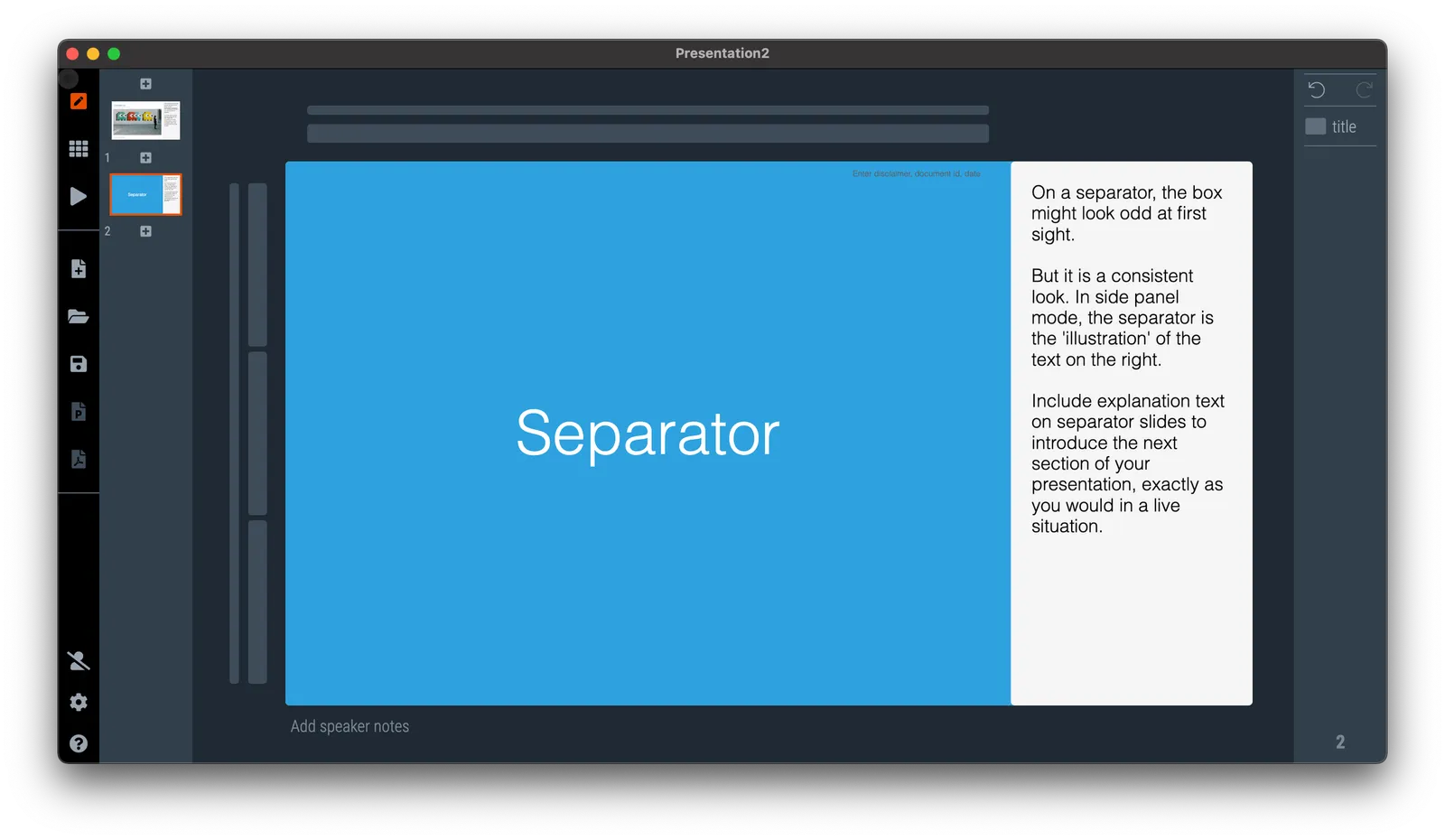
On a separator, the box might look odd at first sight. But it is a consistent look. In side panel mode, the separator is the ‘illustration’ of the text on the right. Include explanation text on separator slides to introduce the next section of your presentation, exactly as you would in a live situation.

See the example below:

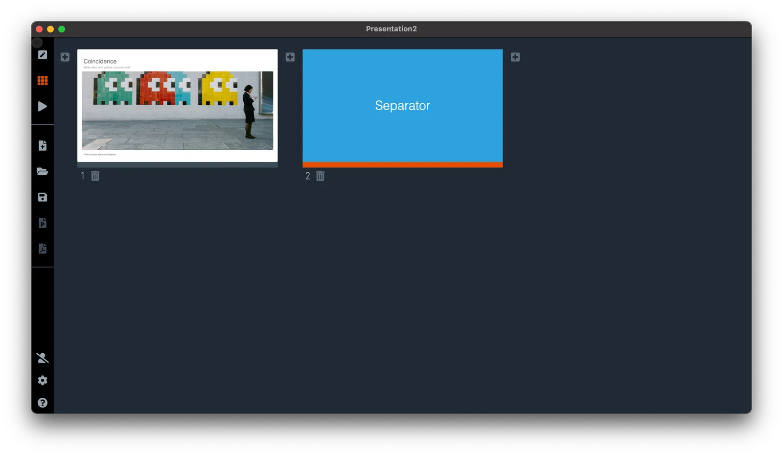
If you switch to another view mode, the side panel will disappear, but the app keeps the text, so you can switch them back on at a later stage.

·Layout

Template request: process maturity

A SlideMagic user requested additional templates in the area of organization design and benchmarking. I added these two upon request. (Don’t tell anyone the secret that these slide design request are usually put up within 24 hours after asking for them.)

Simply searching for ‘process’ in the app will reveal them, or search online via this link. Pro users can convert them to PowerPoint (students, did you see the free SlideMagic Pro plan for you?).