SlideMagic Blog

Frequent updates about all things presentations since 2008. Subscribe to never miss a post.

RSS
all posts

Search results for “projector”

Visual communication in schools - when is it too early?

During a meeting today: “You make presentations? Can you believe that my children are actually producing PowerPoint in school at the moment?”

It made me look back at my own time in school. There was virtually zero training in visual communication. And now that I think of it, this is actually not solely because of a lack of technology (I got my first home computer at around 1986).

  • Primary school. No visuals were encouraged when you had to do your lecture on let’s say “the hamster”
  • High school. The teacher would write his course notes in long sentences on the black board and asked us to copy them in our note books
  • In economics there was a total absence of describing market forces, company strategy, and results of data analysis in conceptual graphs
  • Writing was all about correct senstences and grammar, not convincing structure or logic
  • Later in university, professors would put overhead copies of his course material on the projector, requiring you to study the 4 aspects (bullet points) of issue A, B, and C.

I hope things are better now. My kids are a bit too young still for me to get first-hand experience.

Making things more difficult, visual communication would probably involve the combination of a number of subjects. In high school: economics, mathematics/logic, language, arts, etc.

Does the availability of PowerPoint in the highschool class room today actually help to make kids better at communicating? Or is it counter productive?

·Design

2009 - looking ahead in the world of PowerPoint presentations

It is the time of the year to look ahead. Here are some thoughts where the world of presentations and PowerPoint might go in 2009. A start for debate:

  • The bar is rising to make your presentation stand out. More and more people will get exposed to Presentation Zen and other books, more people will know how to find good stock images, and will be able to produce Zen-style presentations.

  • People will recognize presentation design as a “serious” business discipline. Presentation gurus like Garr Reynolds will become general “business celebrities”, who can reach audiences beyond those people who are just interested in graphics design or public speaking. They will be selling many books, doing many public speaking events, just like experts in other functions such as marketing (Seth Godin) . Congratulations Garr! This will further grow the tribe of people who want to change the world of business communication.

  • Slideshare will become the dominant online presentation sharing platform, defeating many rivals in this area. Big corporates will start using it to upload their official presentations (quarterly results etc.), pretty much in the same way that YouTube has become a mainstream platform for sharing ideas. Online presentation tools that rely on learning a new user interface will not be among the winners.

  • Huge file sizes will drive more and more presentation development work and collaboration into the Internet cloud

  • Slideshare-style presentations meant for online sharing will become one of the most used formats. Almost too simplistic for my taste: “1 word a page”, often accompanied by cliche stock images, to be clicked through at very high speeds, often abandoned mid-way. Better than bullet points, but not necessarly the best presentation form either.

  • Typography and fonts are tools that will be exploited more in mainstream business presentations, beyond the world of advertising

  • More daring creativity will be accepted in the (often “boring”) board room. People suffer form information, PowerPoint overload. Using provocative images, formats, fonts, informal language (i.e., the techniques a billboard designer would use) will become acceptable forms of communication.

  • 3D will be used better, enabled by PowerPoint 2007, bringing “the technology to the masses” people will start to think how to use shadings, gradients, perspective in a way that is more than just adding a (useless) dimension to a bar chart

  • Data visualization is still relative virgin territory. More data is available. More processing power is available. It becomes easier to integrate things like maps. Etc. Etc.

  • Gradually doing away with the overhead projector heritage: one slide per subject, title in the top-left, source at the bottom. Instead slides will become more fluid as they transition into each other. New technologies enabling zooming in and out of areas will be leveraged. A great PowerPoint presentation become more similar to the supporting graphics that are often used in TV documentaries.

Continue reading →

Chart concept - using cinematic effects to provoke real audience emotions using PowerPoint

A combination of big (sometimes huge) projector screens and high-quality images creates an opportunity for (PowerPoint) presenters to enter the arena of the movie director to provoke real emotions in the audience.

  • A bright light or a beaming sun beaming right at us, although there is no risk of dammage to our eyes we intuitively squint
  • A sudden pop up and disapearing of a big spider (“booh”, never used this one though)
  • A gun pointing at the audience (or less dramatic: a remote control zapping you away)
  • Large close-up of eyes (beautiful, innocent, scary)
  • Nails and a blackboard (makes you feel the chart)
  • Looking down a roller coaster track, training coming at you, base baller about to hit a ball
  • The list can go on

Image purchased from iStockPhoto.

·Layout

Picking a background color for a PowerPoint presentation

Some observations on setting the background color for your presentation:

  • Whatever you choose, it should be a plain background without watermarks, logos or shapes. The audience is interested in the content of your slides, not the artwork in the background
  • You have a choice of something dark, or something light. Different presentation settings, benefit from different background colors, see a previous post. (The 2 extremes: a big-audience-keynote is usually dark, a small meeting usually light)
  • In principle, any dark or light color could work. But, watch out for light “pastel” colors that come out ugly on (poor) color printers or overhead projectors. Also think about working with stock images, there are plenty of images with white or black backgrounds that blend easily into the background, finding one with the perfect marine blue might be more challenging.
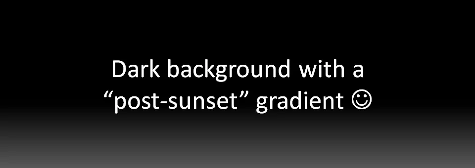
  • Especially with dark backgrounds, it can be elegant to add a tiny gradient to the color, making the bottomo of the screen 1 shide lighter. You create an effect similar to the color of the sky after the sun just went down.

·Images

Chart concept - stage curtains waiting to be opened

Although a bit cliche, I like using an image of a red stage curtain about to be opened. They give a sense of anticipation, look beautiful (nice warm colors, lots of detail), but at the same time focus all the attention on you, the speaker, since there is not that much to look at at the projector.

I got the image below from iStockPhoto (referral program link), many other stock photography sites have many, many of them.

·Delivery

Bad idea - live web pages in your PowerPoint presentation (LiveWeb)

A number of blogs posted about LiveWeb yesterday, a PowerPoint plugin that lets you open a fully functioning web browser inside your PowerPoint slide show. All links work and are active.

Any live demo in a presentation is very, very high risk. Live web browsing is no exception

  • You need to get an Internet connection to work in a strange environment. If finding power lead extension can be difficult, and setting up projectors is not obvious while the audience is settling down, going online is a challenge of a whole different magnitude

  • The momentum is gone. If you have 20 minutes to make your pitch, you cannot afford to break the carefully build up momentum in your presentation. Turning away from the audience, “Wait a minute, where is that link, it was there yesterday” will make your audience opens up their PDAs to check email.

  • Unpredictable content. A large banner ad for a gambling site. A breaking news story about stock markets tumbling. A sighting of Britney Spears. Distractions that will not help your story.

There are obviously situations where you need live web pages on a projector to work together as a group. In an informal setting, why not open up a regular browser? The only exception for a browser inside your PowerPoint might people that run training courses, either on Internet use, or on using internal corporate intranets.

P.S. Not sure what stirred the blogging activity yesterday, LiveWeb seems to have been around for some time.

·PowerPoint

Presenter view - your screen's different from the audience's

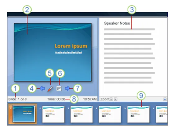
PowerPoint has a smart little-known feature built in: presenter view. The screen on your laptop is different from the full-screen view the audience sees.

  1. Slide count
  2. Current slide
  3. Notes
  4. One slide back
  5. Marker
  6. Opens a menu (black screen, white screen, other functions)
  7. Next slide
  8. Presentation timer
  9. Slide sequence

In order for it to work, you need to setup your computer for 2 monitors (The primary monitor is your laptop, the second one the big projector) in windows control panel/display properties. After that, in the PowerPoint slideshow menu, set up slide show and go to the multiple monitors section.

UPDATE: From the comments below, John Goalby is pointing to his very detailed, free ebook on the subject of Presenter View.

The huge screen - McCain's background visuals

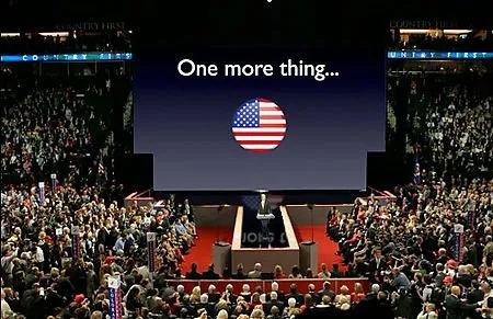
Lots of linking to Garr Reynolds this week. After a lively discussion in the press, Garr added his review of John McCain’s background visuals. An amusing read, the above image is a PhotoShop of what would have happened if Apple had prepared the visuals.

But it highlights a bigger issue: how to use these huge, huge projection screens? We have moved from the overhead project slide, to the PC projector, which in turn have gotten bigger. Now in a big conference, a video of the presentor and a PowerPoint visual are usually projected on a moderately big screen. We started to learn how to best use these screens.

But these size screens? I tend to think that they are actually too large for any image, graphic. Maybe just a few simple words? Anything else will distract the attention from the presentor.

·Story

The 60/20/30 rule of PowerPoint?

The relationship between the number of slides and the length of a PowerPresentation presentation is changing. Seth Godin claimed to have gone through 154 slides in 54 minutes “without a sweat”. At a rate of 1 slide every 3 minutes, we could change Guy Kawasaki’s 10/20/30 rule (10 slides, 20 minutes, font 30 or bigger) into 60/20/30. The “10” refers to the number of ideas you can handle in a presentation, not the number of slides. Obviously slides need to look completely different for a presentation like this, nothing like the bullet point loaded “overhead projector transparencies” we still see in too many presentations today. UPDATE: Today I stumbled on this interesting blog posting by Andrew Abela that clearly separates 2 types of presentations: ballroom-style (big audiences, beautiful graphics, few words, high page turnover, the 60 i.s.o 10) and conference room-style (the classical consulting project final report full of dense facts and figures).