SlideMagic Blog

Frequent updates about all things presentations since 2008. Subscribe to never miss a post.

RSS
all posts

Search results for “mckinsey”

·Concepts

Prioritize your todo list, the Eisenhower matrix

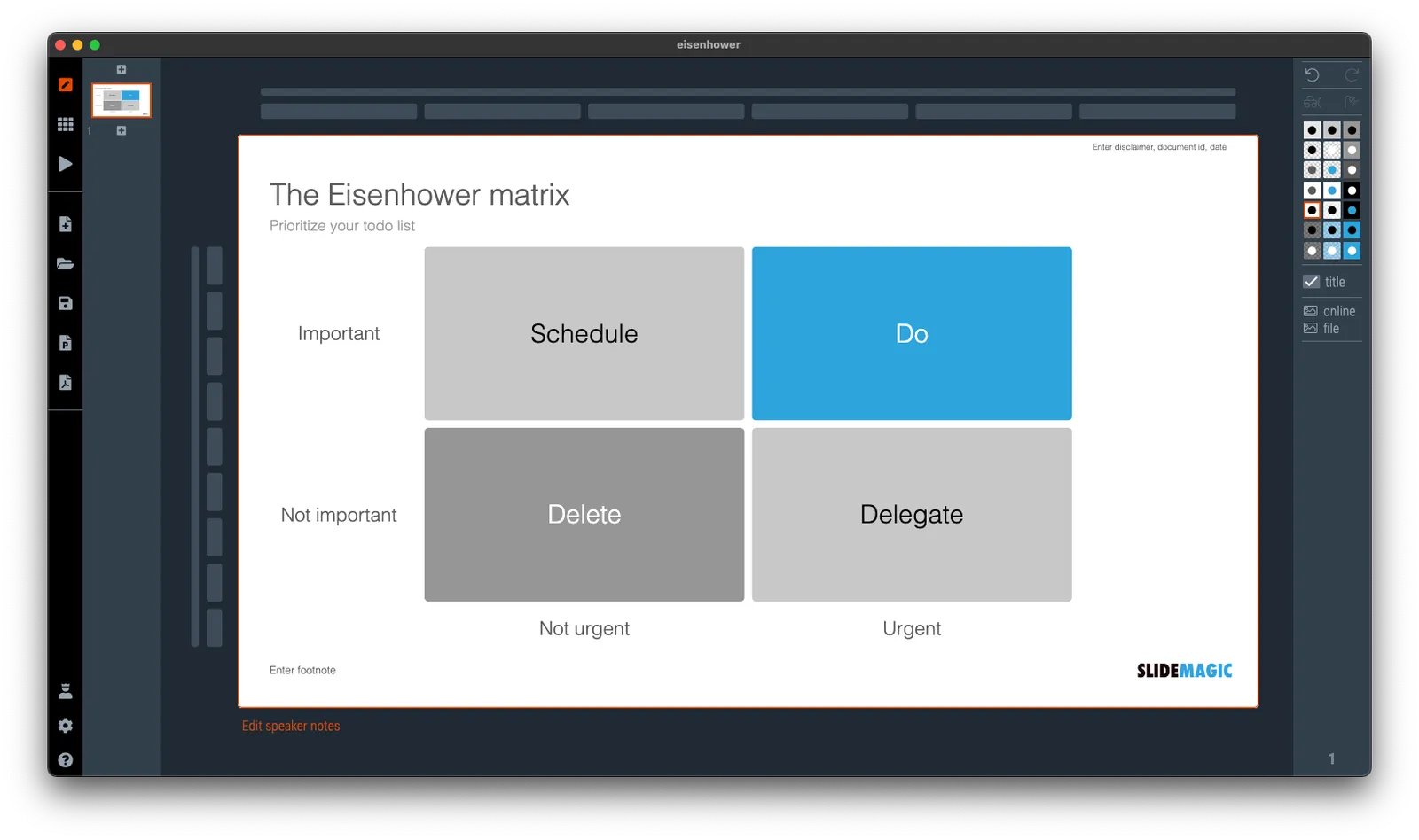
I was talking about prioritizing your time a few days ago and remembered a time prioritization tool that was suggested to me while at McKinsey. It turns out it is called the “Eisenhower Matrix”. I added it as a template to SlideMatic.

They key insight here was to be really rigorous and actually don’t do unimportant, not urgent tasks. The problem though was that all requests added to my desk were important and urgent….

·Sales presentation

Scripted improvisation

I just came back from an industry conference that involved all day, back-to-back, 25-minute meetings in small hotel rooms. Professional speed dating. Very similar in setup to the days I spend interviewing MBA graduates for roles at McKinsey at INSEAD.

These meetings are a challenge. You get tired (especially if you are jet legged), the setting is repetitive, and very unpredictable meeting dynamics and energy in the room. The setting is not right for a formal presentation. You have very limited time, the room is tiny without a screen to project slides, and the setting is very informal. The risk in this setting is that you never get to get your point across in the middle of small talk, room changing logistics and/or the distraction of cleaning staff replenishing the soft drink supply in the room.

In this informal setting, most presenters would “wing it”. Start a pitch in a conversational, improvised way, and see where it takes you.

I would recommend to do the opposite. Have a super tight, very short story, completely engrained in your mind. It is super-scripted, 100% the same in every meeting, and hits exactly the points you want to hit, in the right order. You have practiced and used the script so many times, that you can deliver it jet lagged, distracted without thinking, and most importantly, sounding completely non-scripted. It may sound strange, but the more you practice delivering a these short pitches, the more natural they sound.

As the story goes on auto pilot, you are sure that your messages get delivered, and your brain can focus on reading body language, and connecting with your meeting guests in pre- and post small talk. And remember, in these short meetings, your objective is to get to the next interaction, rather than landing the whole deal.


·Culture

The cultural differences...

Communication cultures differ widely across countries. I experienced it myself in multiple situations:

  • Working as a Dutch national in McKinsey’s London office, people found me somewhat ‘blunt’
  • Living as a foreigner in Israel, I would sometimes be surprised that the first thing some says to you is “how old are you?”
  • Participating in a large Zoom call with many American participants who pretext a point of criticism or disagreement with a 1-2 minute apology before getting to the point

It is important to be aware of these differences:

  • As someone who is presenting
  • But also as someone who is in the audience and needs to put the presenter in perspective

Some of these differences might actually not be down to culture or character. Not all languages have words for specific nuances, so things literally get lost in translation: Language 1 has 5 options on a scale, language 2 only 2. If you are the native speaker in the 2-option language it is hard to pick (or even know) which of the 5 options to pick.

Read body language and ask for clarification when in doubt, or use some self deprecation to preempt possible issues.

·Software

Vintage presentation software

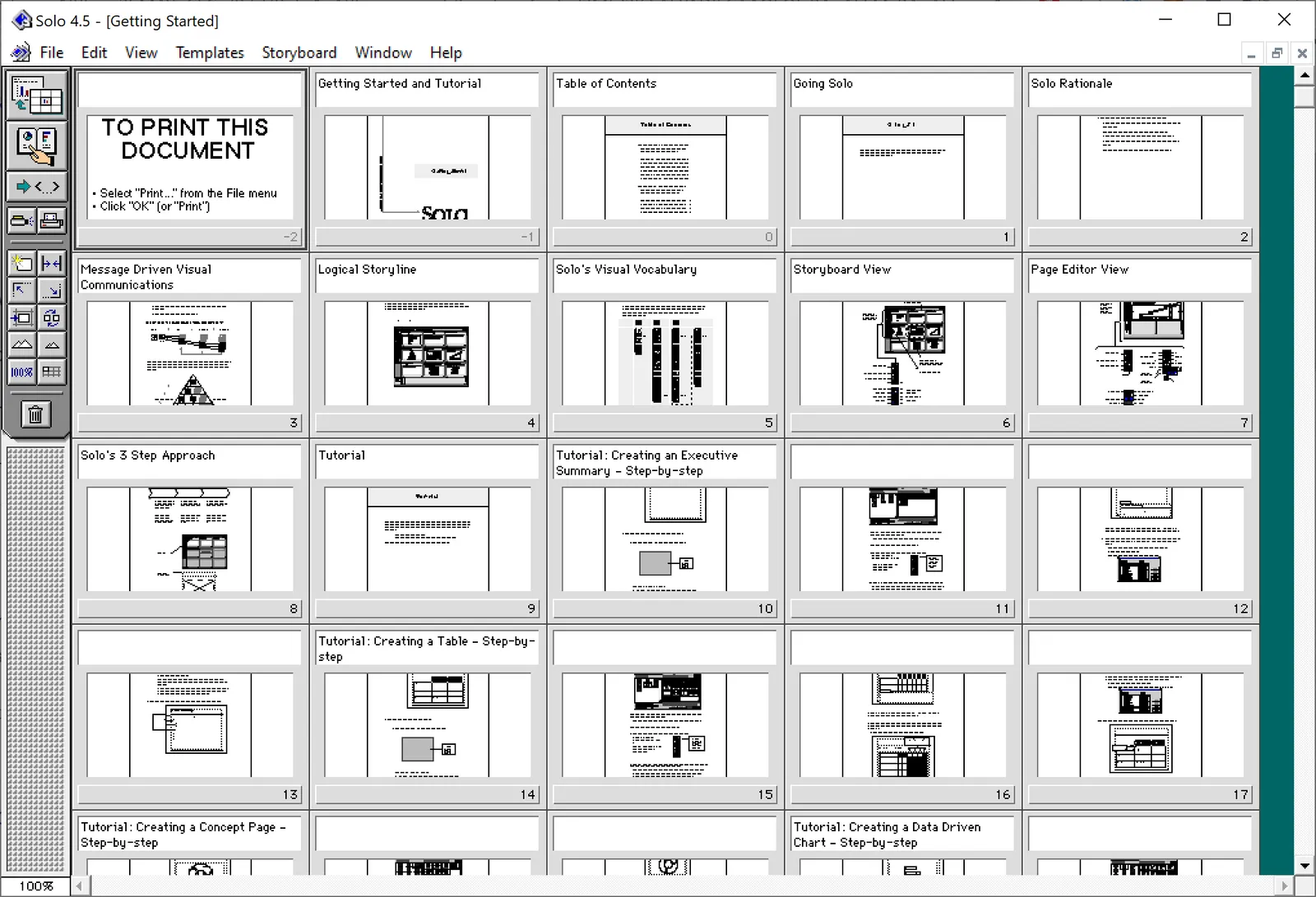
At McKinsey in the 1990s, we used ‘Solo’ presentation software to make slides. It was far ahead of its time (before PowerPoint became the standard). It had a very advanced template engine that enabled you to recreate charts in the McKinsey style. The software required some skill, and charts were usually created by professional graphics designers who took hand-drawn charts as an input. Back then, Solo would run on Macs only. Which was the reason that McKinsey issued Macbooks to their staff at the end of the 1990s, so that consultants could edit (and create) their own slides if they had to.

Ultimately PowerPoint was the end of Solo. Not because of its capabilities, but because McKinsey’s clients would have this installed on their machines, and these clients wanted to edit slides themselves. And with the advent of PowerPoint, the slide format became less consistent in McKinsey. (Both the result of a less sophisticated template library, and the reduced influence of professional graphics designers to create the slides).

I checked this morning, and Solo is still around, here is the web site: https://www.axoninc.com/. Support has ended in 2020 though. I tried installing the demo on Mac, but failed. The PowerPC engine no longer works. It does work on Windows 10 though, but I had to click a button 587 times because the license of the trial version expired 587 days ago (on 7 February 2022). Those clicks were rewarded with some good memories though, I have added some screen shots.

Continue reading →
·Data visualization

Public corona data dashboards

BI (“Business Intelligence”) dashboards with data used to be a corporate thing. Firms such as my previous employer McKinsey would advice clients what metrics to put on them, and how to display them. This is tricky, there is an infinite amount of data to choose from, and even more options to slide and dice the figures.

The COVID outbreak has created many country-wide public dashboard with data. In Israel where I am based, a large tribe of “amateur” statisticians has emerged that runs and discusses analyses on Twitter. The other dashboard I had a look at is the Dutch one (part of my family still lives there).

The approaches are different, and I prefer the Israeli one.

  • The Dutch board looks very pretty, has lots of explanations in text, and has useful maps of regions with color coding. The problem is that it stretches out over many, many, pages, and priotises static data over time series.
  • The Israeli one is just one page, with lots of time series graphs, so you can see things develop over time. And not for basic statistics such as overall cases, benchmarks can get very specific. Benchmarks are normalised so you compare apples with apples (i.e., cases / 100,000 by vaccination status). Also, government policy and benchmarks are tightly integrated. The government wants to encourage parents to vaccinate children, so there are statistics specifically aimed at that target segment. Another example: after discussions whether to close the airport or not, stats about airport tests were published (split by country, so citizens can make the call to travel somewhere or not based on their personal risk appetite).
Continue reading →
·Templates

Another slide makeover

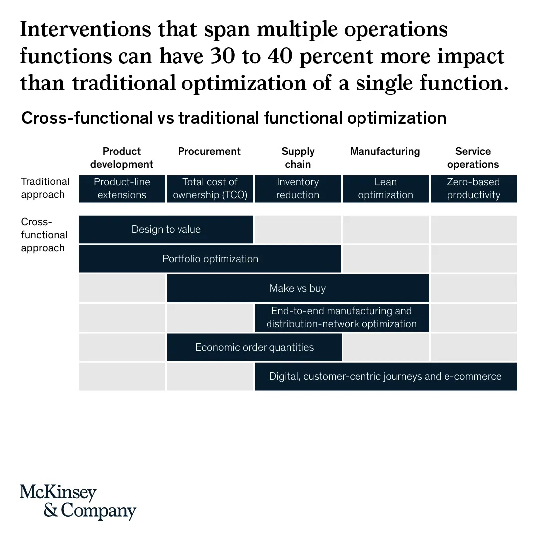
McKinsey’s social media activity provides an excellent stream of slides to work on. The one below could have come straight out of SlideMagic.

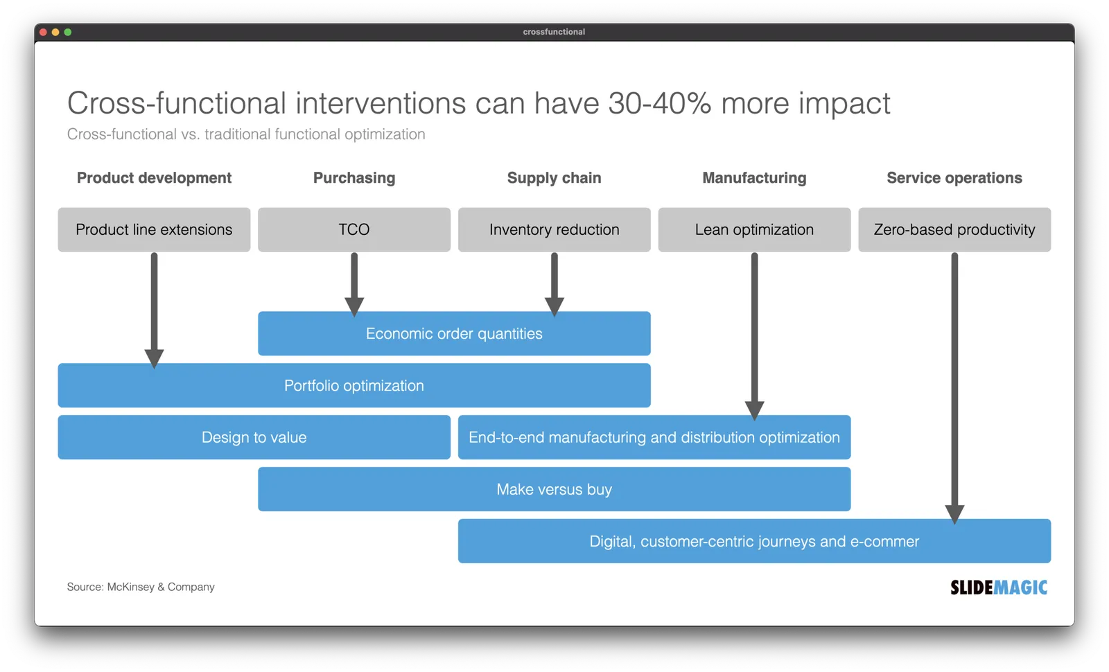
I created a proper SlideMagic version with a few improvements:

  • Emphasized the “from to” theme of the chart with arrows, and two contrasting colors, and a bigger distance between the two options
  • Lighten the colors a bit, especially the dark top row of the original puts a lot fo weight in the chart
  • Actually reduced the font size a bit to give the text more breathing space in the boxes
  • Re-shuffling the bars to get a more pleasing overall composition
  • I eliminated the left column, the audience can guess the description, to add more balance to the composition and gain some extra space

SlideMagic users can use this chart, simply search for a relevant keyword (operations, consulting), and it will pop up for you to adjust to your own project.

Plugged in

This blog post by Fred Wilson resonated with me.

Surrounding yourself with smart people is not enough to make (investment) decisions. Now that I am knee deep into coding applications myself, I finally start to understand technologies that I have been pitching in dozens of slide decks over the past decades.

I think it goes a bit further than Fred’s blog post. Really smart people (not saying I am) with MBAs (I have one), that work at prestigious companies such as McKinsey (I worked there) are extremely good at telling you why something will not work, and 99% of the time their arguments make perfect sense. It is very hard for these people though to commit to believing in something that will work. Advisors are not entrepreneurs.

·Typography

How to punctuate bullet points

Dr Clare Lynch is “chief business writing expert” at Doris and Bertie Ltd and a University of Cambridge writing instructor, she has an excellent YouTube channel that deserves more viewers.

In a recent video, she explains the official rules for punctuating bullet points, full stops or not, capitals, etc.

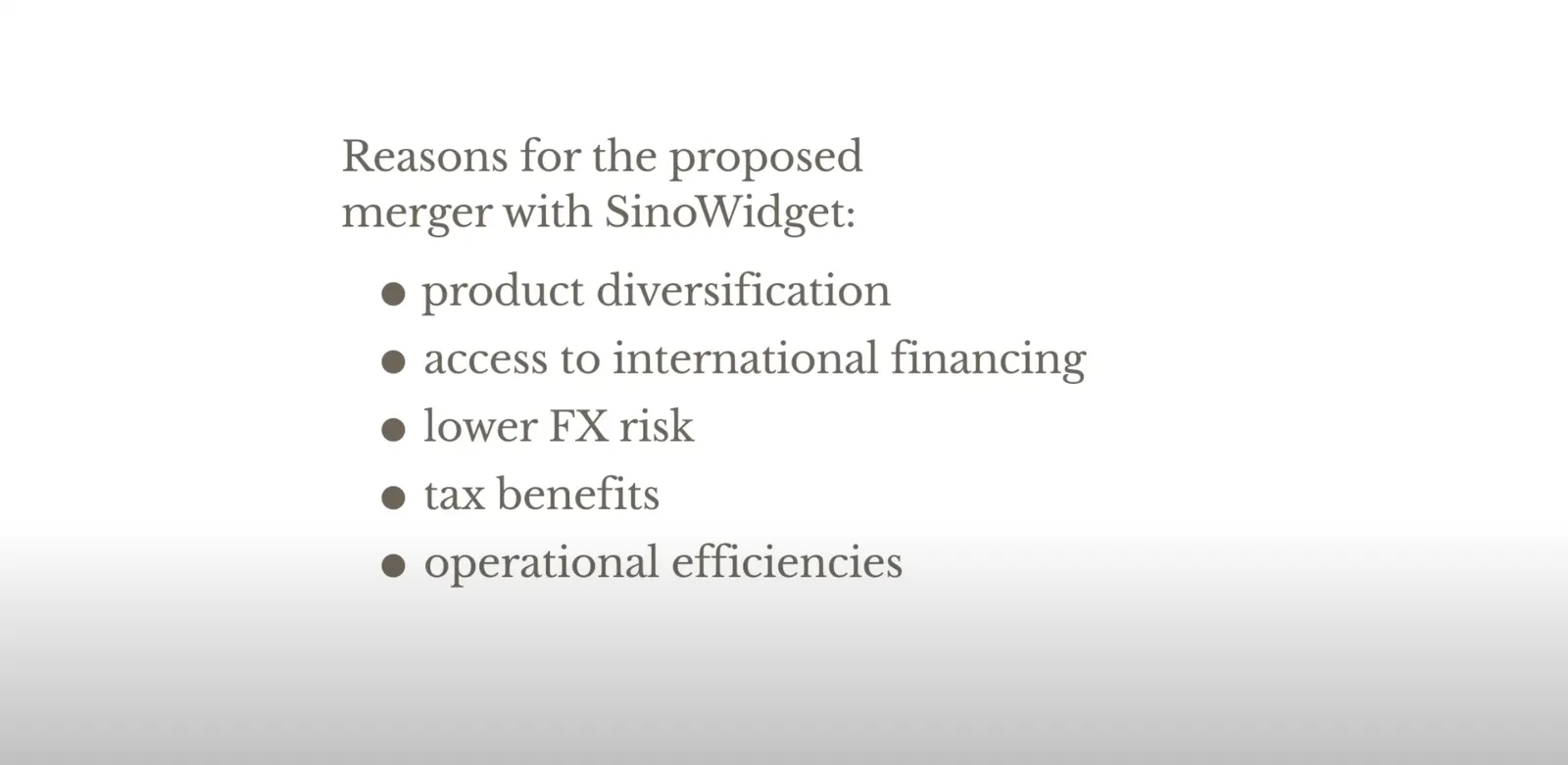
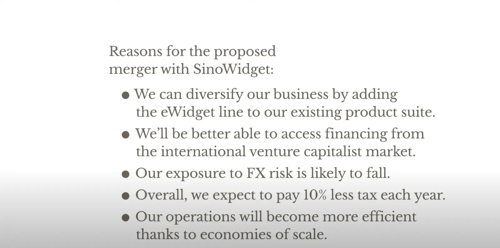
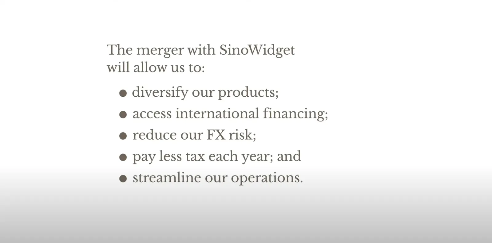
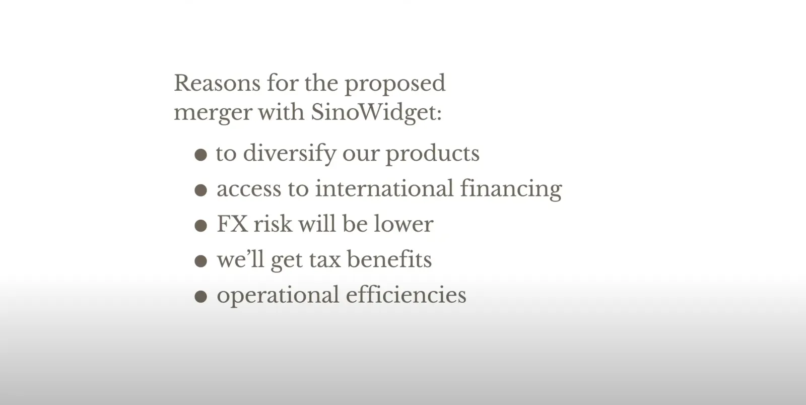
She gives 3 options and a warning:

 Colon: no capitals, no full stops

Colon: no capitals, no full stops

 The long hand version with capitals, and full stops

The long hand version with capitals, and full stops

 For writing: semi colons

For writing: semi colons

 Don’t mix sentence styles

Don’t mix sentence styles

Back at McKinsey in the 1990s, we were taught to write paragraphs in bullet point form but starting with what we called a “clunk”, with a heavy paragraph sign as the bullet point anchor (a pilcrow), and leave the full stop out after the last sentence (but use them for other sentences in the bullet point paragraph).

In presentations? First rule avoid bullet points if you can. If you to include some sort of list to make your point on a slide:

  • I try to keep the text super short (even shorter than Clare in the above examples)
  • Try using some repetition: Higher sales, higher market share, lower costs (“business poetry”)
  • And pay close attention to the length of the text I am writing, I want all text boxes to be roughly the same in terms of length. Yes, I admit that I sometimes “stuff” a super short bullet point with a non-essential word to make it look prettier…

Selling hours as a presentation designer, should you?

Building on a great blog post by Seth Godin.

In my (previous) career as a presentation designer, I walked the path from selling hours to selling presentations, but I did not start with this “pricing for value” right away. Finding your pricing strategy as a freelancer is tricky, especially if your field of work is not yet well established (which was the case with freelance presentation design back in the mid 2000s).

What did I do?

  • At McKinsey, we were billing hours, and I made an estimate what someone at my level (just before partner) could charge per day without the direct McKinsey brand. That daily rate was the input for project proposals priced per day, with a directional, but not binding budget. If the client gave an unclear project briefing, insisted on tons of meetings and revisions, or had lots of iterations, that was her problem. (I always was confident enough to offer a full refund for unsatisfactory work though, and there were probably only 2 projects in 15 years that took me up on that offer).
  • This daily rate soon translated into the dreaded hourly rate, and I was truly selling time. Not scaleable and instantly comparable to all other by-the-hour consultants that work at a client. It was important though for me to find out how much time it actually took me to create presentations. Which type of projects I could do amazing work in very little, and where I delivered less “bang for the buck”. Most designers could calculate their time by pages that needed make overs, each page so many minutes. In my case, I had to come up with the whole story (concept) and then execute it in PowerPoint and get the client to buy into it. Far less predictable. Bit by bit, I moved to projects I liked most, clients I connected with most, and noticed that I got much, much faster at my work.
  • As I got busier, I could raise my hourly rates (pure demand/supply, “sorry, no problem, let’s work together some other day”, but arguments about hourly rates, I hated those. So I switched to project pricing now that I had the confidence to size up project properly. I always did keep an hour book keeping in the background to keep myself in check, but never used it to renegotiate projects budgets with clients. It was much easier to raise prices for entire projects than hourly rates (which usually needed to be approved by purchasing departments)
Continue reading →
·Creativity

Forget about folders

Filing and categorisation systems are a pain. It is tedious to put things in the right folder on your hard drive, put the data of a file in year, month, day format to make them sort, and final versions always become final final, final final final, really final v2. Google replaced Yahoo’s internet categorisation with search.

Back in the 1990s there was a Partner in McKinsey’s London office who gave up on filing (mostly paper at that time) and simply shoved everything chronologically in his cupboard, all clients mixed. Finding something was as simple as looking into your calendar and going back to the appropriate time. Usually, you roughly remember. It takes a tiny bit longer to find something, but save a ton of time doing, and nothing falls through the cracks because of a misplacement.

The same strategy might also work for your digital files in 2021. Your calendar becomes the index to dig something up from the “pile”.

Photo by Viktor Talashuk on Unsplash