Especially for sources in footers I often want to avoid re-typing a complicated title of a document that I found on the web. Copy-paste of the text also copies some of the text formating.
Solution: copy the text, paste it into “Note pad” (the standard text editing utility that comes with Windows), select the text again and paste it into a PPT text box.
I would be interested if other people have faster solutions for this.
UPDATE: Remy got the solution in the comments: copy any text, then select Edit and “Paste Special” and select unformatted text. Thank you!
I was waiting for this announcement, and Anthropic did announce a few hours ago: Claude Design. There are many demo and review videos online that show the features, I will focus on a few specific issues.
The big issue for enterprises when it comes to presentations and documents is to keep all employees “on brand”. The designer of the corporate web site gets it right, but what about the new analyst who works late at night to prepare the quarterly revenue update presentation? Claude Design does a great job here to capture fonts, colors, and style guidelines in one place.
For enterprise AI workflows and systems, context is everything. And the Claude set up makes it easy to access files, information, data, anything.
The current Claude Design application is a web app, that has not been integrated in the desktop all yet (it will probably happen soon). For presentations, its a wrapper around Claude’s ability to manipulate and create slides. At the moment, Claude Design treats presentation slides as HTML. (Unlike Claude Code/Cowork that can work directly with PPTX). As you interact with Claude Design your presentation comes out beautifully, but will have a “web site” look and feel. (Maybe that is actually a better feel than corporate PowerPoint?). Your presentation is HTML with a 16:9 aspect ratio without the resizing options.
When you are done, you can export to many formats, of which PPTX is one. Once exported, Claude Design can no longer edit the resulting PPTX file. (Obviously you can ask Claude Code/Cowork to take over from there, but that app will miss the context that you created before).
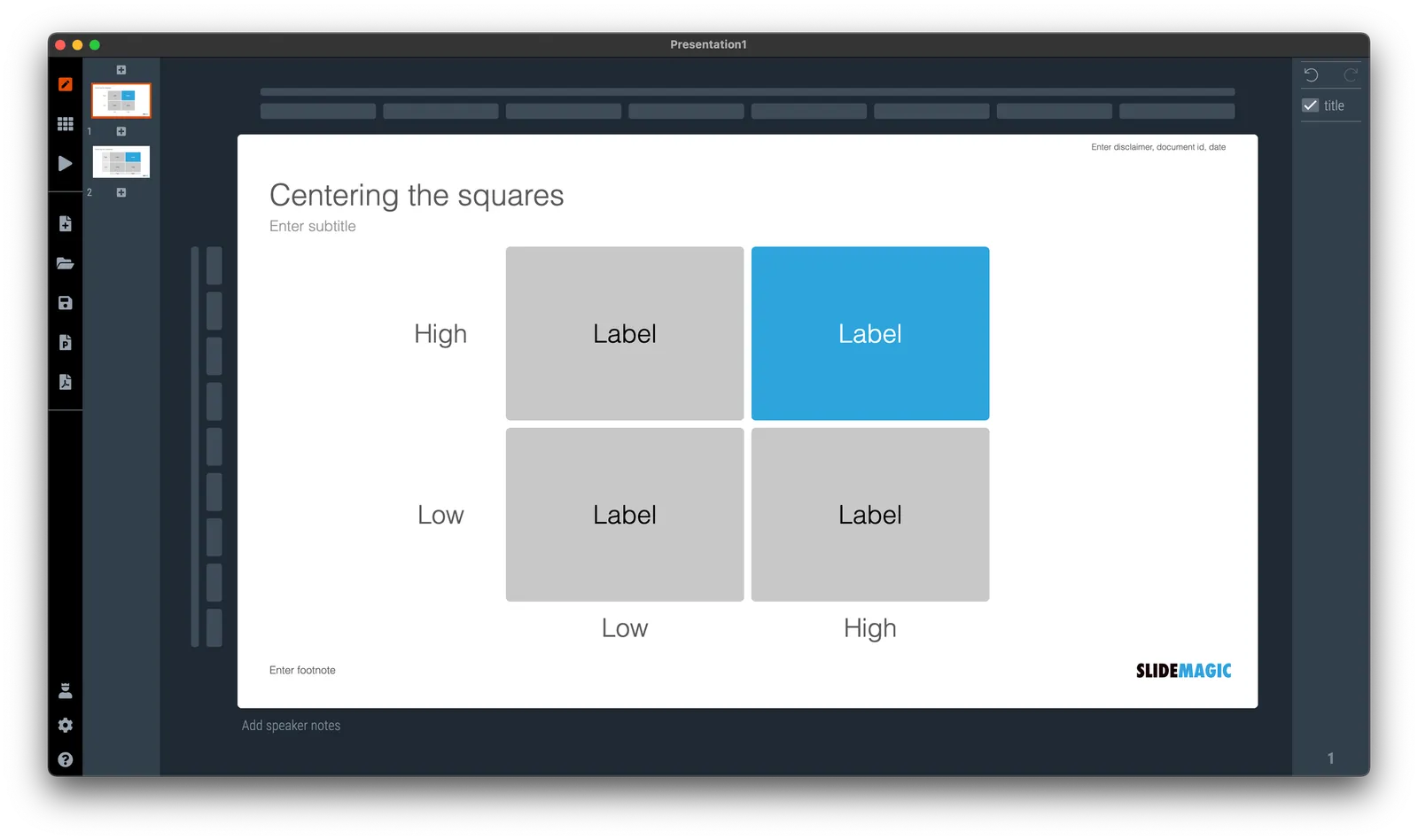
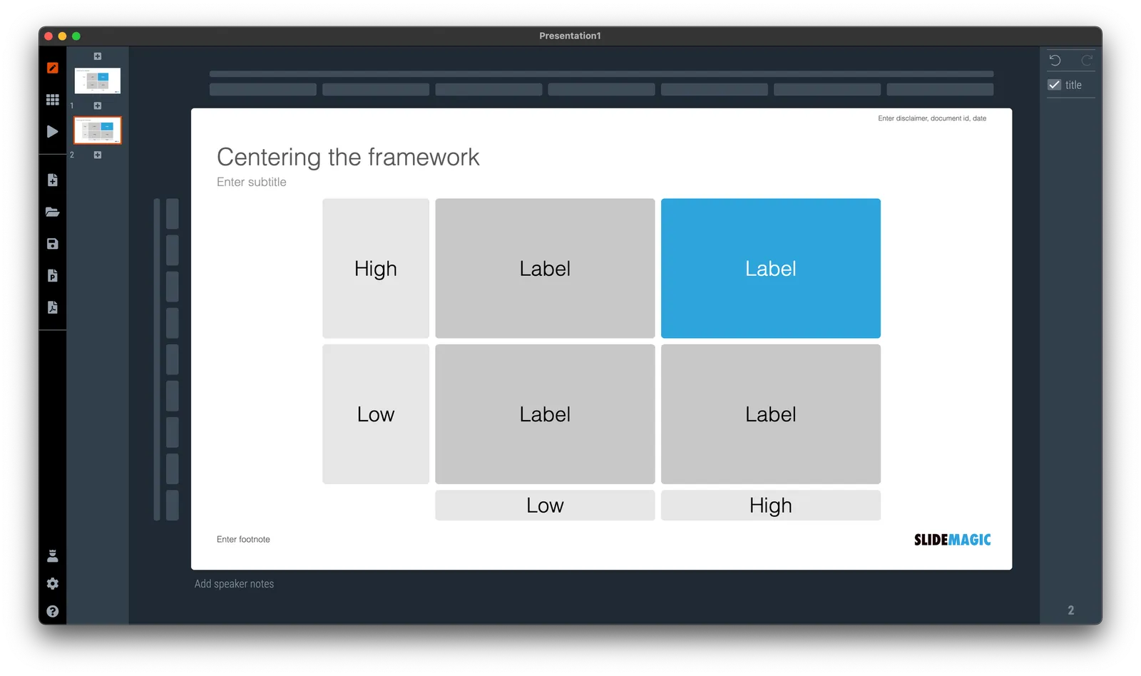
Getting the proportions on a slide right is tricky because it requires an intuition that is very hard to capture in a set of simple rules. An example below. I will have presentations where I center the diagram around the boxes of the 2x2, or other ones where I will center the diagram including its axis titles. Most people probably could not be bothered by this.
It is because of things like this (design is hard to capture in rules) that I think a ChatGPT-like algorithm for page layouts might have a big potential.
In my current (stealth) side project I need to build many dashboards to show information in different cuts and slices. For me, it is a very interesting experience as I can apply the full arsenal of my slide design experience, but now with dynamic data. I control the full stack of technology: what information to store, how to slice it, what information to show, and how to show it.
Each of the above usually reside in a different person. Management consultants spend time recutting and re-combining data manually in spreadsheets because systems can’t do it. So called “BI” applications take data from systems and spit out an endless amount of bar and pie charts in the hope that it will give some insight in where things are going. Traditional front-end web designers can make data look pretty, but don’t really understand what data is required.
The principles of a good dashboard and a good slide are completely the same. Every detail is important. What information to show, what rounding, what order, what sort of graph, what headings, bold, not bold, margins, right aligned, left aligned., how to group things, where to put subdivisions, etc. etc.
But once you get it right, it will work for a long time.
Someone requested me to answer: “How do I design a good presentation slide for business?” Here is what I suggested:
This is a very generic question that is hard to answer without the specifics of the point you want to get across. Having said that:
There are many web sites, blogs, and books out there that advocate the principles of good slide design: minimal use of bullet points, use images, no clip art, use graphs, use white space, etc. etc. Everyone can spot a poor slide vs a good slide. The tricky bit is how - as an “amateur designer” - to make a (reasonably) good looking slide that still captures everything I want to say.
Some guidelines:
Find a basic look that seems to work, you can “borrow” from Apple, or other presentation styles that you think look decent and stick to fonts and generic slide layout rules. Personally, I like the style that Swiss graphics designers used in the 1960s a lot: Helvetica font, with a few simple colours. Very easy to copy to today’s presentation software.
Write the headline of what it is that you want to get across. Important: it can only be one message, not 2, not 3, just one key point that the audience should remember. If your whole slide fails, you (and your audience) still have that title to hang on to
Now, think about what you actually need to show to make that point. Here is where people lose it. They addd info, details, data, graphs, that do not contribute or support the headline at all. In that whole spreadsheet, there could be 2 numbers that you need. Be religious about this: you want to make a point, what visual do you need to support it. If you want to make other points, put them in other slides.
Consider more ways to express an idea than words. Use very simple graphics to simplify text. If there is a choice: put 2 boxes with the options with a double sided arrow in the middle. If there is a consequence, but 2 boxes with a single sided arrow. If there is an overlap of interests, use 2 overlapping circles. I would call this “visual verbs”: very simple shapes that instantly communicate what you want to say.
(Product plug: I am developing a software tool that supports some of this, you can check out SlideMagic, which has a free option, to find slide layout to get you started).
I have started using SlideMagic 2.0 extensively now to shake out every single possible bug (I can’t believe all the things that can go wrong in software). The more I use the tool, the more I come to realise that SlideMagic is a design language that happens to be supported by a tool, and not the other way around.
Trying to break SlideMagic 2.0
Titles, footnotes, (small) corporate logo, page numbers, the slide content, all of them have a fixed place in the layout
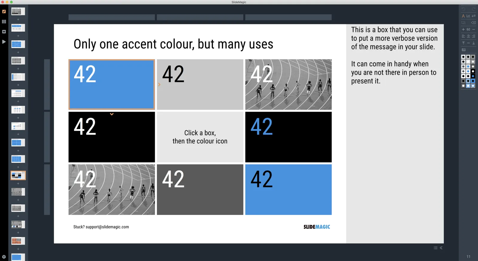
Mainly greyscale slides with one strong accent colour to make things pop out
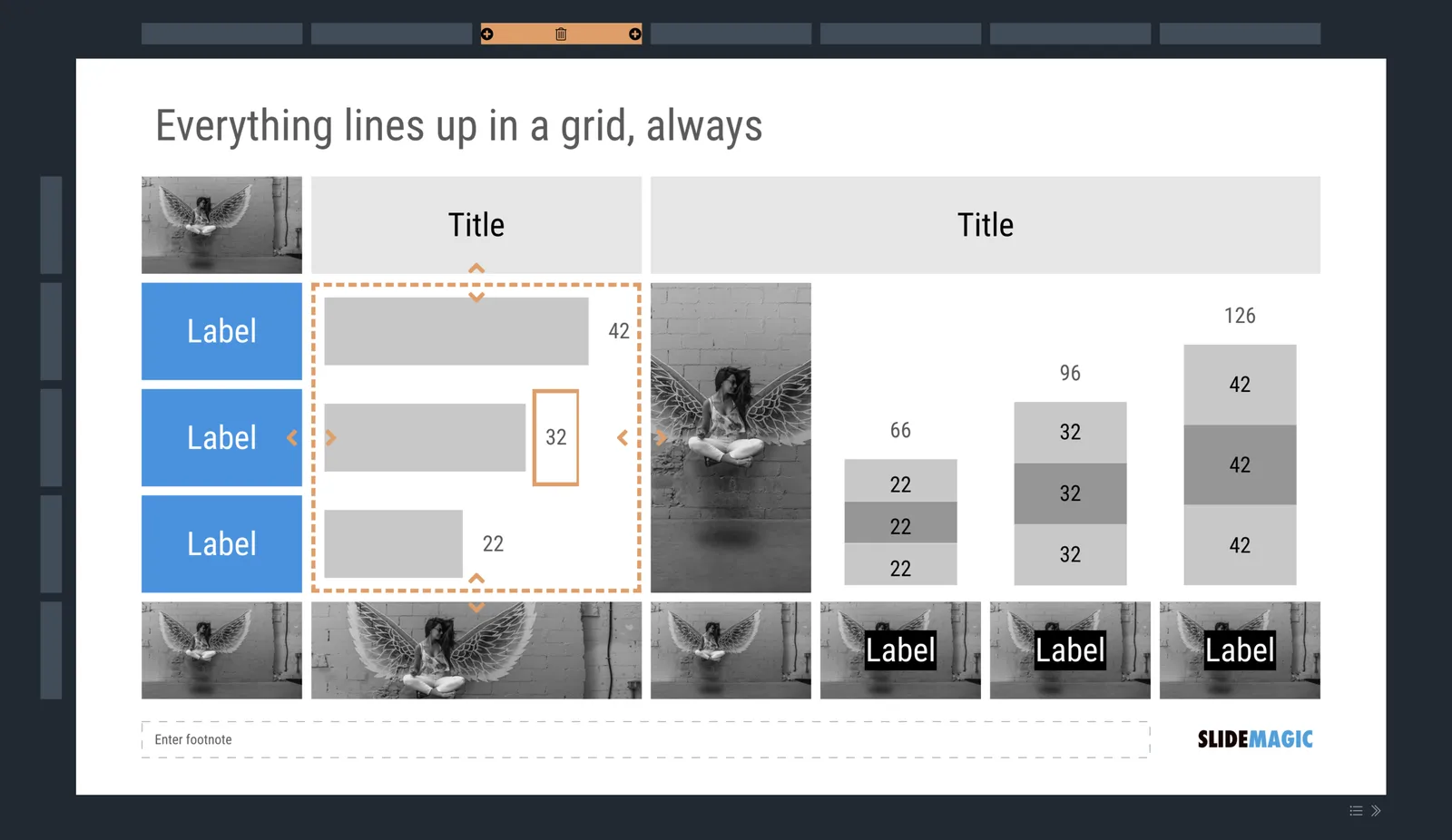
Rigorous adherence to the grid, everything lines up with everything, text, images, arrows, data charts, labels, everything
You can use any shape you want, as long as it is a rectangle with sharp corners
It is technically not possible to create a bullet point dot on a slide
It is technically not possible to stretch images out of their aspect ratio
The constraints of email and instant messages have made corporate communication a lot simpler and more efficient: text can be brief, informal. Something similar needs to happen to presentations.
A large portion of conference audiences now diligently snaps a photo of every slide that the keynote speaker presents. Some implications:
You can no longer hide secrets by quickly going to the next slide. A high resolution camera got all those quarterly sales numbers in that nano second the slide was one. If you don’t want things to end up in the public domain, don’t put it on a slide, not even small. Yes, that might mean investing an extra half hour recreating that graph from the budget document.
The opposite is also true. Slides have a second use, pondering over them after the big presentation. This means you could add more content than you normally would do for an in-person presentation. One way to do that is to use an “explanation box”, like this feature in the SlideMagic presentation app. The main slide and the explanation are clearly separated.
You could take it even further by designing slides explicitly for the photo: for example, a calculation how you got to a certain number. Show it, say what it is, invite a picture, and move on.
The SlideMagic presentation software has an explanation panel that you can slide in and out.
Many company web sites feature some sort of video that plays in the background, covering the entire page. Some things to consider:
This is a background, and should not claim all the attention of the visitor. So pick calm videos, not highway car chases. Also, a series of 5 different short videos of lakes in New Zealand that loop every 10 seconds is still distracting.
A web site without content, but with a video in the background does not create a professional company presence. Content first.
Stock photos with model-turned happy diverse employees are boring, so are videos with the same people featuring in them.
If you have looked a web site (or presentation slide) for a long time as a designer you stop noticing things that a first time visitor will spot. Your brain knows the video loop by heart, filters it out, just to let you focus on that annoying DIV tag that refuses to line up. Force yourself to take that first time visitor perspective and ask yourself whether that video really adds something.
In the very early stages of a company, your website as actually aimed at investors. They want something that looks modest, professional, and with the essentials: a description what it is you are doing (consistent with the confidential pitch deck), a sense that you can communicate professionally and convincingly to future clients and investors, links to team bios, and hygiene factors such as a street address, proper domain name, etc. that shows that you are serious about your venture. Wild animations and spectacular videos do not always support this point.
16:9 monitors are the norm now. And while this aspect ratio definitely works great for movies, I find wide layouts work less for presentation slides. Titles tend to get very loooong, and it becomes harder to make nice diagrams that usually call out for a 1:1 shape.
You might not realise it, but the slide headline on top of a traditional 4:3 slide actually created a slide canvas that is pretty much 16:9 below it.
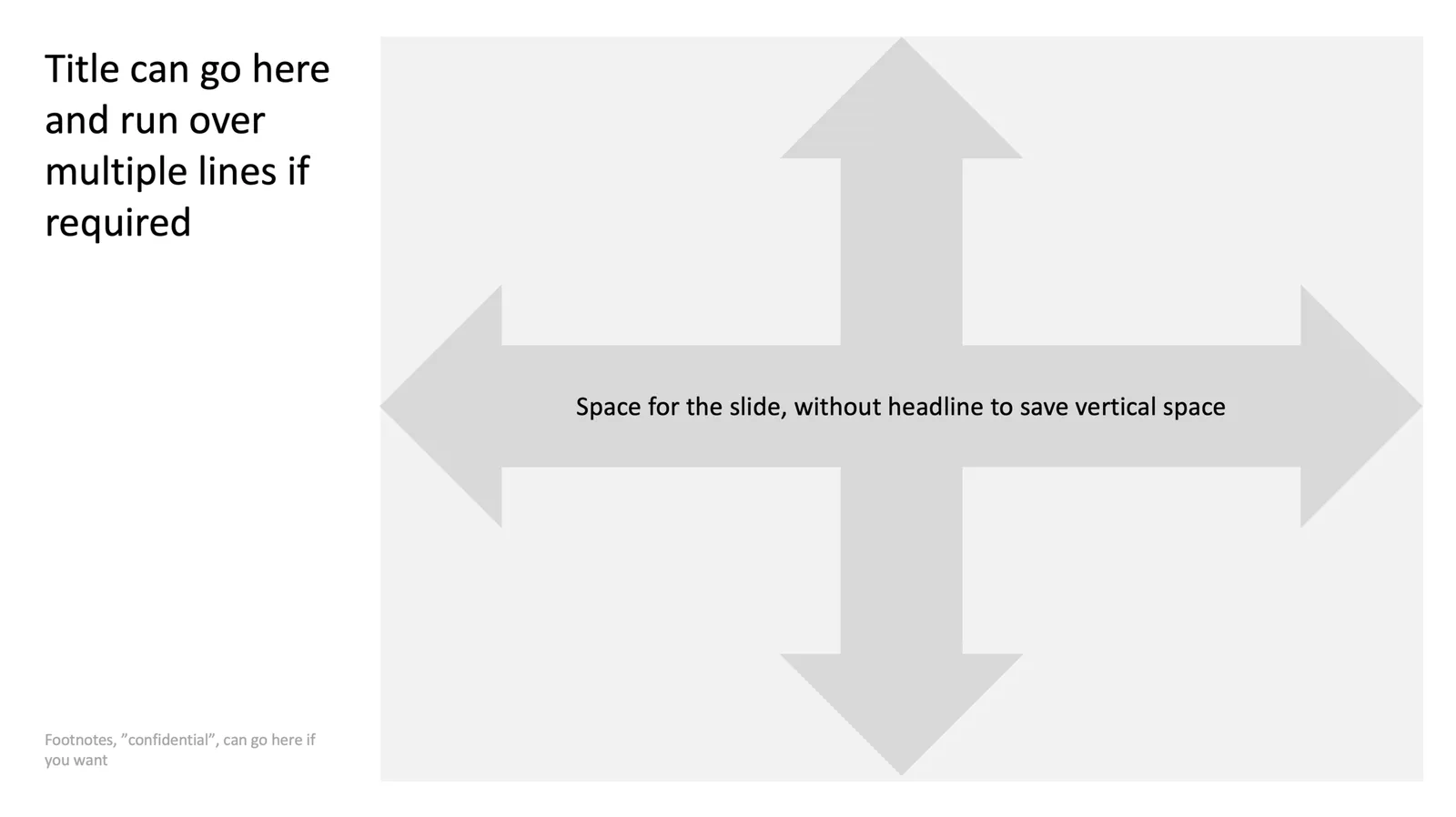
Here is one way to deal with this screen aspect ratio: place the slide title to the left of the slide and use the full vertical space for the slide content next to it. What do you think?
There are 2 types of software approaches for writing add-ins for Microsoft Office applications: so called VSTOs, and web applications. VSTO is the older technology. It integrates deeply into Office and the Windows operating system, code is written in C#. This restriction to Windows is the reason that all PowerPoint plug ins and extensions run on Windows at the moment. The web application API is the newer approach, allowing you to code applications with standard Javascript/HTML.
This has huge advantages:
It runs on all platforms and devices, not just Windows.
Any coder who knows Javascript/HTML can hit the ground running with developing apps, a far bigger developer community than people who know their way around VSTO/C#.
It is a lot easier to integrate these Office web apps into existing web applications (such as SlideMagic).
I have a lot of ideas to extend PowerPoint beyond the current plugins that offer in-app access to stock photo sites but… PowerPoint is at the bottom of the priority list when it comes to API development at Microsoft. Excel, Outlook, and to a certain extend Word, get priority. Specifically, the ability to manipulate slide content is very limited (put text in the currently selected text block, or place an image somewhere on the page).
PowerPoint is the key communication tool that is used in corporates (not Word). PowerPoint is tricky to master (50% to blame on software, 50% to blame on the “eye for design” that not everyone has). Combine these 2 and it is the biggest opportunity for 3rd party developers to make a change to business communication, make a financial return for both developers and Microsoft, and make PowerPoint stand out over Apple Keynote.