

16:9 monitors are the norm now. And while this aspect ratio definitely works great for movies, I find wide layouts work less for presentation slides. Titles tend to get very loooong, and it becomes harder to make nice diagrams that usually call out for a 1:1 shape.
You might not realise it, but the slide headline on top of a traditional 4:3 slide actually created a slide canvas that is pretty much 16:9 below it.
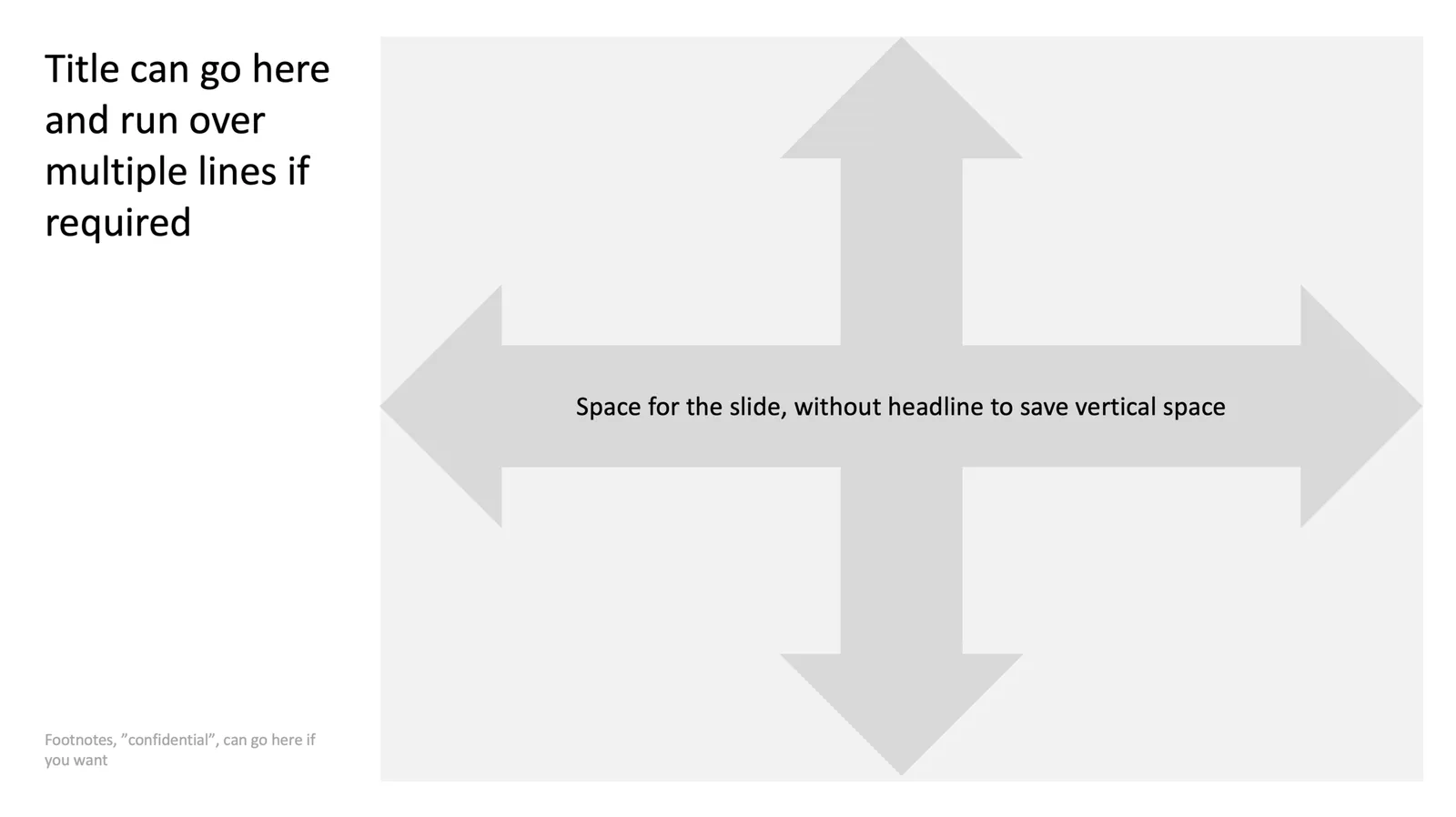
Here is one way to deal with this screen aspect ratio: place the slide title to the left of the slide and use the full vertical space for the slide content next to it. What do you think?
Cover image by Michael D Beckwith on Unsplash