SlideMagic Blog

Frequent updates about all things presentations since 2008. Subscribe to never miss a post.

RSS
all posts

Search results for “web design”

·Delivery

Boring conference panels

The panel session with the CEO of Twitter bored the audience in a recent on-stage conference interview. And Mark Suster recently wrote another excellent post about conference panels.

I have sat through so many boring panels in business conferences here in Israel. The boring panel recipe:

  1. Try to find as many prominent individuals as possible to feature as speaker on the conference invitation flyer
  2. These people are busy, so you do not require a lot of preparation from the panelists
  3. Get a verbose moderator: long panelist introductions, long questions, [short answer], long recaps of the answer

An easy way to fill 45 minutes, but not a very good way for the audience to spend its time. You cannot wing a presentation, you cannot wing a discussion panel. I wonder why it is that most people go to conferences to meet people in the coffee breaks.

·Data visualization

Putting data labels where they work best

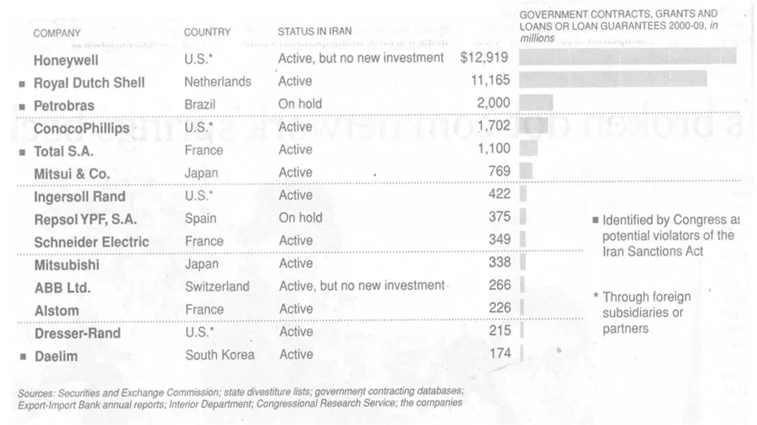
In consulting firms such as McKinsey, there are very strict rules about formating slides. Data labels for example are always placed outside the horizontal bar. The chart below (ripped out of its context from this NYT article) uses a different approach:

The data labels are placed next to the horizontal bars where you would expect the axis labels to be. I am fine with this approach. The relative size of the bars gives a global view of the order of magnitude of the values, and for whomever is interested the data labels provide the exact values.

·Advertising

Teflon headlines

This ad is a good example of how your brain adjusts reality to what it thinks it should look like. I read this sentence the first time as “Don’t drink if you drive”, a familiar slogan.

I find myself doing the same thing when reading headlines full of buzz words and jargon in PowerPoint slides. Skim over it, and see whether there is something more interesting to be seen on the rest of the slide. A teflon headline, it definitely did not stick.

Try this book “Brain Rules” if you are interested in finding out more about how the brain processes information. Ad via Ads of the World.

·Design

Beyond images that just show things

Most stock images are descriptive: search for “ice cream truck” and you get what you asked for. The position the image puts the audience in, is at least as important (maybe even more important) than the object it represents. Look at this image of the inside of the Notre Dame cathedral in Paris (Wikipedia link). Six images stitched together to create the sensation of small child looking up to the ceiling of this vast place. It puts the audience inside the image.

Image credit: eso-teric, visit his site for a larger picture. I linked to these images as a source of inspiration (earlier post), check copy right restrictions before using them in an actual presentation. Found via TwistedSifter.

·Advertising

Subtle light effects in fonts

Inspired by this ad, here is how to create the effect of fonts that seem sunk below the surface in PowerPoint 2007 (as shown in the last 2 images).

  1. Choose a background color
  2. Enter text, preferably in a fat font (I used Helvetica Neue Heavy in this example)
  3. Select the text, go to format, text effects, shadows, and pick inner shadow with light from the top
  4. In text effects, pick a text fill that is just slightly darker than the background

Via Ads of the World

·Advertising

Iconic images

What a wonderful advertising campaign: if 4 pixels can tell a story, imagine what millions can. Here is one example, but there are lots more on Ads of the World (click the previous and/or next buttons).

I like using iconic images in presentations, an endless repertoire of visual shortcuts stored in the brain of almost any person on the planet.

·Concepts

Chart concept - shark!

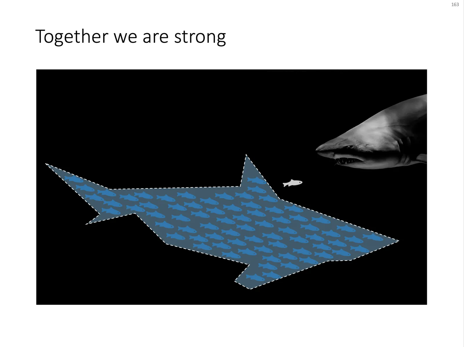
Some might consider it a cliché, but I found it still useful: the school of fish swimming in formation to create the illusion of being a shark. For when you need to visualize how many smaller/weaker entities can work together to become very strong as a group.

An image like this can easily be created by searching for “fish silhouette” or “shark silhouette” in a stock photo site. Resize the small fish, paste them over the shark’s silhouette, and off you go.

Inspired by a scene from the movie Finding Nemo:

UPDATE: I have now added a slide with many fish forming a shark on this concept in the SlideMagic template store.

·Data visualization

Obama infographic and picking the right metric

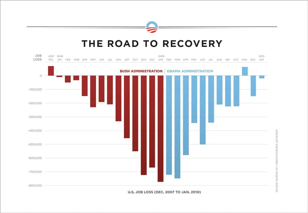
The infographic below released by the Obama administration (here) is a good example of using the full arsenal visual techniques to make your point stand out.

  • Use fat columns to make the trend stick out (much better than a thin line, earlier post here)
  • Use recognizable, contrasting colors
  • Pick a metric that is favorable (monthly job loss)

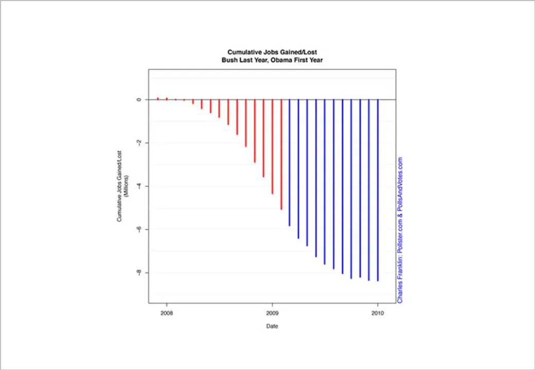
On the Fast Company site, Prof. Charles Franklin put out a second graph depicting exactly the same data, but using a different metric, cumulative job loss:

The formating of the graph is a bit improvised, but it shows the power of picking the right metric. Someone speed-reading a newspaper first notices the sea of blue, and a trend that does not seem to reverse.

Fast Company seems to have taken down the story, so I had to source Franklin graph from Google chache. Thank you Ellen Daehnick for pointing me to this.

·Design

In defense of clichés (sort of)

I came across two interesting links about clichés last week.

  1. Seth Godin: point to a cliché and do the exact opposite (blog post). From a presentation perspective the most interesting tip is the “secret weapon” he points to: a book full of clichés: Dictionary of Cliches (affiliate link)
  2. Nikki Smith-Morgan pointed me to this wonderful list of 101 cliché images.

I now realize that I have been reinventing the wheel over the past few years. I am guilty of using many of visual concepts, and even have posted many of them on this blog. I agree that some of the images are really worn out (#1 example the handshake), but not all 100 other images are equally bad in my opinion.

Especially in everyday corporate presentations, getting people to use images instead of bullet points is a huge win, even if the images that are picked are somewhat obvious. It is the beginning of a path moving away from bullet points. I was there 5 years ago, but every day more and more people join the movement. Clichés are a good way to start. A cliché is a visual shortcut that can prove useful in corporate presentations when used wisely. “Wisely” means picking a beautiful image. (Yesterday I was guilty of a tunnel with light at the end for example).

Obviously, the big keynote address is a different story from tomorrow’s management review meeting.

·Design

Picking the correct logo

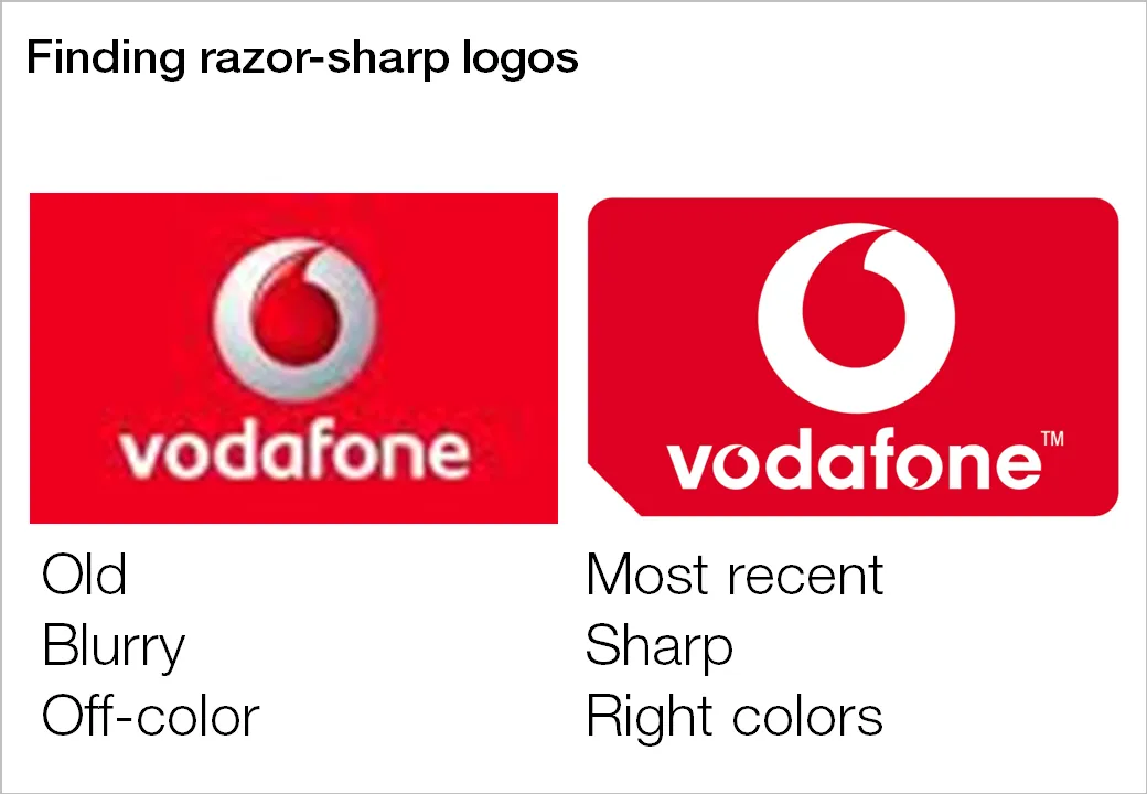
Many investor and sales presentations include logo pages. Improve the quality of these slides significantly by not picking the first image that pops up in Google image search:

  1. Visit the company’s web site to see what the latest logo of the company in question is, logos get updated frequently
  2. Set the Google image search options to large format
  3. Pick a correct, huge logo
  4. Paste it in your presentation, reduce to the correct size, hit compress images

Companies with a good PR department have high-resolution images of their logos on the web site. Use them.