SlideMagic Blog

Frequent updates about all things presentations since 2008. Subscribe to never miss a post.

RSS
all posts

Search results for “web design”

·Concepts

The PowerPoint blur filter

PowerPoint is slowly adding features that have been standard in Photoshop for years. One useful one is the image blur filter to increase depth of field of your photos (earlier post). It adds some extra realism to this composite image trick (discussed earlier here and here)

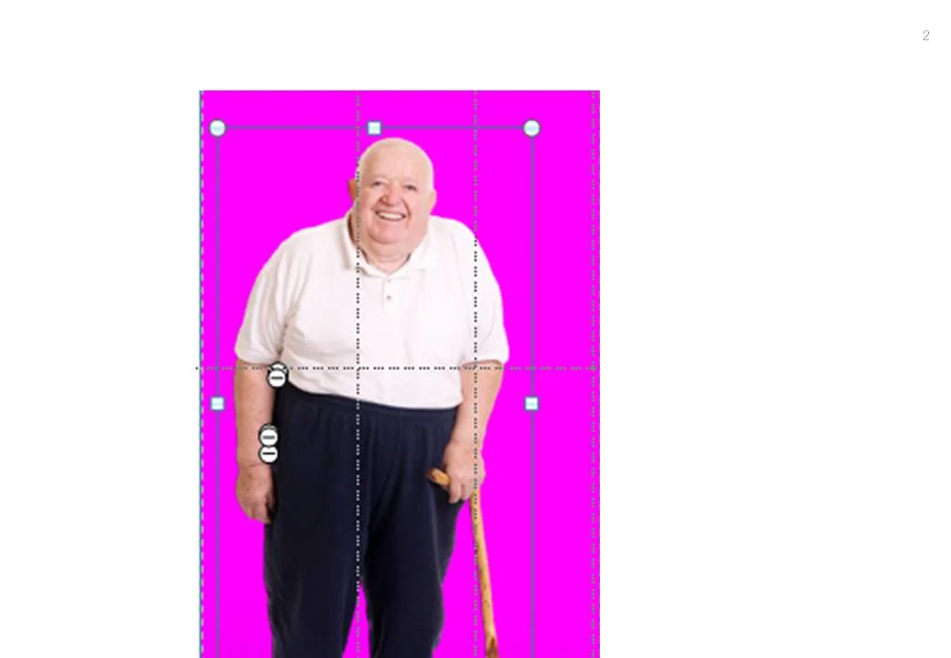
  1. Find an image for the foreground and use the PowerPoint format/remove-background function to get rid of the white background
  2. Find a background (nice image of Cafe de Flore by DarkB4Dwan)
  3. Combine the 2 images
  4. Blur the background with (click the image, format, artistic effects, the right one in the 2nd row)

One other application is to repeat a blurred version of a busy chart for additional comments (see post here)

·Art

The real photographer and the stock photographer

Clicking through some of the black and white images on this incredible page on Smashing Magazine shows you once more the difference between an average stock image and a photograph taken by an artist.

This image is by Andrzej Laskowski

·Data visualization

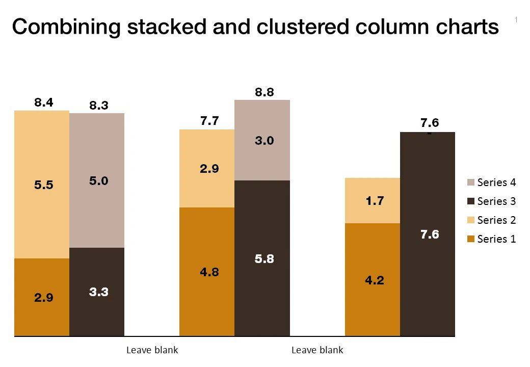
Combining stacked and clustered columns

In PowerPoint, there is no standard option to create a combined stacked and clustered column chart. Here is a work around, taking the stacked column chart as the basis.

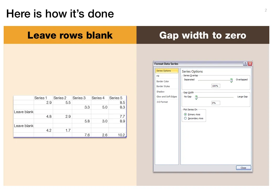
  1. Set the gap width to zero (in the format data series menu) to create the white breaks in between the columns
  2. Adjust the data points manually. The first stacked column goes in regularly. The second stacked column (that should have a different color scheme) gets added on top of the first one. But for data points of the second column, you zero out the values of the first one. Sounds a bit complicated, but the visual example below should make it clear.

Art: Canaletto, The Piazza San Marco in Venice, 1723

**Click here to subscribe to this blog**or follow me on Twitter

·Concepts

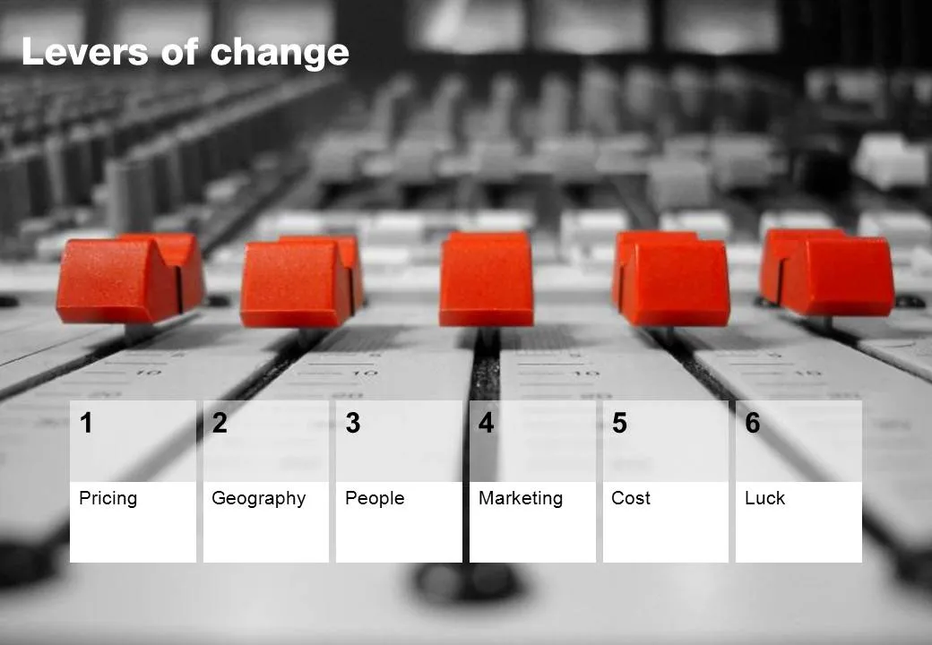
Chart concept - mixing console

Mixing consoles used in recording studios are a good visual metaphor for situations where you carefully need to balance, fine tune, juggle a set of drivers. Image via iStockPhoto.

·Design

Leave some room for imagination

Great novels, movies, and painting leave room for the audience to fill in the blank spots. This photo found outside my own is the exact opposite. Ugly graphics worked out in the greatest detail, even providing the dog with a pair of mean red eyes that would fit the hound of the baskervilles. It is possible to say/show less and still convey the message…

Earlier post with a similar observation.

·Data visualization

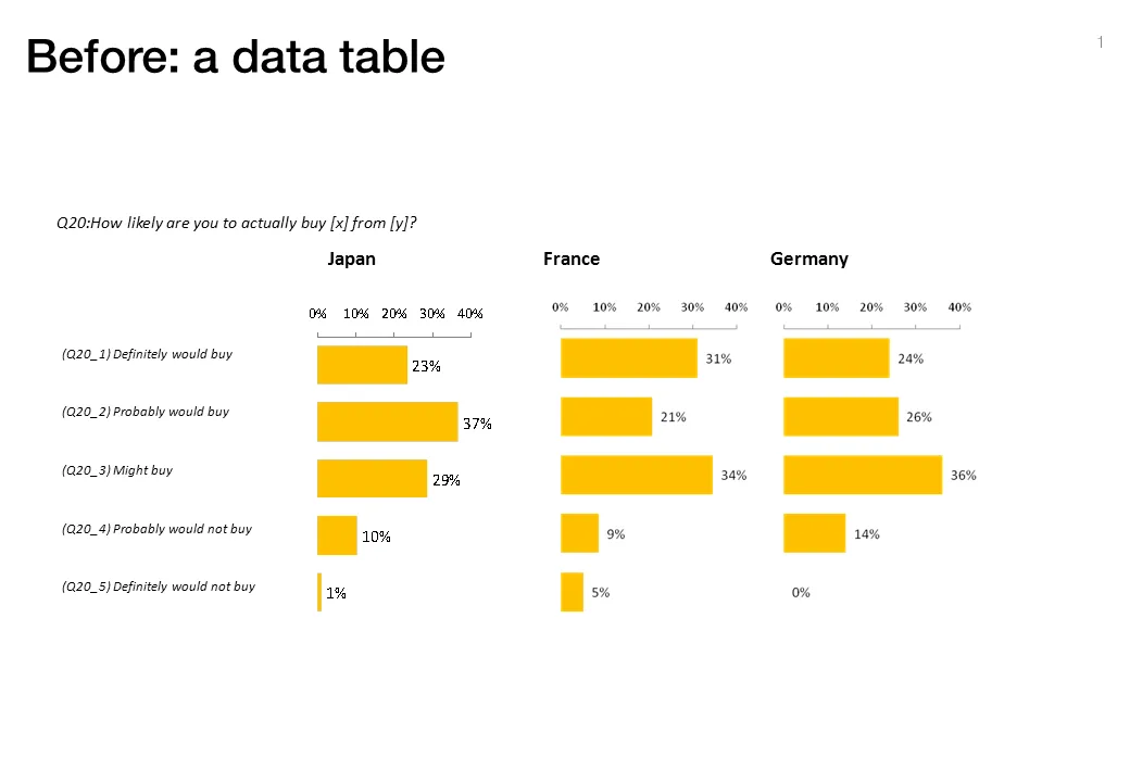
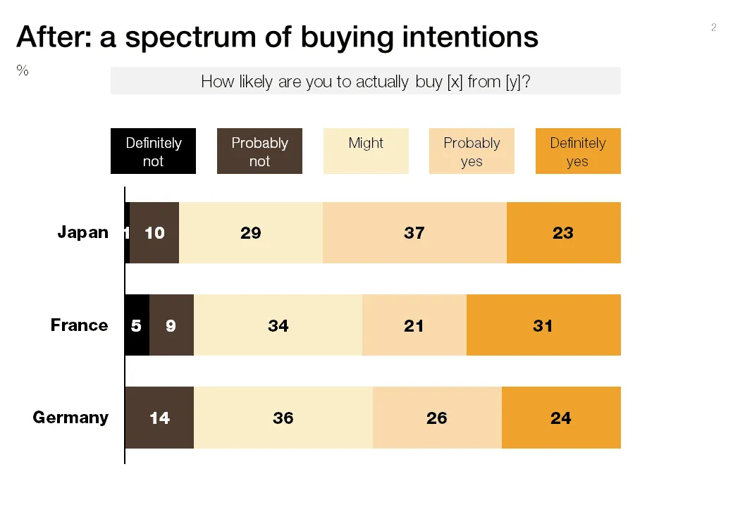
"Would you buy?"-type data from market research

Both of these charts contain the exact same data. The second is a lot easier to read, the spectrum of customer choices is neatly laid out, and the colors are picked in sequential order.

·Advertising

Watch out with charged images

Our collective memory has some very powerful images. Photo editing software enables us to manipulate them and use them to communicate a message. “Learn to anticipate” says the ad below with a set of shortened WTC towers and planes happily flying over it. Maybe the ad was meant to be funny. Maybe its intention was to shock people and trigger a discussion of a controversial subject (What Benetton tried to do in the 1990s). A “fail” on both accounts. Be careful with charged visual concepts.

Via Ads of the World.

·Design

Chart concept - umbrella

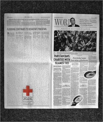
The umbrella protecting you against falling misfortune is powerful visual concept, albeit maybe even a bit cliche (earlier post in defense of cliches). This Red Cross ad uses it very well. Bigger image here. (Via Frederik Samuel’s blog)

·Delivery

Sartre, Beauvoir, and Miles Davis talking presentations

I just returned from a wonderful holiday in France and hope to pick up my posting habits soon. While in France, I read this interesting book: Parisians: An Adventure History of Paris by Graham Robb (affiliate link). Robb uses a variety of styles and settings to describe famous characters living in Paris through the centuries. One chapter is a film-type script set in Cafe de Flore in Paris around 1948, a small fragment:
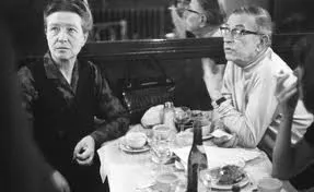
Beauvoir: He [Sartre] was invited to give a conference at the UNESCO. It was the first meeting of UNESCO, two or three years ago, in 1946. At the Sorbonne. The evening before, we went to the Scheherazade, with Koestler and Camus. And Sartre - you remember? - danced with Mme Camus, which was like watching a man lugging a sack of coal. He was very drunk, and he had to give his talk in the morning, but he had not written a line. Miles Davis, pointing at Sartre: The teacher hadn’t done his homework! Beauvoir: Yes, and Camus, who was also drunk said, said, “You will have to do it without my help,” and Sartre said, “I wish I could do it without my help.” Sartre, stubby fingers spread on the the table giggles. Beauvoir: An then - he does not remember this - we had breakfast Chez Victor at Les Halles, soupe a l’oignon, huitres, vin blanc - and then it was dawn, and we stood on a bridge over the Seine, Sartre and me, and we were so sad about la tragedie de la conditione humaine - eh oui! - that we should throw ourselves into the river. But instead of that, I went home to my bed, and Sartre, he went to the Sorbonne to talk about la responsibilite de l’ecrivain… Miles Davis: That’s cool Jean-Paul. They knew you were talking straight because you hadn’t prepared… Beauvoir, shaking her head: No Sartre, he had everything already in his head.

·Data visualization

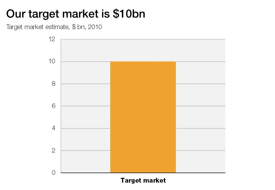
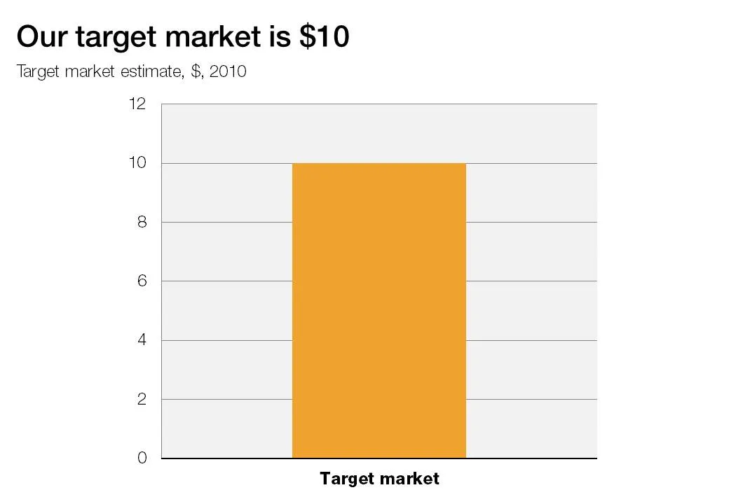
The lone column

A column chart with just one lone column is not a column chart. Column chart need to compare things, show a trend over time.