SlideMagic Blog

Frequent updates about all things presentations since 2008. Subscribe to never miss a post.

RSS
all posts

Search results for “web design”

·PowerPoint

Tilting Google maps

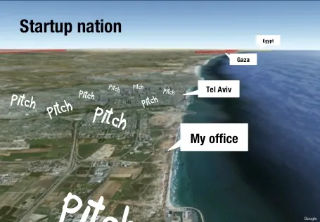
Someone asked me how I managed to create this image of my office location in a recent presentation.

The secret is in an earlier post about tilting Google maps. Pay attention to the angle that the satellite camera took when taking images closer to the ground. Rotate the image in such a way that shadows look natural.

·Advertising

Photo compositions that hurt the eye

Photo editing software can do a lot, and it is getting increasingly used in advertising. This ad however shows its limitation. When you try to be photo-realistic and it is not 100% right, it just hurts the eyes. The concept behind the ad is good, the execution not.

Via Ads of the World.

·Delivery

Voice pacing

Here is an interesting article about voice pacing on the BBC web site. Researches analyzed voice patterns of 1,400 attempts to get people to do a phone service. Here they are:

  • Speak moderately fast
  • Pause
  • Don’t change the pitch of your voice too much

You could re-write these findings as follows:

  • Be energetic and enthusiastic
  • Don’t rattle off a pre-programmed script
  • Act normal

In short, have a human conversation.

Bullet points and abs

I always preach that the look and feel of an investor presentation should match the brand identity of the company.

Abercombie & Fitch sticks to this principle. See the investor presentation here.  The Footnote website comments:

We counted no fewer than 13 slides that featured shirtless dudes baring their pecs. That’s nearly 20% of the slides in the 67-slide deck. The PowerPoint was part of the company’s Investors Day earlier this week. The presentation seems to have gone well, judging by this brief WSJ article that notes that Abercrombie stock climbed over 8% on Tuesday, in part, it seems, based on the bullish projections made during the presentation. So there was some substance in between the eye-candy slides.

On a more serious note, this investor presentation has some good and bad practices. The good:

  • Muted formatting
  • The use of maps to highlight global expansion
  • The real images of the customer excitement in the stories

Things that could have been done better:

  • Too many bullet points, the numbers would have looked even more impressive if they were put into data charts
  • I like the big bold “$1.0bn” type text across the maps, just don’t put financial data in red.

Thank you Robert Lakin. Image by Abercombie & Fitch.

·PowerPoint

My NYU presentations on SlideShare

Last week, I spoke at a SalesSchool event at NYU in New York. Here are the slides I used during the 2 evenings. Both presentations start off the same, but then diverge as they focus on VC pitches and sales meetings. SalesCrunch will post video fragments of the evenings later on their site.

At the end of the presentation, I touch briefly on the challenges of presenting without eye contact. For more suggestions about presenting remotely and in webinars, see this post by Olivia Mitchell.

·PowerPoint

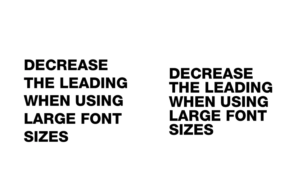
Reduce the leading of large font sizes

Leading is the horizontal spacing between lines of text. For regular font sizes, PowerPoint adjusts the leading fine. When you start getting to huge font sizes though, things tend to go wrong, the distance between lines of text is too large.

To reduce the leading in PowerPoint, select the text, right-click, select paragraph, set spacing inside the spacing group to exactly, and lower the number that pops up.

·Data visualization

Reuters issues a 1-page online annual report

Slowly, large publicly traded companies are starting to experiment with Internet and social media as alternatives to the dry and boring annual report. Reuters just issued a 1-page version (see it here), with a promise that over the next few days, this will be followed up with more detailed blog posts about the company and its financial results.

Early online annual reports were a pain. They basically were print documents put online and you had to keep on clicking on “next” links to get to the following page. Rendering of tables and data in basic HTML also did not provide good results. Combine that with slow page loads and you get a pretty useless experience.
New display protocols (and certainly HTML5) will give PowerPoint-like fast navigation controls to online documents. I think a hybrid of a traditional slide presentation, advanced (and fast) web navigation, video and other multi-media, plus social aspects will give a powerful distribution platform for financial data. You get the best of both worlds: PowerPoint-style visualization of data and key strategic messes, and nicely-formated text for those who want more details. Certainly for public investor presentations such as this one, but also for confidential documents. You can distribute login details to (potential) investors you want to share your data with and exclude them from the online data room as soon as the deal process has stopped.

There are also great opportunities in sales. I rarely use a PowerPoint presentation anymore to introduce my own services for example. Rather, I just take people through a few sections of my web site, either in person or via a remote presentation tool. SalesCrunch, the company that is organizing my upcoming New York presentations, is trying to create a platform for these remote sales presentations.


Continue reading →
·PowerPoint

The sales presentation is only a small part of the sales meeting

A potential customer has many ways to get information about your product:

  • There is information on your web site
  • Your competitors bring the client up the learning curve about the industry
  • In your preparation phone calls with the prospect, already a lot of information gets exchanged
  • Maybe you sent the customer a copy of the slides of the sales presentation in advance
  • There could be a product demo that the client already has been playing with

So, when you finally enter that meeting room, it is good to think about the value of the precious 1.5 hour of face time. Maybe it is not about information transfer. Maybe it is about giving your client an opportunity to get exposed to what they have not seen before: you in action, in person.

  • What type of supplier are you?
  • What about integrity?
  • Can you be trusted?
  • Do you understand their questions?
  • Are you flexible?
  • Etc.

The sales presentation is an excuse to figure you out.

·Images

Images from Chernobyl

The current crisis at Japan’s nuclear plants triggered this morning’s NYT article about Chernobyl, which will need to wait for another 300 years before it can be inhabited by humans again.

The confusion and uncertainty experienced by the people in Japan must be similar to the surreal experience I went through here in Israel while unpacking government-issued gas masks and constructing a biological/chemical shelter in one of our bed rooms just before the 2nd Iraq war in 2003. I remember taping the windows during live TV coverage of Tony Blair’s speech in the House of Commons advocating military action.

This photo set on Flickr by Tim Suess is both scary and beautiful at the same time.

·PowerPoint

Narrow fonts: Beebas

Some fonts are suitable for small text, some for large text, and some for headlines. Narrow fonts are especially useful for the latter. You can still fit in a lot of information, even for large type sizes. See the differences below. Beebas Neue is a free font that is very space efficient, you can download it here.