SlideMagic Blog

Frequent updates about all things presentations since 2008. Subscribe to never miss a post.

RSS
all posts

Search results for “web design”

·Data visualization

Infographic overload

This infographic by Synthesio about the positive side effects of the Burger King Twitter hack is a good example of what - in my opinion - is often wrong with infographics: too much noise (facts, breakdowns, inconsistent graphics), not enough signal.
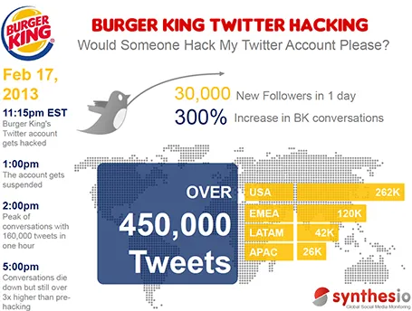
A better visualisation would be a simple time line at the top, below that a horizontal bar with the Burger King logo, followed by a horizontal bar with the McDonald’s logo, below that one stat (maybe number of mentions). This shows that as soon as the logo flips, traffic goes through the roof.

·Keynote

Down a tangent too early

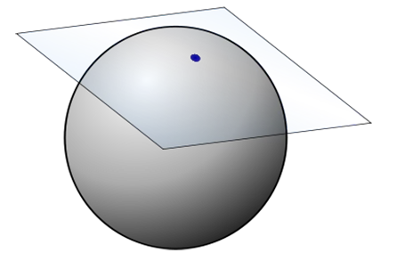
In the beginning of your presentation, the audience is trying to figure you out, and is forming a broad framework about what it is you are talking about. Watch out not to go off on a tangent too early in your story, your audience is not ready for it. Later in your talk, once the overall framework is established, it is perfectly fine to go on a little deviation.

For those interested: in geometry, the tangent is a line or surface that just touches a curve. After the connecting point both lines separate (Wikipedia).

·3D

LiveSurface

Putting objects on realistic 3D image surfaces requires a good eye to find an image on a stock photo site and some skill in PhotoShop. LiveSurface aims to make life a little bit easier, if focusses just on these types of images and the file you buy has everything you need (layers, filters). Still, you need to know what to do in PhotoShop though and you pay for the extra work through a higher image price.

The above was created from an iStockPhoto image that has increased in price since I purchased it a number of years ago (see earlier post)

·Images

Stock image pricing

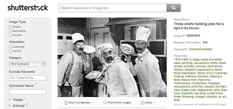
There are big pricing differences between stock image sites, especially for snaps that are different from the over-used smiling call center rep head shots. For example, iStockPhoto uses tiered pricing for images that have a more interesting composition. Shutterstock still uses flat rate pricing. These pie throwing chefs will cost you as much as an image of an orange isolated on a white background. It is worth to give Shutterstock a try. (No, I was not paid to write this).

·Colors

Creative commons Flickr search

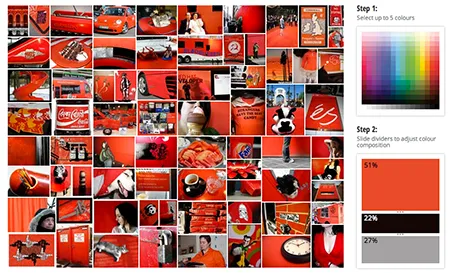
TinEye Labs has developed a cool image search engine. Select multiple colors (unlike Google image search), and the tool will mine 10 million Flickr images with a creative commons license (unlike Google image search).

Image by Mitali Mokerjee

·Data visualization

Shape fill with a data chart

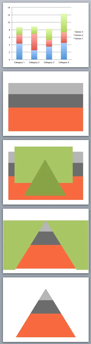
You can use shape cut outs as masks to create unconventional data charts. Here is how I created the pyramid-shaped stacked column chart:

  1. Insert a standard stacked column chart
  2. Cut away clutter until you are left with one huge column
  3. Insert a rectangle and a triangle
  4. Align the two shapes, select the rectangle first, the triangle second, right click, grouping, and hit subtract (PowerPoint 2011 for Mac)
  5. Color the remaining mask in the background color and position it over the graph

·Advertising

Anticipation

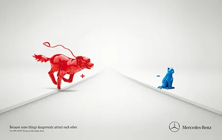
Most of the time, it is more powerful to show events that are about to happen rather than the event itself. It is very well done in the ad below for an automatic braking system that anticipates the movement of objects on the road. It brings great tension to the visual, almost making the still image move.

Commenters on Ads of the World were less enthusiastic though. Maybe the plusses and minuses should have been made a bit bigger. And well, if there is something wrong with the chart, it is in its 3D composition. The dog is too close and actually not running towards the cat. But I am probably the only one who bothers about that…

·Images

Centring objects

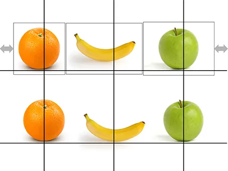
Images with objects isolated on an empty background are not always cropped perfectly. Centring the image will not center the object. Draw a some quick guide lines and you can align things properly.

·Images

Aspect ratios and image fills

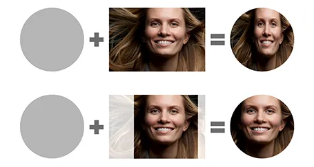
PowerPoint distorts the aspect ratio of images when you use them to fill a shape. To work around the issue, you need to crop the picture in the aspect ratio of your target shape. In the example of the circle below, that is a square.

I use PhotoShop to crop my pictures. You can also use the PowerPoint crop function itself and right-click, save as image.

·Keynote

How to download from YouTube

Videos in your presentation can be powerful, but embedding them using a YouTube link that needs a working Internet connection is a risky strategy in a live presentation, technology always fails when you need it most.

The website keepvid allows you to download YouTube videos to your computer and embed the video file in your presentation. The program comes with a few health warnings though:

  1. Watch out for copyright. Keepvid is legal as long as you use it legally for material for which you have permission to use it
  2. Keepvid is covered with ads and buttons that say “Download”, these usually link to a sponsor site and do not download your actual video. Watch carefully on what link you click.
  3. Technical issues. It takes some time before the Java applet downloads, be patient. There is something funny going on with Java and Google Chrome, so when I use Keepvid I switch to Safari which works fine.