SlideMagic Blog

Frequent updates about all things presentations since 2008. Subscribe to never miss a post.

RSS
all posts

Search results for “web design”

·Investor presentation

The year in Kickstarter

Kickstarter has posted its 2013 overview here. What I like about it: done in HTML, adjusts for different screen widths, beautiful typography, and very nice use of video.

However, the opening slides with the stats are actually not that powerful. Rounding up numbers, using a simple data chart here and there, and maybe use maps would have driven the points home much stronger.

Still, it would be good if more people try to find a different format to publish their annual report.

·Design

Leading

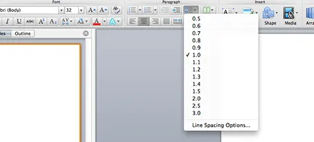
One of the typography elements I play with all the time is leading, the space between 2 lines of text. PowerPoint sets the leading standard to 1.0, or 100% of the typeface size. What leading looks good depends on:

  1. The typeface you use
  2. All caps, sentence caps or lower case
  3. And most importantly: the size of the font, bigger fonts need less leading

There is no general rule here, you need to fiddle and see what looks best. On a Mac, there is a button that controls the leading of your paragraph, see the screenshot below. It is one of the buttons I use most.

·Delivery

The learning pyramid

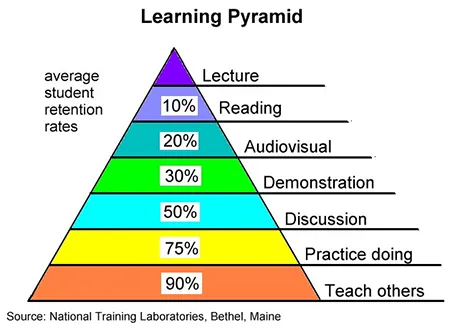
I came across this image the other day, showing retention rates of students by delivery form. A lecture is the worst, teaching others is the best. I am not sure about the accuracy of the exact percentages, but there is something to the overall hierarchy presented here. And presentations are definitely somewhere high up there.

But we can learn from this pyramid to make our presentations better.

  1. Audiovisual: This will not be a shocking new insight: use visual material in your presentation, avoid text
  2. Demonstration: Keep things highly practical, use case examples that people can relate to
  3. Discussion: Easy to do in a small setting, but harder for large audiences. In sales presentations for example, this would mean improvising your entire sales pitch on the client specific situation.

How could you get to teaching others in a presentation?

·Colors

Too much colour (2)

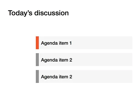
Following frequent requests after my previous post, I have included a picture here that shows the concept of the narrow coloured bar replacing a fully coloured slide object.

·Images

Unexpected perspective

Everyone will agree that this image by Christian Xavier is beautiful and grabs the attention. Why? It is because the implied position of the photographer is impossible, it should be in the middle of the air. We are not used to seeing pictures of the Chrysler building from this perspective. Most pictures of the skyline of New York are taken from the same viewpoint (the roof of the Rockefeller Center for example).

How was this image created? He took a regular New York skyline picture with a good camera and zoomed in, cropping out areas of the picture he does not need.

Two lessons here. The theoretical one of using unexpected perspectives. And two, you can actually use this zoom/crop technique with high resolution stock images to make them more interesting.

·Concepts

White on white

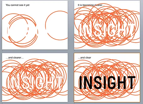
White letters on a white background enable you to make a nice slow-reveal slide. I used it for a client in BI (business intelligence) that creates insight by overlapping multiple analyses.

·Keynote

What is that font?

I get this question a lot. My logo is set in Futura Condensed Extra Bold. Other major brands have followed me…

·Keynote

Dummy grid

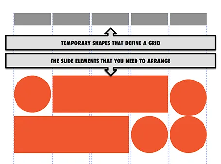
Drawing guides are a pain in PowerPoint (when you need to move an object close to the grid, you always end up moving the drawing guide line by accident). Also, grids can change from slide to slide.

My solution, quickly plop in some dummy shapes that define the grid for the slide you are working on. With snap to shape, you can create the slide layout you need, and get rid of the temporary shapes when you are done.

·Delivery

Sloppiness

When you have done your sales pitch hundreds of times, sloppiness can sneak into your meeting preparation.

You forget your business cards, you forget to remove that food stain your small son made on your laptop, you forget to check out the prospect’s web site and LinkedIn profile, you forget that the person in front of you hears your story for the first time and you should deliver it as if you gave it for the first time.

Every meeting requires concentration, even sales pitch number 723.

·Keynote

A hard drive crash in 2013

I had to swap my hard drive a few days ago and the experience was quite a different one from similar accidents that happened to me in the 1990s. What is different?

First of all, the total lack of panic. After I diagnosed the problem, I did not have to think long about hitting the delete hard drive button. All my data is in Dropbox.

A hard drive crash would have been an excuse to splurge on a new machine a decade ago. Then, there were dramatic performance degradations in just a few years as PC software become more powerful, especially because of the improved graphics. No such thing in 2013, software does not get more complicated, often the opposite is true as PC software is replaced by web applications.

I decided to rebuild my computer from scratch rather than recreating it from a Time Capsule backup. The machine got a little slow and cluttered full of applications that I tried once but never used again afterwards.

One decision: I did decide not to re-install my virtual Windows machine that I put on my machine the first day I bought my Mac to calm down my fears that the whole transition just might not work. PowerPoint 2013 for Windows is better than PowerPoint 2011 for Mac, but not enough to justify breaking my Mac file system workflow and colour picker, and to sacrifice disk and CPU performance to a huge virtual machine (Parallels).

Some things to remember with Dropbox. Move the default photo directory of your Mac inside Dropbox so you have your personal pictures backed up. (But then again, 99% of my personal pictures are actually sitting on my cell phone now, and the reason that it is very important to back up your phone, personal photos on your phone are more important than PowerPoint files on your PC). And secondly, move your Mac download folder into your Dropbox. Some software that you bought online do not allow for re-downloading the installation file (stupid).


Continue reading →