SlideMagic Blog

Frequent updates about all things presentations since 2008. Subscribe to never miss a post.

RSS
all posts

Search results for “web design”

·Art

Review: Art Authority for iPad

I often use paintings as an inspiration for slide design. Sometimes you can actually use the actual painting itself, but more often, I use a painting to borrow a color scheme (earlier post).
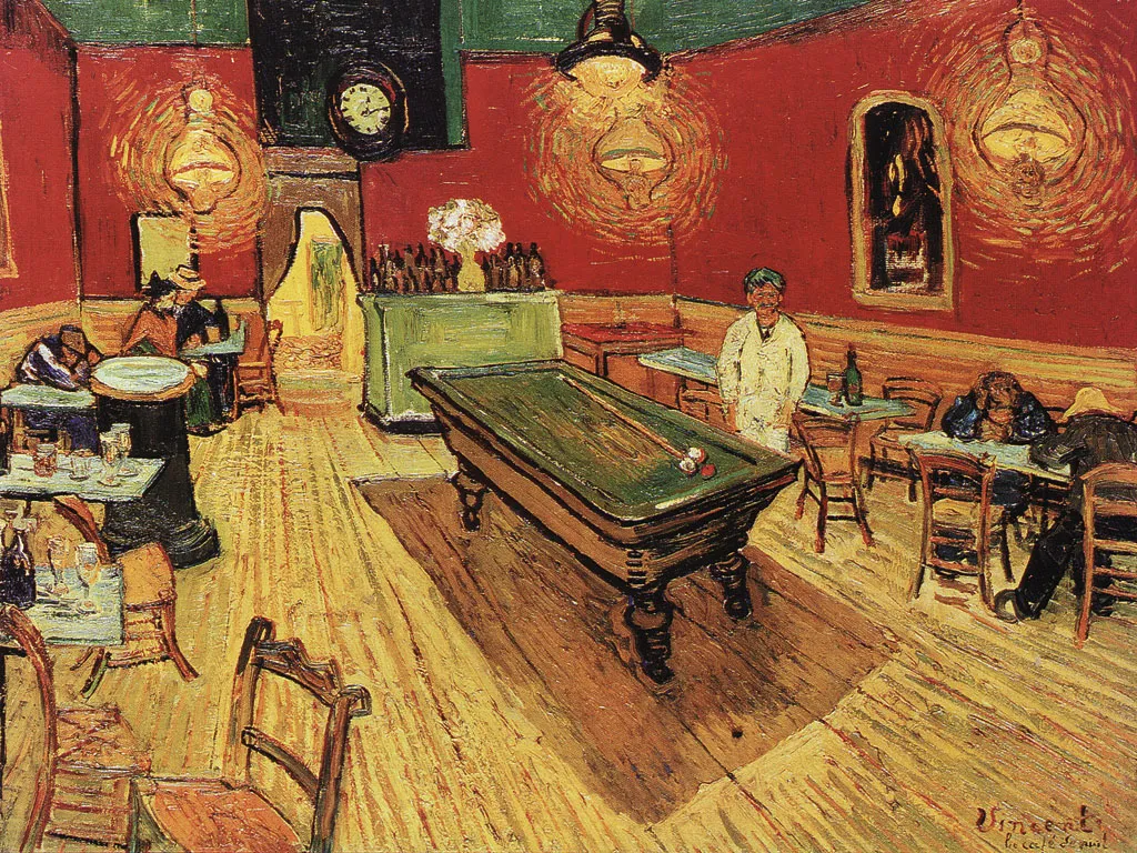

There is  a big problem with art books: it is hard to browse vast quantities of images quickly, slice and dice art works by artist, time, genre. A good painting requires time to appreciate, once you found it. However, the finding is the difficult bit.
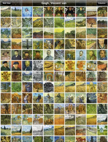
The iPad is a wonderful device to navigate huge image data bases (earlier post). I am a bit late to discover Art Authority for iPad, an application that make this a reality for art. Over 1,000 (Western) artists, with each painting properly documented plus links to Wikipedia for more information.

Most art books show the same “greatest hits” paintings, not spending paper on less well-known works by artists, paper publications cut off the long tail. Not with Art Authority that shows works beyond the beaten path.

$10 well-spent.
·Design

The Wolf

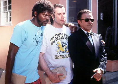
My role in some presentation projects reminds me of the character “The Wolf” in Pulp Fiction. The clock is ticking, (many) people are running around, but the presentation is not progressing towards a final end product…

You can call in The Wolf if you really have to, but these situations are best avoided. And, the talents of a professional presentation designer are most useful in stress-free situations. Energy spent on cranking out the deck comes at the expense of creativity.

I hope Miramax does not mind me borrowing these videos and images, it might just remind people to buy a copy of this classic movie to watch it again this weekend (Affiliate link to Amazon).

·Concepts

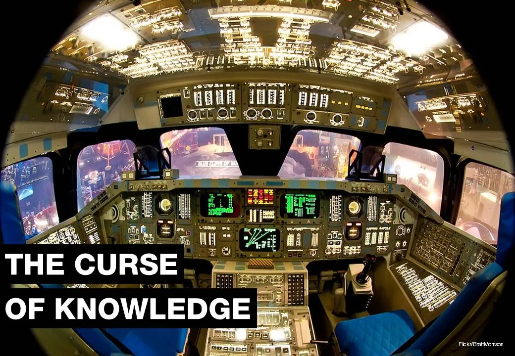
Visualizing the curse of knowledge

I often have to explain the concept of “the curse of knowledge”: it is actually harder for an expert to explain something than a reasonably intelligent outsider (here is why presentation designers should be reasonably intelligent :-) ).

Dan and Chip Heath use a musical metaphor in their book “Made to Stick”:

  1. The presenter thinks of a musical piece and imagines the full symphony orchestra giving all it can
  2. He taps the tune with his fingers on the desk, it all makes perfect sense
  3. The audience sees/hears someone tapping…

For executives who are keen to load their slides with data for an external audience, I use the cockpit analogy. A pilot can interpret all the signals of all the instruments in a split second and understands the situation the plane is in. The novice needs a bit more time to digest the information…

Thank you Brett Morrison for this beautiful picture of a Space Shuttle cockpit.

·Design

What's in my toolbar

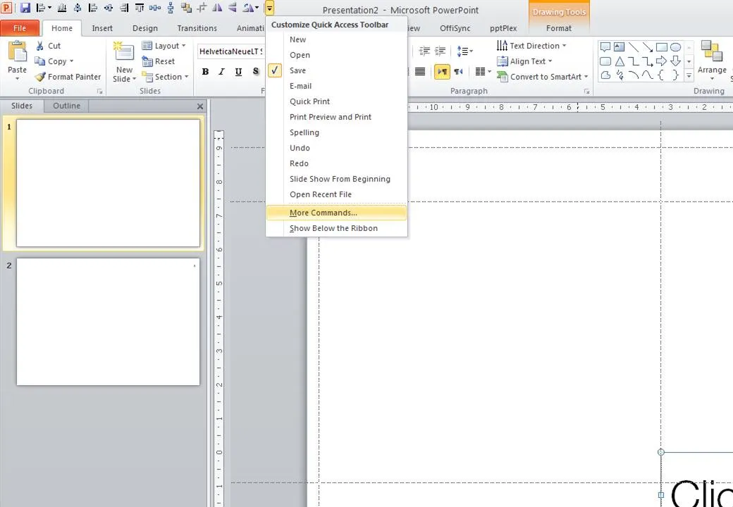
Unlike PowerPoint 2007, it is possible to customize the tool ribbon in PowerPoint 2010 (review). I still use my 2007 workaround in the 2010 version of PowerPoint though. The screen dump below shows those very important buttons that any PowerPoint designer should have always on hand (click for larger image).

  • Save
  • Left, bottom, middle, right, top align
  • Horizontal, vertical distribution
  • Send to back
  • Crop
  • Flip horizontal, vertical
  • Rotate
·Books

Learning from ancient folk stories

I was just reading some stories from Nelson Mandela’s Favorite African Folktales(affiliate link) to my kids and realized how much you can learn from them to create short anecdotes that fit inside your bigger presentation:

  • Very short
  • One to three simple (almost stereotypical) characters
  • Something happens at turn 3. “On the 3rd day…”
  • An unexpected twist at the end: “and this is why monkeys became so good at climbing trees”

These tales were designed to be remembered and passed on for generations. How long does your slide deck stick?

·Creativity

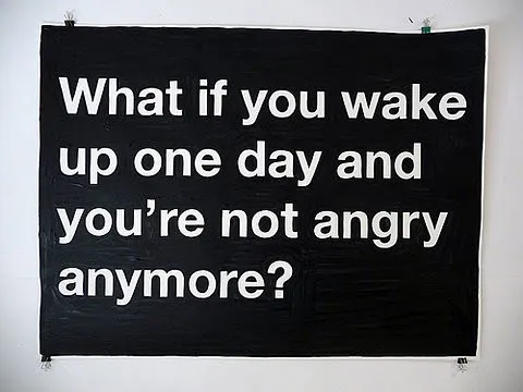
Negative thoughts are creativity killers

I stumbled on this image this morning: such a true quote. Whenever I allow myself to get upset in a Tel Aviv traffic jam, or on the phone to the useless support desk of my ISP, I simply cannot get myself to design a good presentation. The rest of the day is best spent doing the monthly accounting.

Via Diego Zambrano.

·Design

Clearing your head, once a year

Falling in love with an Israeli woman 15 years ago has put me in this slightly unusual situation today: experiencing Yom Kippur as a non-Jew in Tel Aviv. (Read more about Yom Kippur here.) While I do not have the religious tradition of this “holiday” and even think it can be dangerous for people not to drink for 25 hours in a 30C+ climate, there is something special about this day. Everything comes to a complete stand still. No cars, no shopping, no noise, no polluting smells (see graph below, air pollution drops by a factor 100), no nothing. I live right on the sea shore just north of Tel Aviv, very close to the busiest highway crossing of Israel. It is magical to see human society grind to a halt, and you can almost feel the energy of a few million people near by reflecting on what contributions they have made over the past year.  The sun setting and the only sounds remaining are those of the sea, the wind, and the birds. This is not your average car-free day, it is really about letting nature taking back over.

As designers, we need more of these moments that enable us to get rid of the clutter in our minds.

·Design

Making the audience feel small

You probably have noticed as well that it is impossible to capture a wide panorama with a camera. “Look at this sunset over the sea! Where is my camera?!”. The resulting image is often boring and lacks depth, the exact reason why so many stock images of panoramas fail to excite.

The human brain is not restricted by a small 2D screen. It senses distance/3D by blending the slightly different images from both eyes in to one. Eyes never sit still, they constantly move. We are standing at the inside of a gigantic sphere. Eyes compare the size of objects, to assess dimensions.

Handing out 3D goggles to your audience is not an option (at least not today), so the presentation designer has to resort to tricks to create 3D effects.

  • Pay attention to camera position (earlier post)
  • Put a known object in the image so people can relate the size of the whole to the familiar dimensions of the object (earlier post).
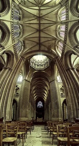
  • Or use effects like the one used in the image below. Stitching together multiple photographs to create on large, distorted image that gives the illusion of standing inside a sphere. Your eyes are really running up and down the image, just as you would do when you would stand inside the cathedral for yourself. Huge image by balondrotor here. (Earlier post on a similar but less spectacular version taken in the Notre Dame)

For those interested, the cathedral in question is the one in Coutances, Normandy, 20 km from this year’s holiday home. This majestic old building stands in the middle of the city center that was largely rebuild after the July 1944 battles. It was almost unscathed.

Continue reading →
·Design

All caps and sentence caps are harder to read

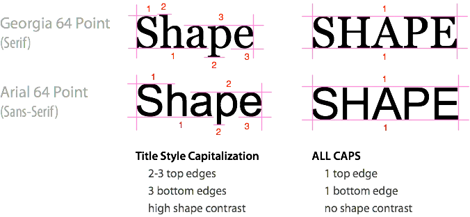
A very interesting analysis of why it is harder to read all caps text on UXMovement. All caps reduces the number of differentiators between words, and hence should only be used in short bites such as titles, logos or lables. I have been ranting about title caps as well before.

OK, sometimes I contradict myself, but all caps worked in this presentation with very few, short sentences.

·Design

Comic sans strikes back / has its say

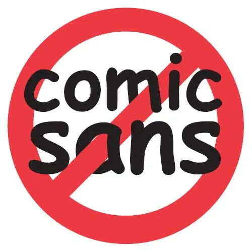
I have joined the legion of designers in criticizing the comic sans font (earlier post here). In this rant (strong language warning), comic sans strikes back at us, elitist Helvetica fans. Written by Mike Lacher, thank you Ellen Daehnick for suggesting it.