

You probably have noticed as well that it is impossible to capture a wide panorama with a camera. “Look at this sunset over the sea! Where is my camera?!”. The resulting image is often boring and lacks depth, the exact reason why so many stock images of panoramas fail to excite.
The human brain is not restricted by a small 2D screen. It senses distance/3D by blending the slightly different images from both eyes in to one. Eyes never sit still, they constantly move. We are standing at the inside of a gigantic sphere. Eyes compare the size of objects, to assess dimensions.
Handing out 3D goggles to your audience is not an option (at least not today), so the presentation designer has to resort to tricks to create 3D effects.
- Pay attention to camera position (earlier post)
- Put a known object in the image so people can relate the size of the whole to the familiar dimensions of the object (earlier post).
- Or use effects like the one used in the image below. Stitching together multiple photographs to create on large, distorted image that gives the illusion of standing inside a sphere. Your eyes are really running up and down the image, just as you would do when you would stand inside the cathedral for yourself. Huge image by balondrotor here. (Earlier post on a similar but less spectacular version taken in the Notre Dame)
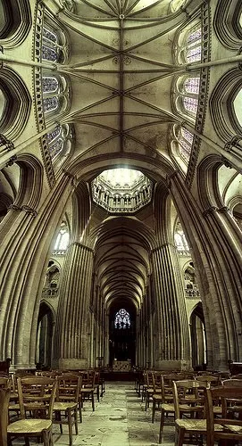
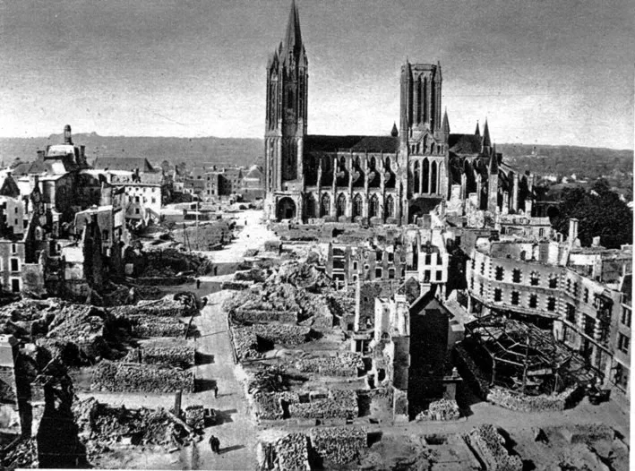
For those interested, the cathedral in question is the one in Coutances, Normandy, 20 km from this year’s holiday home. This majestic old building stands in the middle of the city center that was largely rebuild after the July 1944 battles. It was almost unscathed.
I am not usually into Gothic architecture but this cathedral was an exception although is not usually included in the must-see lists. There is something to the proportions, the rhythm of the vertical lines and blending of light through the windows that creates an effect that I failed to capture on my own holiday photographs. This image gets close though.
Found via TwistedSifter, follow the link for images composition images.
2 comments
Then it occurred to me how that could be put to use in PowerPoint. Keep the image huge and use a motion path. Hopefully, the front rows of your audience are easily subject to motion sickness.