SlideMagic Blog

Frequent updates about all things presentations since 2008. Subscribe to never miss a post.

RSS
all posts

Search results for “prezi”

·Delivery

Apple event - "auditorium camera position"

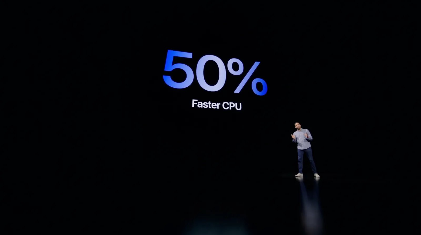
Apple is known for setting the standard when it comes to product presentations. It is interesting to see what they produced in yesterday’s event within the constraints of COVID. A pre-recorded, pre-produced long-format “television commercial” without a live audience.

As we know from Zoom calls, webinars-style presentation of slides with a presenter voice over can be pretty boring. Adding a small picture-in-picture video of the presenter makes things a little bit more interesting, but it still does not capture the energy of a live presentation.

Apple used an auditorium-style camera position in some of the presentations:
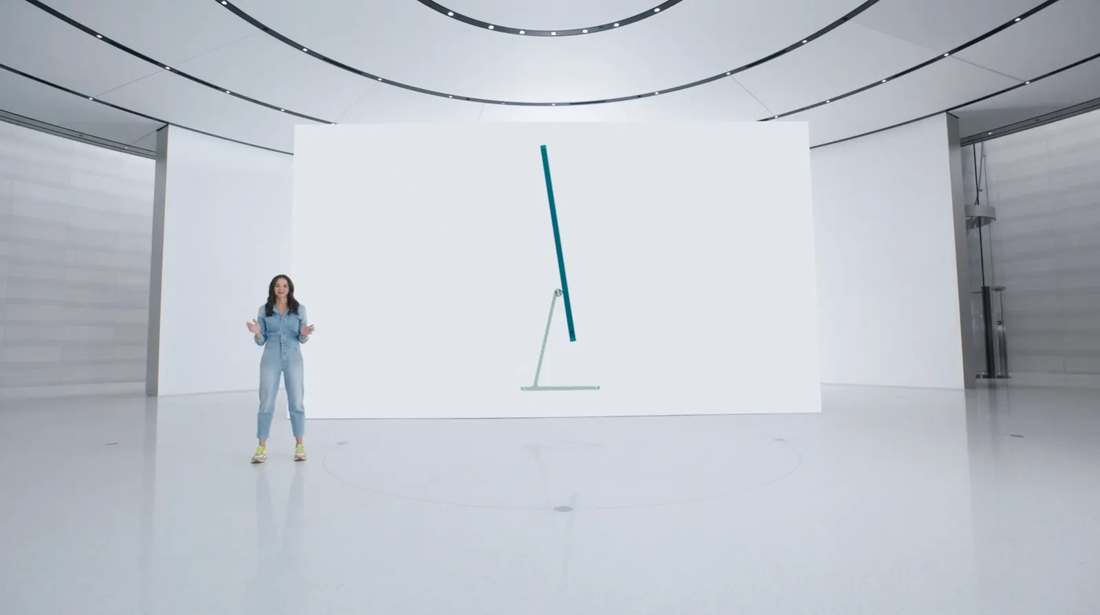
This enables the speaker to walk around, to create a much more interesting presentation. Big budget, multiple camera editing completed the effort.

This is something you could copy, if your business has a large neutral wall, record yourself event without slides in the background, peeking at a small presenter laptop, and later on edit the slides in the background. Or if you have an amphitheater around (if you are a university student), you are lucky and can use that.

I guess this could also be a good idea for some future startup, that maybe can record you in a much smaller setting, and add the digitally created auditorium in a later stage. I see Prezi moving in the direction of video now, but it tries to make the slides more dynamic and exciting. I think this opposite approach is more effective: very calm slides with an energetic presenter.
Investor pitch in virtual reality (Pixvana)

It was bound to happen soon, a startup active in the field of virtual reality made an investor in pitch in well, virtual reality. (The background of Pixvana’s pitch)

For the company, it was definitely the right thing to do. The introduction of the team in a 360 setting is nice touch, and makes you feel right inside the company. The graphics show of the platform’s capability, which is probably the most important objective of the presentation.

Still, when it comes to transferring specific concepts, VR suffers from a similar problem that we already saw with the spectacular animations in Prezi. Sophisticated visual effects are not always helpful to communicate complex issues. I watched the 2D, non-confidential video, in a casual way, similar as an investor would do a first time around. In the video, the company shows why current video production tools fall short, I understand things more or less (“more data is required”), but somehow I feel that it could have been communicated more clearly.

As I discussed earlier re. Prezi, there are specific situations where animations could be really useful in an investor presentation (beyond spectacular page switches): zooming in and out of complex technical diagrams, showing transformations. The same is true for VR: guided tours of facilities, demos of buildings, etc. etc.

Exciting times for visual communication! If you are in the business of video production, the Pixvana SPIN Studio solution might be worth checking out.

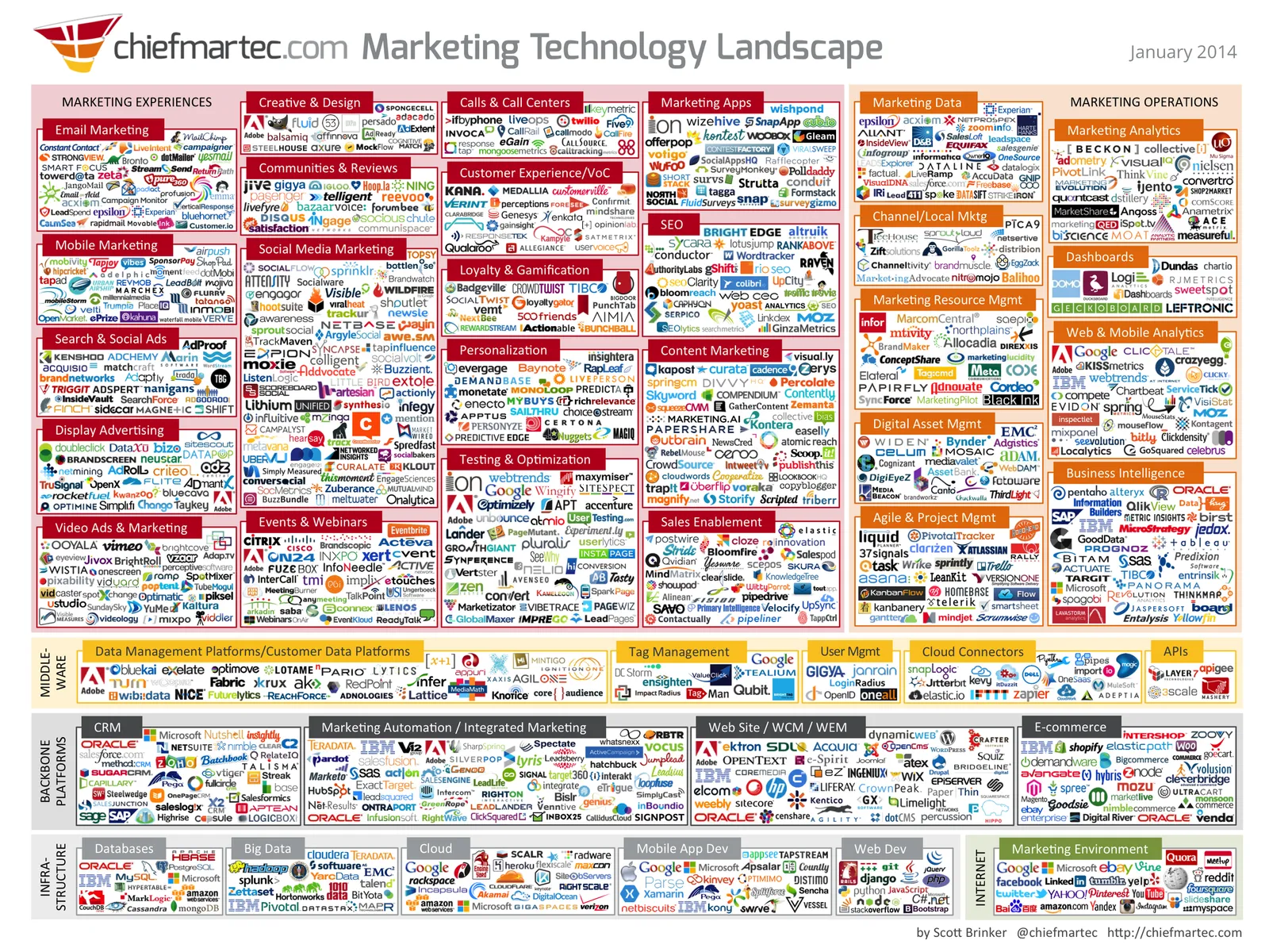
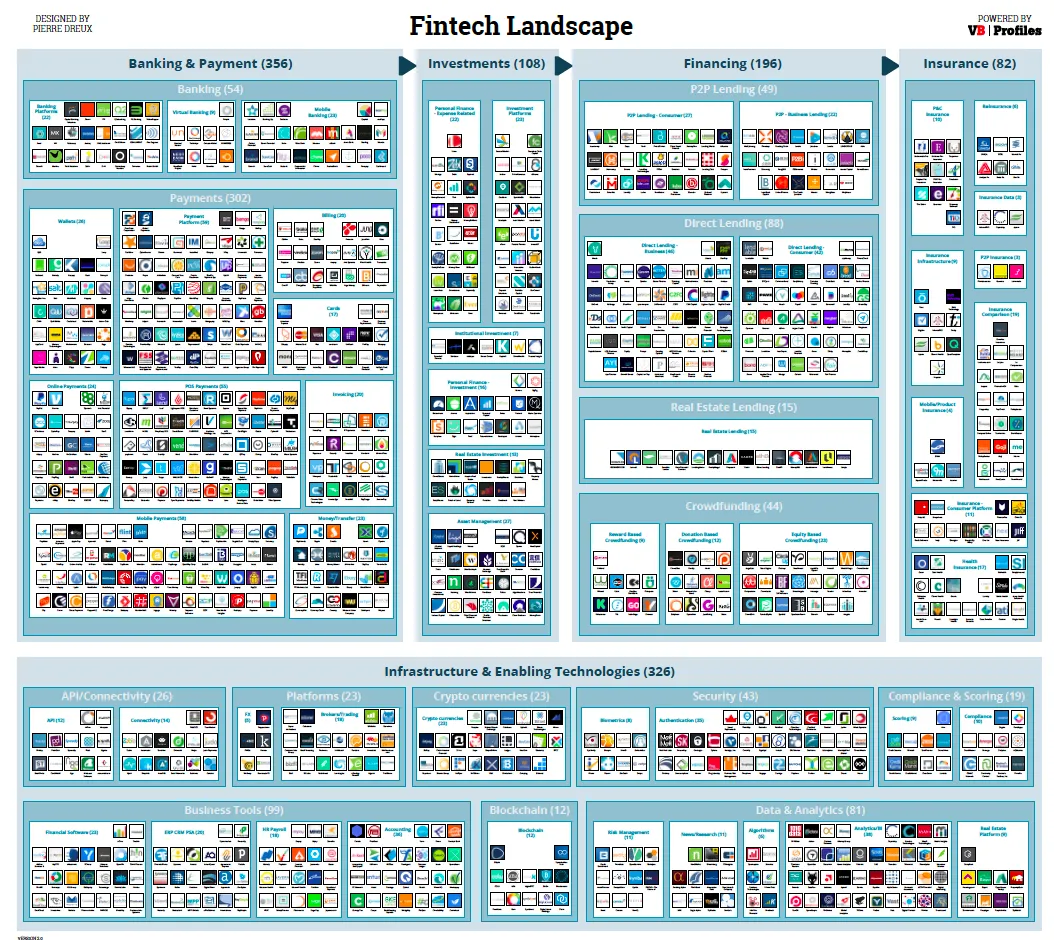
The industry landscape chart

There are a lot of these type of industry charts around. The only message it conveys as a slide is “there are lots of players in the industry”. More information is too hard to read. I think zooming presentation tools such as Prezi do not always help make your presentation more effective, but in this case, it could provide useful in creating a “ponder chart” where you can zoom in and out of specific sections.

·Software

On stage, it does not matter anymore which software you used

On Quora, I see questions like which presentation software did [company X] use at [event Y]. For the audience there is no difference. The same simple, good slide can be made in PowerPoint, Keynote, Google Slides, and Adobe InDesign. The exception is probably Prezi and its complex zooming capabilities.

The process that got you there makes a big difference though. How easy is it set up a basic presentation template (colours, fonts, positions of titles, page numbers, aspect ratio), how is it to create a basic slide layout other than a list of bullets, how easy is it to align items properly on a grid, how easy is to create basic data charts, how easy is it to keep everything consistent page after page, how easy is it to do basic image manipulation (cropping and repositioning).

Either the audience cannot tell in which program the presentation was made and you were either a design pro or have made a huge effort to master the software. Or, the audience can spot your software instantly (most likely PowerPoint), which means that you did not get much further than the standard slide template.

(A secret: you can get away with taking design short cuts in my presentation app SlideMagic and no one will notice).

Edgar Degas, Rehearsal on stage, 1874

·Investor presentation

Finding the bottleneck

If you are struggling to get traction with your investor presentation, it is worthwhile to try to find out where the bottleneck is:

  • Do investors understand what I am trying to do?
  • Do investors understand that this is a big problem/opportunity?
  • Do investors understand that someone can make a big business out of this?
  • Do investors understand that I am the person who can make a big business out of this?

These are slightly different questions than the ideas entrepreneurs often have:

  • My slides do not look “slick” or professional enough, let’s add some colour
  • The story flow is not completely right, let’s talk about the market earlier
  • We have not put in aggressive enough financial forecasts, let’s bump it up to $100m
  • We did not put in that Gartner total market number for 2016
  • We are not mentioning the right buzzwords, let’s add a few
  • The deck is too long, let’s cut it down to 5 slides by combining pages
  • We should use Keynote or Prezi, PowerPoint is stale
  • We should invest in a video clip
  • The deck needs more animated slides
  • AirBNB raised a lot of money, let’s copy their pitch deck

Art: Edvard Munch, Self Portrait with a Bottle of Wine

·Layout

Squarespace versus wix

There are two popular web site template providers: squarespace and wix. I like to think of presentation design software SlideMagic as “squarespace for presentations”. Many other PowerPoint alternatives (such as prezi) are “wix for presentations”. What is the difference?

  • Wix offers a lot of features, colours, fonts, pre-programmed templates for specific sectors (vets and pets for example)
  • Squarespace is muted, has far fewer choices, fewer colours, bells & whistles.

The great thing is that the design restrictions of squarespace actually result in better web designs. People have to think how (whether) to put that content on the page. A professional designer will pick a style and restrict herself to stay in that framework. That is why it looks so good. The layman designer cannot resist to add more stuff. Squarespace and SlideMagic protect the non-designer from herself.

P.S. Squarespace powers the SlideMagic landing pages and blog.

Art: The Stadhuis under construction, by Johannes Lingelbach, 1656 Subscribe to this blog, follow me on Twitter

·Delivery

Do not overdo it

A VC complained a about a Prezi presentation today: a combination of motion sickness and impatience (using 30 slides to make a totally obvious point that could be made in 1).

There is nothing wrong with Prezi if it is used right:

  • Use zooming effects to support your story: zoom in on a technical diagram for example, hop in and out of a time sequence, focus on parts of your product, highlight different areas of a map. Zooming for the sake of zooming is not helping anyone.
  • If you are in a small meeting, leverage the non-linear navigation to have a good interactive discussion. Random story sequence shifts for a big audience makes everyone miss the plot.

Everyone knows that 30 slides with 1 message is better than 1 slide with 30 bullet points. However, obvious points can still be made in 1 slide. I see a lot of presentations on Slideshare that use one spectacular photograph after another to [click] make [click] a [click] totally [click] obvious point (especially social media and/or mobile cliches).

·Gadgets

iPad "books"

Whenever there is an innovation in visual communication, people initially struggle how to use it best. Hand-written text scrolls did not have page numbers, spaces between words, or sentences. The first ads were either paintings or primitive, poorly designed pamphlets. Color and photography took some time to be used properly. It took 10 years or so after the arrival of PowerPoint before Garr Reynolds had his insight and write Presentation Zen, and he is still busy convincing the world to kill the bullet points as I am writing this.

So here we have this iPad and the iBooks writing platform that enables anyone to create apps that incorporate touch and can be read away from the office chair. I have started to write an app on this platform myself and am constantly changing my approach. I started with the concept of a book in my mind (pages of text with images), but then discovered all this other things you can do: Prezi-like zooming diagrams, embedded slideshows, videos, Keynote presentations, questions. This is not a book writing tool, it is a software development tool. All these visual tools were available before on the web: zooming images, videos, data visualization. But somehow they never made it as the basis for the development of visual stories. I think the fact that an iPad can be used away from the office chair/screen will change that.

Nancy Duarte recently ported her book Resonate over to the iBook platform and the result is beautiful. And it gives some good examples of how new visual techniques are more than just making content prettier or more spectacular. Many of the effects in the Wired magazine iPad edition are just like poorly used animations in PowerPoint or Keynote: interesting, but they do not add to the story. When Nancy analyzes a speech by Ronald Reagan, it is just very useful to be able to watch the actual thing alongside.

Continue reading →
·Gadgets

1st experiment with the iPad as a 1-on-1 presentation tool

OK, I did my first presentation in a 1-on-1 meeting using an iPad. It was a bit improvised, as I made a last minute decision to drop a paper copy for the new gadget. My experiences.

  • It still is a bit of a hassle to get your file presentable on an iPad. I installed the Keynote app, but this is an iPad-specific piece of software that does not import regular Keynote files and I have not (yet) designed presentations specifically for the iPad. So I went for PDF.

  • In order to get the file on the iPad I had to upload it to Google docs, and then I used the GoodReader app to get it down on the device.

  • PDF was a bit tricky too. The PDF I created on my Windows PC did not render well on the iPad (custom fonts were invisible). It turned out, that it did not show well on a Mac either. So: import the Windows PowerPoint file into PowerPoint 2008 on the Mac, have the Mac convert it to PDF.

  • The PDF conversion was not ideal. The Mac decided to give my slides a white frame, and keep the parts of the pictures that were outside the slide borders in the page render. So I went back into PowerPoint to delete these (compress pictures) and start the process again.

  • I presented outside and the bright Tel Aviv sun light was too strong for the display of the iPad, so it was a bit hard to see. I already use big fonts om my slides, but my advice when designing for an iPad: go even bigger. The presentation view you have at a coffee table is one of an audience member in the back of the presentation venue.

Continue reading →
·Design

Microsoft Office web apps are going live

Microsoft is quietly rolling out its office applications in the cloud. They announced that the web-version of major Office applications are live, at least in a number of countries/languages. In Israel I could get it to work. Try for yourself here.

I have been following these in-the-cloud initiatives closely, and must conclude that Microsoft stands a good chance to be the winner. I chose Microsoft over Google docs for a recent project that involved collaboration in multiple countries.

It looks like the world is dividing into 2:

  1. Consumers and freelancers using Google Docs, iPhones, prezi, SlideShare, Windows 7 or Apple OS, gmail, freely sharing stuff over social networks and insecure internet connections
  2. Corporate workers using Blackberry, Microsoft Office 2003, Windows XP as a result of strict security guidelines and cost cutting in IT budgets (i.e., delaying upgrades of software). These people are struggling to find stuff in their bulging Outlook 2003 inbox.

The learning curve of switching user interfaces of Office applications is huge (read: costing a lot of money in downtime and helpdesk support), and for a big corporate to switch means that everyone is required to change habits: the 25-year old tech savvy analyst, the 60 year old secretary of the CEO, the CEO herself, to name a few. It’s just hard to move them out of the Microsoft world.

Ultimately, the big corporates will move Office applications/data into the cloud, there are significant benefits to collaboration and simply finding stuff. They will go with Office Live though, and not with Google Docs…

Continue reading →