SlideMagic Blog

Frequent updates about all things presentations since 2008. Subscribe to never miss a post.

RSS
all posts

Search results for “web design”

·PowerPoint

Think of yourself as an interviewer

Back in the old days at McKinsey, your interviewing skills as a consultant on a team would be evaluated roughly on 3 levels: 1) you got the piece of information you needed (the market for [x] is $1bn, 2) you managed to get an insight that was completely new to the team, and 3) you actually made the interviewee realize something she did not know before.

Great journalists know exactly what questions to ask at what time in the interview. The interviewer draws out the story of the interviewee.

When designing a presentation think of your self as the interviewer. If you design something for someone else, then you can take it literally. If you design something for yourself, imagine interviewing yourself in front of a big audience.

Poor interview question: what five pieces of research support the assumption about the target market size? Good interview question: what, I thought only 5 people need this product, give me a feel for why this thing is huge? Poor interview question: “Now that we have spent the past 30 minutes analyzing the market, let me ask you: what do you actually want to achieve?” Good interview question: “before we dive in, tell us quickly what your ambition is”. Poor interview question: “So let me re-phrase what I think your story is”. Great interview question: “But is your story not a bigger one if we draw the parallel with this?”

Then you will have hit level 3, the interviewee walks out of the chair with a different perspective, and the re-designed presentation will be more than a beautification of existing slides. Which interview do you want to follow to the end, and which one will you skip with the mouse or remote control?
Continue reading →
·PowerPoint

The Groupon IPO roadshow

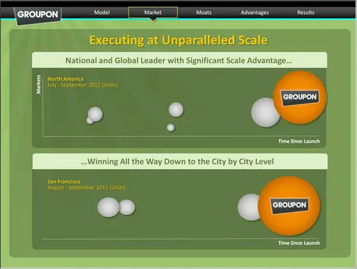
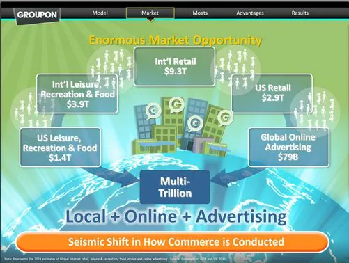
The investor presentation (both slides and video) of the upcoming Groupon IPO are online (link). Robin Wouters of TechCrunch has made a few screen shots of some of the slides. Usually these presentations are held in private meetings with potential investors, and I think it is great that they are now available for everyone to see.

Overall this is not a bad presentation, the presenters rehearsed, the slides are organized. There is still room for improvement though.

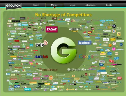
Slide design. The slides look like a beautification of a standard business presentation. The beautification is done professionally: sophisticated graphics and custom-made illustrations. Some of them look great (I love the slide with all the competitor logos). Still, Groupon could have gone further by designing the slides from scratch, making them simpler. For example, the slide right after the competitors on Wouter’s page is not clear. Also, the template could have done without all the trackers that are repeated on every page page.

Examples. Groupon is a business that happens all the way down in the street, at a small merchant. Like retailing, detail is what matters. The case examples could have been featured more prominently. Bigger images of the restaurant, more specifics of the deal. When the VP Product goes through a long list of the detailed information that Groupon has available, it sounds abstract. Why not take one very specific example and show how shoppers for flowers have different habits in 2 streets of San Francisco. The specifics of the detail make the big point.

Continue reading →
·Gadgets

MacBook with 2 external screens

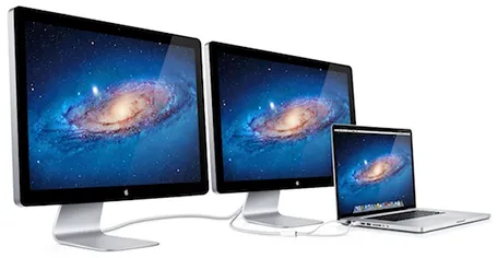
The new Apple 27" Thunderbolt display enables you to connect 2 giant external displays to a laptop, something that has not been possible until now without additional hardware.

Large screen real estate has its advantages. It is easier to design presentation slides when you have a large workspace in front of you. Extra space also enables you to open multiple windows, for example a PDF file with comments on the previous version of your presentation, or an Excel file with the data that need to go into your pie chart.

Now, 27" is a lot of space (2550x1440 pixels) and for most ordinary people, one screen will do. A presentation designer might actually need two (putting her in the same category as financial traders, air traffic controllers and social media addicts). I like to design on a clean and calm canvas. All the small windows with bits of information distract me. So I use that second screen as my messy desktop, literally pushing bits, pieces, and windows aside when I do not need them, preserving my pristine and uncluttered design environment in front of me.

Now some technical details. An Apple Thunderbolt screen can only be connected to a recent MacBook laptop that actually has a Thunderbolt port. But more importantly, the dual screen configuration only works on the most recent 15" and 17" MacBook pros, not on the 13" MacBook Pro, and not on the MacBook Air. (This might actually be an argument for getting a MacBook Pro over a MacBook Air) at the time of writing, October 2011).

Continue reading →
·Cartoons

My friend the silhouette man

I love the simple elegance of the silhouette man. The figure can easily be constructed in PowerPoint by combining circles and rectangles and gives a lot of freedom to draw simple actions. Simple to draw, but the result does not look simplistic. If you find drawing them still to be a challenge, stock photo sites are full of ready-made files that you can use in your slides.

I recently designed a 150-page deck where he was used again and again in different situations. Here is an adaptation of one of the charts.

·Art

Lessons from Vidal Sassoon

I am continuing my quest through the long tail of Netflix design movies and stumbled on this one: Vidal Sassoon the Movie (affiliate link) about the famous hairdresser. In itself, his story is very interesting, growing up poor in an orphanage, and becoming a global celebrity.

For me, there were two things that I found especially interesting.

  1. It took him 9 years to find his signature style that would change the way women looked (and thought of themselves) in the 60s. Design is hard work, even for the best and most talented among us.
  2. He says that it is easy to see when something is wrong, but very hard to come up with something that is right.

This is exactly the case in slide design as well (at least for me). Learning to design is going through lots of your own failures, eliminating stuff that is not right, leaving you with the things that do. One way to accelerate the process is to plough through design books and absorb anything design around you. It increases the odds that you will bump into something that works.

·Layout

One word per line

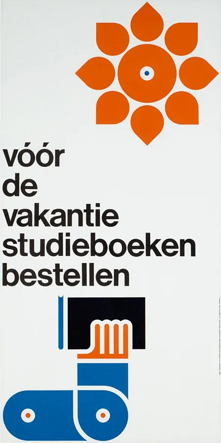
With an elegant font such as Helvetica Neue Medium, breaking a short sentence in one-word lines can create a beautiful effect. Here an example of a poster by Dutch designer Ben Bos

See how he reduced the space between the lines (looks better with bigger fonts), and did not use capitalization to create a more harmonious composition. I would have left a bit more white space under the text though.

For those who are interested, the poster reminds students to order their school books before the summer holiday. Via

AisleOne

.

·Data visualization

Infographic overload

The blog Bitrebels posted a number of infographics that compare the salaries of self-employed people in the U.S. versus those the U.K. Without picking on this particular design, this graphic shows common mistakes that often apear in infographic illustrations.

  1. Round up the numbers to the nearest $ 000. The digits behind the comma do not add anything.
  2. Group data together, a standard bar chart showing the 2 numbers with their delta is much clearer.
  3. Pick a meaningful comparison unit. More than 3,000 hamburgers is not.

·Gadgets

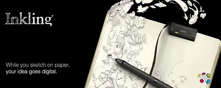
Wacom Inkling

I still have not found the perfect device to transfer sketches to a computer. Drawing with the mouse does not work. I do not like using drawing pads that do not allow you to see what you just drew on the same surface, and the very large touch screens are very expense and so heavy that they are impossible to carry around. And carrying around is crucial for creative sketching. Ideas always come up when you are not at your desk.

So, that is why I am excited about the Wacom Inkling that was announced today. A sensor tracks the movements of a regular pen on normal paper and stores them. Once you connect the sensor to a computer, sketches are transferred.

I see 2 benefits for presentation design:

  1. Enabling me to include cartoon-type drawings in my presentations. The key here is the option to use layers. Sketch a character roughly on a piece of paper. Press a button to open a new layer, and trace a more precise drawing over the rough one. Repeat the process of necessary. The top layer can now be of decent quality, and transfered as a vector to your computer. Great.
  2. An archive for sketches that can be filed and searched on a computer.

The big question: does it actually work? I took the risk and ordered one and will report back.

·PowerPoint

Steve Jobs quotes

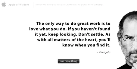
The site Apple of Wisdom is packed with quotes by Steve Jobs. Useful to spice up your presentation. Also, the site design is an example of a minimalist style blurring the boundaries between presentation slide and web site design.

·PowerPoint

Presentations on tablets

I am increasingly interested in designing documents for tablets. They could work great in one-on-one meetings (or even stand alone). I have not found the right platform to develop them yet though.

PDFs do not always work (especially when converted using the Microsoft Office plug in) and show up within the frame of the iPad PDF reader (menu bars, chart thumbnails).

HTML5 looks promising. Onswipe aims to be an HTML5 publishing platform for magazines that also could be useful for presentations. If you visit the Marie Claire web site on an iPad for example you see what it can do (it looks like an app, but it is a regular HTML page). But you also see the limitations. A browser-based environment makes page switching slow, and again, you still have the navigation frameworks of the browser application.

Custom apps. Over the past weeks, I taught myself Adobe InDesign, and loaded up software that can turn Adobe InDesign files into custom iPad apps. My computer science background is trying to convince me actually download the entire IOS 4.3 SDK to have a look inside to see what it takes to program an iPad app from scratch. It is a heavy-handed approach though.

Do you have experience with this? Let us know in the comments.