I stumbled on the slide below by @ING_economics.
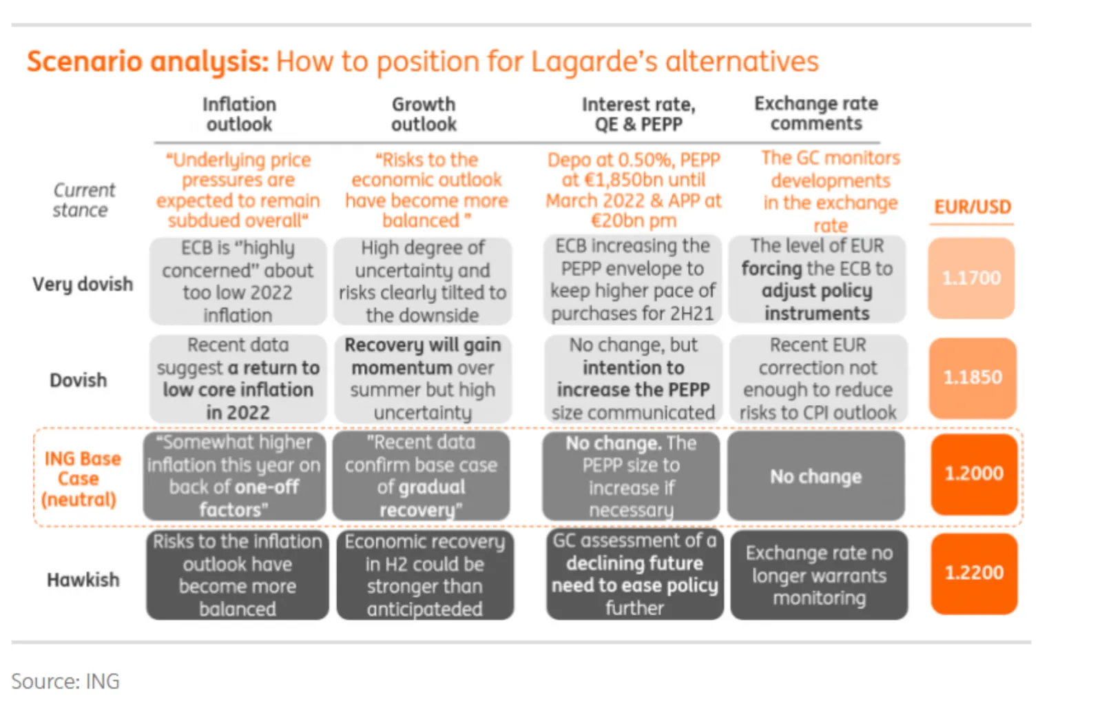
This is a slide intended for reading, rather than serve as the backdrop for a TED Talk. It can be improved on a number of fronts:
- Move the aspect ratio to 16 x 9 to make more space for text in the boxes
- Actually reduce the font size (we are reading anyway), to make the text fit better in the boxes, with more white space, and less irregular sentence wrapping
- Make the rounded edges less extreme
- Make the dark colour accents a bit less strong
- And most importantly, fix those misalignments that make me cringe…
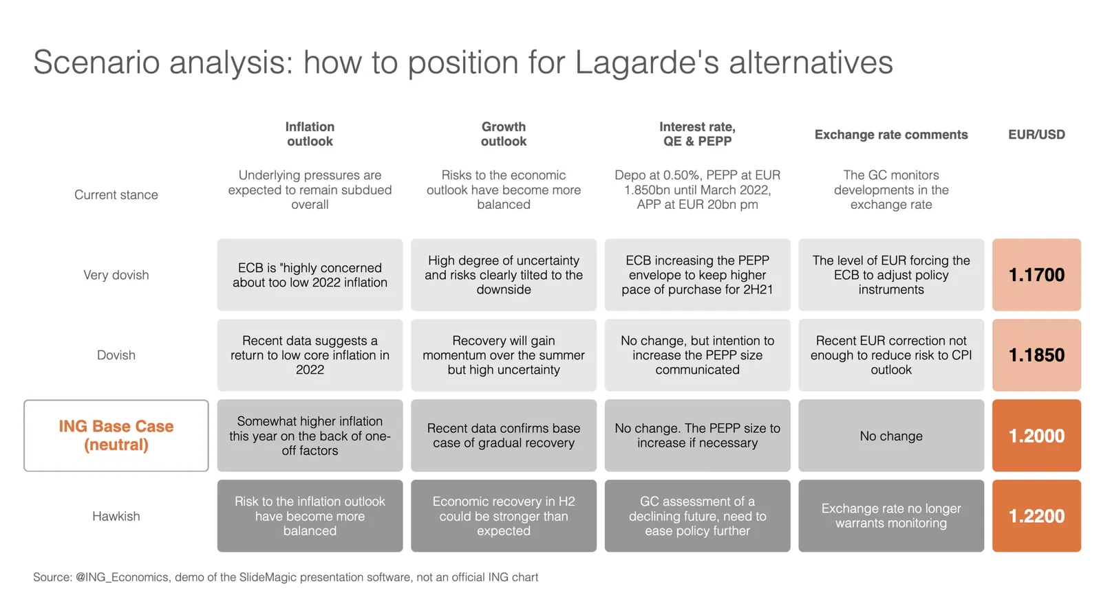
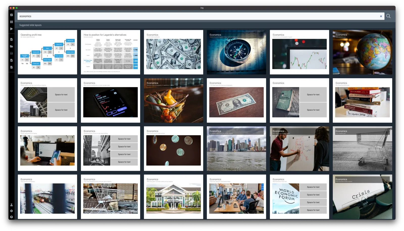
I did a quick re-do in SlideMagic, with is particularly powerful when it comes to text tables. I added the slide to the SlideMagic library, search for “economics” in the desktop and it will show up.