SlideMagic Blog

Frequent updates about all things presentations since 2008. Subscribe to never miss a post.

RSS
all posts

Category Story

·Design

Credible customer testimonials in presentations

An excellent post on copy blogger: hardly anyone reads/believes a customer testimonial. They all sound the same, they use sugary language and buzz words, they are one sided. Most sales presentations have the customary slide with customer quotes in text bubbles inside:

  • Far too much text
  • Stuffed with generic adjectives
  • No specifics related to the customer situation
  • Not a specific source who said it
  • No facts, numbers

Do not send a blank piece of paper to your customer and ask “write something nice”, instead, interview the customer, write down a very specific story with facts and have her approve it. The “reverse testimonial” suggested by copy blogger is a powerful structuring technique.

UPDATE January 2018: we have now added customer testimonial presentation slides on the SlideMagic template store

·Design

Frankensteining a slide deck

Frankensteining”, what a brilliant verb! Most people have been tempted to stitch together a slide deck quickly by yanking slides from old and/or other people’s PowerPoint presentations.

  1. Open all presentations, go to slide sorter mode
  2. Copy and paste any slide that looks vaguely relevant into a new file. It is even cooler when you know this little trick on how to preserve formats when copying slides across.
  3. Re-shuffle the order of the slides and add agenda tracker pages
  4. Skip the bit about practicing
  5. Done in 1 hour and 34 minutes

It will not be surprising that the end result is not a good presentation. It is not your story, you do not completely understand it, and if you do not understand it, the audience won’t either.

The better way to Frankenstein:

  1. Sketch your story on a piece of paper
  2. Add simple slides to support the key elements of the story
  3. Go back to the graveyard of old slides to add backup slides where you need them (“here is the full architecture of our global CRM system, as you can see it is really complex” [* click next slide *])
·Design

Why school text books are so boring

School text books and many business documents are written with the content creator in mind. Organized in sections, a clear structure nicely summarized in a detailed content page (or a PowerPoint agenda tracker). We make a point, provide supporting arguments, repeat the point, go back to the tracker page, open the next section, repeat. Perfectly organized, perfect logic. Studying equals forcing your brain to memorize a sequence of bullet points against its will. (“Hey, the first letters of each point make the word A-P-P-L-E when I swap the last 2 bullets!”)

Stories are sequential, they are not designed to reference back to later by jumping to section 3. Stories have no tracker pages. Stories arrange their points in such a way that they are most interesting and memorable, maybe the most important message does not come first. Stories use analogies.

I am not advocating to abandon all structure in presentations. But still, have that school text book in mind when designing your next series of slides. Maybe your 30 minute presentation should be a story, maybe your 200 page final document should be a text book.

·Design

How I wrote a recent presentation

I kept track of the phases of a recent presentation design project:

  1. Quickly racing down an existing PPT, checking out the client’s web site (“what is it that they do exactly”?)
  2. Break
  3. Listening to the full pitch via screen sharing software: PPT on screen, client on the phone. Asking naive questions all the time, jumping back and forth between slides and web sites, interrupting the presentation all the time (some people might get offended)
  4. Jotting down all impressions immediately after that, to make sure that I do not lose the richness of the discussion (especially comments and ideas that do not appear on a slide)
  5. BIG BREAK including a night of sleep
  6. Putting together the template, setting fonts, colors, spending time on finding a perfect and beautiful image/graphic for the front page (yes, open up the slideware!). Thinking about a style of images, the style of presentation. Most people might embark on some analogue story boarding exercise here, but I find it useful do dive into the detail of color codes to get my mind focussed.
  7. Break
  8. Start designing a few absolute killer charts that are instrumental in getting the story across without worrying where they exactly fit in the story. In VC pitch presentations, these are usually charts describing the pain that the world-without-this-great-invention is suffering. These will be the most important charts in the presentation.
  9. BIG BREAK
  10. Going analogue to design the overall story of the presentation on a piece of paper
  11. Filling in the blanks with slides, starting on page 1 and working my way through to the end. Finishing each slide to final quality (i.e., I do not create quick PowerPoint dummies)
  12. BIG BREAK
  13. Look at the draft again, make some small changes and send it off to the client
  14. Here is where the regular iteration process with the client starts. Feedback, correction, feedback, correction.
Continue reading →
·Design

McKinsey flashback: logic, rhetoric, and presentations

Recent tweets by Nancy Duarte about her reading up on classic rhetoric and a clean-out of my book shelf with old McKinsey training material triggered this post. How can we use the ancient rules of logic and rhetoric in our presentations? Some of my observations.

Logic is necessary but not enough to convince. The perfect logical argument often fails to make people believe your message with their heart. There are still many people that smoke despite this:

  1. Smoking causes cancer
  2. Cancer kills
  3. People do not like to die
  4. Therefore: stop smoking.

The Greek philosopher Aristotle was well aware of this. Logic and rhetoric are often confused to be the same thing. Actually, logic (logos) is one of three components of rhetoric. The other two 2 are ethos (credibility of the speaker) and pathos (emotional appeal to the audience).

Why is logic so popular among McKinsey consultants? A number of reasons:

  • Lack of time. There is an often overlooked difference between a problem solving structure and a solution presentation structure. Logic is a great tool to solve a problem: cut your issue up in pieces, find facts and other evidence to solve sub-problems, and finally build up the overall solution again from the component solutions. Management consultants often stop there and do not invest time to translate the problem solving structure into a compelling and convincing story to communicate the solution. It is not that they don’t want to, at 2AM before the final review meeting there is often simply no time left.
  • Like-minded people. Management consultants usually are very logic-driven people. It is logical work, that attracts logical people, who hire more logical minds. So, the language between management consultants among themselves is highly logical. Some people however have a totally different brain structure (clients of management consultants included).
  • Collaboration. A logical language and structuring technique is very well suited for people that need to work together but have never met each other before. Once you have learned the methodology, you can put a team of consultants from different countries together that can produce results almost immediately.
Continue reading →
·Animations

Getting your idea across in 1:35

Sometimes, a live presentation can be a pretty inefficient way to get a message across. For example, TED presentations are usually really good, but they still need around 20 minutes of your time. Have a look at the new fund raising video of the Acumen Fund that was released yesterday. It lasts 1:35.

In this 1:35 the video manages to explain a completely revolutionary concept to charity. It is not about giving food, it is not about giving the tools to grow food, but it is all about investing in profitable businesses that produce goods/services, create wealth and can grow by themselves.

The video does not need long speaker introductions, does not use spectacular motion graphics, does not rely on “look how miserable these people are” images. Just a number of upbeat people talking straight in the camera at you. It is hard to do this in 1:35 on stage with PowerPoint slides.

Sign up for the recently established social network of the Acumen Fund to learn more about the dramatically different approach the organization is using to combat poverty.

·Design

The cinematic presentation opening

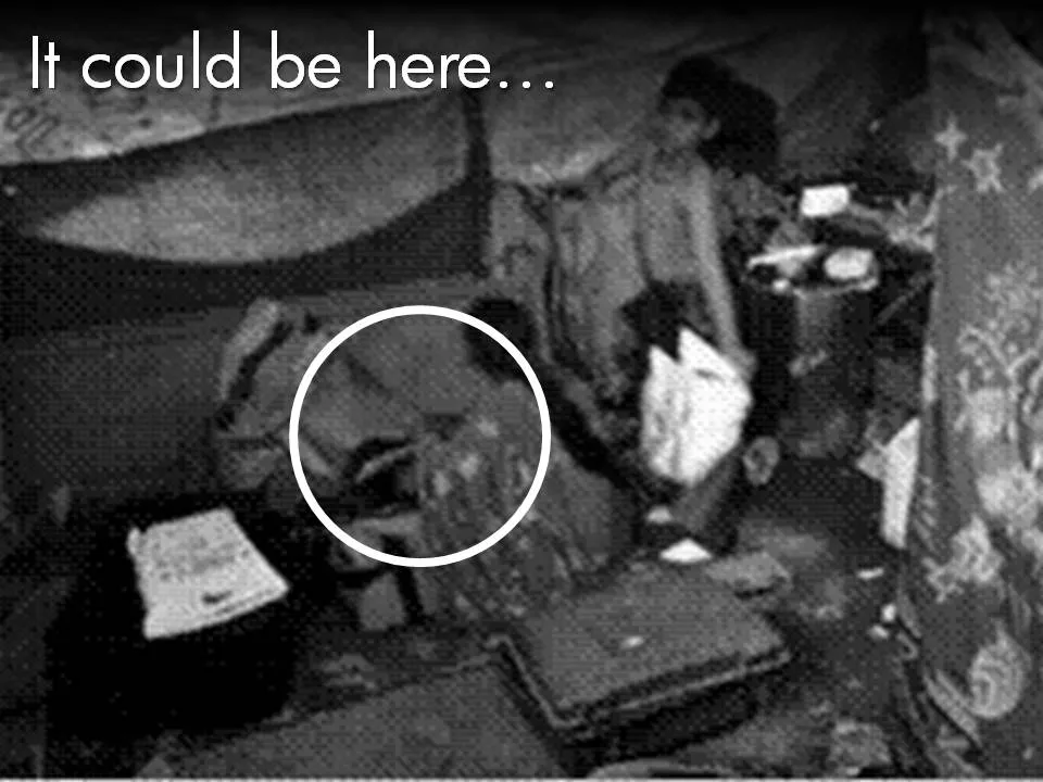
Film directors can use powerful tools to throw us in the middle of a story right in the first seconds of a movie. Steven Spielberg’s opening of Saving Private Ryan is a gruesome but good example. Everyone in the audience thinks “Wow, I should be grateful to these guys that drew the short straw and had to come out of the boat first…”

Presenters can use similar techniques. Try to find big images with a perspective as if they were taken from someone in the middle of the issue you are talking about. These images trigger an emotional response from the audience, especially (and maybe only) if they are “real”. Think of photographs that make it on the front page of a newspaper.

The following 2 images could lead into a presentation about the issue of maternal deaths due to poor living and health conditions in the slums of India:

Less powerful examples of images with a patient or victim perspective here and here. Many of my investor pitch presentations use different styles of charts throughout the presentation:

  1. Emotional opening (images) to connect the audience to the problem
  2. Conceptual diagrams (arrows, boxes) to explain why my solution solves it
  3. Data charts to show why this is a big deal
  4. “Standard”, almost slideument, charts to give more background on the company

P.S. Read more about the great work that the Acumen Fund is doing to combat the issue of maternal deaths here.

·Design

Leonard Cohen building up audience participation

Songwriter / poet Leonard Cohen gave a concert in Tel Aviv a few days ago. In “Tower of Song” he kept the audience craving for The Answer (to all mysteries of life) for almost 2 minutes. The audience got really excited, the backing vocals had to work hard… Listen to the entire song, or skip through to 6:00. No, no spoiler here. The video below is not the Tel Aviv concert, but a different performance in the same tour.

The presentation lesson. Many communication philosophies such as Barbera Minto’s Pyramid Principle (used by McKinsey) advocate to present your conclusion first, then provide backup and logic. Very efficient, at every single point in time, the audience knows the key message of the presentation. Sometimes humor, suspense, drama and good story telling might actually do a better job in getting a message across though. Highly structured presentations are not always the most memorable ones.

·Design

Storybird - collaborative story telling for familes and friends

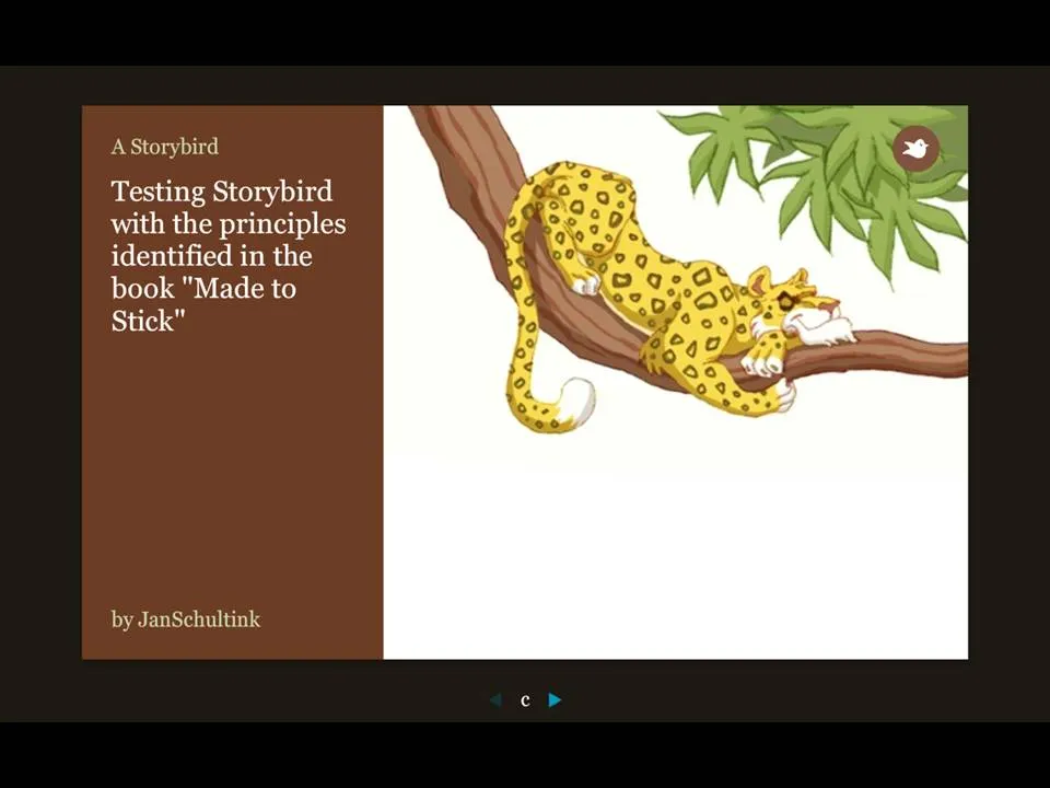
More and more online presentation tools are popping up. A recent one is Story Bird. You select artwork from an artist and are offered a simple interface to weave images of your choice together into a story.

The service is targeted at family/children and works well. Narrowing down the degrees of freedom (artwork in a consistent style, simple page layout [image + big font text]) makes it easy to create and share professional looking stories. You can invite others to collaborate with you as well.

Maybe the biggest application of this service is in education? There is a business presentation version of this application possible as well. Replace the image bank with non-cheesy useful presentation images (you only need a few hundred to cover most business presentations) and you have an alternative template to the PowerPoint bullet points. “Ayne can make Presentation Zen-style presentations”). Cutting the available slideware tools to the minimum helps focus the presentation design amateur on the story.

My first creation can be found here.

Via Orli

·Design

A daily dose of framework napkins

Yesterday’s post about Venn diagrams led me to a blog that I seem to be the last person on the planet to discover:Indexed. Jessica Hagy posts a napkin-style framework everyday. Sometimes funny, sometimes with a valuable insight about life or an unusual way of looking at things. Here is an example:

Venn diagrams, but especially 2x2’s, are very popular among McKinsey, BCG, Bain, and other management consultants. “We have put the world into 4 buckets, so now we understand it”.

For solving problems they are great, and I have used hundreds of them in my 17 year (oops) as a management consultant. All issues are on the map, how we can we move from one box to another?

But take a step back and think when you want to use these frameworks in a big keynote presentation. To illustrate my point: look at the drawings on the Indexed blog, and check which ones do you get in a second. Tricky isn’t it?

My advice: use these 2x2 frameworks only

  1. if you want to show movement of dots in the boxes. For example you can use the same framework in a few slides to show changes in strategy, or the positioning of a company
  2. if you want to highlight how your company/idea differentiates itself from the competition (by being in the top right box).

If you just need a structure to list 3 items, try to find a simpler way to visualize things.

Still, add Indexed to your RSS reader, it’s great fun.