SlideMagic Blog

Frequent updates about all things presentations since 2008. Subscribe to never miss a post.

RSS
all posts

Category Story

·Design

Free the world of trackers

Many business presentations are loaded with tracker elements:

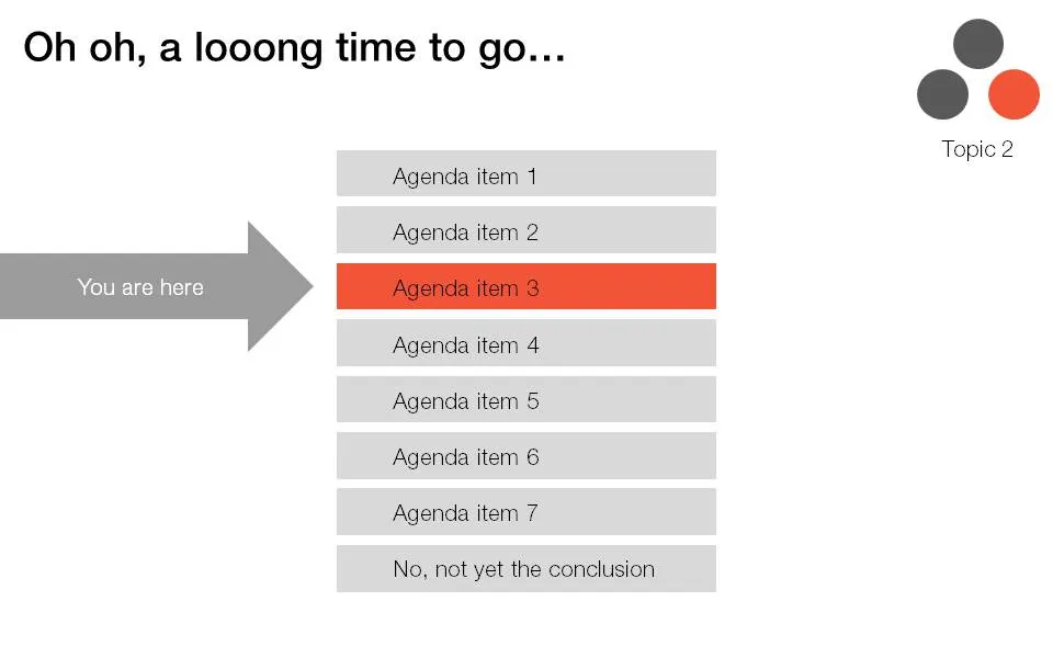
  • An agenda page with a highlighted bar that moves as we go from section to section
  • A miniature version of a framework in the top right corner of a slide with a changing color highlight to remind people what we are talking about.

I find trackers great for big documents: it allows fast browsing if you need to refer back to material. In (shorter) presentations I try to avoid them:

  • If you need trackers to keep people hooked to your story, your story is probably very boring. Maybe you can try to change the story?
  • These top-right symbols add clutter to the slide design
  • A big tracker agenda can come across daunting for an audience: “oh no, 5 sections before we get to the conclusion, let’s check email on the Blackberry…”

I am all in favor of structure, just let it come natural via your story, without having to “rub it in”. One elegant solution is the full page separator slide like the ones I used in the IDU Biometrics presentation. They can contain a few words about what comes next e.g., “technology”, or better you can write a question that wakes up the audience and makes them curious to find out more what’s next: “why is this such a great biometric?”.

·Design

One more post about the closing slide

OK, the comments on my post from 2 days ago showed that I should think a bit more before writing about the last slide in a presentation. Here we go:

  1. A good story does not need a slide that says “that was it, please applaud”, the story flow in itself should let the audience feel that you have come to the conclusion of your talk. (And what if the audience does not applaud when you ask them to? Awkward.

  2. It is good to recap what you discussed though. But recapping does not mean telling the entire story again. Rather think of it what you want people still to remember 4 hours after the presentation. Leave out the buzzwords and the fluff.:

  • "Every teenager sends 3,339 text messages per month.
  • No teenager would want to miss out on our new service"
  • [re-display of stunning key graphic]
  • “Please invest in our 3rd startup that we will bring from PowerPoint to IPO”.

Much better than:

  • "The market is big,
  • there is no competition,
  • we have a solid business model,
  • there are interesting exit opportunities in this ever-changing mobile communications landscape that will transform the way young people communicate with each other".
  1. It is good to put the “killer graphic” back on the projector, since the brain can anchor an entire discussion/story to an image. People will remember. If you get a lot of questions, this slide will stay on the screen for a long time.
Continue reading →
·Books

Learning from ancient folk stories

I was just reading some stories from Nelson Mandela’s Favorite African Folktales(affiliate link) to my kids and realized how much you can learn from them to create short anecdotes that fit inside your bigger presentation:

  • Very short
  • One to three simple (almost stereotypical) characters
  • Something happens at turn 3. “On the 3rd day…”
  • An unexpected twist at the end: “and this is why monkeys became so good at climbing trees”

These tales were designed to be remembered and passed on for generations. How long does your slide deck stick?

·Design

DON'T: Tell 'em what you will tell, tell 'em, tell 'em what you just told 'em

I often hear this advice to make sure something gets stuck in the audience brain: tell it 3 times. I disagree. This is the approach of the (poor) teacher asking a class to recite the alphabet over and over again. Here are some better approaches:

  • Tell a story that stitches the elements of your message together
  • Create a memorable visual to highlight the concept
  • Give them something they will never forget (see Duarte’s post)

Everything is better than boring your audience with saying the same thing three times.

·Design

"Let's start with our history" Uh oh...

You’re the owner/founder of the company and you are pitching to a potential investor. When introducing the company, you always start with its history:

How you started straight out of university, renamed the company after a waterfall you visited in Africa a year later, developed a 2nd product line, but then dropped that again in year 4, re-branded again, moved to a different city, and hey, that’s how we ended up where we are today.

To you it makes perfect sense. The story is how the company became what it is, how you became what you are. To the outsider, it is not that relevant, and even potentially confusing as the audience tries to figure out what you are about.

Skip the history and start with today. Except - if needed - a short reference to a useful link to the past: “the fact that we started out as a piece of 3D home design software in 1998 comes in handy today as we move forward to build the world’s best 3D gaming engine”.

A chronological story line is not always the best story line.

·Design

Don't use the business plan to present the business plan

Finally the business plan is ready. You Googled and asked around to make sure everything is inside: the market pain, the technology solution, the team, the market size, the competitive differentiation, the financial forecast, the intellectual property and patents. The result: 150 pages of PowerPoint.

Do not use this business plan to present the business plan. OK, you used PowerPoint, but not to design a presentation. You used PowerPoint to write a document that is not suitable to put on a projector screen.

How can you figure out what presentation you do need? Invite a friend over without any knowledge about your business venture. Take an empty piece of paper or a white board. Start telling your story. Scribble things on the white board. If need, zoom deep into the business plan PowerPoint file and put one chart on the screen (i.e., an overview of the competitors). After 30 minutes take a step back and see:

  • What issues did you discuss, which topics did you ignore?
  • In what order did you discuss them?
  • What were the hand drawings you needed to explain your idea?
  • Which charts in the 150-page deck did you have to pull out?
  • What questions did your friend ask that caught you by surprise?

Here is the outline of your investor pitch presentation.

·Design

The summary page that does not stick

Many presentations start with a summary page, and most of them are stuck in the middle. They give a bit more information than “I am going to tell you why this is the best investment in cloud computing that you can make” and a bit less information than what is needed for the message to stick (the audience internalizing the logic in their head, and more importantly, their heart).

Worst case scenario: you give the presentation twice: spending 20 minutes on the summary page (which the audience does not understand), then repeating the whole story in the presentation (which bores the audience that misses the details and nuances “oh, we covered that already”). Blackberry on, attention off.

So, have the courage to keep the summary page really, really short. On the first page, tell the audience vaguely in what “box” they should put you in. “We do cloud computing platforms”. Then use a fast-paced sequence of slides to explain the idea that you try to get across. So, now your audience knows, feels, and understands.

After this, the more traditional stuff can come in, even summarized by an agenda page or summary.

·Delivery

Looking back at the UK election debate

I could watch the latest UK election debate live in Israel on Sky News and was fascinated to see these professional debaters in action. In the House of Commons, the UK parliament, debates are very lively and real. In this televised election debate I was a bit disappointed; candidates were hardly listening to one another and tried to find anchor to revert back to their scripts to make a key point.

Where does it get interesting and convincing? When the debaters go off-script and truly try to convince their audience from the heart. They should have the courage to debate like they do in parliament, and stop trying to nail that sound bite. Dry statistics do not move crowds.

The other interesting thing I noticed is the power of the face expression when an opponent makes a point caught by the ever-present cameras. Face expressions reveal one someone thinks an opponent made a really good point.

·Design

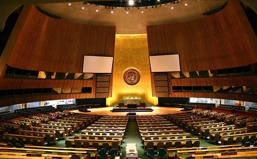
Your presentation is not a UN Security Council resolution

We have all been in meetings that went on and on about the exact wording of a phrase: legal contracts, mission statements, press releases, UN Security Council resolutions, and yes, also presentations. I am not arguing to be less precise when writing a presentation, but word smithing bullet points is not going to make your message clearer, the opposite is probably true.

  • Everyone knows that bullet point slides make bad presentations. And the more text you cut, the less ability you have to get that exact nuance right.
  • The details of text in a presentation do not register, what matters is the - partly improvised - story told by the presenter; and a good story does not include repeating memorized, carefully crafted sentences.
  • Hollow mission statements (earlier post) are the ultimate example of the information asymmetry between the presenter and her audience. It took months to develop, it contains everything the company stands for, people have thought about every word and punctuation mark in it, and still: nobody understands it.

Photo by Flickr/gruban.

·Design

OK, so what do you do exactly?

Startups that are pitching to venture capitalists for funding often start off with a barrage of product benefits, the great qualifications of the team, and the remarkable patent that you secured for the entire world (well, excluding Japan, but that is not a really important market anyway, and we have a way around this black spot on the globe through working with a great distributor we know there who happened to be my room mate while I studied biology, molecular biology to be more precise, in Oxford).

Pause, rewind.

What is it that your company does? “Aah, now I understand more or less in what part of the world I am in.” And your audience is ready to put the rest of your messages in context.