

SlideMagic Blog

Frequent updates about all things presentations since 2008. Subscribe to never miss a post.

RSS
all posts

Category Software

·Colors

What software did you use?

That question is a big compliment for your PowerPoint presentation: you have succeeded in making your PowerPoint not look like PowerPoint. Here are some simple steps that can help you:

  • No hierarchical bullet point texts (if you have to put three messages use 3 grey boxes with a short sentence)
  • Switch the standard Microsoft Office font Calibri typeface for Arial (other exotic fonts will cause issues on tablets)
  • Avoid the standard Office colours (blue, faded red, faded olive) and use your own colour palette, also in data charts
  • No dirty gradients, drop shadows
  • No heavy graphics and/or colours behind the title or at the bottom of your slides
  • Create many slides with page-filling images
  • Remove the default clutter of data charts (tick marks, etc.)

The same applies to Apple Keynote. Although a standard Keynote slides looks a bit better than a standard PowerPoint slide, Keynote also has ugly defaults (colours, texture fillings of data charts).
·Keynote

The new slides.com

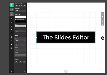
Slides has updated its slide editor. It is another example of people moving away from 1990s drop down user interfaces. The UI is simple and looks great. It has very powerful capabilities to insert HTML code in it. Still - as with all presentation design software - the average user is likely to use it to create bullet point slides… Check out the demo here

·Gadgets

PPT Roomba

SlideProof is a neat PowerPoint plug in that cleans your presentation of common small mistakes - automatically. Misaligned boxes, titles, wrong page numbers, you name it.  A bit like the Roomba vacuum clean robot, a spell checker on steroids. You have complete control over the changes though, so nothing unexpected will happen to your slides, which is crucial since my guess is that most of the vacuum cleaning of presentations will happen just before the live presentation.

Fixing small mistakes might not be crucial to get your message across, but it does make a huge difference in the overall impression you leave behind. A bit like polishing your shoes.

SlideProof only runs Windows so I did not have a chance to test drive it myself (I work on the Mac platform). Please share your experiences in the comments if you managed to check it out.

·Data visualization

Automated journalism

The Associated Press will start using a bot to generate verbatim on company earnings reports. The system takes as input the financial data, and then recycles that into human stories: earnings went up 3%, which is 0.5% higher than the financial services average and leads to an expected gross margin of 46% in Q3.

I never understood the point of journalists spelling out information in sentences that is much better communicated in graphs. Proof is that this translation is easily automated. The only use I can see is in translating data to audio for people who cannot take their eyes of the traffic and still want to digest data.

Instead of using the bot, AP should invest in better data visualisation.

·Keynote

The future of office software

The announcement that online file storage and sharing platform Box is adding a note taking app is another indication how the world of office software is changing (and that includes presentation design).

  • Work and communication styles are becoming more informal. Overloaded with information, we want to get to the point, quickly, with buzzwords or formal verbal padding.
  • Documents need to be readable (and editable) on mobile devices. Even more important, people need to find a document quickly on every mobile device that happens to be closest in reach.
  • People work on documents asynchronously, in different locations, and in different time zones, without the need for a time consuming meeting to discuss small changes.
  • More and more senior executives will make direct edits into documents, cutting out the traditional feedback editing loops involving secretaries, junior analysts,  (who used to be the in-depth experts in Office software), and print-outs/faxes.
  • Ad-hoc presentations in small groups with random/frequent interruptions grow at the expense of orchestrated, big, planned presentations where we let the speaker finish before asking a polite question.

Software needs to follow culture.

·Keynote

One pen

Problem solving in a team can be really powerful. You split up the work to save time by working in parallel. You can discuss data, findings, and ideas with your team tapping into a collective brain that is bigger than yours.

I find that designing presentations though is best done by one person who has the pen. One style, one approach, one story flow, everything gets said once, everything that should be said gets included. Multiple captains on a ship create an inconsistent story.

That is also the reason that I am not a big believer in realtime office document collaboration, a feature that many software publishers try to implement. The fact that the Internet makes it possible does not mean that it is a good thing.

Team input is important, but only one person should have the pen to incorporate them into the story.

·Keynote

App update

Regular readers will know that I am busy developing a “PowerPoint killer” web app in my spare time (and financed with my personal savings). Many of you have signed up to be part of an early testing group. Here is where I am at, at the moment.

The key innovation of the app will be the approach to designing slides, and that engine is now more or less up and running. I am very pleased with the result, it runs exactly as I have imagined it in my head and jotted it down in PowerPoint (my web design environment, believe it or not).

My clients do not know it, but I am slowly changing my approach to (PowerPoint) slide design in such as way that it will fit the design approach of the new app, and I am testing to see where the philosophy breaks down.

The slide design engine, cannot be tested on its down, hence development work is now focussing on getting the more trivial parts of the application working (presenting on a screen, managing files, etc.).

When this is finished, I will release the app to a very very limited testing crowd that will not be intimidated by unexpected bugs. The objective is to test whether the methodology appeals to more people than just myself. After the green light and a more robust design, I will open the app to more people.

Please be patient as I am trying to juggle time and financing carefully. Watch this space.

·Animations

"We need to animate that!"

The audience does not see the difference between 4 consecutive slides with different images, or 1 slides with 4 consecutive image build up, so there is no point in trying to cut slides by consolidating 4 images into one. Four slides are easier to edit, and four separate slides are easier to email as PDF.

·Keynote

Keynote with Dropbox/Box/Gmail

The new Keynote creates files that look like a single file on a Mac, but on other machine appear as a folder with multiple files in them. This has implications for online file sharing:

  • Gmail: emailing a Keynote file as attachment does not work
  • Box: file syncing, or sharing a download link does not work
  • Dropbox: seems to have fixed the issue.

Has anyone had issues or is it just me?

·Keynote

Screenshots are great

Aspect ratios, dots per inch, file formats and conversions, forgetting where you saved that file, these are all problems that are disrupting my creative workflow. More and more I just work with screen shots. If the image looks sharp on my big 27" monitor, I crop it as I want it, and use it in my presentation. It could have been a JPG, a PNG, a web page, a PDF document, a Keynote file, it does not matter. CMD-SHIFT-4- and “click”, done.