SlideMagic Blog

Frequent updates about all things presentations since 2008. Subscribe to never miss a post.

RSS
all posts

Category Software

·Story

Presentations are short cuts

Many of a company’s operational processes have become a lot more efficient over the past decades, partly with the help of automation and computers.

Above the factory floor, middle management of corporations gets more efficient as well. Computers take over routine tasks, and slide/dice data so it becomes easier to make decisions.

Human communication among decision makers is pretty inefficient. People are bad at formulating and selling their ideas. Presentations have helped though: they have replaced long-winded memos and forced people to get to the point faster. Visuals are easier to digest, and more importantly, it is faster to skip through useless pages of a presentation (PGDN, PGDN) than looking for “the meat” in a text document.

This realisation might help you with the design of your everyday presentations. It should look decent. It should get to the point. It should show interesting, unusual, unexpected facts and insights. You want to get to a decision, you are not aiming to publish a complete, scientific document.

Here is where my presentation app SlideMagic comes in, adding even more shortcuts to make corporate decision making more efficient, and less cumbersome, boring and time consuming.

Image from WikiPedia

·PowerPoint

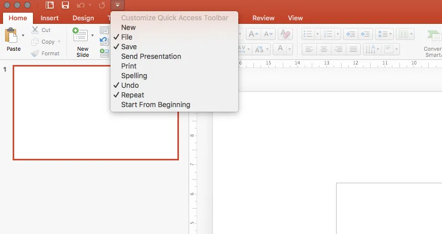
PowerPoint 2016 now lets you customise toolbars

In the latest PowerPoint 2016 software update, Microsoft started to fix one of the last remaining issues in a great product: customisation of the top tool bar. Here is a screen shot of what is new:

Things are limited to just these functions though. In PowerPoint 2011 it was possible to add any function you want to the top bar. File, save, and definitely print, are not the actions a PowerPoint user needs to access all the time. What I would like to see are buttons to align and distribute objects, and move things to the front and the back. Here is my toolbar from PowerPoint 2011:

Image from WikiPedia

·Software

It takes too much time...

Some new users of my presentation app SlideMagic complain that you cannot import any existing PowerPoint presentations, you have to start from scratch to design your pitch. “This will take me too much time!”

There are 2 reasons why SlideMagic does not import PowerPoint presentations (export is OK though):

  1. Technical: SlideMagic uses a very strict slide layout, which simply cannot be matched (automatically) to the wide variety of PowerPoint designs
  2. Behavioural: SlideMagic aims to make corporate communication simpler and less time consuming. The fact that it takes too much time to re-create a PowerPoint presentation one-for-one in SlideMagic probably says something about your presentation. SlideMagic has excellent tools and templates to take your message and show it in simpler form.

If you really need to import that one complex PowerPoint slide, you can always use a screen shot and import it as an image.

Image by Alexandre Duret-Lutz on Flickr

·Software

On stage, it does not matter anymore which software you used

On Quora, I see questions like which presentation software did [company X] use at [event Y]. For the audience there is no difference. The same simple, good slide can be made in PowerPoint, Keynote, Google Slides, and Adobe InDesign. The exception is probably Prezi and its complex zooming capabilities.

The process that got you there makes a big difference though. How easy is it set up a basic presentation template (colours, fonts, positions of titles, page numbers, aspect ratio), how is it to create a basic slide layout other than a list of bullets, how easy is it to align items properly on a grid, how easy is to create basic data charts, how easy is it to keep everything consistent page after page, how easy is it to do basic image manipulation (cropping and repositioning).

Either the audience cannot tell in which program the presentation was made and you were either a design pro or have made a huge effort to master the software. Or, the audience can spot your software instantly (most likely PowerPoint), which means that you did not get much further than the standard slide template.

(A secret: you can get away with taking design short cuts in my presentation app SlideMagic and no one will notice).

Edgar Degas, Rehearsal on stage, 1874

·Story

Corporate language simplification is next

A lot of the progress of humanity boils down to improving and simplifying communication. There were huge wins when we figured out how to speak and coordinate hunting strategies, learned how to read/write/print books, speak long distance instead of taking the ocean liner, video, etc. etc.

More subtle improvements happened as well. Clear, simple language impacts the premium/position that bosses, priests, doctors, lawyers, politicians, can command. Long-winded corporate memos and formal letters made way for informal emails and now messaging to get to the point, quickly.

What we lose in style, we gain in efficiency and clarity. Gone are the beautifully hand-written letters without grammatical errors. Now we have the universal “business English” with a tiny vocabulary, full of mistakes, and pronunciation can be whatever you see fit. The English might not be perfect, or sophisticated, its meaning is crystal clear.

The same happens to corporate language. Management consultants took a first stab at making memoranda logical and structured. The exhibits in these documents slowly become more important than the written words themselves. And now presentation software/slides has become the main language in which we do business.

We need a crisp, simple, visual language to get a business concept across. Everyone can understand it, everyone can use it. That’s what I am trying to do in the presentation app SlideMagic.

Art: Pieter Breugel the Elder, The Tower of Bable, 1563

·Software

The broken Apple Keynote interface, is it me?

I have now created many, many client presentations in Apple Keynote. And most of the clients who request a presentation in Keynote rather than PowerPoint are proud that they are willing to use more design-oriented products. For many years, Apple Keynote was ahead of PowerPoint: a cleaner user interface, cleaner templates, those alignment guides that pop up when you want to position an object. And in addition, you were using the same product that Steve Jobs, the master presenter, was using for his slides.

With the latest release of PowerPoint, I think both applications are at par. With each one of them, you can create both beautiful presentations, and horrible decks full of bullet point slides.

The workflow of Keynote though makes me scratch my head. While more complicated tasks are taken care of very well, it is the basic functions such as changing fill colours, font colours, aligning, that drives me crazy. Too many clicks, and I am always looking where to click. Initially I though it was me, but after month and months of trying things are still not getting better.

PowerPoint has a more cluttered interface but after some time working with it your eyes look on locations/icons and you instantly click without having to think. The solution for both programs is clear: create space for one user customisable tool bar. PowerPoint for Mac had one, but it disappeared with the 2016 update, Keynote needs one.

The above partly informed the design of my own presentation design app SlideMagic. You actually need very few functions to create beautiful charts. Most reviews of software tools are still 1990 style: a comparison of features. What you really should be measuring is how fast/easy it is to get a decent end product. Hopefully Microsoft and Apple are not reading this post, so SlideMagic can keep its competitive advantage!

Continue reading →
·Software

Microsoft Excel versus Google Sheets

In spreadsheets, I have now moved from Microsoft Excel to Google Sheets as my favourite app.

  • It is faster to fire up quickly for a small calculation doodle
  • It also snappier in use to do the basic things, entering data and moving around
  • It has some neat functions (like automatically cutting up a string and putting all words, numbers in subsequent columns)
  • While I don’t believe in online collaboration of presentations, for models it is actually useful that all the people in the team have access to the laters numbers 24/7
  • Filing and naming of presentation documents is usually pretty organised. With spreadsheets however, I always lose that calculation I did, and the Google search function is really helpful here.

Part of this might be rooted in the way I use spreadsheets: basic functions only, even for the biggest models. I “grew up” with Lotus 123 and early on in my McKinsey career realised that errors in a valuation model can make a difference of billions of dollars. A simple model is far easier to debug because it allows you to see every step in the calculation.

·SlideMagic

Example PowerPoint conversions

Many of you are requesting PowerPoint conversions of the templates that ship with SlideMagic. You will see that the conversion works nicely, but that it is inconvenient to make structural slide edits in the PowerPoint version of the file, doing them in SlideMagic is much easier.

If you want to check out how converted SlideMagic presentations look, I have put the files all in this shared Google Drive folder.

·SlideMagic

Combining tables and data charts

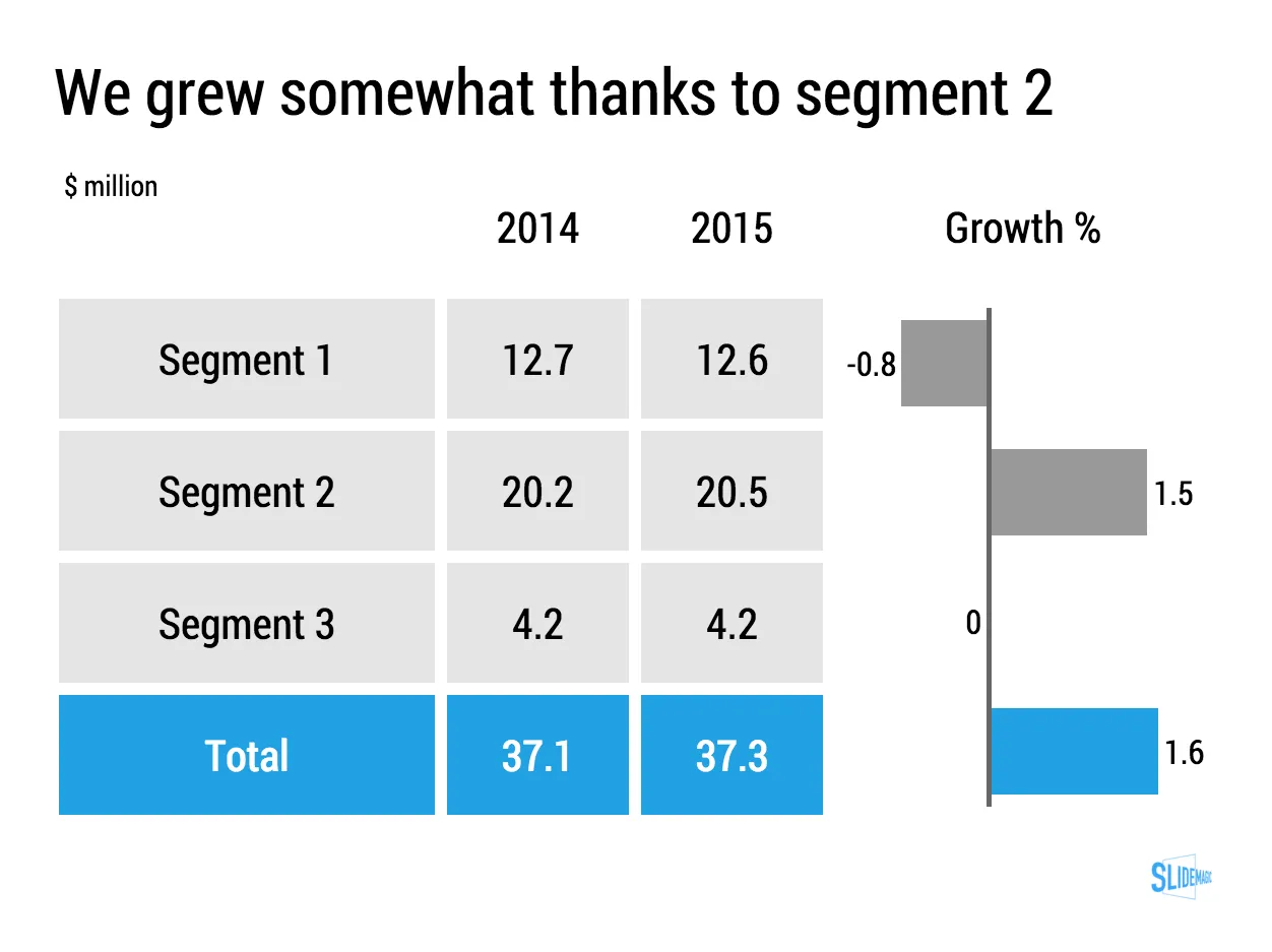
Lining up a data chart and a table in PowerPoint or Keynote is very tricky. And that is a shame, because it is one of the most useful compositions to present data. Just tables, and you cannot really see the trends. Just data charts, and it all becomes cluttered.

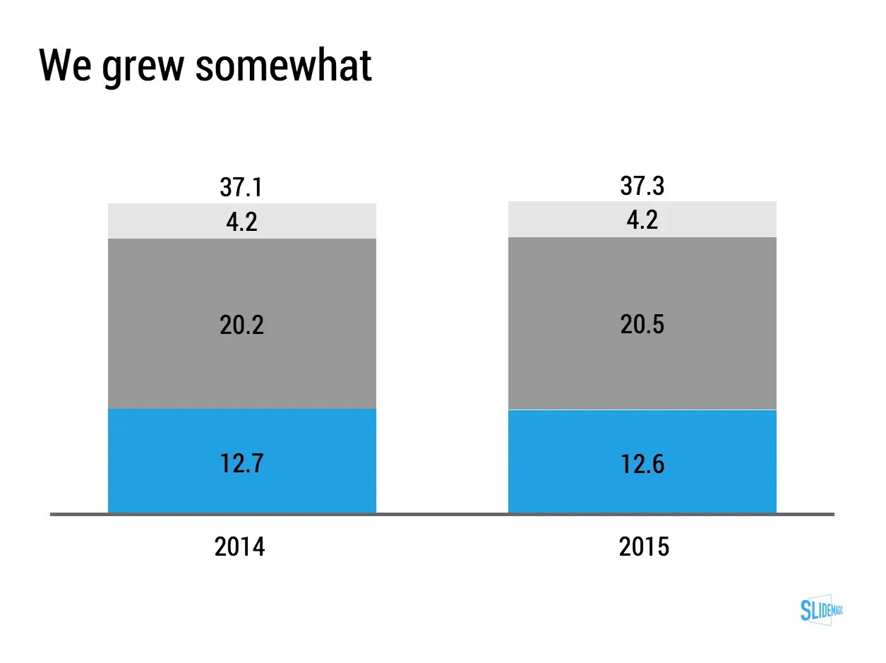
I took the data from an earlier blog post and quickly turned it into a combined table/data chart. You can clone the slides I create in presentation app SlideMagic into your own SlideMagic account by clicking this link.

·Software

The user is always right

Sometimes I get the strangest support questions by users of my [presentation app SlideMagic](http://Mobile/tablet apps all look very cute but it is often incredibly difficult to find the most obvious functions.). Obviously, the user did not explore the help pages, or did not try out all the menu options, or did not understand the philosophy behind SlideMagic. Initially, I felt like pointing that out. Now I figured out that it is my problem, not the user’s.

User interface is entering an interesting phase. Mobile/tablet apps all look very cute but it is often incredibly difficult to find the most obvious functions. Desktop/laptop applications have become so bloated that obvious functions are hard to find, or are still in places “because they have always been there for the past 10 years” to serve the large install base of users. Every time I set up a new presentation, or create a new slide in PowerPoint I find myself doing a large number of repeat clicks (by now at incredible speed) that basically do very simple things (creating and aligning a grid of boxes for example).

I keep on trying to get it right.

Art: Vladimir Makovsky, Teacher Visiting a Village, 1897