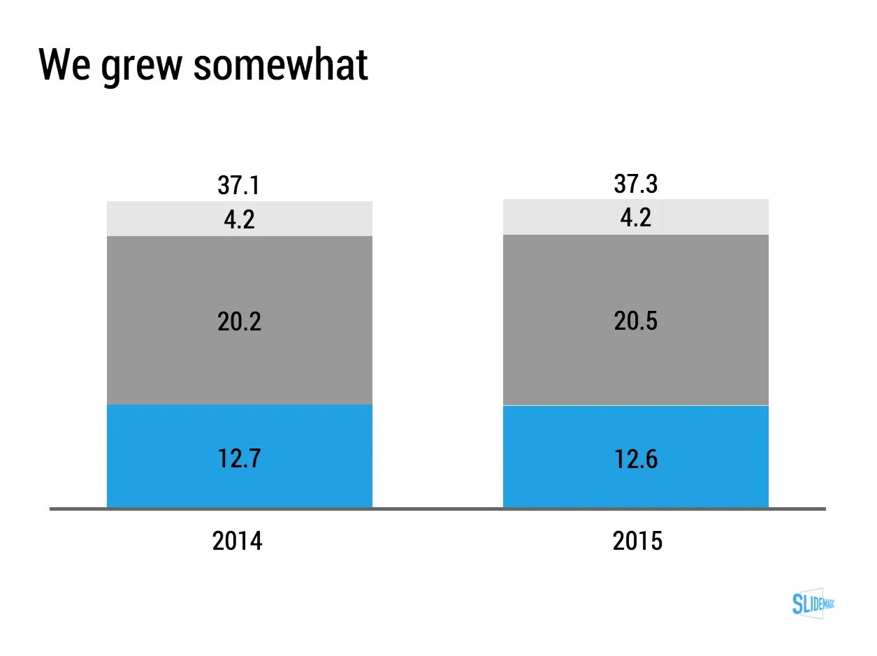
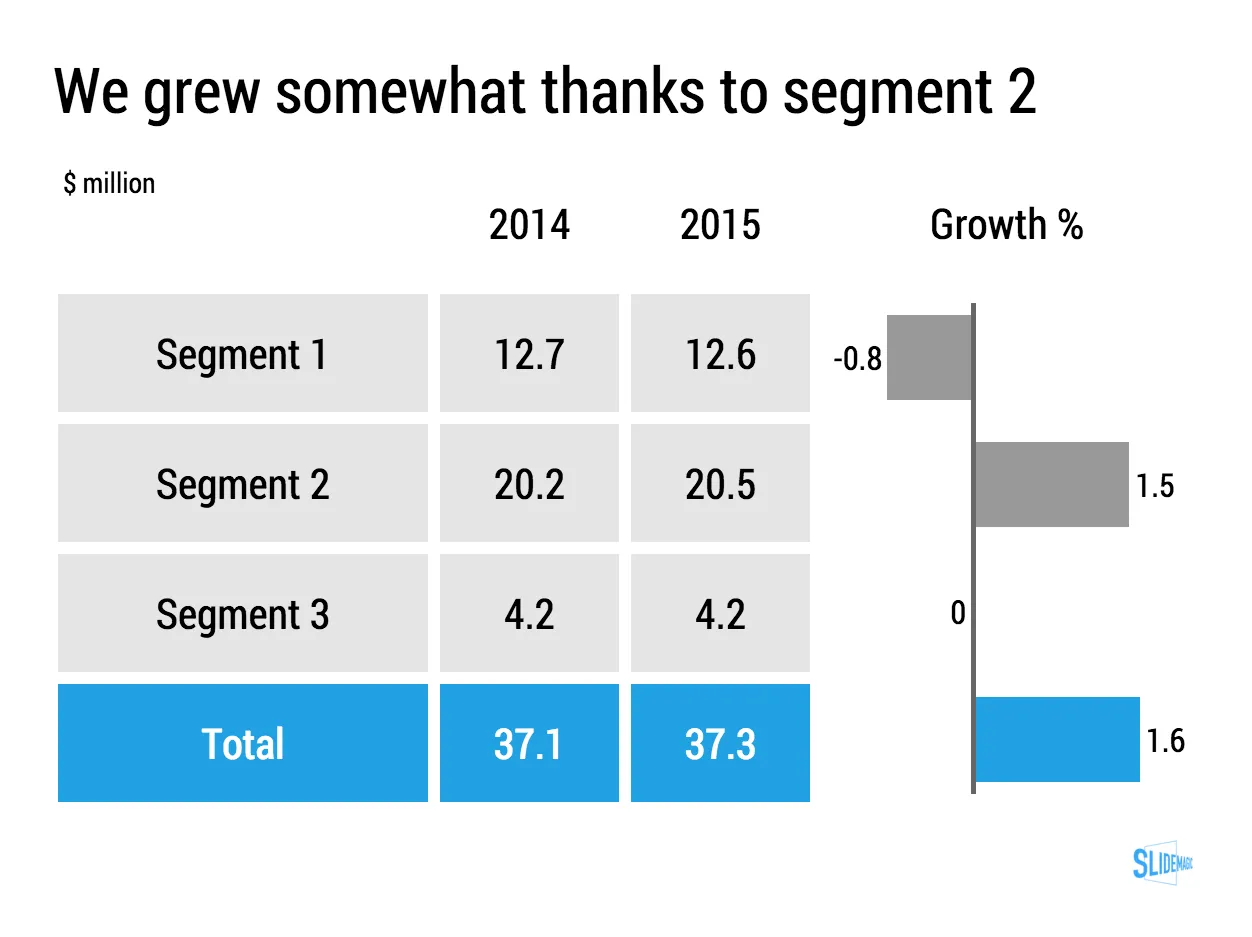
Lining up a data chart and a table in PowerPoint or Keynote is very tricky. And that is a shame, because it is one of the most useful compositions to present data. Just tables, and you cannot really see the trends. Just data charts, and it all becomes cluttered.
I took the data from an earlier blog post and quickly turned it into a combined table/data chart. You can clone the slides I create in presentation app SlideMagic into your own SlideMagic account by clicking this link.