SlideMagic Blog

Frequent updates about all things presentations since 2008. Subscribe to never miss a post.

RSS
all posts

Category Software

·Software

Convert SlideMagic presentations to PowerPoint

Many people have asked for this feature. I might have found a partially automated solution for this. Partially means, slides are converted automatically, but the overall workflow is still manual.

Before I start investing a lot of resources (time and money) in developing a fully automated solution, I want to test demand. Soon, I will be adding a “PowerPoint” button to SlideMagic, but in the interim, you can email to (ppt at slidemagic dot com) an editable link of your presentation (generate it via the SHARE menu in SlideMagic) and we will send you back a PowerPoint file.

It is important to send the link using the SHARE function, nobody but you can open the links in your browser for privacy/security reasons.

Make sure that you have the Roboto Condensed font installed on your machine. It is a free font provided by Google

  1. Exit PowerPoint
  2. Go to the Roboto Condensed download page
  3. Tick the 400 and 700 boxes
  4. Download using the “arrow down” icon at the top right
  5. Double click the downloaded files to install the fonts
  6. Re-open PowerPoint

Roboto Condensed cannot be installed on iOS devices. If you want to edit your converted SlideMagic presentation in PowerPoint for iOS consider replacing the Roboto Condensed font for Helvetica Neue Condensed. Here is how to swap fonts across an entire presentation on a Mac. But hey, SlideMagic runs pretty well in Safari on iPad, no need to convert to PowerPoint for this.

Some disclaimers:

  • It is a partially manual solution, please be patient, delivery can be instant or take some time.
  • A human will open your presentation, we are nice people and unlikely to read it all in detail and/or post things on the Internet though. Still some corporate compliance regulations might have an issue with this
  • There might be glitches in the quality of the conversion, if so, we would like to hear about them.
Continue reading →
·Hardware

Presentations on mobile devices - taking stock

Five years after the iPad launch let’s take a step back and see what is actually happening in the world of presentation software and the use of mobile devices. My observations are based on the people I see around me everyday: startup employees (mostly mid 30s to 40s) and staff in big corporates (a bit older).

  • Designing. Apple has made a big inroad in terms of hardware, but it is still PowerPoint that runs on a laptop machine that is the preferred set up to create slides. I have not encountered anyone who uses a mobile device to do this. Apple Keynote is pretty much still a niche application.
  • Frankensteining / finding stuff. Cloud-based file systems can be confusing to use. I still do not understand exactly what happens when Keynote on iPad tells me it is converting a regular Keynote file. In practice, the file system that everyone is using is… the email inbox and sent box. People with gmail can find stuff faster than Outlook users.
  • Viewing. Yes, more and more, people use their mobile devices to view a presentation. And it is not the iPad, a tablet, it is the mobile phone, where people squint to see what is in the slides. These are investors looking at a pitch deck, these are managers/superiors proving input on a slide. Think about it, this might be a more important audience for your slides than the ones sitting in conference room.
  • Emergency edits. Still laptop, although a tablet could work here, few people use it in a corporate setting.
  • Coffee chat, 1 on 1. Mostly laptop, I see fewer iPad/tablets than I saw 1-2 years ago.
  • Conference room. Laptop. The crappy VGA projector is being replaced by crappy LCD screens. Presentations that look beautiful on your retina display, look absolutely horrible on an LCD screen with poor resolution and overly bright settings. (Test, test, test). Advanced meeting rooms now allow you to airplay your presentations into the screen. People use their laptops to do this, not their mobile devices.
  • Big keynote. Conference laptop with a memory stick plugged in.
Continue reading →
·Software

How to recover lost PowerPoint 2016 files after a crash

Note: this blog post discusses PowerPoint 2016 for Mac.

PowerPoint 2016 is great, but it still crashes left right and centre, all the time. Autorecovery does not always work, and when you forgot to hit SAVE every 5 minutes in the heat of a presentation design project, you are stuck.

The good news: you can often recover data, even when PowerPoint thinks it is lost.

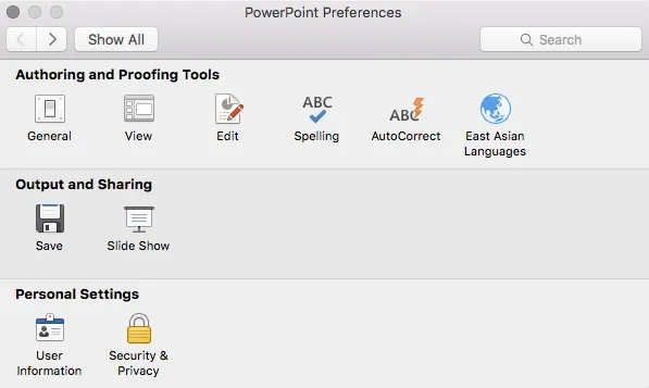
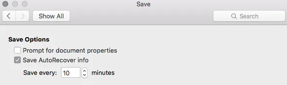
PowerPoint autosaves your files in the background, without your realising it. Make sure you have switched this on, you can set the save interval in PowerPoint settings:

Normally after a crash, PowerPoint will automatically restart and present you with the last file that was auto saved. Normally… If not, try the following.

  • In the Mac finder window, open the “Go” drop down, press ALT, to show the LIBRARY folder and click it.
  • Once in Library, go to  Containers > com.microsoft.Powerpoint > Data > Library > Preferences > AutoRecovery
  • Have a look at the files there and spot a file with a “_autorecover” ending to its name, taking into account the time it was saved.
  • Copy this file just to make sure
  • Rename this copied file with the “.pptm” extension at the end. Ignore all warnings you are presented with.
  • Double click the file and cross your fingers

There is no 100% guarantee this will work, but it is worth a try

One more tip: as soon as you see the small “spiral of death” spinning across the PowerPoint screen develop the instant reaction to take a screen shot of the application. If you are lucky and you grab the slide sorter window, you have captured a miniature icon of all your slides, which should save a lot of time recreating them. Worst case, you just got the thumbnails on the left of your screen that are in the regular slide editing window.

Continue reading →
·SlideMagic

SlideMagic on iPad

I have never been a big believer in focussed and productive presentation design on tablets, but presenting documents (mostly in 1-on-1 meetings) and making last minutes edits are important on mobile devices.

We are not making tablets a design priority, but have deployed some changes to the code that makes SlideMagic run pretty smoothly on an iPad (iPhone is still not optimal). Try it out and report back any bugs. Android tablet users, let me know what happens (I have not tried things out there yet).

With the large iPad Pro coming out later this year, there could be a brighter future for SlideMagic on iPad given the very simple menu structure we use.

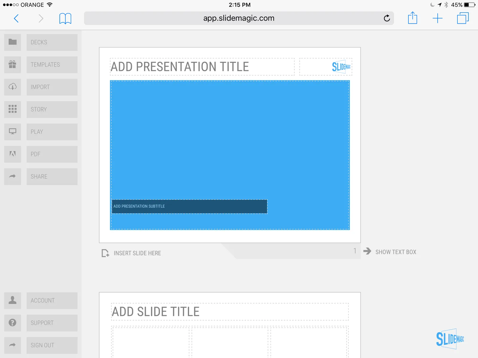
 Screen shot of SlideMagic on my iPad Mini 2

Screen shot of SlideMagic on my iPad Mini 2

·SlideMagic

Thoughts on user interfaces

As I am making progress with my presentation design app SlideMagic, I spend a lot of time thinking about user interfaces (UI) for office applications.

Part of the reason that it is so hard to wean people of Microsoft Office applications is that they have gotten used to the mouse/click/dropdown user interface. Spreadsheets, word processors (who uses them still?) and presentation design software all basically have that same UI.

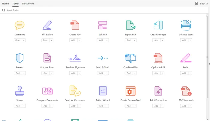
The drop down UI started out pretty simple. File, edit, help menus. Over the years ribbons and tool bars have complicated things. Most people now use a fraction of the functionality that is available to them. As soon as a program does not have that familiar dropdown UI, people are in trouble. I had a hard time understanding the new Adobe Acrobat UI. It is beautifully simple, but it takes time to figure out how to do very basic operations (zooming in and out, combining multiple files into one, rotating mixed up pages of a scan).

Over the past years, user have gotten to know a second UI: the mobile device. The solution for office apps is super simple functionality that draws heavily on icons, UI elements that we have learned from mobile devices.

See how it can work in SlideMagic.

·Software

How to format a spreadsheet

A few simple rules to keep your spreadsheet readable and error-free.

  • Use one set of column headings through the entire worksheet and freeze the panes to the top of the sheet. If you need a completely different table, create a new worksheet in your workbook
  • Avoid using too many colours, use shades of grey instead
  • Round data by dividing by thousands, millions so that they are readable. Round to 1-2 digits behind the comma. Excel will continue to calculate things with the highest precision, even if you do not see it
  • No underlines, italics, but use bold, uppercase, and bold upper case
  • Use long, descriptive row headings
  • Write your formulas top down, a lower row depends on a result that was calculated the line above. Keep formulas as simple as possible. A spreadsheet is a form of computer code: it should be readable the week after you created it. One formula with 15 cell references is the equivalent of code spaghetti.
  • Add totals where ever you can to check for formula errors and to keep things readable. The brain often memorises a number quicker than a description (35.4 instead of “North Africa sales 2014 H1”)
  • If you need to source data out of a “data dump” keep that data in a separate worksheet and pull the numbers via links into your analysis. It creates a nice clean separation between your data source and the analysis, and makes it possible to over write your source data with new information and have the analysis updated instantly (always double check)
·SlideMagic

SlideMagic versus PowerPoint

Some interesting feedback from SlideMagic beta testers:

  • I promised some SlideMagic beta testers to convert the presentation to PowerPoint in the end (there is not yet an automated feature that does that), and it is encouraging to see that these users are postponing that conversion again and again.
  • For some clients I quickly re-do a short presentation in SlideMagic. Client response: the SlideMagic one looks better, why can’t you do that in PowerPoint? Answer 1): SlideMagic uses a pretty font, not Arial, and 2) the corporate PowerPoint template has a slightly less elegant composition of the slide (position of titles, margins etc.)
  • Some clients want the templates that ship with SlideMagic in PowerPoint. After sending them, there are issues with modifying the template in PowerPoint, adjustments that take a second in SlideMagic
  • Some users ask where you can upload PowerPoint slides to convert them instantly to SlideMagic, that will not be possible I am afraid.

Most users are hesitant to switch because 1) it requires changing 20 years of presentation design habits, and 2) yes I admit, SlideMagic had a few bugs that need sorting out. As we make progress with the app, that second excuse becomes less relevant. SlideMagic is slowly reaching the production release.

If you have not tried SlideMagic, you should, Try it here.

Art: Gulliver Exhibited to the Brobdingnag Farmer (painting by Richard Redgrave)

·Software

SlideMagic as a sketch board

Some of you out there are probably still afraid of using a new presentation design tool that is still in beta for live presentations. Here is another way to get started: use SlideMagic as your sketch board.

Many of you use bullet points to sketch out the content of a presentation. Maybe in a word processor, maybe in PowerPoint. The problem is that once you have iterated those bullets and everyone agrees to them, it is hard to turn those lists into visual designs.

Here is where SlideMagic could come in handy. It is very easy to set up charts that are not lists: a quick table, a quick contrast between two options, a quick 2x2. Jot your ideas down, and if you set your accent colour and logo, the whole sketch board will probably look better than a finished end product in PowerPoint.

Use SlideMagic to form your first ideas of your presentation, until the moment has arrived when you “have to” translate the designs to PowerPoint or Keynote. You can of course, but I think many of you will find that it is much easier to stick to SlideMagic after trying a few pages.

Art: an unfinished painting by William Berryman, created between 1808 and 1816

·Delivery

Designing presentations for print

In some industry sectors, especially financial services, people still insist on printing the presentation slides and handing out booklets at the start of the meeting. You can have groups of 10-20 people sitting around a conference table flicking through pages.

It is great for taking notes, analysing detailed financials, but it is not that great for a close connection between speaker and audience, and that last minute typo in the name of the CEO cannot be corrected once on paper.

Sometimes you have to pick your battles and if print is the way to go, think about these issues when starting the design of your slides. The bottom line, get a slide to look good on paper on day 1 of the design project, not at 3AM the night before the meeting.

  • Colours appear different on screen than on paper, especially on cheaper, older, or almost-out-of-toner printers. Bright blue can turn into faded grey, lively orange can become girly pink, subtle grey shadings turn into bright white, just to name a few potential problems.
  • Hole punchers for binding machines require extra space at the top of your page, test it.
  • Dark back grounds empty toner cartridges and make make the fingers of your audience black.
  • You can get away with low res images on a 15 year old VGA overhead projector, on paper though, you will get caught. Use high resolution images.
  • A monitor frame, or the light rectangle on a projection screen provide an implicit frame for your slide. Paper should do the same in theory, but A4/letter/4:3 and other issues makes it highly unpredictable how your slides are scaled on paper. In the worst case you might have draw a tiny grey line around your slides to anchor things (yes really).
Continue reading →
·Software

Hopefully Microsoft reads this: small change to PPT 2016

I have been working with the PowerPoint 2016 preview for a while now, and overall my feedback is very positive (see my PowerPoint 2016 review here).

There is one small thing that keeps me going back to PowerPoint 2011 though: the ability to customise the toolbar at the top of the screen. My set up has not really changed since this blog post from 2008. When working in PowerPoint I constantly need to access buttons that align/distribute/crop/flip and send objects to the back (and the drop shadow button to kill drop shadows). With my custom toolbar, I basically circumvented the majority of the PowerPoint user interface and created my own.

Hopefully Microsoft will include this feature in the final release of PowerPoint 2016.

Image credit: Kate on Flickr