

In SlideMagic 2.0, I have pushed the use of colours in the application user interface further. The look and feel of the application will be the opposite of the slides you are working on:
- If the slides have a dark background colour, the application will be light
- The accent colour of the application will be the opposite colour on the colour wheel from the colour .you are using in your slides.
Here are some screen shots from the alpha version:
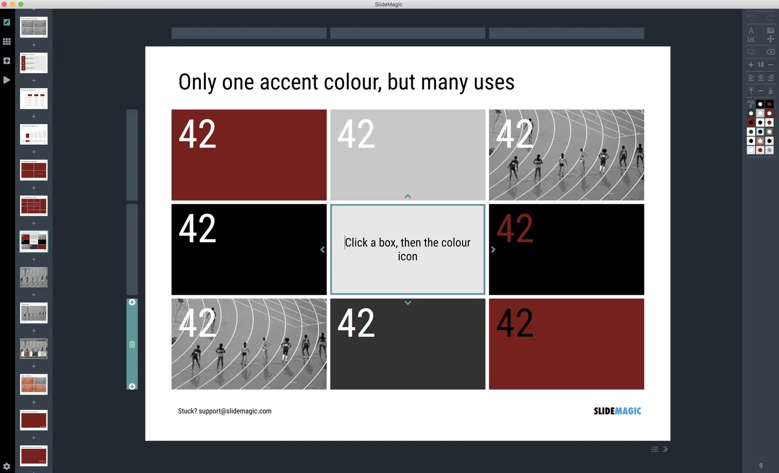
Brown/red in the slides, green in the app
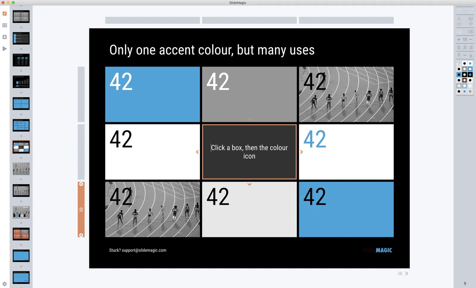
Switch the slide background to dark, the app turns light
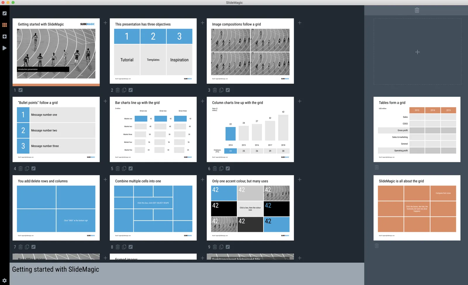
Slides on the clipboard are in the template bank are presented in the opposite colour so you can differentiate easily between the slides that are already in your presentation, and the ones you could add.